Event Planning Digital Presence Professional Website Template
Curate is a dashboard-style event planning landing page template built for digital academies that train aspiring event planners. It leads with an interactive Event Budget Simulator, guides visitors through a data-rich scroll experience, and drives clicks to an enrollment page, all wrapped in a sleek Tech Glass design with an Electric Indigo color system.
by Rocket studio
Quick summary
Curate is a single-page, click-through landing page template designed for event planning course and training platforms. It opens with a logo bar of social proof, then immediately drops visitors into a live budget simulator before unfolding a full curriculum showcase as a glowing dashboard. The layout is built to earn trust fast and move visitors toward enrollment.
Who this template is for
This template is built for educators and course creators in the event planning space. It speaks directly to three types of students you are likely recruiting, making your pitch feel personal from the first scroll.
- Career-changers leaving corporate roles who want a structured path into professional event planning
- Side-hustlers already coordinating informal events and looking for a credential to go official
- Working planning assistants who need formal training to manage their own client roster
What problem this template solves
Most course landing pages tell visitors what they will learn. This template shows them. Before any enrollment pitch appears, the visitor has already used your tool and generated real budget data, which means the course has proven its value before asking for a click.
- Visitors leave generic course pages without understanding the practical payoff of enrolling
- Long curriculum lists feel abstract and fail to demonstrate real professional skill
- A single call-to-action buried below paragraphs of copy loses most visitors before they ever reach it
What you get with this template
You get a fully structured, scroll-driven landing page that functions like a planning command center. Every section is a dashboard panel, and every design choice reinforces the idea that your academy is the serious, modern choice.
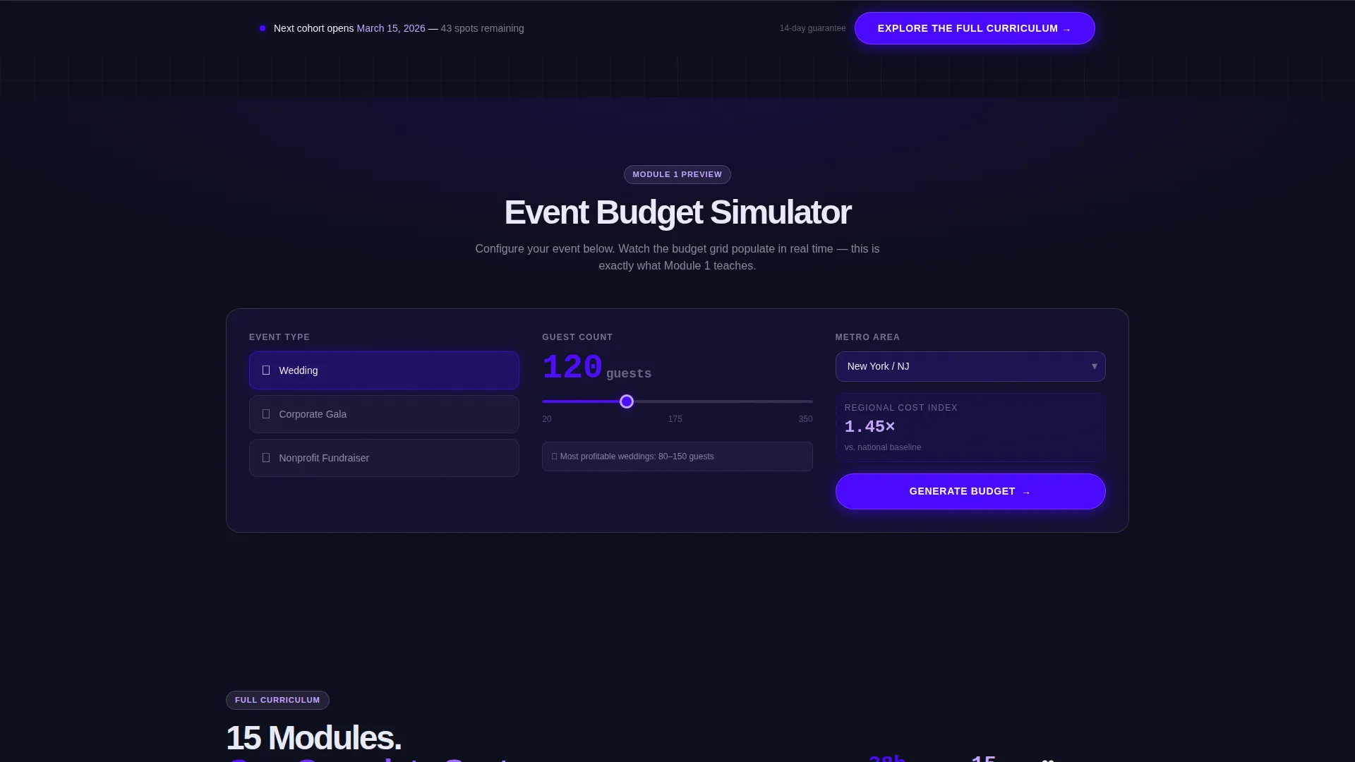
- An interactive Event Budget Simulator with event type, guest count, and metro area inputs
- A curriculum progress tracker, a credential comparison grid, and a student outcome data wall
- A sticky bottom call-to-action bar that appears after the third scroll section and stays visible
Feature list
This template is built around one central idea: demonstrate value before you ask for commitment. Each feature below serves that goal directly.
Interactive Event Budget Simulator
Visitors select an event type, drag a guest-count slider, and choose a metro area. The dashboard instantly populates a twelve-category budget breakdown with regional benchmarks and margin percentages. Each card animates from glass-blank to data-rich, category by category.
Logo Bar with Social Proof Header
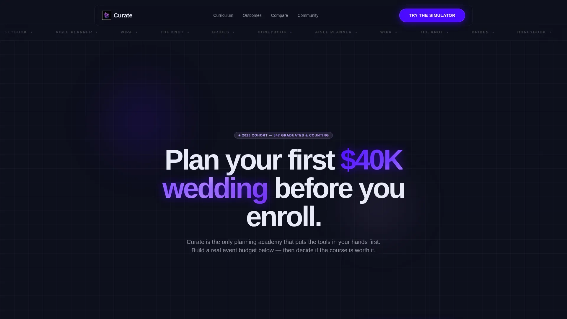
A horizontal ribbon of publication and platform logos opens the page above the main headline. The logos render in monochrome silver against the dark interface and carry a glass-refraction shimmer on scroll, establishing immediate credibility before a single word of course copy appears.
Dashboard-Style Curriculum Panels
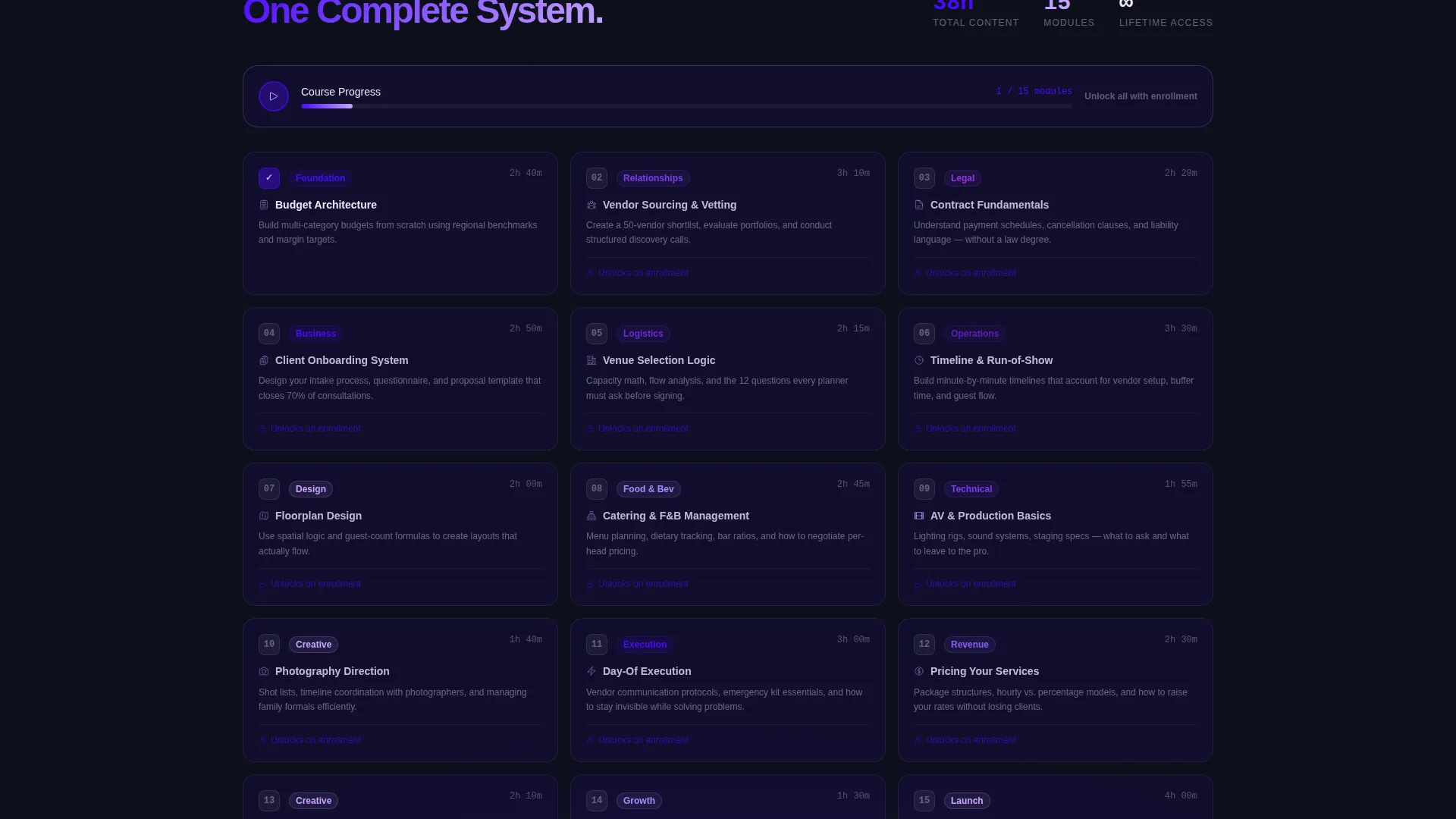
After the simulator, the page reframes the experience with the line "You just did Module 1. There are fourteen more." Subsequent sections unfold as translucent dashboard panels covering the curriculum progress tracker, credential comparison grid, and student outcome data wall.
Sticky Click-Through Call-to-Action
The primary call-to-action button, "Explore the Full Curriculum," appears first beneath the simulator results. It then reappears as a persistent sticky bar after the third scroll section. No form is included; every click routes directly to the enrollment page.
Student Outcome Data Wall
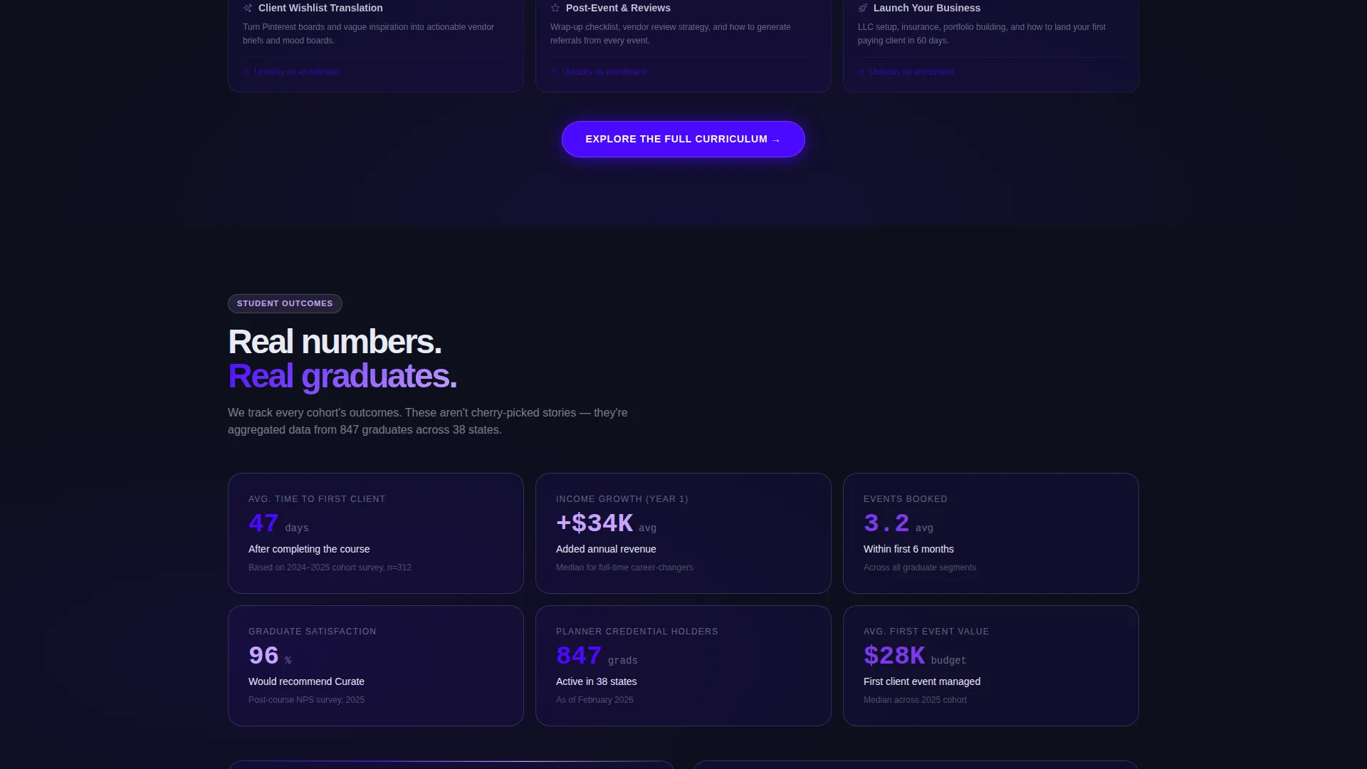
A dedicated panel displays real-feeling outcome metrics such as average time-to-first-client and income growth figures. The data wall keeps the page grounded in results rather than promises, giving career-changers and side-hustlers the confidence to click.
Translucent Card Grid Layout
The entire page uses a glass-panel card system where each section feels like a layer inside a planning command center. Cards use a translucent indigo surface treatment, keeping the visual hierarchy clean while reinforcing the tech-forward brand identity.
Page sections overview
| Section | Purpose |
|---|---|
| Logo Bar | Opens with recognizable publication and platform logos to establish credibility instantly |
| Hero Headline | Delivers the bold promise "Plan your first $40K wedding before you enroll" directly below the logo bar |
| Budget Simulator | Interactive tool where visitors build a real budget before any course description appears |
| Simulator Reframe | Transition line that connects the tool experience to the full fourteen-module curriculum |
| Curriculum Tracker | Dashboard panel showing the course structure as a visual progress system |
| Credential Comparison | Grid comparing this credential against alternatives to help visitors evaluate the offer |
| Outcome Data Wall | Metrics panel showing graduate results like time-to-first-client and income growth |
| Primary call to action Block | Glowing indigo button labeled "Explore the Full Curriculum" beneath the simulator results |
| Sticky call to action Bar | Persistent bottom bar repeating the primary call-to-action after the third scroll section |
Design & branding system
The visual identity follows a Tech Glass theme built entirely around an Electric Indigo color system. The palette is designed to feel like navigating a premium productivity app at midnight, every glow deliberate, every surface slightly transparent.
- Deep interface black (#0D0F1C) as the base background, translucent glass-panel indigo (#4B0AFF at 12% opacity) for card surfaces, and bright electric indigo (#4B0AFF) on active states and progress bars
- Cool silver-white (#E8EAF6) for body text, with holographic lilac (#C7A4FF) reserved for hover states and badge accents
- Medium-weight sans-serif typography on the headline, fading up on load to create a calm, confident first impression
Mobile & speed optimization
The dashboard layout is designed to translate cleanly from desktop to smaller screens. The card grid and simulator panels are structured to stack and reflow without losing the layered glass aesthetic.
- Simulator inputs and budget breakdown cards are touch-friendly and readable at mobile viewport widths
- The sticky call-to-action bar is especially effective on mobile, remaining visible throughout the full scroll experience
- Section transitions and card animations are kept intentional and purposeful rather than heavy or decorative
How this template helps you convert
This template is engineered around a single conversion path: one click to the enrollment page. Every design and content decision reduces friction and builds confidence along the way.
- The budget simulator creates a hands-on moment of value before any sales copy appears, so visitors already feel capable and informed when they reach the call-to-action
- The sticky bottom bar ensures the primary call-to-action is always one tap away, regardless of how far down the page a visitor has scrolled
- The outcome data wall and credential comparison grid answer the two biggest objections, "will this actually work for me?" and "is this better than other options?", before the visitor has to ask
Other information about this template
Curate is designed specifically for the event planning education niche, where trust and demonstrated expertise matter more than aggressive sales tactics. The template's calculator-first creative direction is a deliberate choice to lead with proof over persuasion.
- The page connects naturally to platforms and publications familiar in the wedding and event industry, such as The Knot, Brides, Honeybook, Aisle Planner, and WIPA, through the logo bar section
- The no-form approach keeps this page focused purely on click-through traffic, making it pair well with a separate, detailed enrollment page that handles pricing tiers and cohort dates
- The Tech Glass theme and Electric Indigo palette give the template a distinctive identity that stands apart from the typical pastel or floral aesthetics common in the wedding planning space
Theme
Tech Glass
Creative direction
Calculator/Tool First
Color system
Electric Indigo
Style
Dashboard/Data Grid
Direction
Click-Through
Page Sections
Interactive Event Budget Simulator
Logo Bar Social Proof Header
Dashboard Curriculum Panels
Sticky Click-through Call to Action Bar
Student Outcome Data Wall
Translucent Card Grid Layout
Related questions
Does this template include a sign-up form or checkout flow?
Can I customize the budget simulator categories and regional benchmarks?
Is this template suitable for a non-wedding event planning course?
Who is this landing page template best suited for?



