Curate - Powerful Hospitality Landing Page Template
Curate is a hub and spoke landing page template built for hospitality social media marketers. It combines a Bold Brutalist visual identity with an AI Iridescent color system to deliver a data-driven, scrollable pitch. The layout features a live stats header, comparison tables, and spoke sections that turn a visitor's workflow pain into a compelling case for switching their template stack.
by Rocket studio
Quick summary
Curate is a single-page hospitality social media template landing page. It is designed for hotel and restaurant marketing teams who need to justify a smarter creative workflow. The page opens with animated stat counters, flows through an industry-report-style narrative, and closes with brutalist comparison tables that make the cost of the current setup undeniable.
Who this template is for
This template speaks directly to hospitality marketing professionals who are managing social output at speed and scale. It is built for teams that need visual consistency without burning hours on custom layouts.
- Boutique hotel marketing coordinators balancing Instagram grids around daily front-of-house responsibilities
- Restaurant group brand directors enforcing visual consistency across multiple locations
- Resort social media teams producing Stories, Reels covers, and carousel posts on tight deadlines
What problem this template solves
Most hospitality social teams cobble together posts from a handful of reused layouts, spending hours hunting for the right starting point. That approach creates visual inconsistency and eats into time that should go toward strategy and guest engagement.
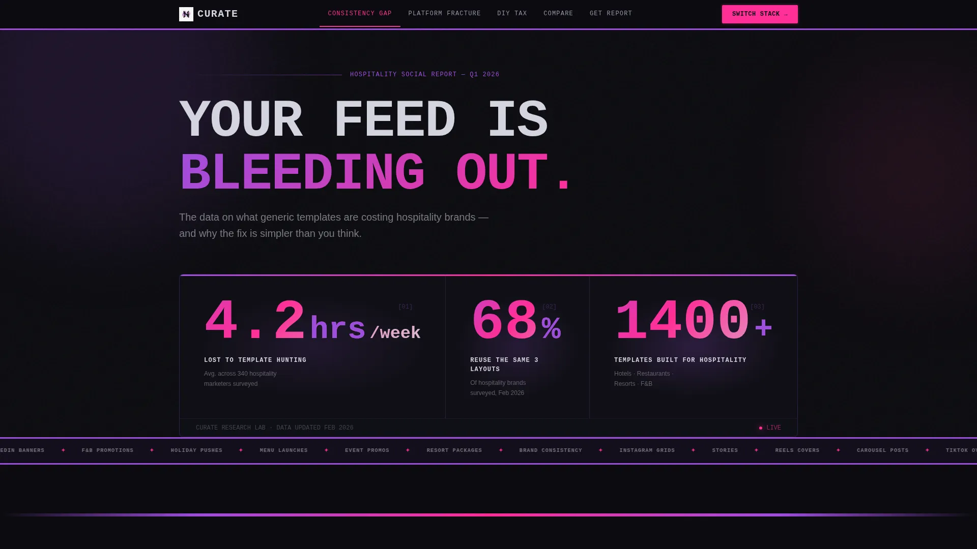
- Teams lose an average of 4.2 hours per week searching for or rebuilding templates
- 68 percent of hospitality brands rely on the same three layouts repeatedly, weakening brand distinction
- Without a structured template library, every platform push becomes a from-scratch sprint
What you get with this template
You get a fully structured hub and spoke landing page that presents a hospitality social template library as the logical answer to a documented workflow problem. The page is built to move visitors from recognition to action.
- An animated stats header that opens with real industry metrics rendered in oversized monospaced type
- Spoke sections anchored in a persistent navigation bar, each pairing a data finding with a template preview grid
- Three brutalist comparison tables covering key decision objections, plus a gated secondary lead capture path
Feature list
This template includes a focused set of page-level features, each grounded in the brief's creative and structural direction.
Animated Live Stats Header
The header renders three industry metrics in oversized monospaced type against a void black background. Each number animates on load with a mechanical counter effect. Iridescent light refracts behind the digits, making the data feel alive rather than static.
Persistent Anchor Navigation
A sticky navigation bar lets visitors jump between the page's spoke sections at any point during their scroll. This keeps the hub and spoke structure navigable without requiring a return to the top. The nav reinforces the report-style flow by labeling each section as a distinct finding.
Industry Report Spoke Sections
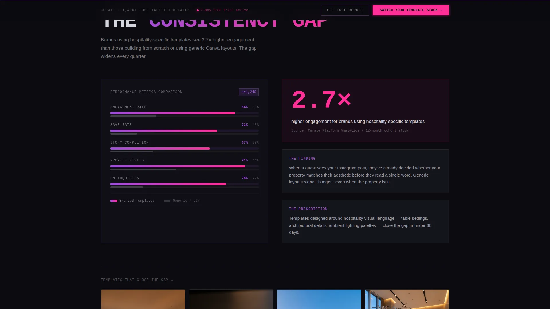
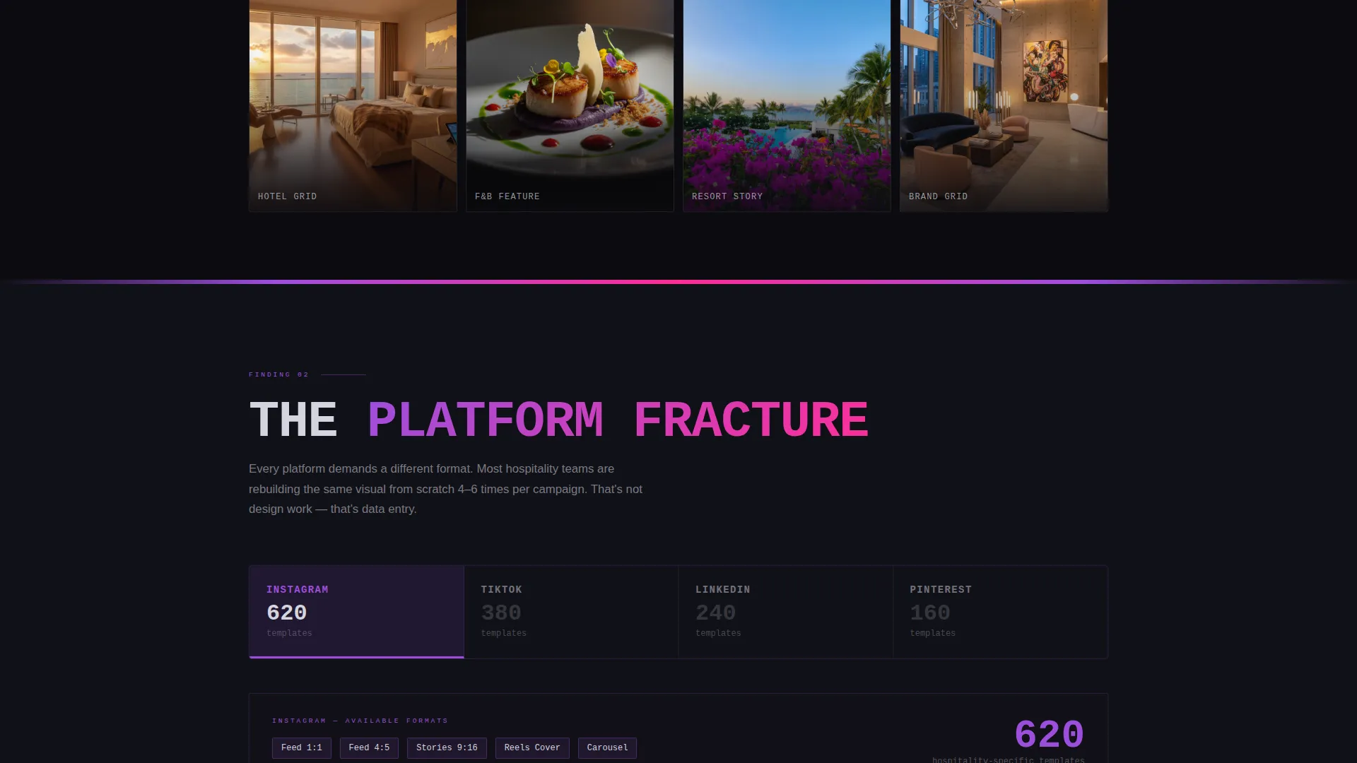
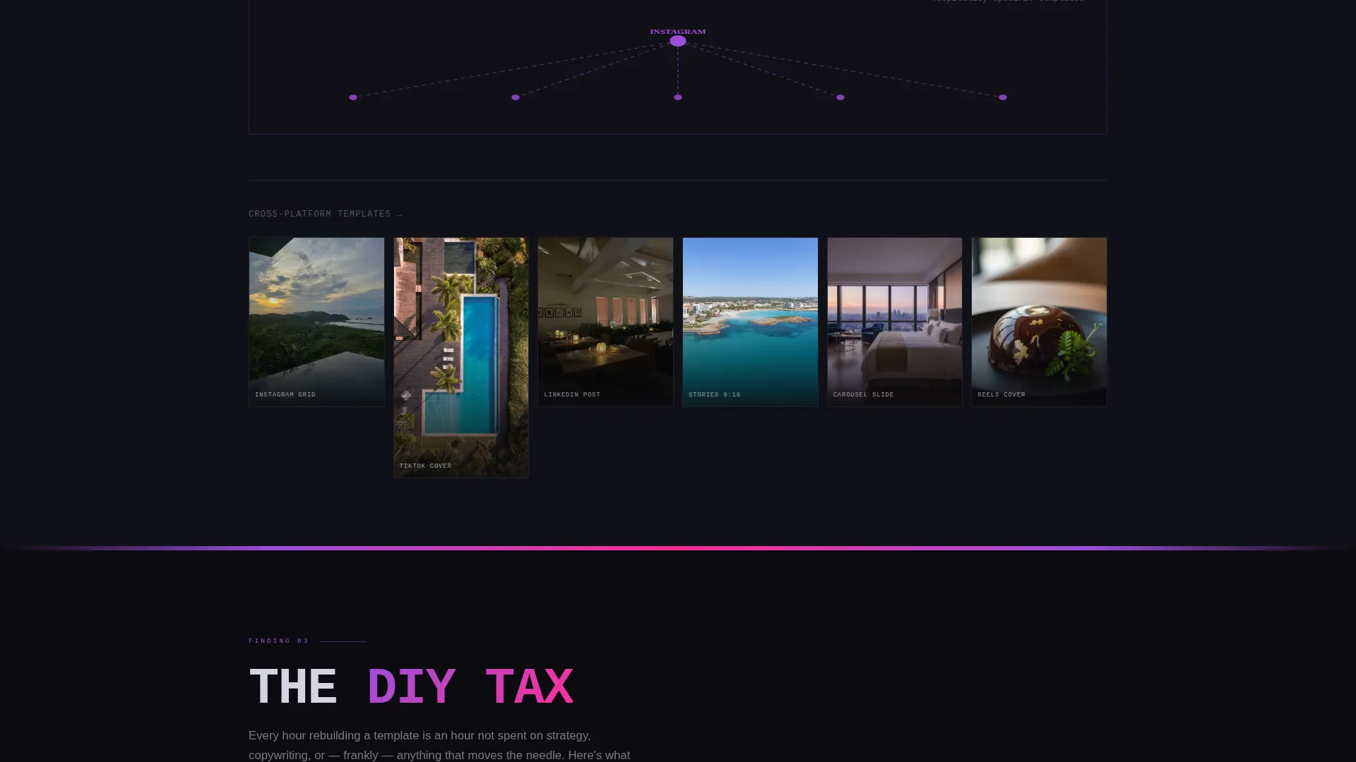
Each spoke section pairs a named problem with inline data visualizations and a template preview grid. Sections cover the consistency gap, the platform fracture across Instagram, TikTok, and LinkedIn, and the do-it-yourself time tax. The scroll feels like a report that keeps diagnosing the reader's situation before offering the fix.
Brutalist Comparison Tables
Three full comparison tables pit the template library against common alternatives. Chrome-bordered brutalist grid cells keep the layout sharp and scannable. Each table ends with the primary call to action to maintain conversion momentum.
Gated Secondary Lead Path
A secondary conversion option offers a downloadable hospitality social report in exchange for a work email and property type. This path qualifies visitors by segment while delivering immediate value. It runs alongside the primary call to action without competing with it.
Signal Pink Call-to-Action System
Every primary call to action uses the signal pink color token, set to pulse on hover states. The floating bottom bar reinforces the primary action throughout the scroll. This system ensures the next step is always visible without being disruptive.
Page sections overview
| Section | Purpose |
|---|---|
| Stats Header | Opens with animated industry metrics to establish credibility and urgency |
| Anchor Navigation | Persistent hub nav linking all spoke sections for easy movement |
| The Consistency Gap | Compares branded versus unbranded post engagement with inline bar charts |
| The Platform Fracture | Maps template needs across Instagram, TikTok, and LinkedIn with spoke diagrams |
| The DIY Tax | Calculates hours lost to building social assets from scratch |
| Comparison Tables | Side-by-side brutalist grids covering three key decision objections |
| Lead Capture Path | Gated PDF download qualifying visitors by email and property type |
| Floating call to action Bar | Persistent bottom bar keeping the primary action visible at all times |
Design & branding system
The visual identity follows a Bold Brutalist theme expressed through an AI Iridescent color system. The result feels like a nightclub lobby redesigned by a Swiss typographer, where iridescent gradients shimmer behind heavy type blocks and chrome surfaces catch neon reflections.
- Core palette uses void black (#0B0B0F) for backgrounds, holographic violet (#9D4EDD) for section dividers, liquid chrome (#D4D4DE) for body text, and signal pink (#FF2E97) reserved for calls to action and hover states
- Typography leans on oversized monospaced type for metrics and brutalist type blocks for section headings, creating a sharp data-report aesthetic
- Iridescent gradients appear behind key data points and interactive elements, giving the page visual depth without relying on photography
Mobile & speed optimization
The template is structured to stay functional and readable across screen sizes. The hub and spoke layout adapts naturally to narrower viewports without losing its visual hierarchy.
- The persistent anchor navigation collapses cleanly on smaller screens, keeping spoke section access available throughout the scroll
- Oversized mono type and thick violet section dividers maintain visual hierarchy on mobile without requiring image assets
- The floating call-to-action bar remains anchored at the bottom of the viewport on all device sizes, keeping the primary action reachable
How this template helps you convert
The page is engineered around a clear conversion model that earns the click before asking for it. Every structural choice reduces hesitation and builds toward a decision.
- The stats header opens with data that reflects the visitor's actual situation, creating immediate recognition and reducing the time needed to establish relevance
- The spoke sections follow a problem-then-prescription structure, so each scroll step deepens the case for switching rather than repeating the same pitch
- The dual conversion path captures both ready-to-act visitors and those who need one more touchpoint, qualifying leads by segment without adding friction
Other information about this template
This template is categorized under Technology with a subcategory focus on hospitality digital presence. It is designed specifically for the hospitality social media template niche, making it a focused tool rather than a general marketing page.
- The template style is hub and spoke with anchor navigation, meaning the page functions as a central hub that branches into clearly labeled spoke sections
- The creative direction follows an industry report model, giving the page a journalistic authority that differentiates it from standard promotional layouts
- The header concept is built entirely around stats and metrics rather than hero imagery, which is an intentional choice to lead with proof rather than aesthetics
- The comparison and versus conversion model is a deliberate structural decision that addresses objections before they are raised
- The intersection match score of 13 reflects a tightly aligned combination of theme, color system, creative direction, template style, landing page direction, and header concept drawn from the matched context fields
Theme
Bold Brutalist
Creative direction
Industry Report
Color system
AI Iridescent
Style
Hub & Spoke (Anchor Nav)
Direction
Comparison/Versus
Page Sections
Animated Live Stats Header
Persistent Anchor Navigation
Industry Report Spoke Sections
Brutalist Comparison Tables
Gated Secondary Lead Path
Signal Pink Call-to-action System
Related questions
Who is this landing page template designed for?
What makes the header different from a standard hero section?
How does the comparison table section work?
Can the gated lead capture section be used independently?
What is the primary call to action on this landing page?



