Cloud-Native Enterprise Software Specialist Reviews Website Template
Catalog is a scroll-reveal landing page template built for cloud-native product information management platforms. It pairs a bold brutalist visual identity with interactive exploration, dark glass panel headers, a live data-mapping diagram, and a channel previewer, to guide e-commerce operations teams from problem awareness to sandbox install in one confident, deeply engaging page.
by Rocket studio
Quick summary
Catalog is a single-page, scroll-reveal landing page template for cloud-native product information management (PIM) software. It uses a bold brutalist design, an interactive data explorer, and a low-friction install form to move operations managers, merchandising leads, and integration engineers from first scroll to sandbox signup.
Who this template is for
This template is built for teams who manage large product catalogs at scale and need a landing page that speaks their language. It does not assume a casual consumer audience. It speaks directly to the people responsible for product data quality and channel distribution.
- E-commerce operations managers who maintain thousands of stock-keeping units (SKUs) across multiple storefronts
- Merchandising leads who manually copy and update product descriptions across separate sales channels
- Integration engineers connecting enterprise resource planning (ERP) systems to downstream commerce platforms
What problem this template solves
Product data chaos is expensive. Teams lose hours every week copying descriptions, reconciling spreadsheet versions, and chasing down missing fields before a launch. A PIM platform solves that, but the landing page selling it has to prove the value before the visitor reads a single paragraph. This template builds that proof through interaction.
- Fragmented product data spread across spreadsheets and disconnected systems
- Manual, error-prone workflows for syncing content to multiple sales channels
- Difficulty communicating a complex technical platform's value without walls of text
What you get with this template
You get a complete, production-ready landing page layout that delivers the full sales narrative for a cloud-native PIM platform. Every section is purposefully sequenced. The structure escalates from problem to architecture to proof, rewarding curiosity at each stage.
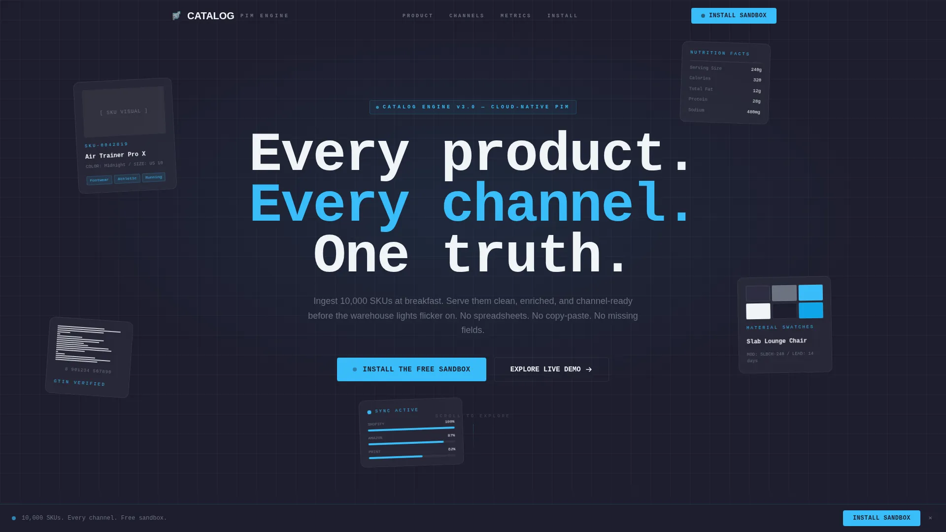
- A dark glass panel header with parallax depth and ghosted product card visuals
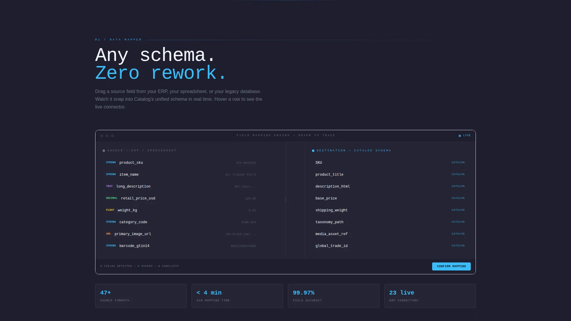
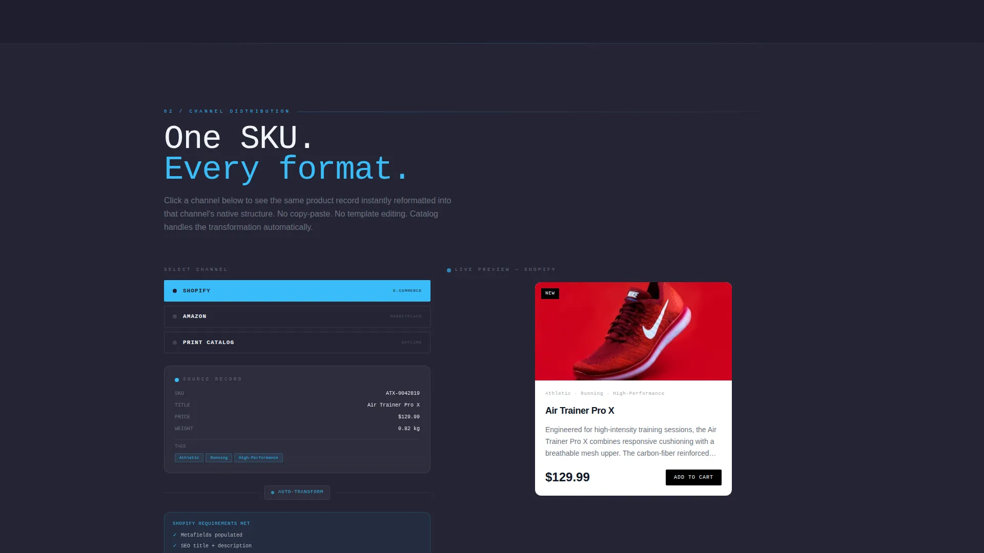
- An interactive data-mapping diagram and a channel distribution previewer with real-time format switching
- A persistent bottom-bar call to action and a full-width brutalist call to action block at the page floor
Feature list
This template is built around the idea that the visitor should touch the product before they are asked to commit. The features below reflect what is actually designed into this layout.
Dark Glass Panel Header
Five or six translucent, frosted-glass rectangles float against a deep graphite background. Each panel holds a ghosted product card, a sneaker, a SKU number, a nutrition label, a furniture swatch. Mouse movement shifts the panels with subtle parallax depth, creating the feeling of looking through layered panes in a server rack.
Scroll Reveal Progressive Layout
The page does not present everything at once. Each section materializes as the visitor scrolls into it. The reveal sequence escalates deliberately: problem first, then platform architecture, then throughput proof. This pacing keeps attention focused and prevents cognitive overload on a technically dense subject.
Live Data-Mapping Diagram
Inside the architecture section, a visual diagram shows source fields mapping to destination fields. Hovering a source field draws an animated connector line to its destination. This single interaction communicates the platform's core value, structured data enrichment and routing, without requiring the visitor to read a technical specification.
Channel Distribution Previewer
A panel lets visitors click a channel name and watch the same product card reformat instantly into that channel's native layout. This real-time preview makes channel-ready data output tangible and concrete, not abstract. It answers the visitor's key question before they have to ask it.
Minimal Sandbox Install Form
The primary call to action form asks for only two inputs: a work email address and an estimated SKU count via a slider. The slider replaces a text field to reduce friction and signal that the platform understands scale. A secondary path offers access to a live embedded demo with no credentials required.
Persistent and Floor call to action Architecture
The "Install the Free Sandbox" call to action first appears as a persistent bottom bar after the second scroll reveal. It then reappears as a full-width brutalist block at the bottom of the page. This two-stage exposure means the visitor encounters the ask only after they have already interacted with three template sections.
Page sections overview
| Section | Purpose |
|---|---|
| Dark Glass Header | Opens with parallax product card panels and the primary headline |
| Problem Statement | Establishes fragmented data pain for the target audience |
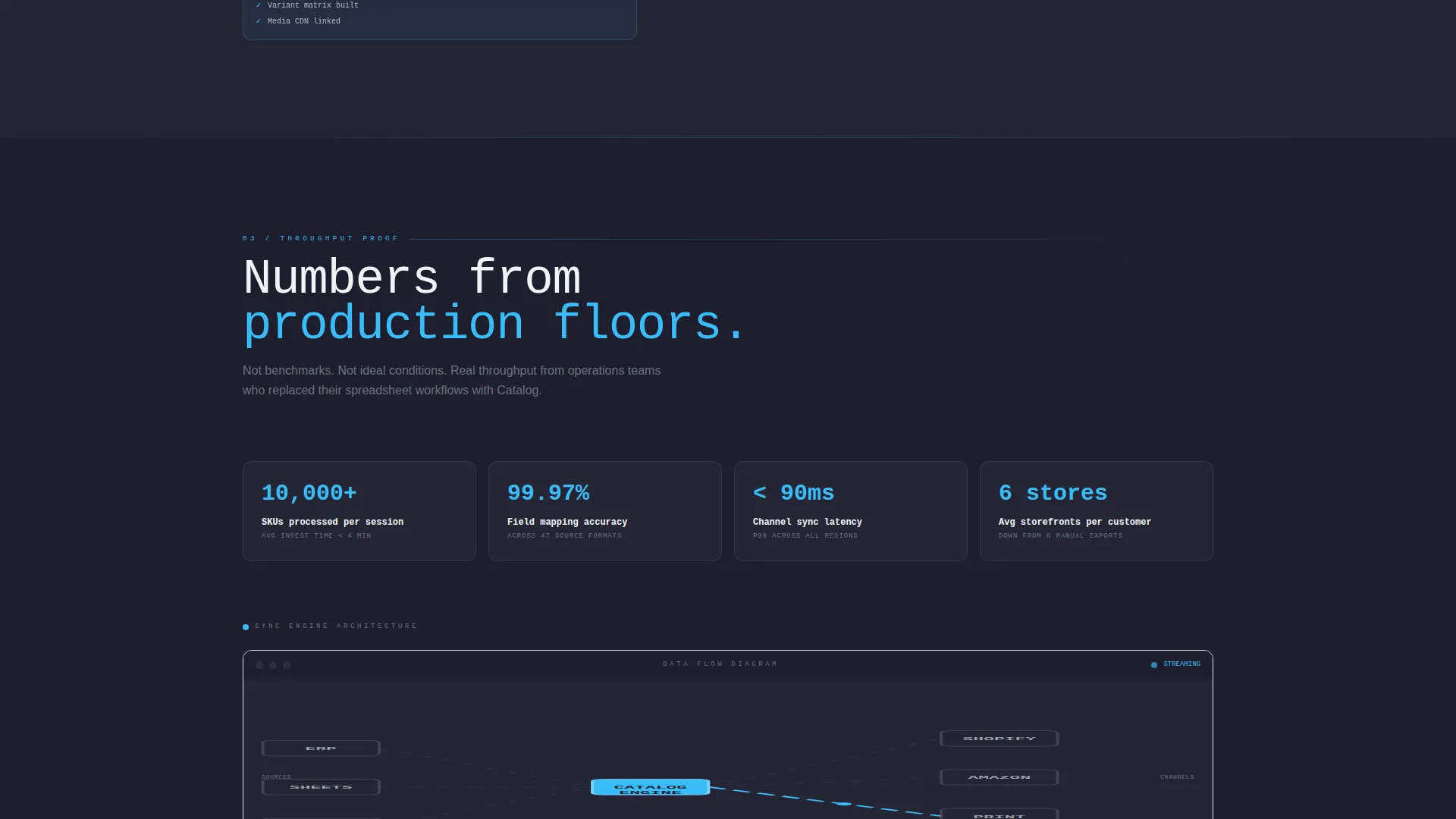
| Sync Engine Architecture | Visualizes the platform data-mapping flow interactively |
| Channel Distribution Panel | Demonstrates real-time product card reformatting per channel |
| Throughput Proof | Presents customer volume metrics as scroll-revealed evidence |
| Persistent call to action Bar | Locks the sandbox install prompt to the bottom of the viewport |
| Floor call to action Block | Closes the page with a full-width brutalist install invitation |
Design & branding system
The visual identity is bold brutalist, no gradients, no decorative imagery, no stock photography. Every design choice references the aesthetic of industrial infrastructure: raw steel, poured concrete slab, and the electric-blue sky above a data center rooftop at dawn.
- Color palette: deep graphite (#1E1E2E) for backgrounds, exposed-concrete mid-gray (#6B7280) for borders and secondary type, atmosphere blue (#38BDF8) for hover states and active indicators, and cloud-break white (#F0F4F8) for body text and negative space
- Typography: oversized brutalist monospace for headlines, with generous white gutters separating monolithic content blocks
- Interactive states: atmosphere blue activates on hover, tab focus, and progress indicators throughout the scroll sequence
Mobile & speed optimization
The template is designed so its interactive components and heavy visual language translate cleanly to smaller screens. The scroll reveal behavior and parallax effects are scoped to avoid layout breakage on mobile viewports.
- Parallax depth and panel-shift effects are contained within a mouse-movement context, scaling gracefully when touch is the primary input
- The SKU count slider and minimal form fields reduce typing burden on mobile keyboards
- Section materialization on scroll is structured to work within standard mobile browser rendering behavior
How this template helps you convert
The conversion architecture in this template is deliberate. The visitor is given three chances to interact with the product before any form or call to action appears. By the time the install prompt is visible, the visitor has already experienced the core value proposition hands-on.
- Three pre-ask interactions, the parallax header panels, the data mapper, and the channel previewer, build product familiarity and trust before any commitment is requested.
- The persistent bottom bar introduces the install call to action at exactly the right scroll depth, keeping it visible without interrupting the discovery flow.
- The minimal two-field form at the floor reduces abandonment by asking only for what is necessary to begin a sandbox session.
Other information about this template
This template is categorized under Technology and specifically targets the cloud-native enterprise software subcategory. It is designed for PIM platform providers operating in a technically informed B2B market.
- The template style is Scroll Reveal (Progressive), meaning sections appear sequentially as the visitor scrolls rather than loading all at once
- The header concept is Dark Glass Panels, a brutalist design motif with no hero images or stock photography
- The creative direction is Interactive Explorer, meaning the page rewards engagement with explorable components rather than passive reading
- The landing page direction is App Download, with the primary goal of driving sandbox installs through a low-friction form
- The color system is Slate and Sky, anchored by deep graphite, concrete gray, atmosphere blue, and cloud-break white
- The theme is Bold Brutalist, emphasizing raw structural aesthetics, heavy typography, and unapologetic use of dark backgrounds
Theme
Bold Brutalist
Creative direction
Interactive Explorer
Color system
Slate & Sky
Style
Scroll Reveal (Progressive)
Direction
App Download
Page Sections
Dark Glass Parallax Header
Progressive Scroll Reveal Layout
Interactive Data-mapping Diagram
Real-time Channel Distribution Previewer
Minimal Two-field Install Form
Two-stage Call to Action Architecture
Related questions
Who is this landing page template designed for?
Can I customize the color palette and typography?
Does this template require a developer to set up?
What makes the interactive elements different from standard hover animations?
How is the call to action structured across the page?



