Refined Weekly Newsletter Landing Page Template
Curate is a horizontal scroll landing page for a weekly roundup newsletter. It uses a refined Atelier Studio aesthetic with warm parchment tones and deliberate whitespace to signal editorial calm. Built as a waitlist page, it guides one kind of visitor toward one action: reserving their Sunday copy with a single email field.
by Rocket studio
Quick summary
Curate is a single-page horizontal scroll landing page designed for a weekly roundup newsletter with a waiting list. The layout moves visitors through four distinct panels, editor portrait, sample edition, testimonials, and signup, using quiet transitions and a warm, studio-inspired palette. One call to action, one email field, and zero distractions.
Who this template is for
This template speaks directly to independent editors and solo newsletter writers who want their signup page to reflect the same care they put into their writing. If your product is restraint, your page should prove it immediately.
- Newsletter editors launching a curated weekly roundup with a coming-soon waitlist
- Freelance strategists, creative directors, or founders building a personal editorial brand
- Writers who want a page that feels considered and calm rather than loud and promotional
What problem this template solves
Most newsletter landing pages look like every other landing page. They stack too many sections, compete for attention with social icons, and bury the signup under layers of copy. That mismatch destroys trust before a single word of the letter is read.
- Visitors arrive and immediately feel the tone of the newsletter, not just read about it
- The single call-to-action path removes every reason to leave without signing up
- The horizontal scroll format separates context from conversion without losing the reader
What you get with this template
You get a fully structured horizontal scroll landing page with four panels and one focused purpose: collecting email addresses from the right readers. Every design detail is part of the argument for why this letter is worth waiting for.
- A manifesto header panel with oversized serif typography and a quiet editorial byline
- A four-panel horizontal scroll flow covering editor context, sample content, social proof, and signup
- A waitlist-style signup block with a print-run counter styled as an edition number
Feature list
This template is built from a small number of decisions, each made carefully.
Horizontal Scroll Panel Layout
The page moves horizontally through four panels: the editor at their desk, a sample edition with marginalia, three postcard-style testimonials, and the signup form. Each panel slides in with the steady weight of walking through a gallery rather than swiping through a feed.
Manifesto Header with Oversized Serif
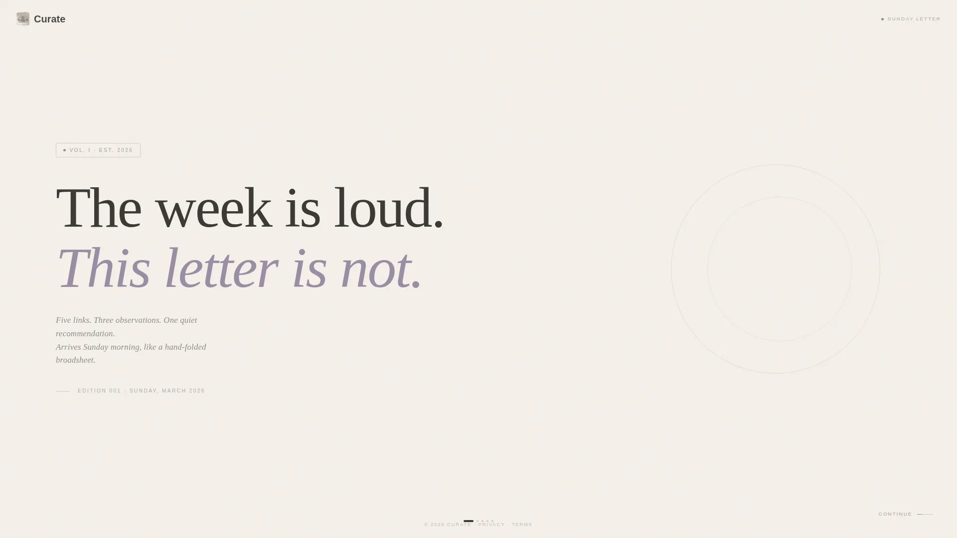
The header panel opens with a single typeset line on bare parchment: "The week is loud. This letter is not." Large letter-spacing and no imagery keep the statement clean. A small italic byline and edition number sit below, grounding the page in print tradition.
Waitlist Signup with Edition Counter
The final panel holds one email field with the placeholder text "sunday@yours.com" and a single call-to-action button labeled "Hold My Copy." Below the field, a reader counter reads as a print-run edition, for example "Edition 001 · 2,407 copies reserved," reinforcing scarcity and editorial identity at once.
Postcard Testimonial Styling
Three short reader endorsements are styled as handwritten postcards rather than standard quote blocks. The format matches the newsletter's tactile, analog tone and keeps social proof consistent with the overall visual identity.
Sample Edition with Marginalia Panel
The second scroll panel shows a real-feeling sample edition with visible links and annotation-style marginalia notes in the margins. This gives prospective readers a direct preview of what they are waiting for, removing uncertainty about the format.
Soft Mist Color System
The entire page uses four colors: warm parchment, studio fog, graphite pencil, and dried lavender. Lavender appears only on interactive elements and hover states, which gives the page a focused color vocabulary that feels handcrafted rather than generated.
Page sections overview
| Section | Purpose |
|---|---|
| Manifesto Header Panel | Opens with the editorial statement and edition byline |
| Editor at Desk | Introduces the single editor behind the letter |
| Sample Edition Panel | Shows a real edition preview with marginalia |
| Postcard Testimonials | Displays three reader endorsements as handwritten postcards |
| Waitlist Signup Panel | Captures the email address with edition-style counter |
Design & branding system
The visual system is built around the Atelier Studio theme and a four-color Soft Mist palette. Every decision points toward the same feeling: something made carefully by one person for a small number of readers.
- Warm parchment (#F5F0EB) and studio fog (#D6CFC7) form the page backgrounds, with graphite pencil (#3B3A36) for all primary text
- Dried lavender (#9B8EA4) is used only for interactive moments such as hover states and the call-to-action button, keeping the accent meaningful
- Typography uses a single oversized serif for the manifesto header and consistent spacing throughout to preserve the handmade, editorial quality
Mobile & speed optimization
The horizontal scroll experience is purpose-built for the page's editorial rhythm. On smaller screens, the panel layout adapts so readers can move through each section without losing the template's considered pacing.
- Each panel is designed to hold its visual identity at reduced screen widths without crowding the typography
- The minimal asset load, no background video, no heavy animations, no image carousels, keeps the page light by design
How this template helps you convert
Every structural choice in this template is designed to move one kind of reader toward one action. The page does not try to serve everyone.
- The manifesto header qualifies visitors instantly. Readers who connect with the editorial tone self-select before they reach the signup, meaning the people who convert are the right people.
- The single call-to-action path removes friction completely. There are no social links, no secondary buttons, and no navigation menu to pull attention away from the email field.
- The edition counter creates a quiet sense of community. Seeing that over two thousand readers are already waiting makes the decision to join feel less like subscribing and more like being included.
Other information about this template
This template is categorized under Blog and Editorial, with a specific fit for the Newsletter and Publication subcategory. It is designed for the weekly roundup newsletter niche where tone and trust are the primary conversion drivers.
- The template style is Horizontal Scroll, which is uncommon in newsletter landing pages and immediately signals that this product is different
- The creative direction follows a Day-in-the-Life approach, grounding the page in the editor's real working process rather than abstract brand language
- The header concept is a Quote and Manifesto format, which leads with voice rather than features and is well suited to editorial products where writing quality is the offer
- The landing page direction is Waitlist and Coming Soon, meaning the template is optimized for collecting early interest before a public launch
Theme
Atelier Studio
Creative direction
Day-in-the-Life
Color system
Soft Mist
Style
Horizontal Scroll
Direction
Waitlist/Coming Soon
Page Sections
Horizontal Scroll Panel Flow
Manifesto Header with Serif Typography
Waitlist Signup with Print-run Counter
Postcard-style Testimonial Panel
Sample Edition Preview Panel
Soft Mist Four-color Palette
Related questions
Can I change the manifesto headline to match my own newsletter voice?
Does the horizontal scroll layout work on mobile devices?
Can I update the reader counter as my waitlist grows?
Is this template suited for a newsletter that has not launched yet?
Can I adjust the color palette to match my own brand?



