Action-Able Industry Insights Landing Page Template
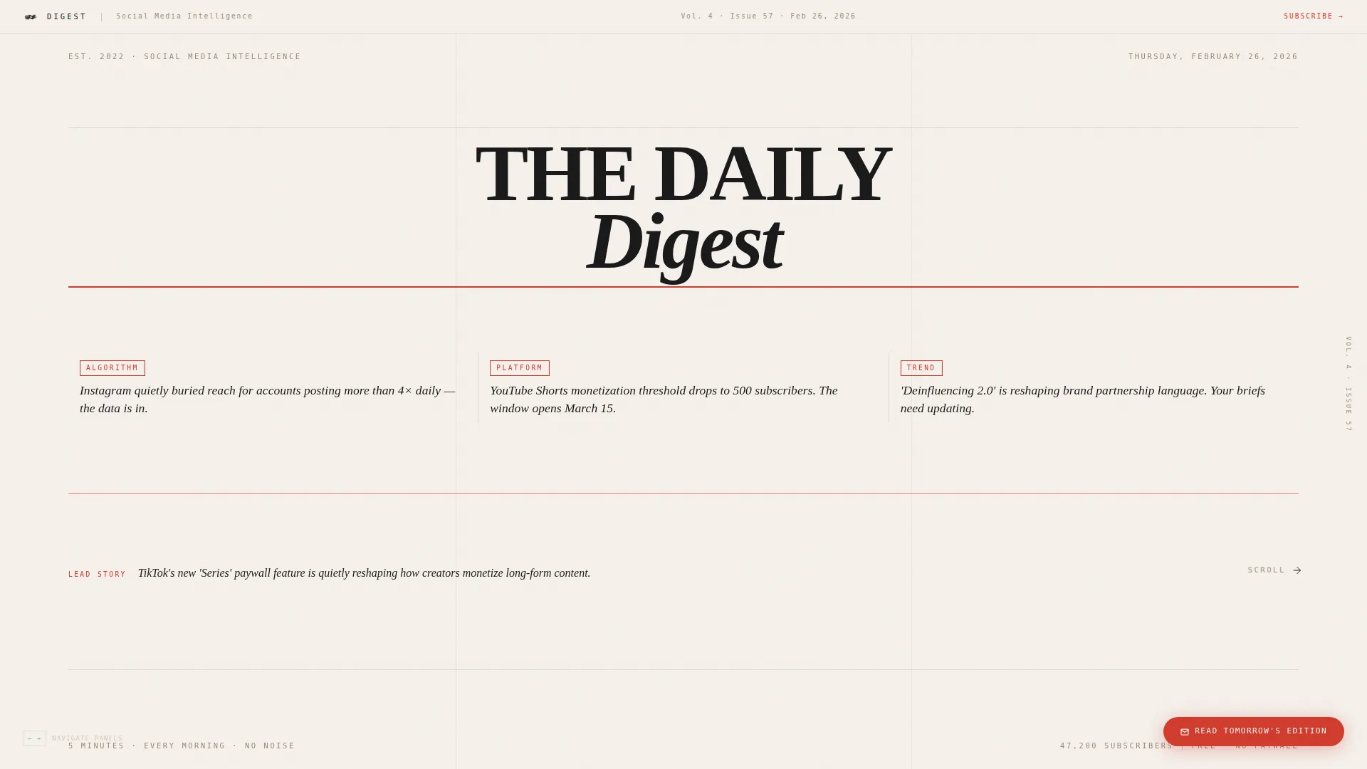
Digest is a horizontal scroll landing page template for a social media marketing daily newsletter. It uses a broadsheet editorial masthead, a Gallery Walk panel layout, and a Japanese Zen color system to guide agency social managers, freelance creators, and in-house marketing leads toward a single subscription click, no form fields, no friction.
by Rocket studio
Quick summary
Digest is a single-page, horizontal scroll landing page built for a curated social media marketing daily newsletter. The design feels like a private editorial studio, each lateral panel delivers a piece of genuine insight before a final vermillion call-to-action closes the experience. The goal is one clear click: "Read Tomorrow's Edition."
Who this template is for
This template is made for newsletter creators and content marketers who want to convert readers through demonstrated editorial value rather than aggressive opt-in forms. It suits anyone building a daily briefing product in the social media marketing space.
- Agency social media managers who handle ten or more brand accounts and need fast, reliable morning briefings
- Freelance content creators who cannot afford to miss a trend cycle and want a trusted daily source
- In-house marketing leads reporting to senior stakeholders who need clear, concise social intelligence each morning
What problem this template solves
Social media marketing professionals are overwhelmed by algorithmic noise, platform changes, and competing trend cycles. A generic email signup page does nothing to prove that your newsletter is worth their inbox. This template solves the trust problem before the click ever happens.
- Visitors consume three panels of real editorial content before they reach the call to action
- The gallery format shows curation quality in action, making the subscription feel earned rather than pushed
- The single-click, no-form design removes friction at the moment of highest intent
What you get with this template
You get a fully structured horizontal scroll landing page with six self-contained editorial panels, a floating call-to-action button, and a closing full-panel subscription prompt. Every design decision, from the broadsheet masthead to the breathing-room panels, is built to convert through taste, not pressure.
- A broadsheet-style hero masthead with editorial serif typography, today's date, and a rotating lead story summary
- Five content panels covering platform updates, a pulled-quote insight, trend deconstruction, and social proof testimonials
- A sticky floating "Read Tomorrow's Edition" vermillion pill button active throughout the scroll, expanding into a full closing panel at the final frame
Feature list
This template ships with a focused set of editorial and interactive features drawn directly from the design brief.
Broadsheet Editorial Masthead
The hero panel presents "THE DAILY DIGEST" in a high-contrast display serif at editorial scale. Today's date sits beneath it alongside three visible headline fragments and a thin vermillion rule separating the masthead from a rotating lead story summary.
Horizontal Gallery Walk Scroll
Visitors move laterally through the page like walking through exhibition rooms. Each panel is a self-contained editorial clipping, annotated platform updates, pulled-quote insights, and marginalia-style trend breakdowns, with breathing-room panels of pure stone white between denser frames.
Sticky Floating Call-to-Action Pill
A vermillion pill button labeled "Read Tomorrow's Edition" stays pinned to the bottom-right corner throughout the entire scroll journey. It expands into a full closing panel at the final frame, making the subscription prompt feel like a natural arrival rather than an interruption.
Editorial Social Proof Panel
Testimonials are framed as "letters to the editor" in broadsheet style, and the subscriber count is displayed as a circulation figure. This treatment keeps social proof consistent with the editorial identity rather than breaking it with conventional review blocks.
Hover Marginalia Reveals
Interactive hover states reveal additional annotations and marginalia on content panels, rewarding curious visitors with extra detail. This interaction deepens engagement without cluttering the primary reading experience.
Japanese Zen Color System
The full palette, stone white, sumi ink, tatami warm, and vermillion seal red, is applied with editorial restraint. Vermillion appears only on interactive hotspots and the subscribe action, so every use of it carries deliberate visual weight.
Page sections overview
| Section | Purpose |
|---|---|
| Hero Masthead Panel | Sets editorial tone and anchors the broadsheet identity with today's date and a rotating lead story |
| Platform Updates Panel | Delivers an annotated platform change clipping as the first piece of free editorial value |
| Breathing Room Panel | Presents a single pulled-quote insight on pure stone white to pace the reading experience |
| Trend Deconstruction Panel | Breaks down a current trend with marginalia-style annotation and supporting stats |
| Social Proof Panel | Frames subscriber testimonials as letters to the editor with a circulation-style subscriber count |
| Closing Call-to-Action Panel | Expands the floating pill into a full-frame subscription prompt with the primary vermillion action |
Design & branding system
The visual identity follows an Atelier Studio theme built on a Japanese Zen editorial aesthetic. Every color, typeface, and spacing decision is deliberate, the page feels like handmade washi paper laid across a black lacquer desk, restrained and confident.
- Color palette: stone white (#F5F0EB) for backgrounds, sumi ink (#1A1A1A) for body text, tatami warm (#C4B39A) for accents, and vermillion seal red (#D03C2F) reserved exclusively for calls to action and interactive hotspots
- Typography: Fraunces display serif for headlines and mastheads, DM Sans for body text, and IBM Plex Mono for metadata labels and datelines
- Visual rhythm alternates between dense editorial panels and open breathing-room panels, creating an unhurried, gallery-like pace through the content
Mobile & speed optimization
The template is designed desktop-first, as the horizontal scroll experience is inherently suited to larger screens. A vertical fallback layout is included for mobile visitors so the content remains accessible and readable on smaller devices.
- Horizontal scroll is powered by CSS scroll snap and transform-only animations, keeping motion smooth without relying on heavy third-party libraries
- Panel reveal staggering and floating call-to-action behavior use lightweight animation techniques drawn from the brief's performance-conscious technical approach
- Mobile visitors receive a vertically stacked version of the same editorial panels, preserving the reading experience without the lateral scroll mechanic
How this template helps you convert
This template earns the subscription click by delivering editorial value first and asking for commitment last. The conversion path is built into the content sequence itself.
- Visitors absorb three panels of genuinely useful social media marketing intelligence before they ever reach a call to action, building trust in the curator's judgment with each frame
- The sticky floating pill button maintains low-pressure visibility throughout the scroll, so readers who are ready early can act without waiting for the final panel
- The closing full-panel call to action arrives after the full editorial experience, making the click feel like pulling up a chair at a desk the visitor already wants to sit at
Other information about this template
This template is categorized under Blog and Editorial with a subcategory of Social Media Marketing Newsletter. It is built specifically for the Social Media Marketing Daily Digest niche and carries a strong intersection match across all three context layers.
- The template style is Horizontal Scroll with a Gallery Walk creative direction, making it a distinctive choice in a category typically dominated by vertical funnel pages
- The header concept follows a Newspaper and Publication masthead approach, giving newsletter brands an instant credibility signal rooted in print editorial tradition
- The landing page direction is Click-Through, meaning the page carries no inline form fields, the single call to action routes visitors to a dedicated signup page on click
- The Atelier Studio theme and Japanese Zen color system are designed to appeal to an audience that values editorial taste, making it well suited to premium newsletter positioning in the content marketing and B2B media space



Theme
Atelier Studio
Creative direction
Gallery Walk
Color system
Japanese Zen
Style
Horizontal Scroll
Direction
Click-Through
Page Sections
Broadsheet Editorial Masthead
Horizontal Gallery Walk Layout
Sticky Floating Call-to-action Pill
Editorial Social Proof Framing
Hover Marginalia Reveals
Japanese Zen Color System
Related questions
Does this template include a signup form?
Can I update the headline fragments and lead story in the masthead?
Is the horizontal scroll experience available on mobile devices?
What makes the floating call-to-action button different from a standard sticky button?
Can this template work for newsletter niches beyond social media marketing?



