Bohemian Fashion Professional Website Template
Adorn is a Neo-Retro boho landing page built for handcrafted accessories brands. The modular card grid organizes pieces by occasion, Festival Season, Wedding Party, and Everyday Stack, while a letter-mask hero, card flip mechanics, and a "Stack & Save" bundle drawer work together to turn single-item browsers into full-stack buyers. Every design choice signals artisan value and layering culture.
by Rocket studio
Quick summary
Adorn is a single-page, modular card grid landing page designed for bohemian accessories brands selling handcrafted, semi-precious stone jewelry. The page uses a Neo-Retro visual language, an occasion-based product grid, and a bundle upsell system to turn casual visitors into loyal stack builders. It is beautiful, electric, and built to convert.
Who this template is for
This template is made for independent artisan jewelry makers and direct-to-consumer accessories brands who love the craft-first approach to selling. It speaks directly to the boho market, festival regulars, vintage-market wanderers, and wedding parties seeking mismatched-but-unified earring sets they will actually wear again.
If you run a workshop-to-wrist operation and want a landing page that feels as handmade as the pieces on your shelves, this template was built for you.
- Bohemian accessories makers selling handcrafted, semi-precious stone pieces
- Festival and vintage market brands targeting the layering and stacking culture
- Wedding-party stylists offering mismatched-unified jewelry sets with artisan quality
What problem this template solves
Most boho shop pages feel cluttered, outdated, or too generic to match the personality of a truly handmade brand. Visitors land, scroll once, and leave without buying anything. The problem is not the product, it is the page.
This template solves that by organizing accessories not by category but by occasion, creating a mood-board journey that pulls shoppers from one row to the next. It also addresses the single-item ceiling: most buyers stop at one piece when there is no clear path to a bundle. The built-in upsell mechanics remove that ceiling entirely.
- Eliminates the flat, category-only grid that fails to create desire or tell a brand story
- Removes friction between browsing and bundle-buying with a persistent drawer and sticky cart bar
- Gives artisan brands a page that feels as crafted and intentional as the jewelry itself
What you get with this template
You get a complete, single-page layout that is rich in animation, interaction, and occasion-based storytelling. Every section is purpose-built for the boho accessories market, and every design element reinforces the Neo-Retro night-market aesthetic that your audience will instantly recognize and love.
The template is mobile-first, high-interactivity, and built around a clear upsell funnel that guides users from a single piece to a curated full stack.
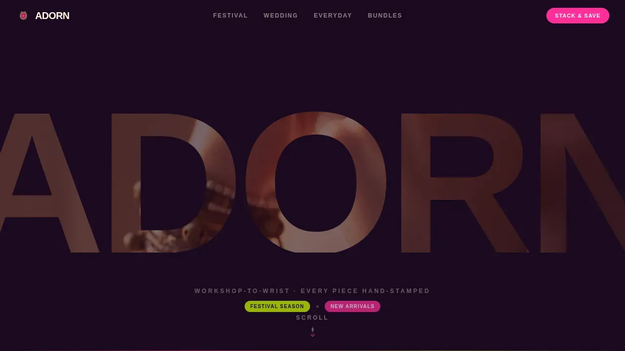
- A letter-cutout hero with a slow-motion video mask, dissolving on scroll into a full-bleed video moment
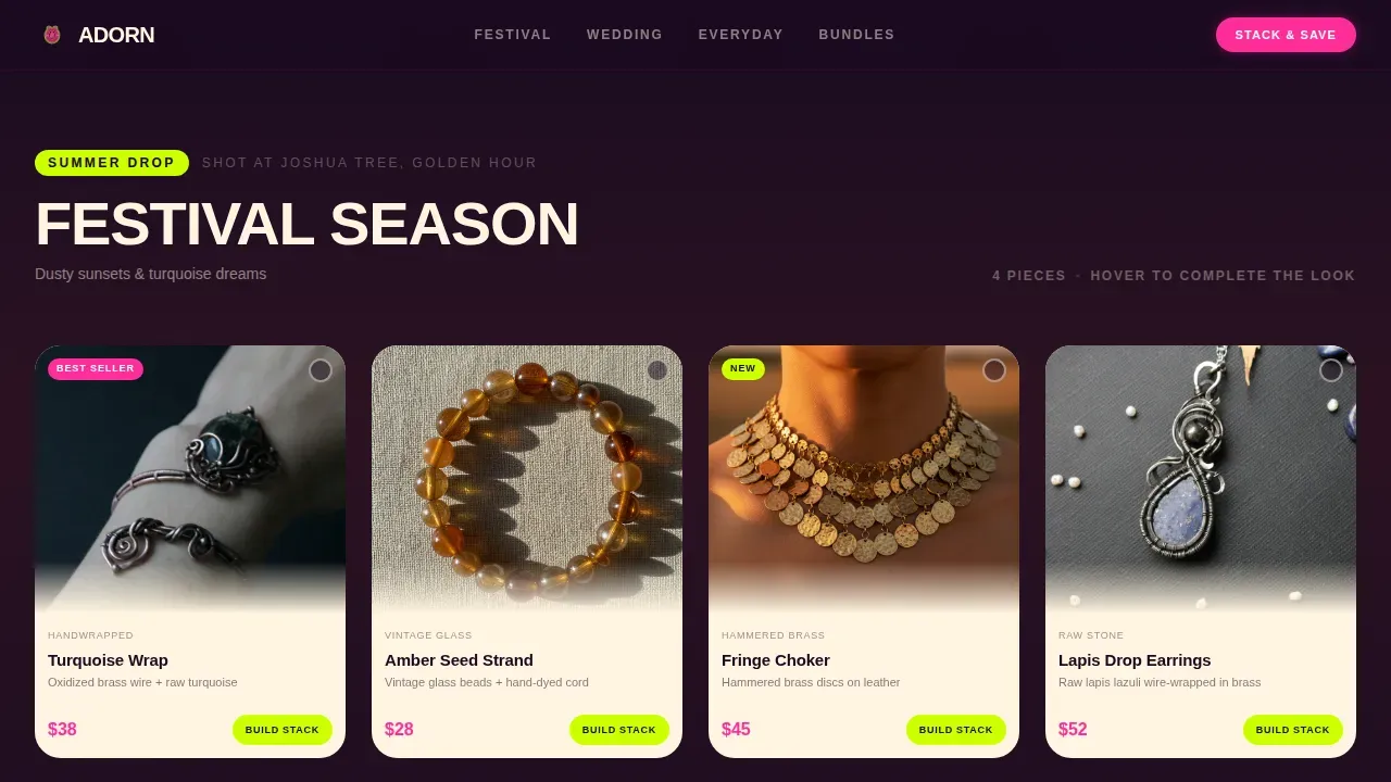
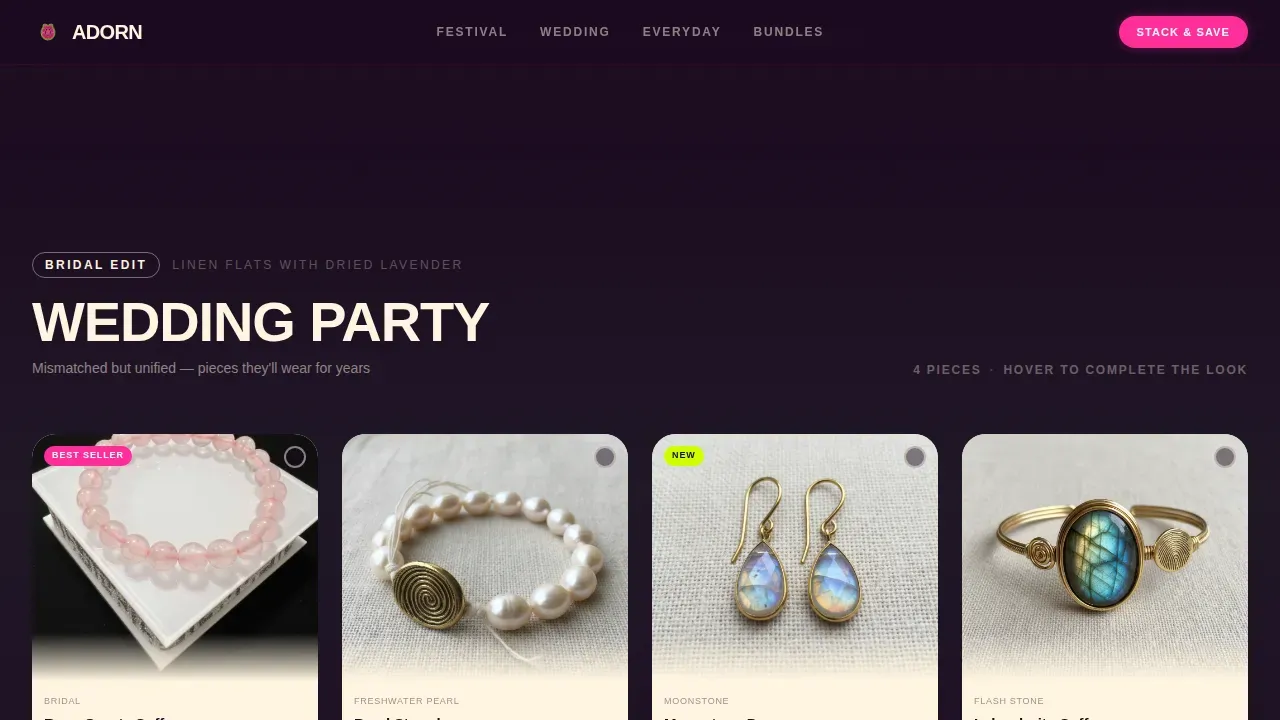
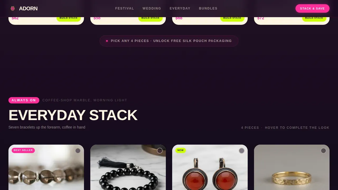
- Three occasion-based product rows, Festival Season, Wedding Party, and Everyday Stack, each with card flip mechanics that reveal bundle offers
- A "Design Your Own Bundle" section, a sticky "Stack & Save" bar, and a footer built on a horizontal flow pattern
Feature list
This template ships with a focused set of features that are directly grounded in the design brief. Each one serves the occasion-based boho shopping experience.
Letter Cutout Hero with Video Mask
The brand name is punched out of a deep blackberry background in massive rubber-stamp typography. Through each letter, a slow-motion video plays, hands layering bracelets, clasping a choker, shaking out earrings against golden-hour skin. On scroll, the mask dissolves and the video expands full-bleed for one breath before collapsing into the first card row. This is one of the most visually distinctive hero design treatments available for a boho landing page, and it sets the tone for everything that follows.
Occasion-Based Modular Card Grid
The grid organizes products not by type but by moment in life. Festival Season cards use dusty sunlight photography with turquoise and fringe. Wedding Party cards sit on linen flats with dried lavender. Everyday Stack cards shoot against coffee-shop marble. Each row shifts the lighting, texture, and fantasy, making every scroll feel like turning a page in someone's personal style journal. Bohemian style encourages mixing and matching different textures, fabrics, and color combinations, and this grid makes that philosophy tangible at the product level.
Card Flip Bundle Reveal
Every product card flips on hover to show a "Complete This Look" bundle on the reverse side. The flip side includes a "Stack & Save" call-to-action button and a curated bundle with the current piece pre-selected. This mechanic makes the single item feel incomplete and the bundle feel inevitable, a core principle of high-converting upsell design. It is fun to interact with and surprisingly effective at increasing average order value.
Persistent Bundle Drawer with Discount
Each card includes a chartreuse "Build the Full Stack" button that slides open a side drawer. The drawer shows the full curated bundle at fifteen percent off, with the current item already checked. This design removes the decision effort from the buyer and makes the upgrade path feel like a natural next step. The drawer is built for users who love to browse and compare before committing.
Sticky Stack and Save Bar
Once two or more items enter the cart, a sticky bottom bar appears across the page with the "Stack & Save" call-to-action. This persistent sign keeps the bundle offer in view at all times without interrupting the browsing experience. It is one of the most essential conversion elements in the template and works especially well for mobile shoppers who browse vertically through the page.
Design Your Own Bundle Section
A dedicated section lets shoppers pick any four pieces and unlock free silk pouch packaging as a reward. This secondary conversion path appeals to buyers who want to express personal preferences rather than accepting a pre-curated set. It adds a sense of agency and creative ownership that boho audiences particularly love.
Page sections overview
| Section | Purpose |
|---|---|
| Letter Mask Hero | Brand intro via video-masked typography that dissolves on scroll |
| Festival Season Row | Occasion-based product cards styled in dusty sunlight with turquoise and fringe |
| Wedding Party Row | Linen-flat product cards styled with dried lavender for bridal audiences |
| Everyday Stack Row | Marble-surface product cards for daily wear and minimal stacking looks |
| Bundle Builder Section | "Design Your Own Bundle" with free silk pouch unlock at four items |
| Sticky Save Bar | Persistent "Stack & Save" bar that appears after two cart additions |
| Page Footer | Horizontal flow footer pattern with brand information and navigation |
Design & branding system
The visual identity is built on the Neon Shock color system, a palette that feels like a vintage Polaroid left on a dashboard in Joshua Tree. Warm, faded analog tones collide with synthetic electric light, creating a retro style that is simultaneously nostalgic and contemporary. The color palette for the Neo-Retro boho style includes muted, warm, earthy tones contrasted with vibrant pops of jewel tones, and this template delivers exactly that contrast with precision.
The Neo-Retro bohemian design language blends the free-spirited essence of the 1960s and 1970s with modern, polished minimalism and a retro-maximalist twist. Retro websites often feature bold colors, geometric patterns, and vintage typography to evoke nostalgia, and Adorn leans fully into that tradition while keeping the layout clean and conversion-focused.
- Color system: deep blackberry (#1A0A1F) background, electric fuchsia (#FF2D9B) for hover states and price callouts, acid chartreuse (#CCFF00) for badges and seasonal tags, sun-bleached cream (#FFF5E1) for card faces and body text
- Typography: Cabinet Grotesk for headlines with a rubber-stamp uneven feel, DM Sans for body copy, both tuned for high readability at mobile size
- Animation and interaction: letter mask dissolve on scroll, GPU-accelerated card flips, bundle drawer slide, staggered IntersectionObserver scroll reveals throughout the page
Mobile & speed optimization
Boho consumers often browse via Instagram and Pinterest, making mobile-first design a necessity for this type of landing page. This template was built with mobile as the primary viewport, every card, button, and drawer is designed to work smoothly on a phone screen before being adapted for larger windows.
Performance is handled through GPU-accelerated transforms and IntersectionObserver-based scroll reveals, keeping animations smooth without taxing the browser. The mobile experience preserves the full card flip mechanic, the bundle drawer slide, and the sticky bar, none of the essential interactivity is stripped away for smaller screens.
- Mobile-first layout with touch-friendly card interactions and drawer navigation
- GPU-accelerated animation transforms to keep scroll reveals and card flips smooth across devices
- IntersectionObserver scroll triggers to load and animate elements only when they enter the viewport
How this template helps you convert
A retro style landing page is designed to showcase products and convert visitors into customers through clear value propositions and high-quality visuals. Adorn is built around exactly that principle, layering multiple conversion mechanics on top of an immersive occasion-based browsing experience. Effective retro style landing pages convert through clear value propositions and high-quality visuals, and this template delivers both.
The page earns the upgrade by showing every piece styled in context. It does not just display jewelry, it shows the life that jewelry belongs to. That emotional specificity is what drives purchases beyond the first item.
- The card flip reveal makes every single item feel like part of an incomplete set, naturally directing interest toward the bundle offer on the reverse side
- The persistent bundle drawer and sticky "Stack & Save" bar keep the upgrade offer visible at every stage of browsing, reducing the drop-off that happens when buyers lose the upsell path
- The "Design Your Own Bundle" section gives buyers with strong personal preferences a structured way to build their own set and unlock a packaging reward, creating a second conversion path that does not compete with the primary one
Other information about this template
This template is ideal for brands that already have a presence on platforms like Etsy and want to graduate to a standalone landing page that better reflects their brand identity and upsell strategy. Etsy listings offer limited space for storytelling, and a dedicated page like Adorn gives the designer full control over layout, color, animation, and the buyer journey. Many artisan brands use Etsy as a primary traffic source, and this template is purpose-built to serve as the destination those shoppers land on after clicking through.
The Neo-Retro boho aesthetic is specifically calibrated for audiences who love the "collected over time" look. These are buyers who do not want a sterile e-commerce grid, they want to feel like they are rummaging through shelves at a night market, discovering things one at a time. The page recreates that tactile experience digitally, with photography direction, animation, and color working together to hang that market atmosphere in the browser.
This template also works well for brands who want to test a new product line or seasonal collection without rebuilding their main website. You can use it as a standalone campaign page, a festival-season drop, or a wedding-party landing page linked directly from social campaigns. The modular grid makes it easy to swap card content and update the occasion rows as preferences and seasons shift.
- Etsy sellers looking to create a standalone branded landing page beyond their marketplace listings will find this template ready to use with minimal customization
- The "3,400+ stacks built" social proof metric, maker's process callouts, and piece count badges are baked into the layout to build trust with boho audiences who value artisan quality and ethical sourcing
- Bohemian style often incorporates vintage and antique items to add a sense of history and character, and this template's card design system supports rich photography and lifestyle context that brings those stories to life
- The template includes authentic trust-signal zones for testimonials and quality badges, essential for boho shop pages where buyers need to agree on value before committing to a purchase
- Whimsical prints and patterns are a hallmark of bohemian style, and the design system here supports that visual energy through the Neon Shock color palette without sacrificing legibility or layout clarity
- Using shelves of occasion-based cards rather than a flat category grid helps visitors find things faster and keeps their interest alive across all three product rows
- Personal touches such as maker's thumbprint callouts and process notes are built into the layout as content slots, giving the brand space to express its unique personality
- The page is a strong fit for social traffic from Instagram and Pinterest, where visual storytelling and a clear "swipe up to stack" moment are essential for converting that traffic source into purchases
- Natural objects such as stones and crystals are central to the product range this template is built around, and the card photography direction is designed to hang those materials in their best possible light
- Conversion rates for retro style landing pages vary by traffic source and offer type; using A/B testing on headlines and call-to-action copy is recommended to determine what resonates best with your specific audience
- The template is a practical guide for any boho accessories brand that wants to move beyond a basic product grid and offer a fully immersive, story-driven shopping experience
Theme
Neo-Retro
Creative direction
Seasonal/Moment
Color system
Neon Shock
Style
Card Grid (Modular)
Direction
Upsell/Upgrade
Page Sections
Letter Cutout Video Hero
Occasion-based Modular Card Grid
Card Flip Bundle Reveal Mechanic
Persistent Bundle Drawer
Sticky Stack and Save Bar
Design Your Own Bundle Section
Related questions
Can I use this template for a wedding accessories brand specifically?
Does the card flip and bundle drawer work on mobile?
Can I customize the occasion rows for my own product categories?
Is this template suitable for brands currently selling on Etsy?
What makes this different from a standard bohemian shop template?