Premium Dental Software Comparison Website Template
Curricula is a dental learning management system landing page template built around a live stats dashboard, a filterable specialty grid, and a side-by-side competitor comparison tool. It speaks directly to associate dentists, practice managers, and dental faculty who need one organized place for continuing education credits, board prep, and clinical skill tracking.
by Rocket studio
Quick summary
Curricula is a single-page dental learning management system template with a Dashboard/Data Grid style and a Directory & Discovery theme. It opens with a live metrics header, moves through a filterable course catalog, and closes with a CE mapping form. The design feels clinical, organized, and immediately interactive.
Who this template is for
This template was built for dental education platforms that serve working dental professionals and institutional users. It fits teams who need to communicate scale, structure, and practical utility without a lengthy sales pitch.
- Associate dentists tracking continuing education (CE) credits across multiple state licenses
- Practice managers onboarding dental hygienists and assistants to required training paths
- Dental school faculty designing blended learning curricula for student cohorts
What problem this template solves
Dental professionals deal with fragmented course libraries, conflicting state CE requirements, and clunky legacy learning platforms. The result is wasted time, missed renewal deadlines, and no clear view of who has completed what. This template frames Curricula as the organized alternative.
- Scattered CE credits across multiple providers with no unified tracking view
- Confusion about overlapping state license requirements for dentists and hygienists
- No easy way to compare an existing learning management system against a better option
What you get with this template
You get a fully structured, section-led landing page designed to show rather than tell. Each section builds on the last, guiding visitors from awareness of the problem to confidence in the solution.
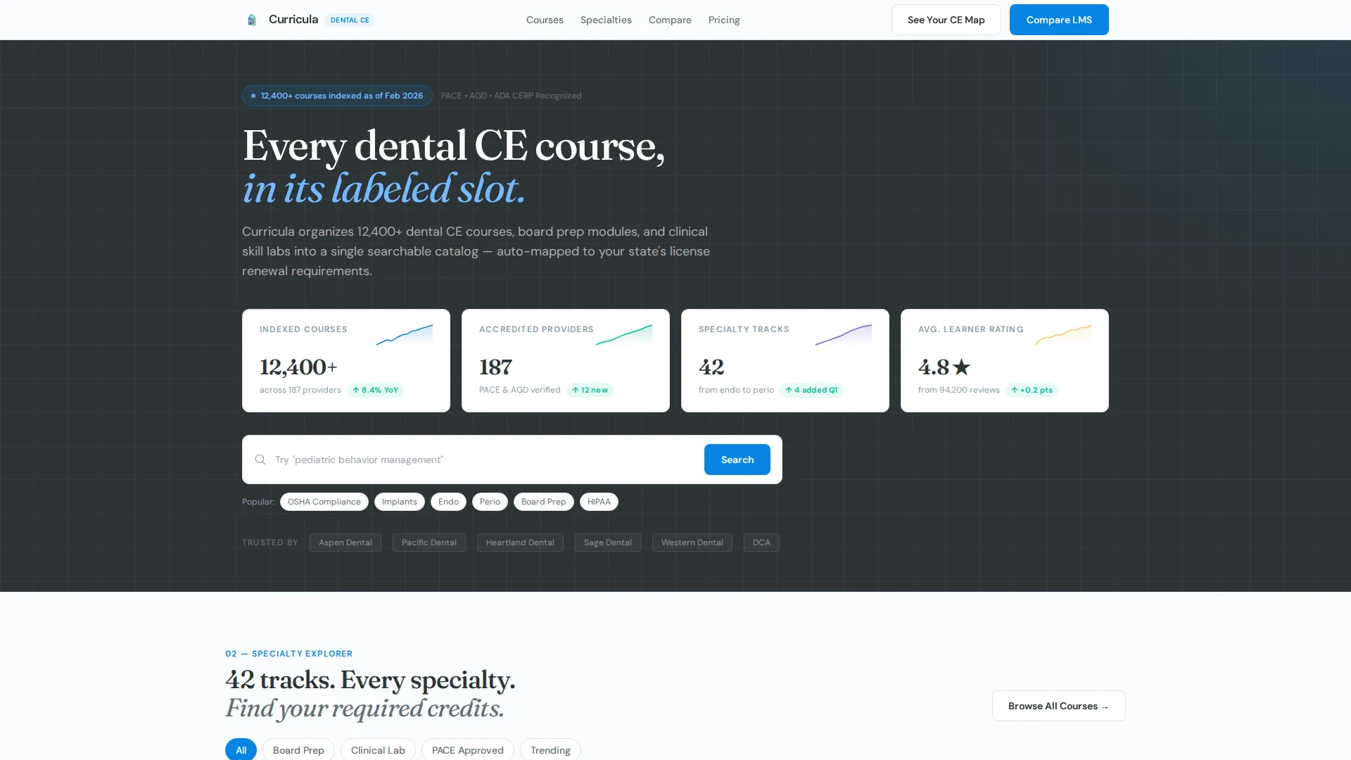
- A live stats header with four metric cards and micro-sparklines covering twelve months of growth data
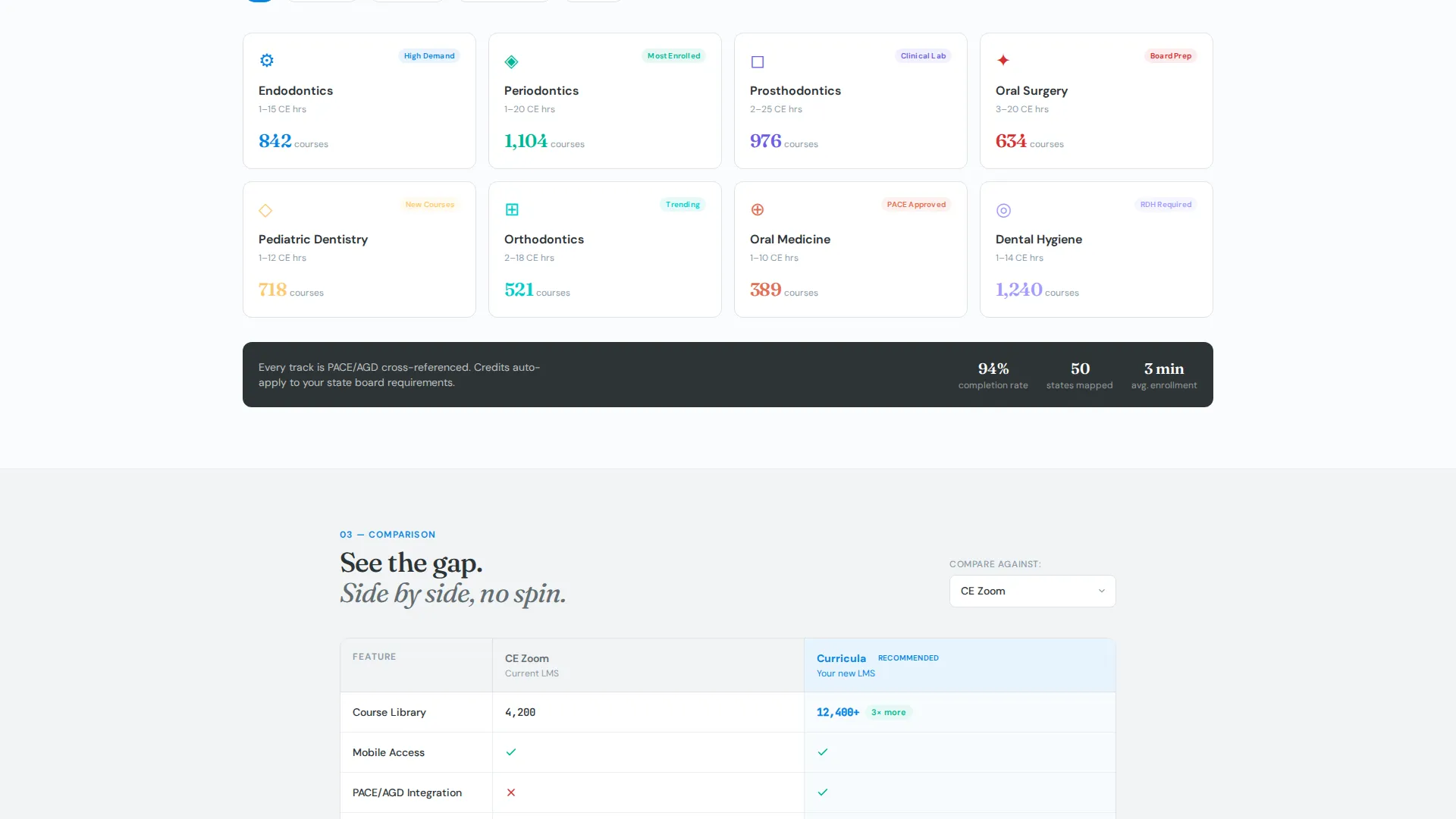
- A filterable specialty grid with hover states that reveal course counts and top-rated modules
- A dynamic side-by-side LMS comparison table with green checkmarks and red gap indicators
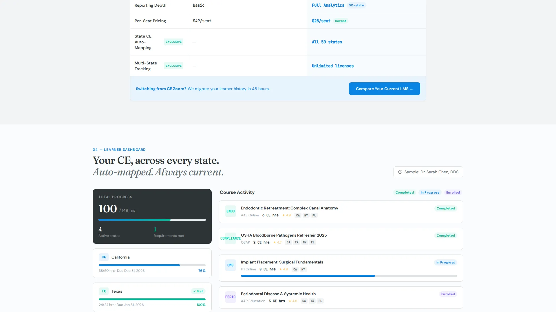
- A learner-progress simulator showing a sample thirty-two CE hour tracking dashboard across four states
- Two purpose-built calls to action: "Compare Your Current LMS" and "See Your CE Map"
Feature list
This section covers the core interactive and structural capabilities built into the Curricula template.
Live Metrics Dashboard Header
The page opens with four large metric cards displaying real numbers: 12,400 or more indexed courses, 187 accredited providers, 42 specialty tracks, and an average learner rating of 4.8 stars. Each card includes a micro-sparkline chart showing twelve months of growth. A search bar with ghost-text prompts sits below, inviting immediate interaction.
Filterable Specialty Course Grid
Section two presents a tiled grid of dental specialties including prosthodontics, periodontics, pediatric dentistry, and oral surgery. Each tile responds to hover by surfacing the course count and the highest-rated modules within that specialty. Visitors can explore the catalog depth before committing to any action.
Dynamic LMS Comparison Table
Section three loads a side-by-side comparison between any visitor-selected competitor platform and Curricula. Rows cover course library size, mobile access, PACE and AGD (Academy of General Dentistry) credit integration, reporting depth, and per-seat pricing. Visual checkmarks and gap indicators make the comparison immediately readable.
Learner Progress Simulator
Section four renders a sample associate dentist dashboard tracking thirty-two CE hours across four states with different renewal requirements. Each state's requirements are auto-mapped and color-coded. This section lets visitors feel the organizational power of the platform before they sign up.
Comparison-First Primary call to action
The primary call to action, "Compare Your Current LMS," lives inside the competitor-selection dropdown section. The click feels like a natural continuation of the exploration rather than a separate sales step. This placement reduces friction and increases intent-matching for sign-ups.
CE Map Secondary call to action Form
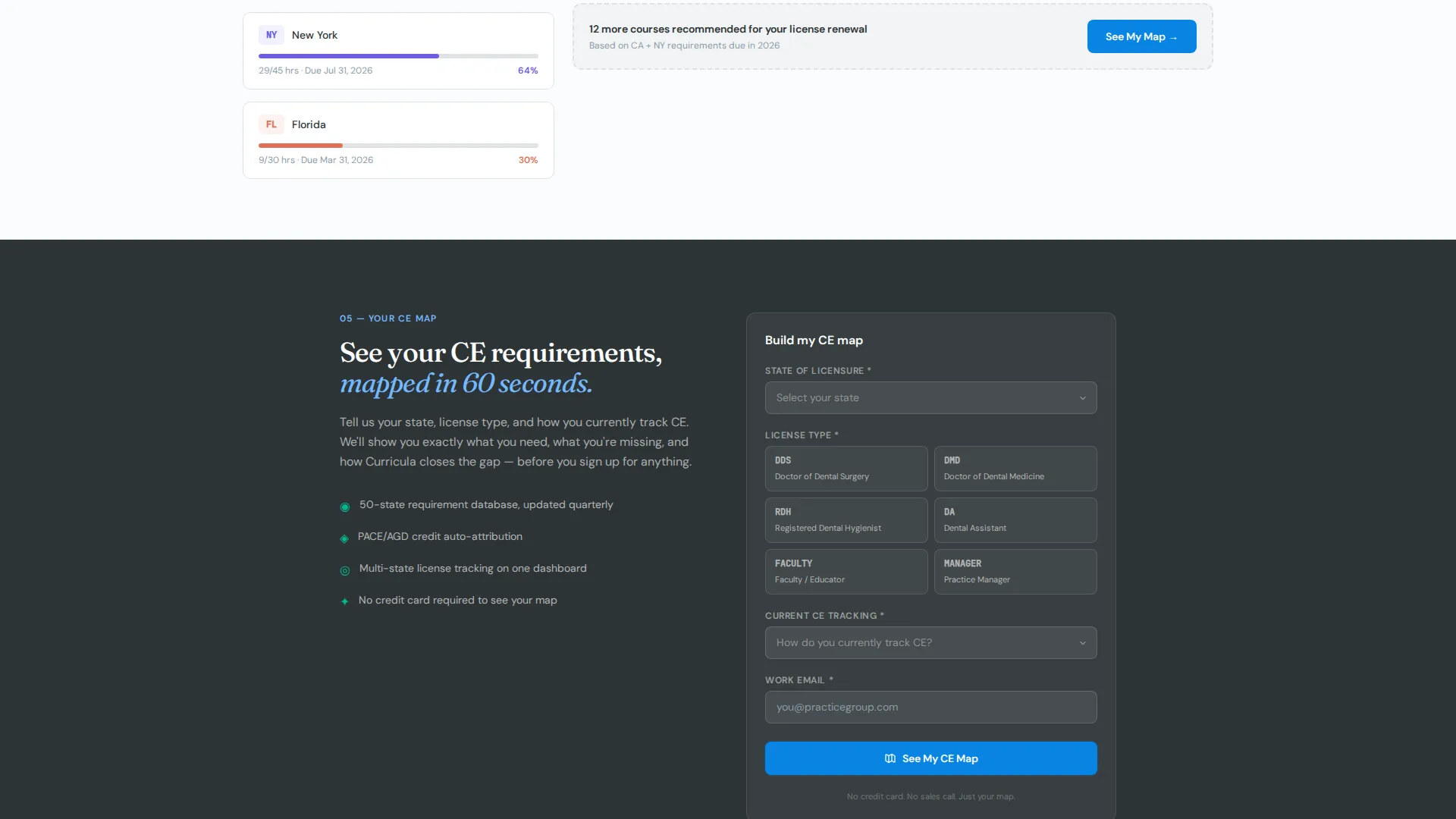
The "See Your CE Map" form collects four fields: state of licensure, license type (DDS, RDH, or DA), current CE tracking method, and work email. It earns the submission by first reflecting the visitor's own complexity back to them through the simulator section.
Page sections overview
| Section | Purpose |
|---|---|
| Stats Metrics Header | Display live course catalog scale and invite search |
| Search Bar Prompt | Encourage immediate keyword-driven exploration |
| Specialty Course Grid | Browse dental specialties with hover-revealed course details |
| LMS Comparison Table | Compare competitor platforms against Curricula side by side |
| Learner Progress Simulator | Visualize multi-state CE tracking in a sample dashboard |
| Compare Your LMS call to action | Capture high-intent visitors through competitor selection flow |
| CE Map Form | Collect licensure details and work email for personalized mapping |
Design & branding system
The visual identity follows a Slate & Sky color system built to feel like a modern dental operatory at the start of a clinical day. Every color choice reinforces cleanliness, precision, and trust.
- Clinical charcoal (#2D3436) for primary text and sidebar backgrounds, instrument-tray gray (#636E72) for secondary surfaces
- Open-sky blue (#0984E3) on active states and progress indicators, with sterile white (#FAFBFC) across content panels
- Accent mint (#00B894) reserved for completed modules and passed assessments, making achievement instantly visible
Mobile & speed optimization
The template's Dashboard/Data Grid layout is structured to remain readable and functional across screen sizes. Data-dense sections like the comparison table and simulator are designed to reflow cleanly on smaller viewports.
- Metric cards in the header stack vertically on mobile so key numbers stay large and legible
- The specialty grid tiles resize and reorder to maintain tap-friendly spacing on touch screens
- The comparison table scrolls horizontally on narrow screens so no data row is clipped or hidden
How this template helps you convert
The page earns each micro-conversion before it asks for personal information. Visitors move from curiosity to commitment through a structured sequence of interactive moments.
- The metrics header establishes credibility instantly with specific, large-format numbers and sparkline proof, so visitors trust the platform scale before reading a single feature claim.
- The comparison table and learner simulator create a felt contrast between the visitor's current fragmented system and the organized alternative, making the primary call to action feel like a logical next step rather than a sales push.
- The CE Map form asks only for four practical fields and delivers immediate perceived value by promising a personalized state-requirement view, which lowers submission resistance significantly.
Other information about this template
This template is built for the dental software and dental learning management system niche, where buyers are detail-oriented professionals who distrust vague marketing claims. The design and content direction prioritize data visibility and structured navigation over decorative elements.
- The template style is Dashboard/Data Grid, suited for platforms with large, structured content catalogs
- The Directory & Discovery theme supports catalog-first browsing behavior common among CE credit seekers
- The Interactive Explorer creative direction turns passive reading into active exploration at every scroll depth
- The competitor dropdown references real platform categories in the dental continuing education space, making comparisons feel credible rather than hypothetical
Theme
Directory & Discovery
Creative direction
Interactive Explorer
Color system
Slate & Sky
Style
Dashboard/Data Grid
Direction
Comparison/Versus
Page Sections
Live Stats Metrics Dashboard
Filterable Specialty Course Grid
Dynamic LMS Comparison Table
Learner Progress Simulator
Comparison-first Call to Action Placement
CE Map Lead Capture Form
Related questions
Who is the Curricula template designed for?
Can I customize the metric numbers in the header dashboard?
How does the LMS comparison table work?
Does the template include the CE Map lead capture form?
Is this template suitable for a platform still building its course catalog?



