Dental Training Platform Landing Page Template
Curricula is a hub-and-spoke landing page template built for dental continuing education platforms. It combines a product screenshot header, anchor navigation, data-rich spokes, and a freemium conversion flow into one clean, clinical layout. The Monochrome Steel palette and Industry Report creative direction give the page the precise, credible feel that dental professionals expect.
by Rocket studio
Quick summary
Curricula is a single-page, anchor-navigated landing page template designed for dental training platforms. It opens with a live-product screenshot header, flows through four data-driven spokes, and closes with a freemium sign-up path. The design borrows its discipline from the operatory, clean steel tones, no clutter, and every element earning its place.
Who this template is for
This template is built for teams running dental continuing education products who need to convert skeptical, time-pressed clinicians. It speaks directly to the priorities of professional learners without relying on lifestyle imagery or vague benefit claims.
- Associate dentists tracking Continuing Professional Development (CPD) hours before licence renewal deadlines
- Practice owners who need to upskill hygienists and support staff on clinical protocols
- Overseas-qualified practitioners preparing for dental equivalency examinations
What problem this template solves
Dental education platforms struggle to earn trust quickly. Their audiences are trained to evaluate evidence, and a generic SaaS landing page layout does not hold up under that scrutiny. Curricula replaces soft marketing language with profession-specific data and a product that speaks for itself.
- Legacy e-learning pages lead with stock photography and vague promises, losing credibility before the scroll begins
- Clinicians cannot assess course quality or CPD value from a standard feature grid alone
- Freemium offers on dental platforms often feel gated or incomplete, reducing sign-up confidence
What you get with this template
You get a structured, fully laid-out single landing page that positions your dental training platform as the professional default. Every section has a defined job, from proof-first data panels to a two-step sign-up form that personalises the user's dashboard before they even log in.
- A pinned anchor navigation bar linking to four named sections: Course Library, Profession Data, Credentials, and Pricing
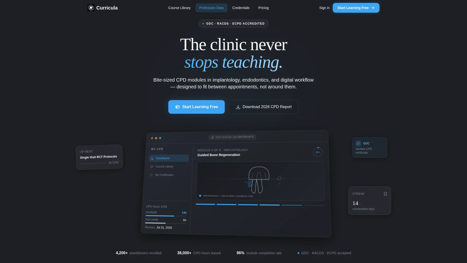
- A product screenshot header zone with headline placement and isometric tilt treatment on autoclave charcoal
- A two-step freemium conversion form capturing specialty and course preferences, plus a secondary PDF lead gate
Feature list
This template covers every layout component a dental education platform needs to turn a professional visitor into an active learner.
Anchor Navigation Bar
A sticky nav bar pins to the top of the page as the visitor scrolls. It links directly to four spokes, Course Library, Profession Data, Credentials, and Pricing, so users can jump to the section most relevant to their immediate question.
Product Screenshot Header
The header zone is built around a pixel-perfect platform dashboard capture. It shows a half-completed module, a CPD-hours tracker, a progress ring, and a 3D cross-section of a mandibular molar on an isometric tilt against a dark background.
Data Visualization Panel
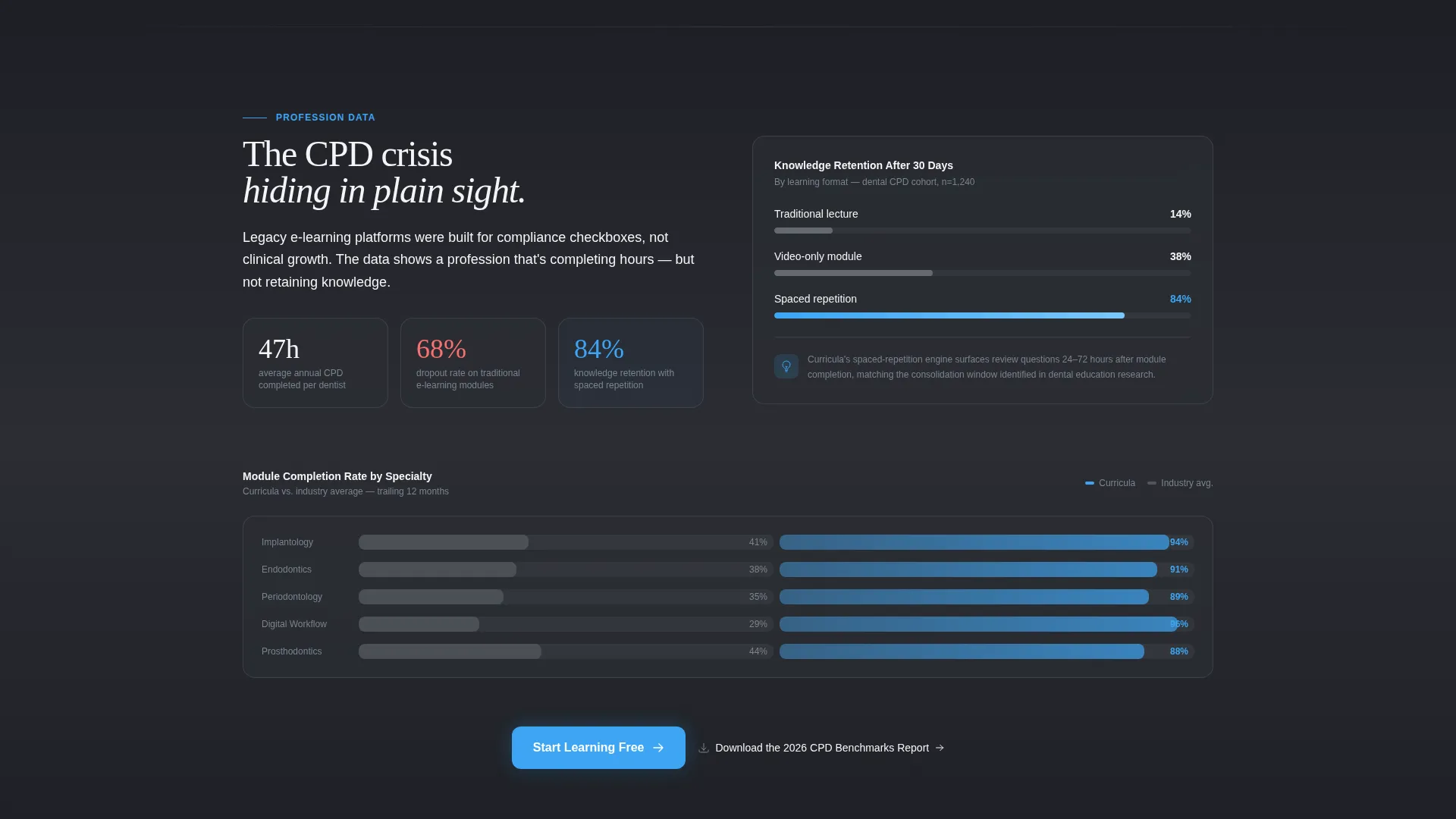
The Profession Data spoke includes a structured layout for displaying CPD completion rates by specialty, dropout curves from legacy e-learning platforms, and a highlighted retention stat tied to spaced-repetition learning. The panel turns scrolling into a credibility-building narrative.
Filterable Course Library Cards
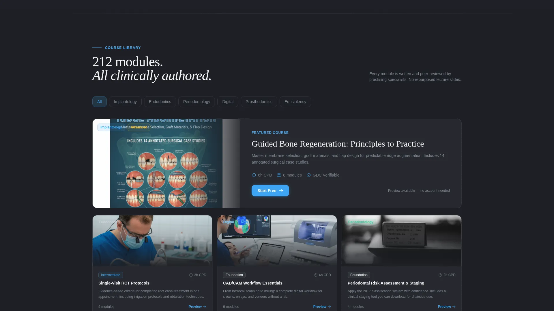
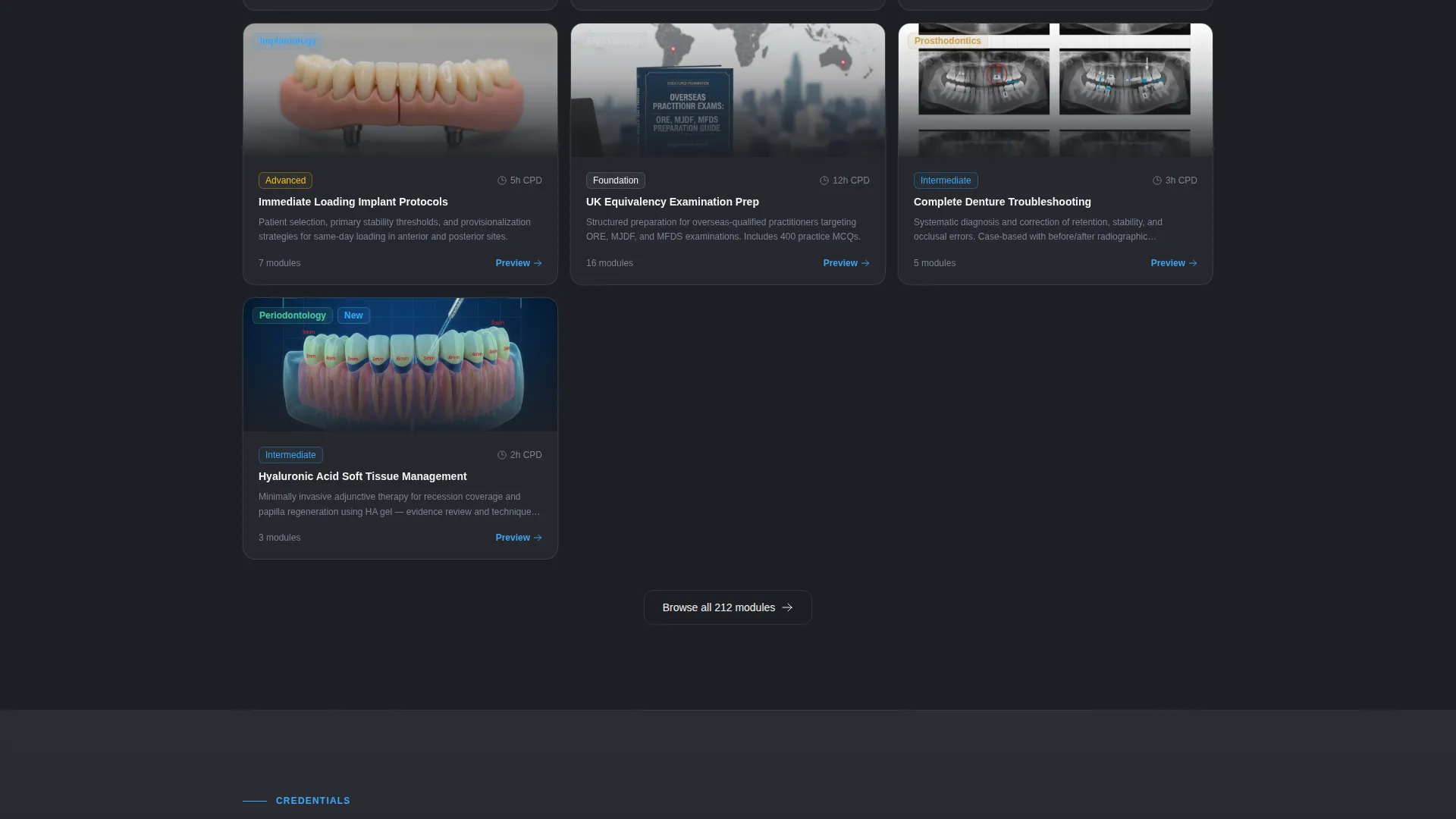
The Course Library spoke presents course cards organised by specialty and difficulty level. Visitors can browse implantology, endodontics, periodontal protocols, and digital workflow modules in a scannable card grid.
Two-Step Sign-Up Form
The primary call to action opens a two-step form. Step one collects name, email, and primary specialty via a dropdown. Step two lets the user bookmark three courses from a visual picker, personalising the dashboard they arrive on after sign-up.
Secondary Lead Gate
A parallel conversion path offers a downloadable Continuing Professional Development benchmarks report gated behind email only. This captures engaged visitors who are not yet ready to commit to a full sign-up.
Page sections overview
| Section | Purpose |
|---|---|
| Product Screenshot Header | Establishes platform credibility with a live dashboard view and primary call to action |
| Anchor Navigation Bar | Lets visitors jump directly to their highest-priority spoke |
| Profession Data Spoke | Builds the evidence case using CPD completion rates and retention data |
| Course Library Spoke | Showcases filterable course cards organised by specialty and difficulty |
| Credentials Spoke | Displays accrediting-body logos with verification timestamps |
| Pricing Comparison Spoke | Frames the free tier as genuinely usable via a side-by-side comparison table |
| Two-Step Sign-Up Form | Converts visitors with specialty capture and a personalised course picker |
| PDF Lead Gate | Captures email from visitors not yet ready for a full account sign-up |
| Mobile Sticky call to action Bar | Keeps the primary "Start Learning Free" button accessible on smaller screens |
Design & branding system
The visual identity follows a Monochrome Steel palette and a Directory and Discovery theme. The result feels like a freshly prepared clinical space rather than a typical software marketing page.
- Core palette: surgical-instrument silver (#B0B8BF), autoclave charcoal (#2B2D33), and latex-glove white (#F4F5F7) form every background, surface, and text layer
- Accent: curing-light blue (#3DA5F4) appears exclusively on interactive states, progress indicators, and the primary call-to-action button
- Layout rhythm alternates between data-dense panels and open breathing space, following the cadence of a well-structured white paper
Mobile & speed optimization
The template is structured to work cleanly on smaller screens without losing its clinical precision. Key conversion elements remain visible and reachable throughout the mobile scroll.
- The "Start Learning Free" call-to-action appears as a sticky bottom bar on mobile so it is always one tap away
- The anchor navigation collapses cleanly for portrait viewports, keeping the four-spoke structure navigable on any device
- Data panels and course cards are laid out to restack vertically without breaking the visual hierarchy
How this template helps you convert
The page is structured as a persuasion sequence, not just a feature list. Each section adds a layer of proof before asking for a commitment.
- The product screenshot header opens with evidence before any marketing claim, letting the platform demonstrate competence through a live dashboard view showing real module progress and CPD tracking
- The Profession Data spoke reframes the visitor as someone already behind the curve, using specialty-level CPD completion data to make the free sign-up feel like a professional obligation rather than a trial
- The two-step form rewards curiosity by letting the user personalise their own dashboard during sign-up, reducing the psychological friction of starting something new
Other information about this template
This template is part of the Curricula design system, built specifically for dental software and SaaS products in the continuing education category. It is well-suited for any dental training platform looking to establish authority with a professional clinical audience.
- The template style is Hub and Spoke with Anchor Navigation, making it easy to structure multiple value propositions inside a single-page layout
- The Industry Report creative direction and Directory and Discovery theme make this template a strong fit for platforms that want to lead with data and profession-level insight rather than generic benefit claims
- The Freemium and Trial landing page direction is baked into the layout, with primary and secondary conversion paths already positioned at logical trust-building moments throughout the scroll
Theme
Directory & Discovery
Creative direction
Industry Report
Color system
Monochrome Steel
Style
Hub & Spoke (Anchor Nav)
Direction
Freemium/Trial
Page Sections
Anchor Navigation with Four Spokes
Product Screenshot Header Zone
Profession Data Visualization Panel
Filterable Course Card Grid
Two-step Freemium Sign-up Form
Secondary PDF Lead Gate
Related questions
Can I customise the course specialties shown in the sign-up form dropdown?
Does the template include real CPD data and charts, or just the layout for them?
Is the pricing section flexible enough to show more than two plan tiers?
Who is the secondary PDF download path aimed at?
Can the credentials and accrediting-body section be updated for different regulatory markets?



