Accelerated Online Education Landing Page Template
The Syllabus Dynamic Learning Path Comparison Landing Page Template is a dark-academic, single-page design built for EdTech subscription confirmations. It greets newly confirmed subscribers with an animated three-tier comparison table, an interactive quiz that personalizes course recommendations, social proof from real learner personas, and a two-step "Build My Learning Path" form that converts curiosity into commitment.
by Rocket studio
Quick summary
This template transforms the standard education thank-you page into an immersive course landing page. Newly confirmed subscribers arrive at a Midnight Blue environment that maps every course, workshop, and masterclass in the catalog. Three animated content tiers, a personalized quiz, and a gold call-to-action button guide students from "just signed up" to "ready to start" without a single moment of confusion.
Who this template is for
This page is designed for EdTech creators, online course platforms, and education landing page builders who need more than a plain confirmation screen. It speaks directly to the learners most likely to disengage the moment enthusiasm fades.
- Career-switchers who need a clear course outline to justify the commitment
- Night-owl parents who access learning on mobile devices after hours and need scannable content
- Fresh graduates who arrived through a webinar funnel and are looking for proof of value before diving in
What problem this template solves
Most education thank-you pages waste the highest-intent moment in the entire student journey. The subscriber has just confirmed. Their motivation is at its peak. A generic "thanks for signing up" page abandons them at precisely the wrong time.
This template replaces that lost opportunity with a structured, visually appealing course landing page that shows depth before asking for anything. It removes unnecessary complexity from the onboarding process and replaces it with guided discovery.
- Students leave generic confirmation pages with no clear next step, killing early engagement
- A flat, static syllabus format fails to communicate the range and depth of available course materials
- Without social proof, potential students second-guess their decision before they ever open a lesson
What you get with this template
The template delivers a complete, interactive course landing page built on a proof-first principle. Every section earns the scroll before the call to action ever appears. The result is a page where student engagement grows naturally as users move through the content.
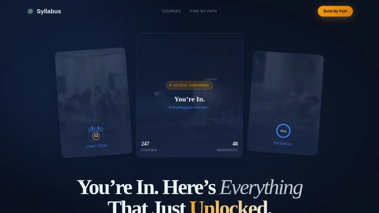
- A three-panel hero section with parallax tilt, animated progress ring, and calendar micro-animation
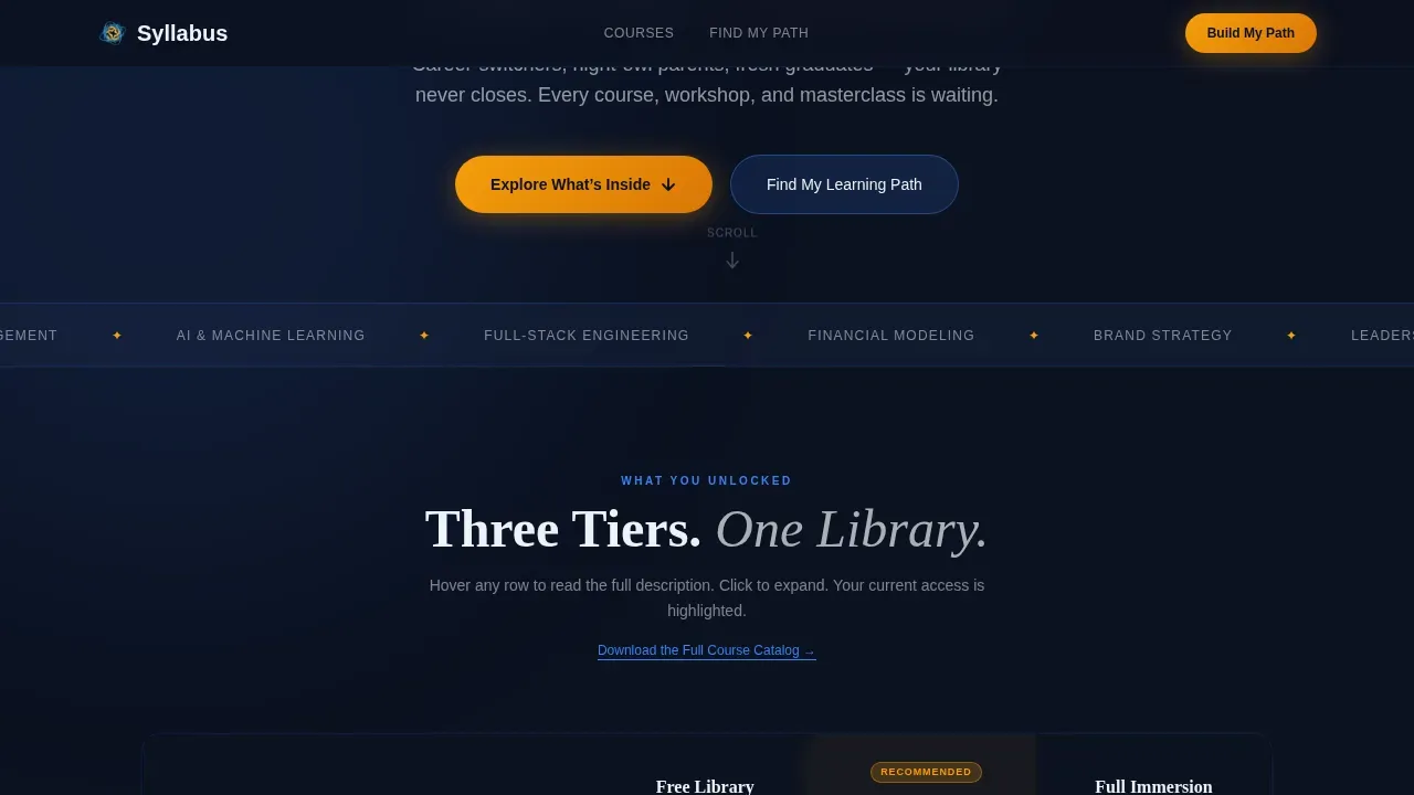
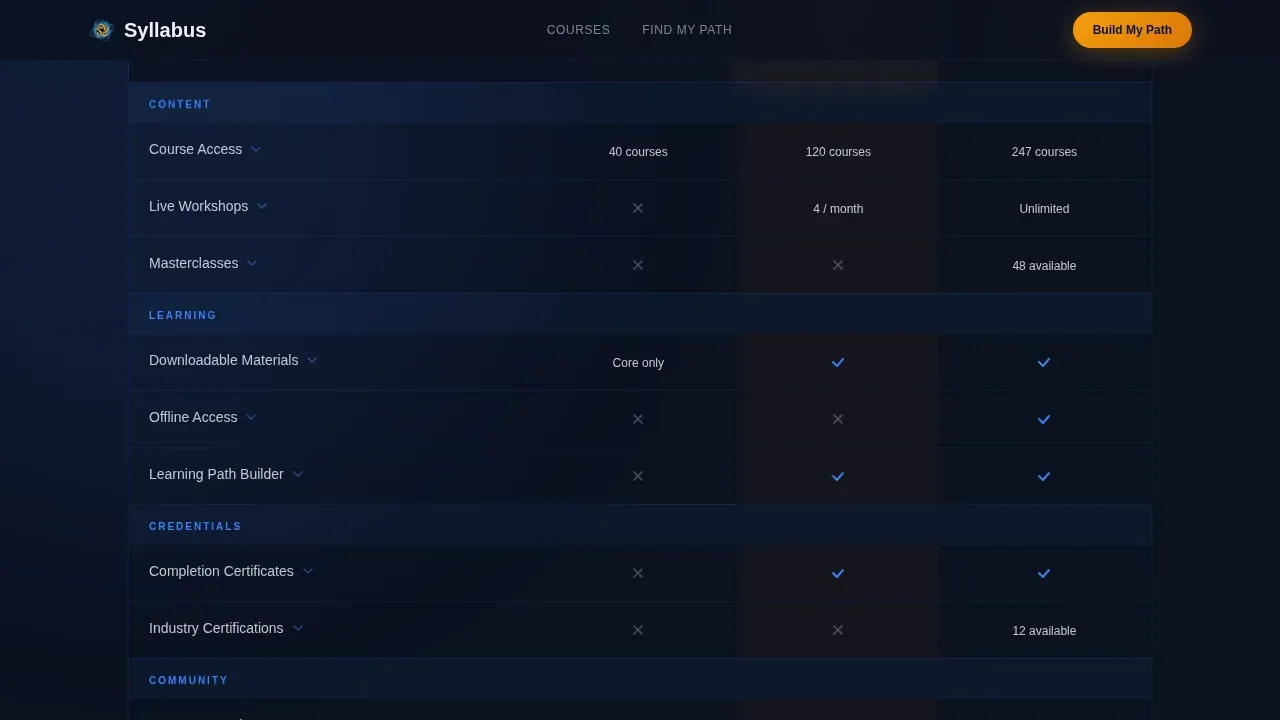
- A three-tier animated comparison table (Free Library, Core Track, Full Immersion) with hover glow and expandable row descriptions
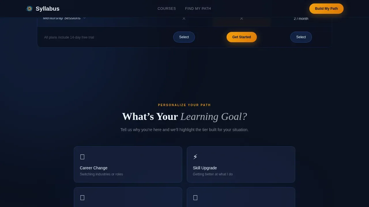
- An interactive "What's your learning goal?" quiz that dynamically reorders table columns to recommend a tier
- Three persona-mapped student testimonials covering career-switcher, parent, and graduate profiles
- A two-step "Build My Learning Path" form with goal dropdown and pre-filled email capture
- A secondary "Download the Full Course Catalog" text-link conversion path beneath the table
Feature list
This section covers the core built-in capabilities of the template and explains what each one does for the page and for student learning.
Animated Three-Panel Hero Section
The hero section opens with three frosted dark glass panels tilted at slight parallax angles against a deep navy background. Blurred course thumbnails shift behind the glass with subtle motion. The center panel carries the headline in chalk white. The flanking panels display micro-animations, including a progress ring that fills and a calendar date that circles itself, giving the page immediate energy before a visitor even scrolls. This makes the first point of contact feel alive and purposeful rather than static.
Three-Tier Animated Comparison Table
The comparison table is the structural core of this course landing page. It contrasts three subscription tiers across animated rows that slide into view as each feature enters the viewport. Hovering any row triggers a cerulean glow and expands a short micro-description. This approach lets students compare course content, course materials, and expected outcomes at a glance, making the page a genuine decision-support tool rather than a passive outline. A well-designed course outline benefits from this kind of progressive reveal, which reflects backward design principles by leading with outcomes before logistics.
Interactive Learning Goal Quiz
Midway through the page, a quiz module asks visitors to identify their learning goal from four options: career change, skill upgrade, certification, or curiosity. Based on that answer, the table columns dynamically reorder to highlight the recommended tier. This practical application of personalization replaces a one-size-fits-all syllabus with a living document that responds to each visitor. The core structure of this personalized learning feature opens with a diagnostic "Find Your Path" tool, following best practices for interactive course creation. Dynamic call-to-action elements then reflect the specific path chosen by the user, keeping the page relevant throughout the scroll.
Persona-Mapped Social Proof Section
Three student testimonials are mapped to the three primary learner personas: a career-switcher, a night-owl parent, and a fresh graduate. Each testimonial anchors a specific outcome to a recognizable identity, making social proof far more persuasive than generic five-star ratings. Including social proof like this is a proven best practice for education landing pages because it helps potential students see themselves succeeding. Past students speaking from experience carry more weight than any feature bullet.
Two-Step Conversion Form
The primary call to action is a gold "Build My Learning Path" button placed after the comparison table. Clicking it opens a two-step form. Step one captures learning goal and preferred weekly hours. Step two captures name and email, pre-filled for subscribers who arrived via email link. This progressive commitment approach ensures the form feels like a natural next step in the learning process, not a cold interruption. Multiple calls to action are structured into the page, with the secondary path being a "Download the Full Course Catalog" text link that serves visitors who need more time to browse.
Midnight Blue Visual Identity System
The entire page uses a clean and professional design rooted in a Midnight Blue color system. The abyssal navy background, deep slate card surfaces, and chalk white body text create a visually appealing, planetarium-like atmosphere. Electric cerulean drives interactive highlights, while molten gold is reserved exclusively for call-to-action buttons and progress indicators. Typography pairs Fraunces display serif for headings with DM Sans for body text, keeping every piece of course content readable and engaging.
Page sections overview
| Section | Purpose |
|---|---|
| Hero Glass Panels | Open with immersive parallax animation and headline |
| Comparison Tier Table | Show course tiers with animated, hoverable row reveals |
| Learning Goal Quiz | Dynamically reorder columns based on visitor input |
| Social Proof Block | Reinforce trust with three persona-specific testimonials |
| Two-Step call to action Form | Capture goal and contact details through progressive commitment |
| Catalog Download Link | Provide a lower-friction secondary conversion path |
| Footer | Close with horizontal flow layout and navigation |
Design & branding system
The visual identity is built around a Dynamic Motion theme that treats the page like a planetarium dome. Every color choice has a deliberate role. The palette pulls the eye precisely where it needs to go, and motion is used purposefully, never as decoration.
- Background uses abyssal navy (#0B1120); card and table surfaces use deep slate (#1A2744); body text uses chalk white (#EDF2F7) for maximum readability
- Electric cerulean (#3B82F6) handles all interactive highlights and hover states across the comparison table and quiz module
- Molten gold (#F59E0B) appears exclusively on call-to-action buttons and progress indicators, keeping its visual weight reserved for conversion moments
Mobile & speed optimization
This template is built desktop-first with strong mobile adaptation. Night-owl parents are explicitly identified in the brief as a key audience accessing the page on mobile devices after hours, so small screens receive full functionality. Every interactive element, from the quiz to the expandable table rows, works on touch interfaces.
- The comparison table, quiz module, and hero panels adapt fluidly to small screens without losing interactive behavior
- Static page sections use server-rendered components; interactive table, quiz, and form sections use client-side components to keep the page responsive
- Typography and spacing are tuned so course content remains scannable on mobile devices without requiring horizontal scrolling
How this template helps you convert
This course landing page is designed to convert visitors into active learners through a proof-first sequence. By the time the call to action appears, students have already interacted with the page multiple times, received a personalized recommendation, and read testimonials from people like them.
- The comparison table and quiz engage users before any commitment is requested, so the two-step form feels like the natural continuation of a process already started rather than a cold request for information
- Social proof from three distinct learner personas addresses the specific hesitations of career-switchers, parents, and graduates, reducing friction at the exact point where potential students most often abandon education landing pages
- Multiple calls to action, including the primary gold "Build My Learning Path" button and the secondary catalog download link, create two distinct conversion paths so visitors who are not yet ready to commit still have a meaningful next step
Other information about this template
This template is relevant for anyone building education landing pages that need to communicate a structured course syllabus while maintaining high student engagement. The design philosophy draws from Universal Design for Learning (UDL) principles, which hold that an engaging syllabus should be easy to read, student-centered, and explicit in its expectations. An effective syllabus creation process involves careful planning and ensures the syllabus content accurately reflects the course design and teaching methods being used.
The template supports a course syllabus format that goes well beyond the traditional syllabus model. A traditional syllabus often lives as a flat text document or a Microsoft Word file. This template treats the syllabus as a living document, turning the course outline into an interactive experience that students can navigate at their own pace. Rather than printing out lecture notes or downloading a Microsoft Word file, students interact with tier comparisons and a quiz that guides them toward the right course structure from the start.
For faculty and instructors building in the digital age, this template provides detailed guidance on how to present course materials in a visually compelling way. The syllabus serves as both an organizational tool and a motivational one. A well-structured syllabus can set the tone and build rapport, acting as the first point of contact in the student-instructor relationship. When that first point of contact is this immersive and interactive, it communicates a high level of care and craft.
- The course schedule, learning outcomes, and tier-based course content can all be communicated within the comparison table structure
- Student learning outcomes are made visible and tier-specific, so students understand the expected outcomes before choosing a path
- Inclusive language and clear expectations are part of the writing approach for all placeholder text in this template
- The page includes relevant sections for social proof, course outline, and goal capture that align with proven course landing page best practices
- The template supports multiple formats for reaching students, whether through direct email link arrival or organic traffic to an online course landing page
- Faculty building higher education onboarding flows will find the persona-driven layout and competency-based tier structure especially useful
- The backward design approach used in the template structure, starting with student learning outcomes and working back toward course schedule and materials, reflects modern pedagogical best practices
- The institutional policy on student data is reflected in the pre-fill behavior, which only populates name and email when the visitor has already provided that information through a verified email link
- For teams using tools like Notion or ClickUp to manage their course outline, this template provides a public-facing layer that transforms internal planning into a compelling, visually appealing course landing page
- The legal document implications of a course syllabus, such as its function as a form of agreement between faculty and students, are acknowledged in the clear expectations set by the tier comparison structure
Theme
Dynamic Motion
Creative direction
Interactive Explorer
Color system
Midnight Blue
Style
Comparison Table
Direction
Lead Generation
Page Sections
Animated Three-panel Hero Section
Three-tier Animated Comparison Table
Interactive Learning Goal Quiz
Persona-mapped Social Proof Block
Two-step Progressive Commitment Form
Midnight Blue Visual Identity System
Related questions
Who is this template designed for?
Does the comparison table work on mobile devices?
Can I customize the quiz options and tier names?
How does the two-step form support the student learning experience?
Is this template suitable for higher education institutions?



