Curriculum — K12 Education Landing Page Template
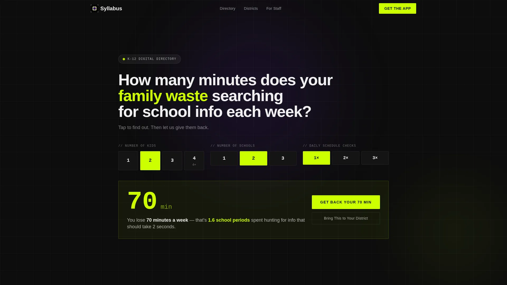
Syllabus is a modular card-grid landing page built for K-12 digital directories. It consolidates school resources like lunch menus, bus routes, grade portals, club signups, and counselor booking into one tappable interface. Designed for time-pressed parents, front-office staff, and district administrators, it leads with a live time-waste estimator and drives app downloads through a two-step district search flow.
by Rocket studio
Quick summary
Syllabus is a single-page K-12 digital directory landing page that replaces scattered PDFs and fragmented apps with one searchable, card-based resource hub. The header opens with an interactive estimator that calculates how many minutes families lose each week searching for school information. Every section leads with a data point before the explanation, and the page closes with a pinned app download call to action.
Who this template is for
This template is built for anyone who needs to present a K-12 digital directory to busy families and district decision-makers. It works equally well for product teams launching a school app and for district communications leads who need a convincing showcase page.
- Parents and guardians managing multiple children across different school schedules
- Front-office staff and district administrators looking to reduce repetitive information requests
- Product and marketing teams promoting a K-12 directory app to districts and schools
What problem this template solves
School information is scattered. Parents toggle between separate apps for grades, lunch menus, bus routes, and club schedules. Front-office staff answer the same forty questions every morning. This template creates one focused landing page that demonstrates the value of consolidation before a single download happens.
- Families waste meaningful time each week hunting across disconnected school communication tools
- Districts struggle to communicate the ROI of a unified app to skeptical administrators and budget holders
- A generic landing page cannot capture the urgency parents feel at 7 AM on a school day
What you get with this template
The template delivers a full modular card-grid layout purpose-built for K-12 app marketing. Every section is designed to move a visitor from recognition to download in a straight line.
- An interactive header estimator that calculates personal time loss and keeps the stat visible through the download flow
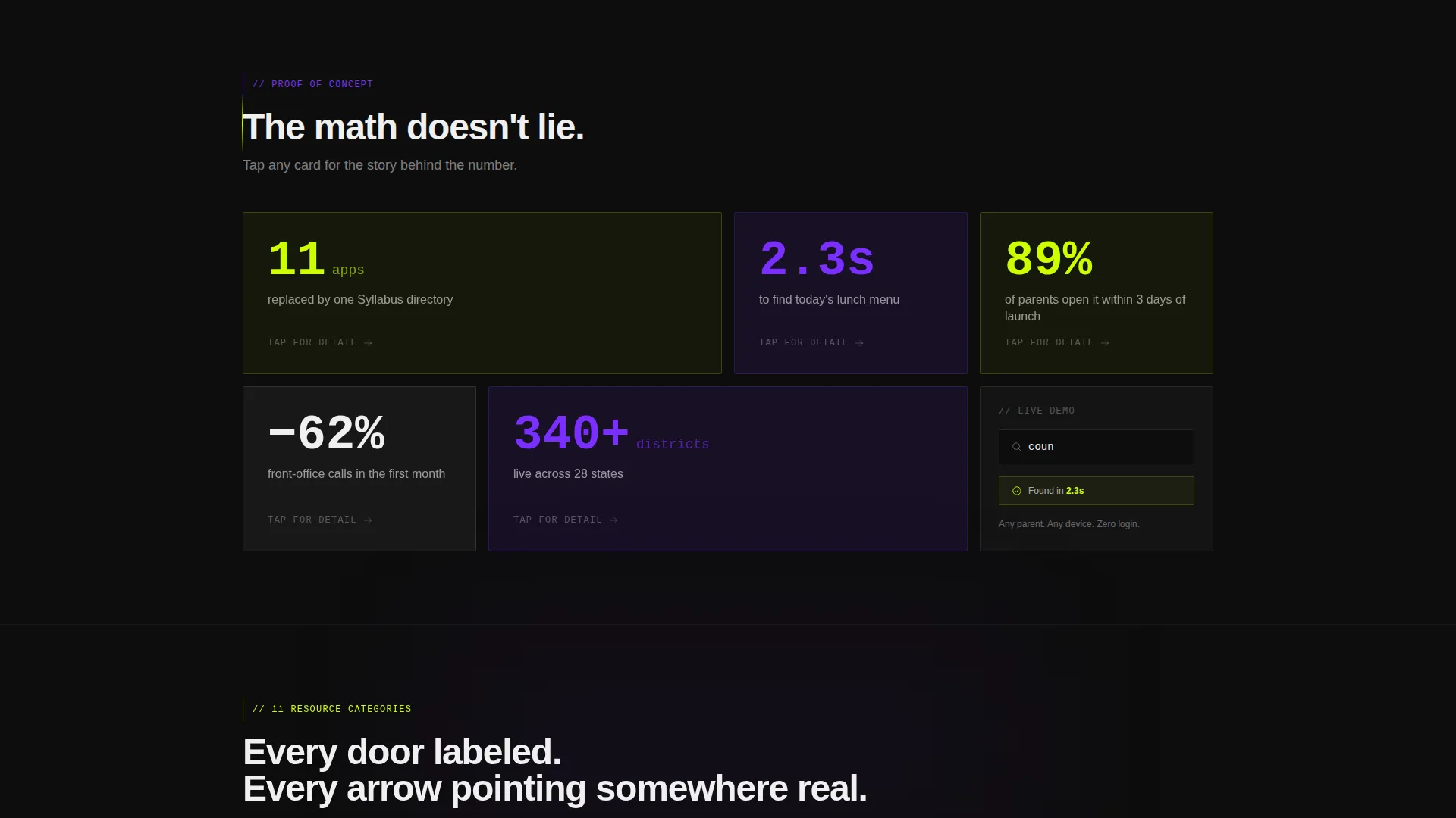
- A stats-first modular grid with expandable and flippable cards showing proof points like "11 apps replaced" and "2.3 seconds to find today's lunch"
- A two-step app download flow with district auto-complete, platform selection, and a secondary administrator qualification path
Feature list
This template packs purpose-built components that serve both the parent visitor and the district decision-maker in the same scroll.
Interactive Time-Waste Estimator
The header widget lets parents tap tiles for number of children, number of schools, and check frequency. It instantly calculates a personalized weekly time-loss figure displayed in oversized chartreuse type. The stat animates upward like a scoreboard and reappears beside the download button as a personal reminder.
Stats-First Modular Card Grid
Every scroll-stop opens with a data point before any explanation appears. Cards show figures like "11 apps replaced," "2.3 seconds to find today's lunch," and "89% of parents open it within 3 days." Each card flips or expands on tap to reveal the detail beneath the number.
Pinned App Download Call to Action
The primary call to action, "Get Your School's App," stays pinned to the bottom of the viewport on mobile throughout the entire scroll. It never disappears, so the moment a parent is ready to act, the button is already there.
Two-Step District Download Flow
Tapping the download button opens a compact two-step flow. Step one is a district name auto-complete field. Step two is a platform selector for iOS or Android. The estimator result from the header reappears here as a personalized nudge.
Administrator Qualification Path
A secondary call to action lets district administrators tap "Bring This to Your District." This opens a short qualification form asking for role, district size, and current communication system. It captures high-intent institutional leads without interrupting the parent-focused flow.
Directory Category Architecture
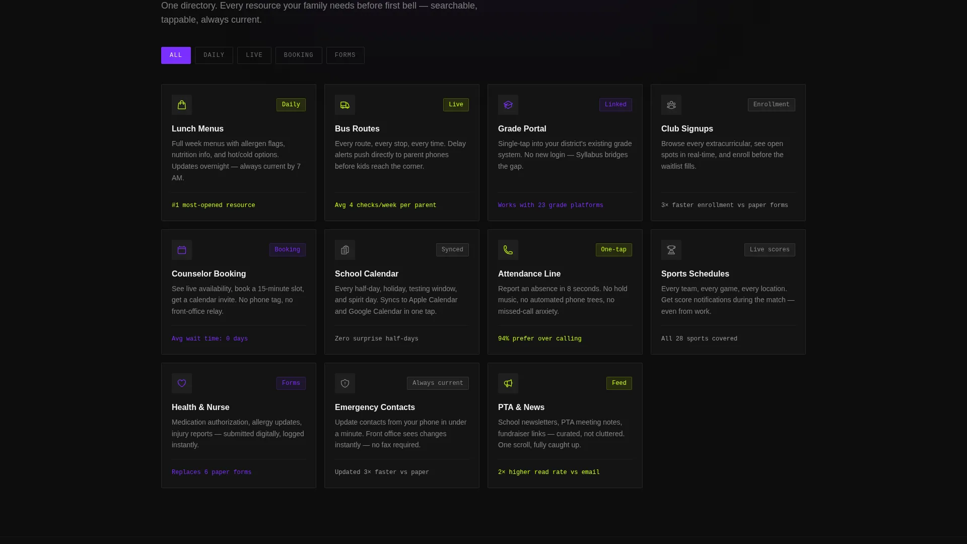
The card grid surfaces all major resource categories: lunch menus, bus routes, grade portals, club signups, and counselor booking. Violet-colored category headers and active filter states make it easy to scan the full scope of what the directory replaces.
Page sections overview
| Section | Purpose |
|---|---|
| Header Estimator Widget | Calculates personal weekly time loss for families |
| Stats Impact Cards | Delivers proof points before feature explanations |
| Directory Category Grid | Showcases all resource categories in one view |
| Live Search Demo | Demonstrates 2.3-second find time with a search bar |
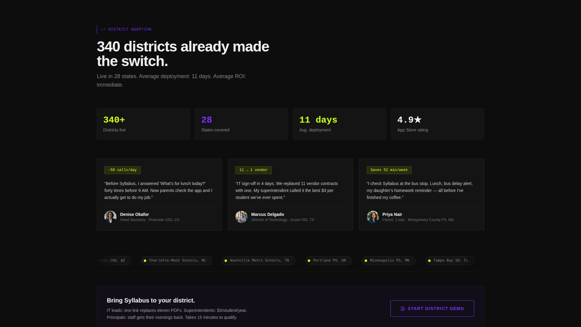
| District Adoption Map | Shows adoption heat map to build institutional trust |
| App Download Block | Drives two-step download with platform selector |
| Admin Qualification Form | Captures district administrator leads |
Design & branding system
The visual identity follows a Directory and Discovery theme built on an Acid Digital color system. The palette feels synthetic and energized, like a school hallway lit by vending-machine glow after hours. Every color has a specific functional role in the interface.
- Electric chartreuse (#CCFF00) dominates interactive cards, hover states, call to action buttons, and the estimator stat display
- UV violet (#7B2FFF) marks category headers and active filter states throughout the card grid
- Deep terminal black (#0D0D0D) anchors all backgrounds, and notification-ping white (#F0F0F0) carries body text for comfortable reading on phone screens at bus-stop brightness
Mobile & speed optimization
The entire layout is built around the reality that parents open this page on a phone at 7 AM, not at a desk. Every interaction is tap-first, and the most important action is always one thumb reach away.
- The pinned download button stays fixed to the bottom of the mobile viewport so the call to action is never out of reach
- Card tiles and estimator inputs are sized for easy tapping without zoom, even on smaller phone screens
- The two-step download flow is deliberately short, removing friction at the exact moment a busy parent is ready to commit
How this template helps you convert
The page is built as a conversion funnel from the first tap. Each section advances visitor intent rather than simply presenting information.
- The estimator makes the problem personal immediately. A parent who sees "You lose 47 minutes a week" is no longer reading about a generic app; they are reading about their own Tuesday morning.
- The stats-first card grid builds credibility fast. Proof points appear before explanations, so skeptical visitors absorb evidence before they encounter any marketing language.
- The pinned call to action and the returning estimator stat at the download step close the loop. The visitor is reminded of their personal number at the exact moment they choose to act.
Other information about this template
This template is part of a broader set of modular landing pages designed for technology products in the education space. It is a strong fit for K-12 digital presence projects where the goal is app adoption at both the family and district level.
- The card grid layout is fully modular, meaning individual cards can be reordered, added, or removed to match a specific district's resource categories
- The Stats-First Impact creative direction means the visual hierarchy always leads with numbers, making the page feel data-driven rather than promotional
- No stock photography of children or classrooms is included by design; the visual language relies entirely on data, color, and type to communicate urgency and credibility
Theme
Directory & Discovery
Creative direction
Stats-First Impact
Color system
Acid Digital
Style
Card Grid (Modular)
Direction
App Download
Page Sections
Interactive Time-waste Estimator
Stats-first Modular Card Grid
Pinned Mobile Download Button
Two-step District Download Flow
Administrator Qualification Path
Directory Category Architecture
Related questions
Who is this landing page template designed for?
Can I change the resource categories shown in the card grid?
What does the two-step download flow look like?
Is there a separate path for district administrators?
Does the estimator result carry through the whole page?



