Plus-Size Lingerie Landing Page Template
Curve is a Neo-Retro landing page template built for plus-size lingerie boutiques. It pairs a cinematic letter-mask header with a modular occasion-based card grid, deep ruby and chrome branding, and a click-through flow designed to turn browsers into buyers. Every detail, from the velvet-dark palette to the flip-card vignettes, is built around bodies and moments that most lingerie templates ignore.
by Rocket studio
Quick summary
Curve is a single-page landing page template designed for plus-size lingerie boutiques that sell with feeling, not just product specs. It opens with a full-viewport letter-mask video header, moves into a modular occasion-sorted card grid, and closes every visit with a clear path to shop or take a fit quiz. The visual identity is rich, intentional, and ready to use.
Who this template is for
This template is built for boutique owners and independent brand founders who sell lingerie to women who have been underserved by mainstream sizing. It works equally well for a brand launching its first online storefront and for an established shop refreshing its seasonal presence.
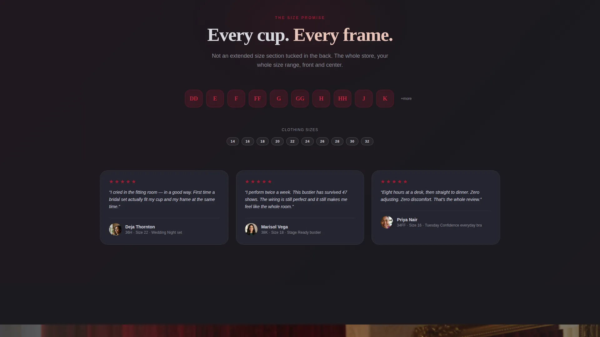
- Lingerie boutiques specializing in sizes DD through K cups and size 14 through 32 frames
- Brands serving brides, burlesque performers, and everyday women who want glamour and support together
- Founders who want a high-end visual experience without building a custom page from scratch
What problem this template solves
Most lingerie templates are designed around a standard small-to-large size narrative. They show product grids organized by category, use minimal styling, and give no emotional reason to buy. For a boutique selling confidence as much as fabric, that approach falls flat.
- Visitors land on a generic grid and feel nothing, so they leave without clicking
- Extended-size shoppers have learned to distrust brands that hide size information until checkout
- Without occasion-led storytelling, a bra is just a bra, not a honeymoon set or a stage-ready piece
What you get with this template
Curve delivers a fully designed, section-complete landing page layout with a strong visual identity baked in. Every section from the header to the sticky bottom bar is purposeful and ready to be customized with your own products and photography.
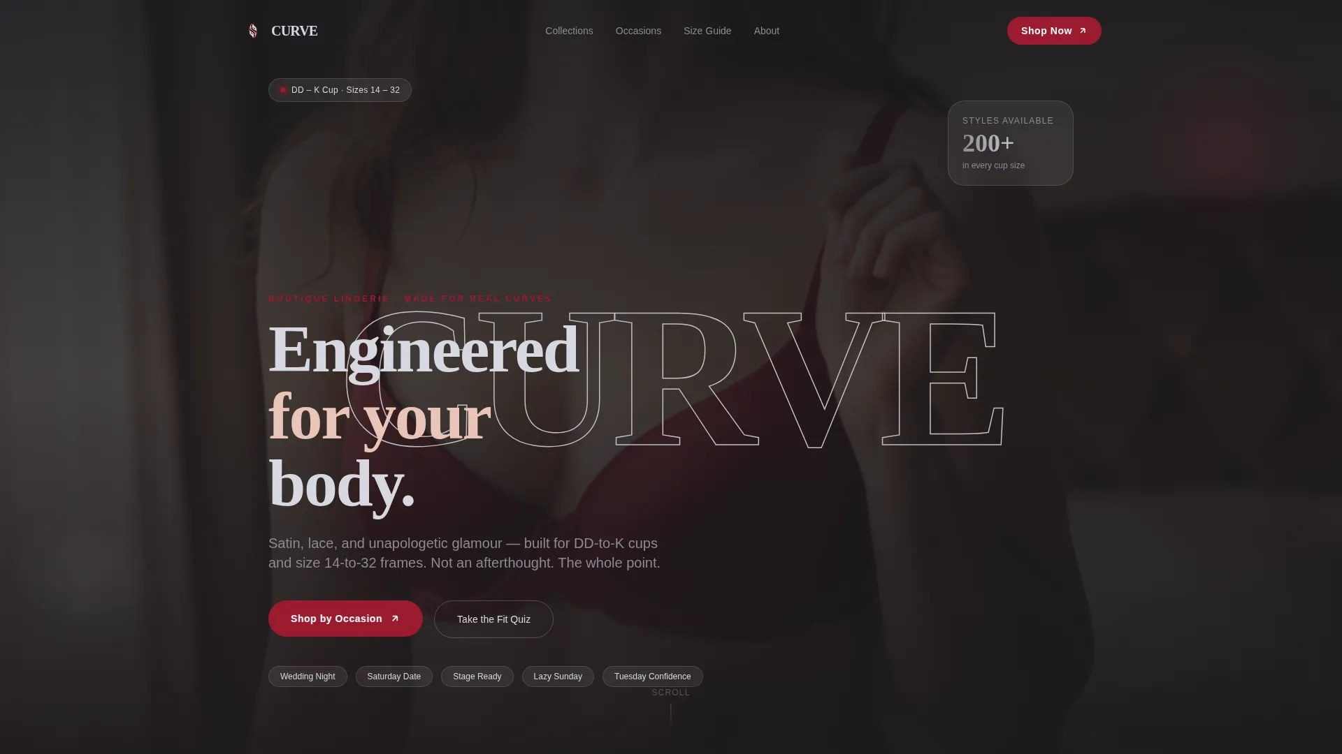
- A cinematic letter-mask video header spelling out "CURVE" with looping editorial clips visible through each letterform
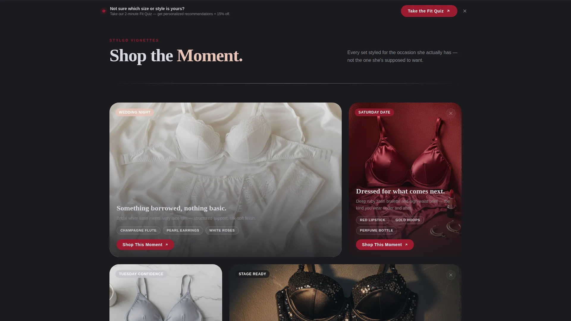
- A modular card grid sorted by occasion, with flip-on-hover cards that reveal fabric closeups, size range badges, and price
- A sticky bottom bar carrying a secondary "Take the Fit Quiz" call-to-action that captures email from visitors not yet ready to browse
Feature list
This template is built around a focused set of design and interaction features drawn directly from the Curve brief.
Letter Cutout Video Header
The word "CURVE" spans the full viewport in large serif letterforms. Each letter acts as a video mask, looping a short editorial clip: a lace hem traced by hand, a clasp clicking shut, satin catching light. As the visitor scrolls, the mask dissolves and the clips merge into a single full-width hero image of a model mid-laugh, completely at ease.
Occasion-Based Card Grid
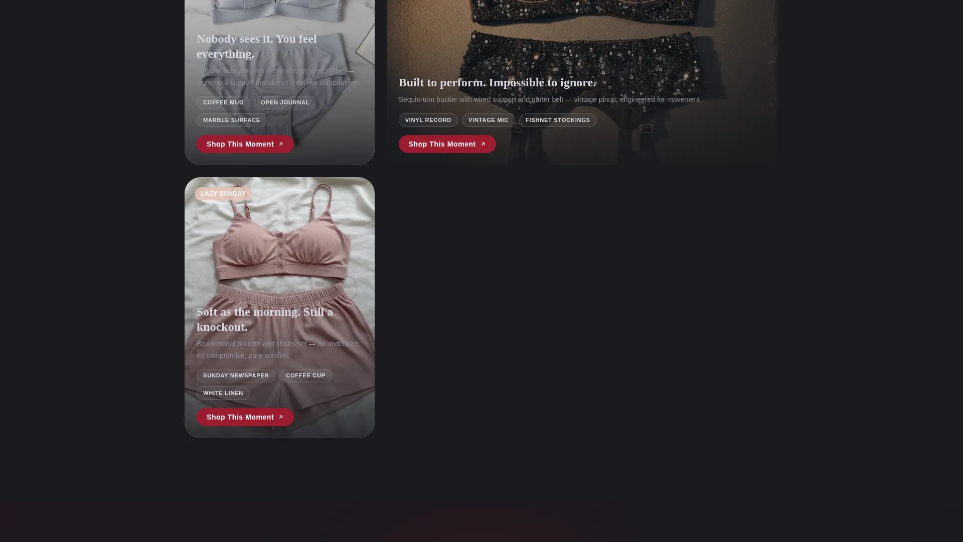
Cards are organized not by product type but by moment: "Wedding Night," "Saturday Date," "Tuesday Confidence," "Stage Ready," and "Lazy Sunday." Each card is a styled vignette with props like a champagne flute, red lipstick, a vinyl record, or a coffee cup. The grid shifts subtly in warmth and prop styling as the visitor scrolls, giving the page a living-catalog rhythm.
Flip-on-Hover Card Interaction
Every card in the grid flips on hover to reveal the reverse face. The back side shows a fabric closeup, a size range badge, and a quick-view price. This gives shoppers the detail they need without leaving the landing page.
Click-Through "Shop This Moment" Flow
Every card and every primary call-to-action button routes to a filtered collection page on the main store. The copy reads "Shop This Moment" rather than a generic "Buy Now," keeping the occasion-based narrative intact through to the click.
Sticky Fit Quiz Bottom Bar
A persistent bottom bar stays visible as the visitor scrolls. It carries the secondary call-to-action "Take the Fit Quiz," which captures an email address in exchange for personalized size and style recommendations. This recovers visitors who are interested but not yet ready to browse a product page.
Ruby and Chrome Visual System
The color system uses deep ruby red for hover states and call-to-action buttons, polished chrome silver for card borders and divider lines, warm blush nude for photography backgrounds, and midnight matte as the foundational grid backdrop. The result reads like a vintage Cadillac parked under neon: cool structure radiating warmth.
Page sections overview
| Section | Purpose |
|---|---|
| Letter Mask Header | Opens the page with looping editorial video clips masked inside large serif letterforms |
| Hero Dissolve Moment | Transitions from the letter mask into a full-width model photograph as the visitor scrolls |
| Occasion Card Grid | Organizes products by styled life moment rather than category or product type |
| Card Flip Detail | Reveals fabric closeup, size badge, and price on hover without leaving the page |
| Shop This Moment calls to action | Routes each card and button click to a filtered collection page on the main store |
| Fit Quiz Bottom Bar | Persistent sticky bar offering a personalized quiz and email capture for undecided visitors |
Design & branding system
The Curve template follows a Neo-Retro theme that mixes vintage glamour with modern editorial confidence. The palette and typographic choices feel deliberate and specific, not generic.
- Color system: deep ruby red (#9B1B30) for actions and hover states, polished chrome silver (#C0C0C8) for structural accents, warm blush nude (#E8C4B8) for photography warmth, and midnight matte (#1A1A1E) for backgrounds
- Typography uses large serif letterforms in the header to reinforce the vintage-couture feeling, contrasting with clean modern type in card labels and body text
- Chrome traces card borders and divider lines, giving the grid the precision of a jeweler's display case while the ruby accents inject heat and urgency
Mobile & speed optimization
The card grid layout is modular, which means it reflows cleanly across screen sizes without losing the vignette styling or the occasion-based organization.
- Flip-card interactions adapt for touch screens, allowing the detail reveal to work on mobile without requiring hover capability
- The sticky bottom bar remains visible and tappable on mobile, keeping the fit quiz call-to-action accessible throughout the scroll
How this template helps you convert
Curve is built around the principle that a visitor should want the feeling before she taps the button. The page earns the click by showing the product in context first, styled and storied, so the decision is emotional and already made.
- The occasion-based card grid removes decision fatigue by framing each product as a specific moment rather than a category, making the choice feel personal and easy
- The flip-card detail layer gives size and price information at the right moment, building trust without interrupting the browsing rhythm
- The sticky fit quiz bar captures visitors at every scroll depth, so the page recovers interest even when a visitor is not ready to go straight to the store
Other information about this template
Curve is part of a curated set of fashion and lifestyle landing page templates built around specific niche identities. A few additional details worth knowing before you use it.
- The template is designed as a click-through landing page, meaning it functions as a brand and occasion gateway rather than a standalone store
- The card grid is modular, so occasion categories can be renamed, reordered, or expanded to match your actual collection lineup
- Photography and video content shown in preview use editorial styling intended to represent the Neo-Retro creative direction; your own brand imagery replaces these placeholders at setup
- The template suits seasonal refreshes well, since card photography warmth and prop styling can be adjusted to shift the mood across spring, summer, autumn, and winter collections
Theme
Neo-Retro
Creative direction
Seasonal/Moment
Color system
Ruby & Chrome
Style
Card Grid (Modular)
Direction
Click-Through
Page Sections
Letter Cutout Video Mask Header
Occasion-based Modular Card Grid
Flip-on-hover Card Detail Reveal
Click-through Shop This Moment Flow
Sticky Fit Quiz Bottom Bar
Ruby and Chrome Color System
Related questions
Can I rename the occasion categories in the card grid?
Does the letter-mask header require custom video footage?
How does the sticky fit quiz bar work?
Is this template suitable for a brand that sells both standard and extended sizing?
What happens when a visitor clicks 'Shop This Moment'?