Curves - Bold Plussize Landing Page Template
Curves is a bold, editorial landing page template built for plus-size women's fashion brands. It combines a cinematic spotlight hero, a modular card grid with shoppable and editorial tiles, a full-width video break, and a three-question Fit Quiz. The Neo-Retro Ink and Paper design system makes every scroll feel like a fashion magazine brought to life.
by Rocket studio
Quick summary
Curves is a single-page, modular card grid template designed for plus-size women's fashion brands. It opens with a cursor-tracking spotlight hero, moves through an alternating editorial and shoppable grid, breaks the layout with a cinematic video card, and closes a secondary conversion path with an interactive Fit Quiz. The visual identity is vintage broadsheet meets Risograph print.
Who this template is for
This template is built for fashion brands that design for real bodies, not scaled-up samples. It suits any brand that leads with editorial confidence and needs shoppable product cards that convert without sacrificing visual identity.
- Direct-to-consumer plus-size women's fashion brands launching or refreshing their online presence
- Independent designers and boutiques showcasing size-inclusive occasion wear, workwear, or swimwear
- Brand founders who want a lookbook feel with built-in shopping functionality on a single page
What problem this template solves
Most fashion templates were built for sample sizes and stock photography. They push a narrow visual language that size-inclusive brands are forced to work around, diluting their identity before a visitor even sees the clothes. Curves solves that from the first pixel.
- Generic grid layouts flatten editorial photography into plain product rows, losing the storytelling that drives trust
- Standard templates offer no size-range signaling, so visitors must click through to discover whether a brand actually serves them
- Single-call to action pages miss secondary buyers who need a guided path before committing to a product
What you get with this template
You get a fully structured, high-animation landing page with every section planned and wired for a plus-size fashion brand's conversion journey. No blank canvas guessing required.
- A spotlight hero section, marquee press strip, modular editorial and shoppable card grid, full-width video break, and Fit Quiz section
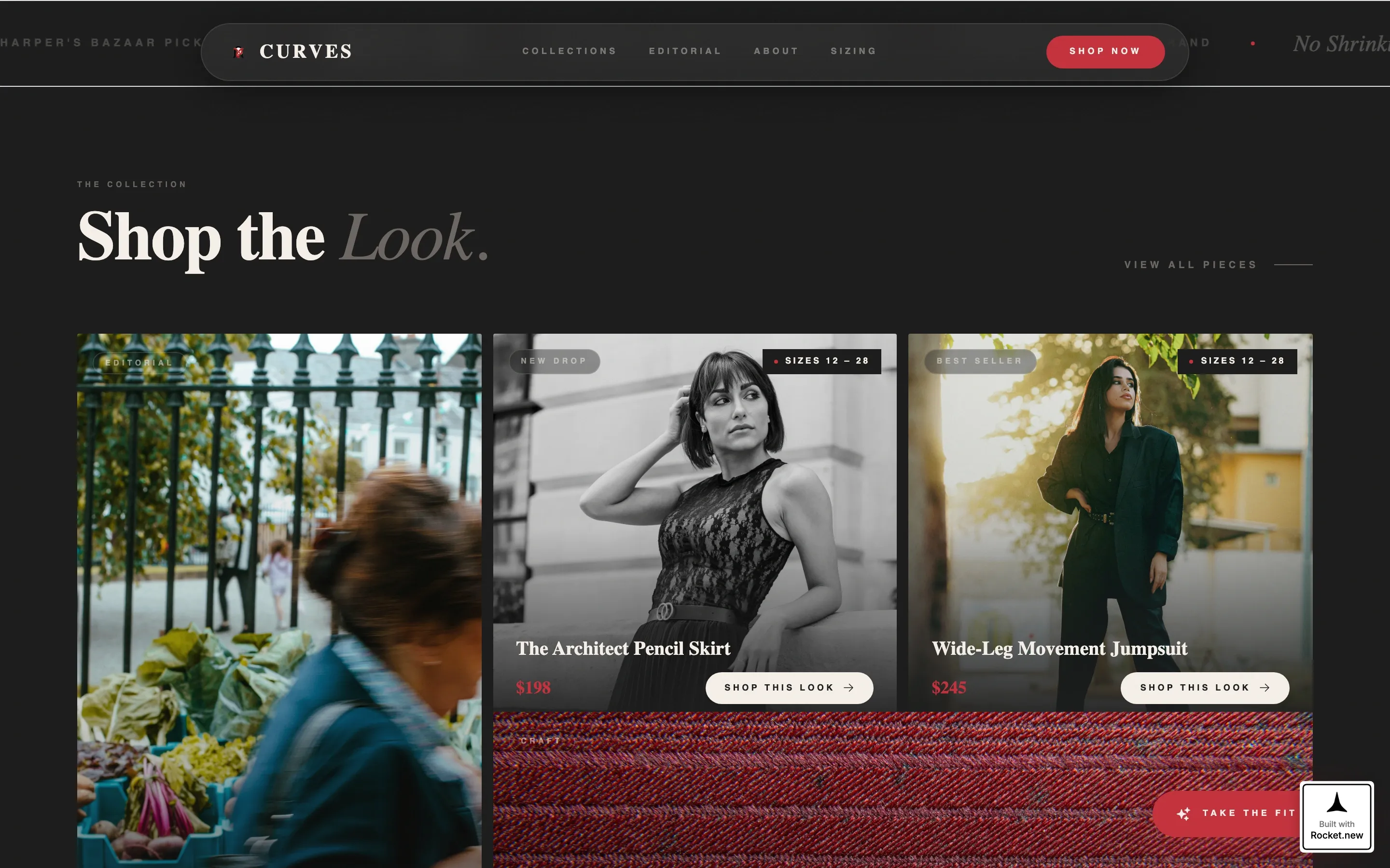
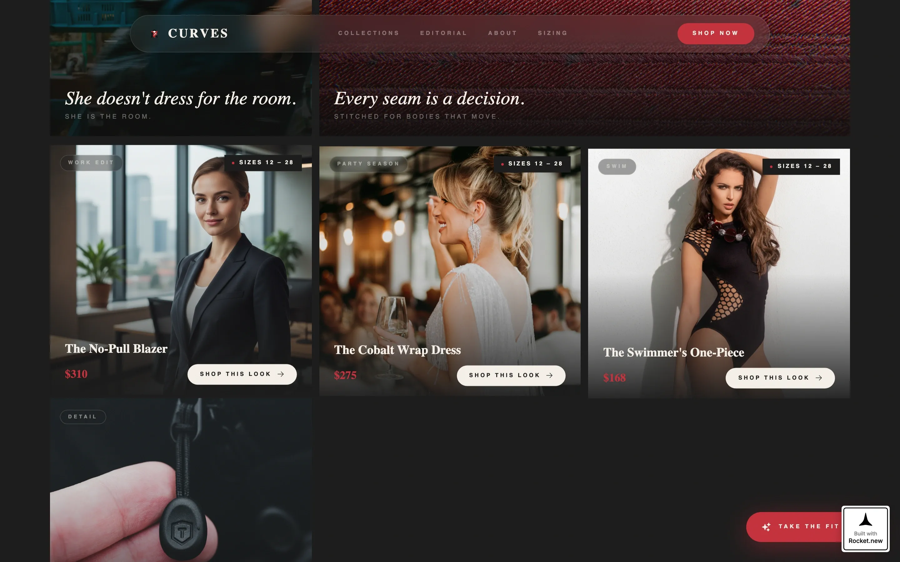
- Size-range ribbons (12 to 28) displayed on every product card before click, with "Shop This Look" as the primary call to action on each tile
- A persistent floating "Take the Fit Quiz" button that opens a three-question modal returning a curated capsule recommendation
Feature list
This template was designed with a specific conversion architecture in mind. Every feature listed below is built into the template as described in the source brief.
Cursor-Tracking Spotlight Hero
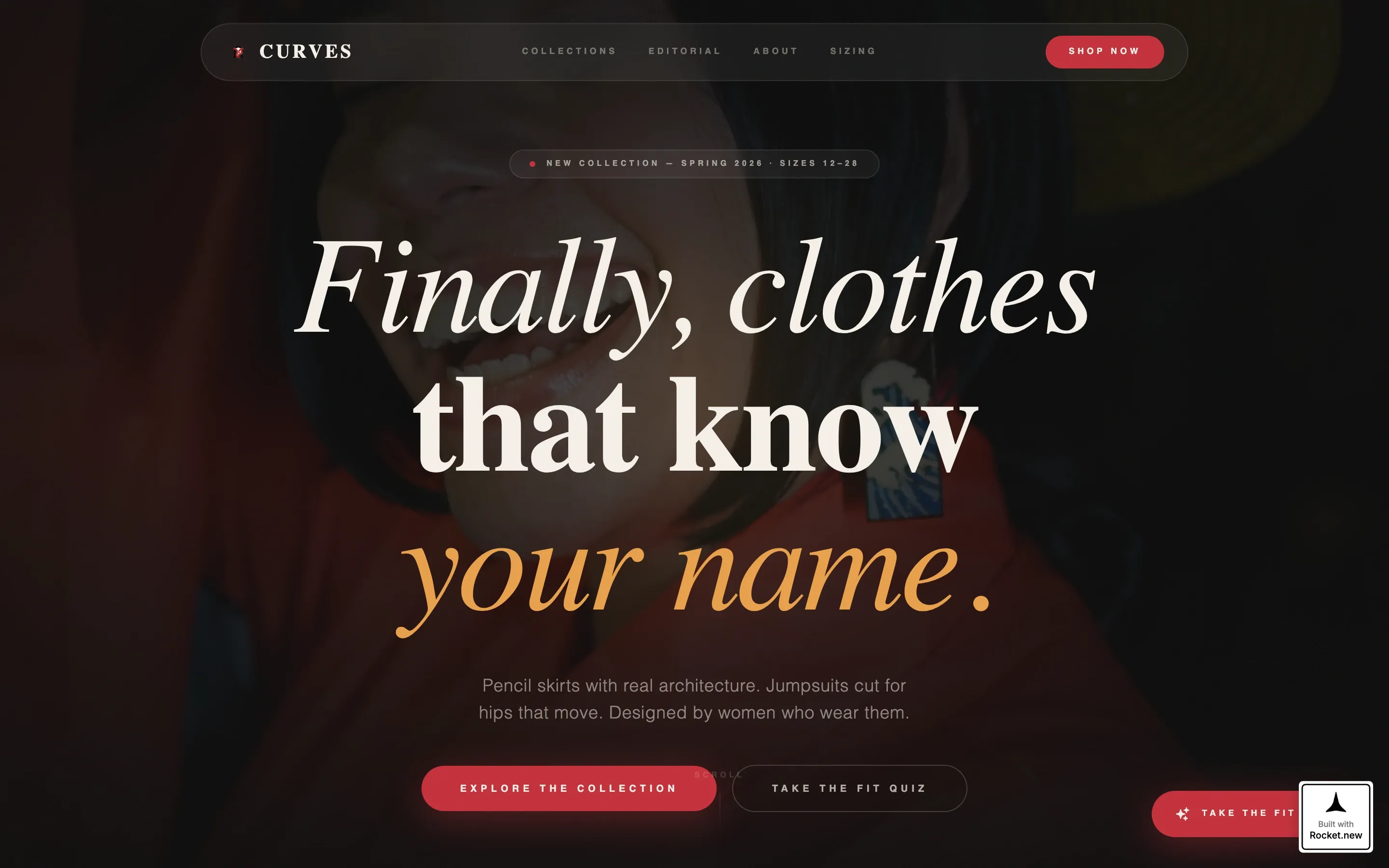
The hero section places a single model against deep black, lit with warm amber light. A radial gradient follows the visitor's cursor, mimicking a live follow-spot. A Fraunces serif headline fades up on load. The effect is immediate and cinematic, setting the brand's editorial tone before a single product appears.
Modular Card Grid with Editorial Tiles
The main grid alternates between shoppable product cards and editorial moment cards. Product tiles show a size-range ribbon (12 to 28) and a "Shop This Look" call to action. Editorial cards display close-up stitching details, lifestyle photography, and motion shots. Cards enter the viewport with staggered clip-path animations driven by GSAP ScrollTrigger.
Full-Width Video Break Card
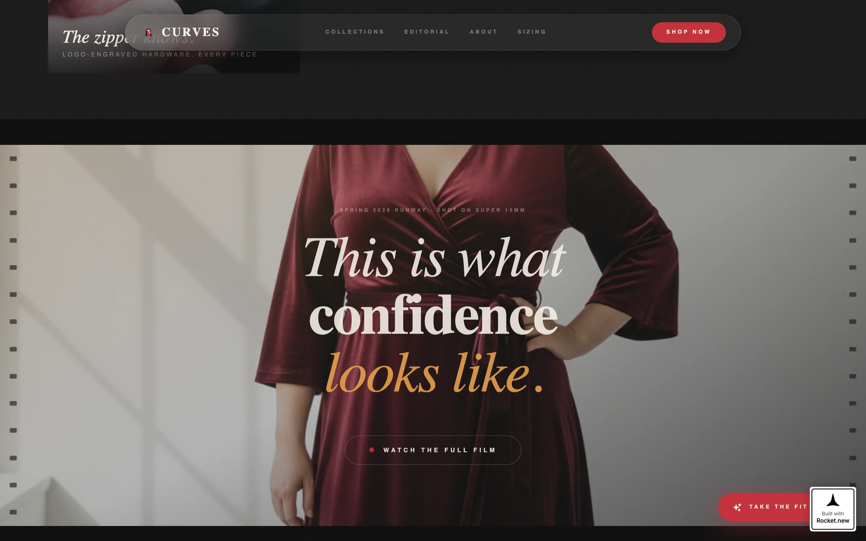
A single card breaks the grid entirely with a full-width video. The footage uses a Super 16 film aesthetic to show a runway sequence. This break resets the visual tempo between grid sections and gives the brand a cinematic proof-of-product moment inside the shopping flow.
Interactive Fit Quiz Modal
A magnetic floating button labeled "Take the Fit Quiz" stays visible throughout the page. Clicking it opens a modal that asks three questions: body shape, comfort priority, and style era preference. The quiz returns a curated capsule, giving undecided visitors a guided path to purchase without leaving the page.
Neo-Retro Marquee Press Strip
A horizontal marquee strip runs between the hero and the grid. It carries press mentions and brand pillar statements in a looping ticker format. The strip uses the Ink and Paper color system and Fraunces typography to maintain the vintage broadsheet editorial tempo established by the hero.
Arc-Split Footer
The footer uses a Pattern 7 arc-split layout. The brand logo and tagline anchor the left side. Navigation links sit on the right. The footer closes the page cleanly without interrupting the editorial flow.
Page sections overview
| Section | Purpose |
|---|---|
| Spotlight Hero | Opens the brand story with a cursor-tracking, model-lit cinematic moment and serif headline |
| Marquee Press Strip | Loops press mentions and brand pillars to build credibility at editorial tempo |
| Modular Card Grid | Alternates shoppable product tiles and editorial lifestyle cards with size ribbons and calls to action |
| Full-Width Video Break | Interrupts the grid with a Super 16 film runway sequence to reset visual pace |
| Fit Quiz Section | Captures undecided visitors with a three-question modal that returns a curated capsule |
| Arc-Split Footer | Closes the page with logo, tagline, and navigation in a balanced arc layout |
Design & branding system
The design language is Neo-Retro editorial. Think vintage broadsheet fashion spread, reprinted on a Risograph this morning. Every color and type choice reinforces the tactile, slightly imperfect feeling that makes the template feel handcrafted rather than templated.
- Color palette: editorial black (#1A1A1A), newsprint cream (#F5F0E8), typeset gray (#6B6560), and punctuation red (#C4303B) reserved for prices, calls to action, and hover states
- Typography: Fraunces serif for headlines and editorial moments, DM Sans for body copy and product details
- Animation style: GSAP ScrollTrigger powers card stagger reveals, clip-path entries, and the cursor spotlight, with all motion running on GPU-accelerated transforms
Mobile & speed optimization
The template is built desktop-first, with full mobile responsiveness across the grid and modal layers. Fashion browsing happens across devices, so the layout adapts without losing the editorial quality that defines the brand.
- The modular card grid reflows cleanly on smaller screens, preserving size ribbons and call-to-action buttons at every breakpoint
- Animations use GPU-accelerated transforms only, keeping motion smooth without heavy repaints on mobile hardware
- Server Components handle static sections while Client Components manage interactive layers like the cursor spotlight and Fit Quiz modal
How this template helps you convert
Every section of this template is designed to move a visitor from discovery to decision. The conversion architecture mirrors the way fashion-forward customers actually shop.
- The spotlight hero creates an immediate emotional connection through editorial photography and a headline that speaks directly to the target buyer, earning attention before asking for a click.
- The alternating grid builds purchase intent progressively. Editorial cards build desire; shoppable cards with visible size ranges remove the hesitation that stops plus-size shoppers mid-browse.
- The Fit Quiz provides a low-commitment secondary path for visitors who are not yet ready to buy. By returning a curated capsule, it keeps them engaged and moves them toward a specific product rather than away from the page.
Other information about this template
This template is part of a broader card grid modular template family designed for fashion and lifestyle brands with strong editorial identities. A few additional details worth knowing before you start building:
- The template is categorized under Fashion and Lifestyle, with a specific focus on the Plus-Size and Inclusive Fashion subcategory
- US English copy, USD pricing conventions, and US sizing (sizes 12 to 28) are baked into the template structure
- The Intersection Match Score for this template's niche alignment is 13, reflecting a precise fit between the creative direction and the plus-size women's brand use case
- The Cinematic Sequence creative direction means the scroll pacing is intentional: loungewear cards are spaced wide, partywear cards stack tight, and the video break punctuates the rhythm
Theme
Neo-Retro
Creative direction
Cinematic Sequence
Color system
Ink & Paper
Style
Card Grid (Modular)
Direction
Marketplace/Multi
Page Sections
Cursor-tracking Spotlight Hero
Modular Editorial and Shoppable Card Grid
Full-width Cinematic Video Break
Interactive Three-question Fit Quiz
Neo-retro Marquee Press Strip
Arc-split Footer Layout
Related questions
Can I replace the placeholder photography with my own brand images?
Does the Fit Quiz store or process customer data?
Is the size-range ribbon editable to match my brand's actual sizing?
How does the cursor spotlight behave on mobile and touch devices?
Can I add or remove cards from the modular grid?