Self-Hosted Enterprise Software Careers Website Template
Dam is a self-hosted digital asset management landing page template built for enterprise creative teams and post-production houses that cannot afford third-party cloud exposure. The modular card grid layout presents technical proof at every scroll stop, funneling visitors toward a single deployment call to action. Dark terminal aesthetics and iridescent accents make the page feel as serious as the infrastructure it promotes.
by Rocket studio
Quick summary
Dam is a single-page, card grid landing page template for a self-hosted digital asset management platform. It is designed for technical buyers who need to evaluate infrastructure ownership, compliance posture, and petabyte-scale performance. Every section delivers evidence first and marketing second, guiding visitors toward one clear destination: the deployment page.
Who this template is for
This template speaks directly to the people who own the problem. It is built for professionals who need full control over where their creative files live, how they are stored, and who can access them.
- Creative ops directors at agencies managing large volumes of RAW footage, brand kits, and versioned source files across distributed teams
- In-house brand teams at enterprises where compliance requirements prohibit sending assets to any third-party server
- Post-production houses handling petabytes of footage across distributed editorial workflows
What problem this template solves
Most digital asset management landing pages bury the technical detail and lead with lifestyle imagery. That approach fails with the buyers this template targets. Security-conscious evaluators need proof before they click anything.
- Creative teams drowning in shared Dropbox links have no single source of truth for asset versions, formats, or usage rights
- Enterprise compliance teams cannot approve platforms that store sensitive files on infrastructure they do not control
- Post-production operations lack a clear, visual argument for why self-hosted infrastructure outperforms cloud storage at scale
What you get with this template
You get a fully structured, desktop-first landing page that reads like a technical whitepaper and converts like a product page. Every section is a self-contained argument, and the modular card grid lets a technical buyer scan non-linearly the way they actually evaluate software.
- A cinematic hero section with a full-width product screenshot on an isometric tilt, a headline, and a primary call to action
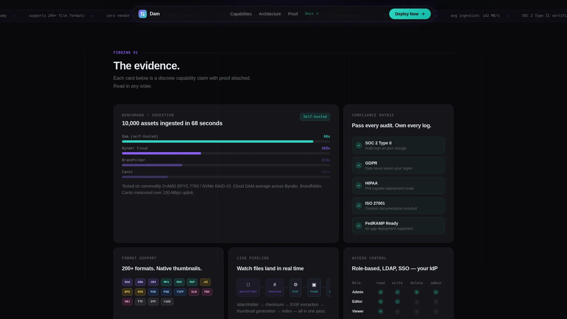
- An asymmetric capability bento grid with benchmark, compliance matrix, format support, and ingestion speed cards
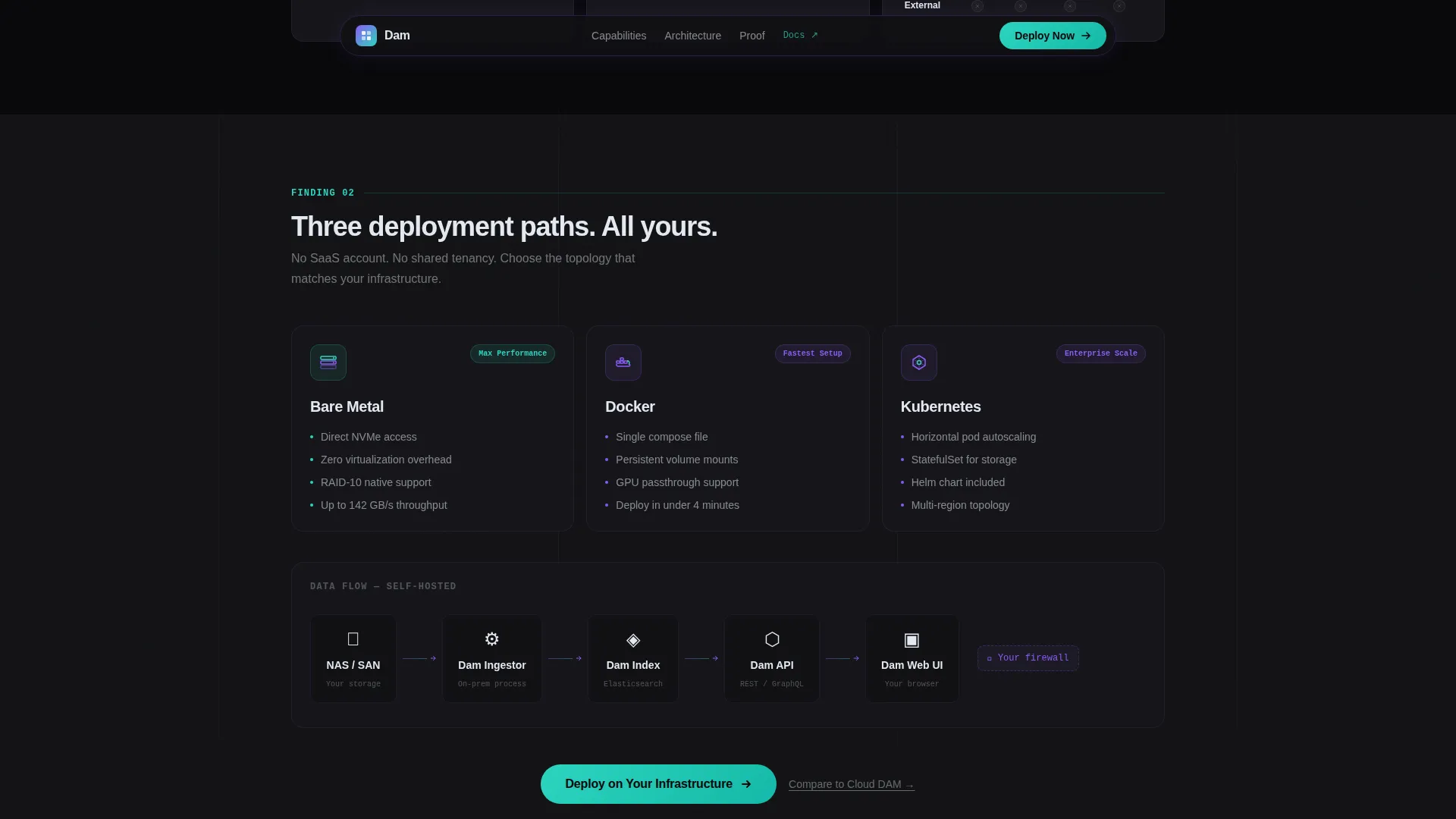
- An architecture deployment card showing bare metal, Docker, and Kubernetes options, a mid-page call to action, a social proof section, and a full-width closing call to action band
Feature list
This template ships with a focused set of purpose-built components. Each one serves the goal of turning a skeptical technical buyer into a confident deployer.
Cinematic Hero with Product Screenshot
The header drops visitors into a pixel-sharp capture of the digital asset management interface. A nested taxonomy tree, a mixed-format thumbnail grid with colored format badges, and a metadata inspector panel are all visible at first glance. The screenshot sits on a subtle isometric tilt with an iridescent glow behind it.
Asymmetric Capability Bento Grid
Four discrete cards present platform capabilities as evidence rather than marketing copy. One card shows an ingestion speed benchmark comparing self-hosted performance against cloud digital asset management. Another displays a compliance matrix with indicators for relevant regulatory frameworks. The grid layout lets visitors scan in any order.
Architecture Deployment Diagram Card
A dedicated card visualizes the three supported deployment paths: bare metal, Docker, and Kubernetes. This gives infrastructure evaluators the diagram they need to assess fit before they ever speak to a sales team.
Social Proof Section
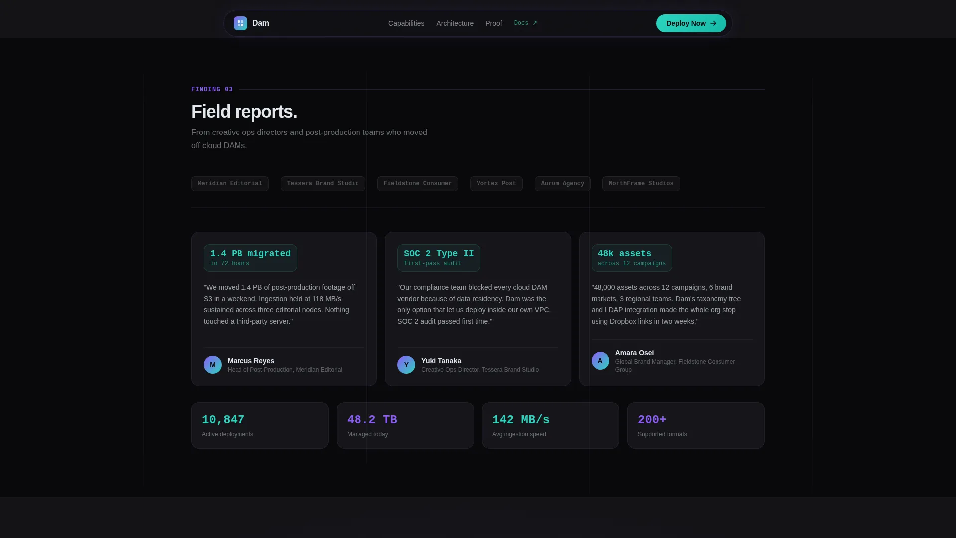
Agency and studio logos appear alongside quote cards that reference specific throughput metrics. The section grounds abstract performance claims in named, real-world evidence.
Persistent and Repeated Call to Action System
The primary call to action, "Deploy on Your Infrastructure," appears in spectral teal at the header, mid-page after the architecture card, and again in a full-width closing band. A secondary text link routes evaluation-stage visitors to a feature comparison page.
Data Command Visual System
The template uses a four-color iridescent palette applied with strict purpose. Void black grounds every surface, holographic violet provides accent structure, spectral teal marks live-state indicators and calls to action, and iridescent white handles all typography and iconography.
Page sections overview
| Section | Purpose |
|---|---|
| Hero with screenshot | Establish ownership positioning and primary call to action |
| Capability bento grid | Present benchmark, compliance, format, and ingestion evidence cards |
| Architecture deployment card | Show bare metal, Docker, and Kubernetes deployment options |
| Mid-page call to action | Reinforce deployment click-through after technical proof |
| Social proof section | Add credibility with studio logos and metric-backed quotes |
| Full-width call to action band | Close the page with a single, high-visibility deployment prompt |
| Footer | GitHub developer minimal pattern with secondary navigation |
Design & branding system
The visual identity follows a Data Command theme. Every color and typographic choice is intentional and load-bearing, not decorative. The overall feeling is a dark terminal that radiates controlled precision.
- Four-color AI Iridescent palette: void black (#09090B) for backgrounds, holographic violet (#8B5CF6) for structural accents, spectral teal (#2DD4BF) for live-state indicators and calls to action, and iridescent white (#E2E8F0) for all text and icons
- Card surfaces sit on #111114 with 1-pixel violet borders at 12% opacity and a subtle glow on hover; teal accents pulse on calls to action
- Typography pairs Manrope for headers and body copy with JetBrains Mono for technical labels and data readouts
Mobile & speed optimization
The template is built desktop-first because technical buyers evaluate enterprise software on large screens. The layout still adapts cleanly for mobile viewports without losing readability or hierarchy.
- The modular card grid reflows from an asymmetric desktop bento layout to a stacked single-column view on smaller screens
- CSS animations handle shimmer cards, scroll reveals, iridescent glow pulses, and staggered bento grid entrances without JavaScript overhead
- Server components power static sections, keeping the initial render fast even with high-animation density
How this template helps you convert
This template is engineered around a single conversion goal: the click to the deployment page. Every design and content decision removes friction between arrival and that click.
- Front-loading technical proof through the benchmark card, compliance matrix, and architecture diagram eliminates the objections that would otherwise block a click
- The persistent three-point call to action system at the header, mid-page, and closing band means a visitor is never more than one scroll stop away from the next step
- The secondary "Compare to Cloud DAM" text link captures visitors still in evaluation mode and keeps them inside the funnel rather than bouncing to a competitor
Other information about this template
This template is categorized under Technology and specifically targets the self-hosted enterprise software space. It is a strong fit for teams building or launching a self-hosted digital asset management product and needing a landing page that speaks the language of their buyers.
- The Industry Report creative direction means each card module frames a capability as a discrete, verifiable finding rather than a marketing headline
- The GitHub Developer Minimal footer pattern signals technical credibility and fits naturally with an audience of developers and infrastructure engineers
- Animation intensity is set to high, with cinematic entrance effects, card hover states, format badge hover interactions, and a teal glow pulse on calls to action all specified in the build
- The template targets desktop-first rendering with full mobile responsiveness, matching the device habits of enterprise software evaluators

Theme
Data Command
Creative direction
Industry Report
Color system
AI Iridescent
Style
Card Grid (Modular)
Direction
Click-Through
Page Sections
Cinematic Hero with Product Screenshot
Asymmetric Capability Bento Grid
Architecture Deployment Diagram Card
Persistent Three-point Call to Action System
Social Proof with Metric-backed Quotes
Data Command Visual and Animation System
Related questions
What kind of buyer is this landing page template designed for?
Does this template include a lead capture form?
Can I customize the card grid layout and color palette?
What deployment options does the architecture card cover?
Is this template suitable for a SaaS product that is not self-hosted?



