Data-Driven Learning Platform Landing Page Template
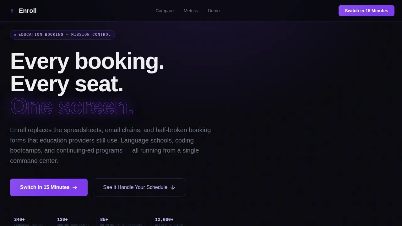
The Enroll Data Command Education Booking Landing Page Template is a bold, comparison-driven landing page built for education software platforms. It replaces the chaos of spreadsheets and broken forms with one focused screen. Designed for language schools, bootcamp operators, and university continuing-education teams, this template uses a dark Data Command visual system to highlight your platform's edge over manual processes and competitors.
by Rocket studio
Quick summary
This is a high-intensity comparison landing page built specifically for education booking software. The page leads with a live-looking dashboard preview, moves into a head-to-head comparison table, fires off a metrics strip, and closes with a two-step form. Every section builds the case that switching to your platform is not an upgrade, it is ignition.
Who this template is for
This landing page is built for education technology teams that need to convert visitors fast. It works for any platform replacing manual enrollment workflows at scale.
- Language school administrators managing 200 or more weekly sessions across multiple rooms
- Coding bootcamp operations managers losing enrollments to slow checkout flows
- University continuing-education coordinators still processing registrations by hand
What problem this template solves
Education providers still rely on spreadsheets, email chains, and half-broken booking forms to fill courses and manage waitlists. Students need reassurance before enrolling, and a slow or cluttered page destroys that confidence instantly. A dedicated landing page built around comparison gives visitors the clarity to act.
- Manual tools scatter enrollments across disconnected systems, causing lost leads and missed seats
- Generic landing page templates fail to highlight the specific gap between old processes and modern platforms
- Education landing page designs that lack social proof and urgent metrics leave applicants uncertain
What you get with this template
You get a complete, single-page layout built around one conversion goal: getting education operations teams to switch. The page is structured to explain your platform's value before a visitor has time to second-guess the decision.
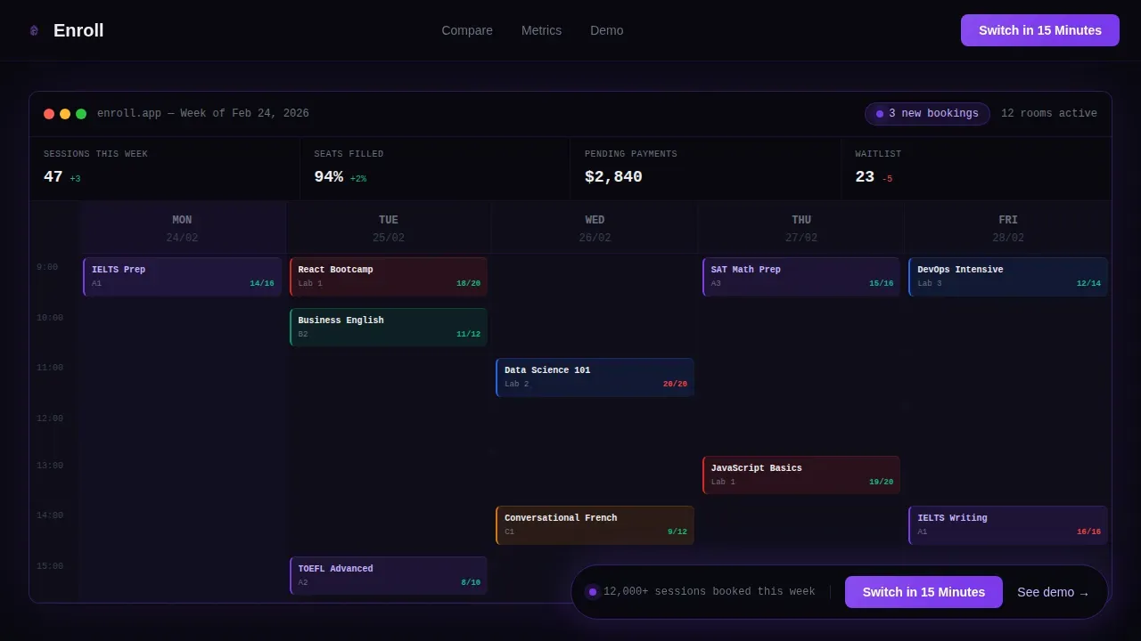
- A full-width dashboard preview hero with a scanline animation and a sticky call to action bar
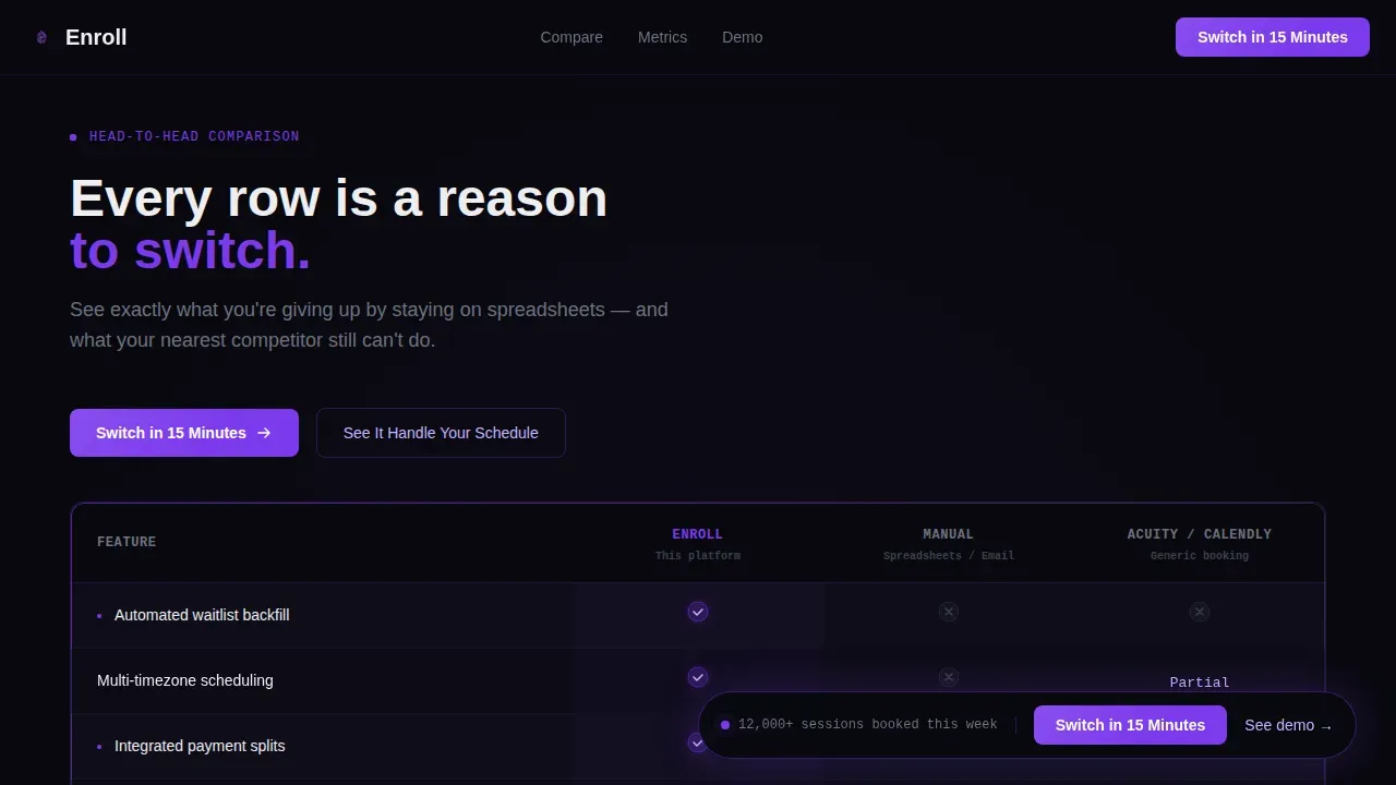
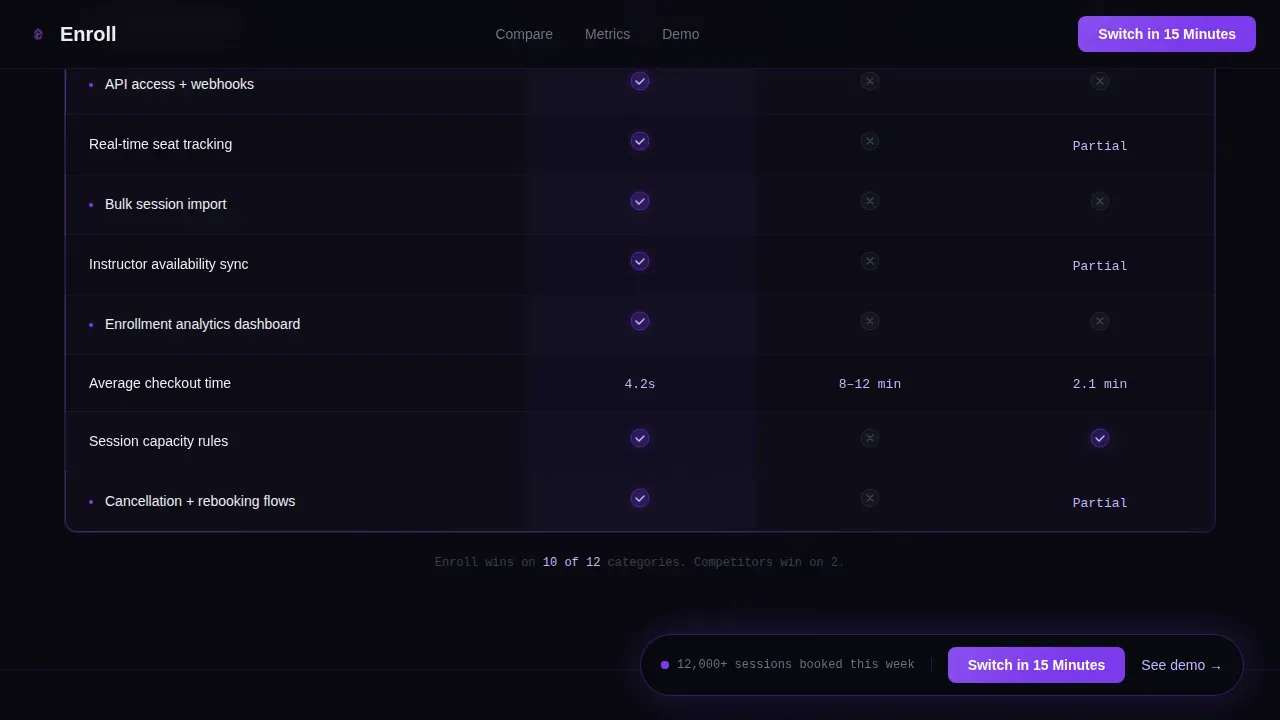
- A scroll-animated comparison table showing your platform versus manual processes and a competitor
- A metrics strip, an interactive drag-to-schedule demo, and a two-step lead capture form
Feature list
This landing page template delivers a focused set of built-in components. Each one serves a specific role in moving visitors toward the desired action.
Dashboard Preview Hero
The hero is a pixel-perfect, full-width screenshot of the platform's scheduling grid. Real class names like "IELTS Prep 9:00" and "Python Fundamentals 14:30" are visible at a glance. A single animated scanline sweeps across once, reinforcing the mission-control energy before any copy is read.
Scroll-Animated Comparison Table
The comparison table is the heart of this landing page. Rows animate in one by one as the visitor scrolls, each landing with a violet pulse. Categories cover automated waitlist backfill, multi-timezone scheduling, integrated payment splits, branded booking pages, and application programming interface access. Check marks glow violet; rejected features stay muted gray.
Live Metrics Strip
After the table, a telemetry-style metrics strip counts up key metrics in real time. Numbers like seat fill rates, average checkout speed, and weekly session volume display as live readouts. This section functions as social proof without relying on student testimonials alone.
Interactive Drag-to-Schedule Demo
A secondary conversion path lets visitors drag a sample class into a live calendar grid. This interactive moment lets potential leads experience the platform before committing to a form. It is one of the most effective ways to build trust with skeptical operations teams.
Two-Step Lead Capture Form
The two-step form keeps friction low. Step one asks for the visitor's current tool and monthly booking volume. Step two captures work email and institution name. Keeping forms short is critical, research consistently shows that shortening forms can double conversion rates for education courses and programs.
Floating Call to Action Bar
A sticky bar appears after the first scroll and stays pinned throughout the page. It keeps call to action buttons visible at all times, ensuring visitors always have a clear path to the desired action without needing to scroll back up.
Page sections overview
| Section | Purpose |
|---|---|
| Dashboard Preview Hero | Opens with the platform in action and sets mission-control tone |
| Floating call to action Bar | Keeps conversion entry point visible throughout the full page scroll |
| Comparison Table | Highlights platform advantages over manual tools and one competitor |
| Metrics Strip | Displays live-counting performance numbers to reinforce scale and speed |
| Interactive Demo | Lets visitors drag and schedule a class to experience the platform directly |
| Two-Step Form | Captures leads with minimal fields across two low-friction steps |
| Footer | Single-row linear footer with contact and navigation links |
Design & branding system
The template uses a Void and Violet color system that feels like mission control at 2 a.m. Clean lines, intentional light, and precise spacing make every data point feel urgent and alive.
- Colors: void black (#09090F), deep space indigo (#1A1335), electric violet (#7C3AED), and interface lilac (#C4B5FD) for hover states and highlights, with terminal white (#EEEEF0) for text contrast
- Typography: JetBrains Mono for all numbers and data readouts, DM Sans for body copy and interface labels
- Animation: scanline sweep on hero load, scroll-triggered row pulses on the comparison table, count-up numbers on the metrics strip, and a floating bar that appears after first scroll
Mobile & speed optimization
The template is desktop-first by design. Operations managers running language schools and university programs typically work on large screens where the dashboard preview and comparison table have the most impact.
- Static sections use server-rendered components for fast initial load; animations and interactive elements run as client components to avoid blocking the page
- The page layout is structured so mobile users still receive a fully readable, optimized experience without losing the core comparison flow
- Call to action buttons and forms remain accessible and tappable across screen sizes
How this template helps you convert
This education landing page is engineered to increase conversions at every scroll depth. It does not rely on passive browsing, it builds a case, then closes it.
- The comparison table makes the gap between manual processes and the platform impossible to ignore, giving visitors a concrete reason to take the next step and sign up
- The floating call to action bar and two-step form reduce abandonment by keeping the path to conversion always visible and always short
Other information about this template
This template draws on the same principles behind the strongest education landing page templates available today. Pages like those from well-known schools and training providers demonstrate that clarity, social proof, and focused forms drive enrollments. The Enroll Data Command Education Booking Landing Page Template applies those same principles to the software sales context.
- Well-designed education landing page examples, including those from university programs and online course platforms, consistently highlight testimonials, cost details, and trust indicators to build credibility with prospective students
- This template can support student testimonials or video snippets in place of or alongside the metrics strip, giving you flexibility to add social proof that fits your platform's history
- Education landing page templates that include explainer video sections, student testimonials, and visible key metrics outperform generic page designs across courses in language learning, coding skills development, and professional training program contexts
- No-code platforms offer drag-and-drop interfaces for customization, and this template is built to integrate into those workflows, giving educators and marketing efforts teams the ability to launch a dedicated landing page without deep technical knowledge
- The page layout, integration options, and educational offerings focus of this template make it suitable for businesses ranging from independent tutors to multi-site schools and university departments
- Transparency in details like cost, program eligibility, and enrollment timelines reduces uncertainty for applicants, this template creates the sense of a complete, trustworthy platform before a single form is submitted
Theme
Data Command
Creative direction
Launch Energy
Color system
Void & Violet
Style
Comparison Table
Direction
Comparison/Versus
Page Sections
Scroll-animated Comparison Table
Dashboard Preview Hero with Scanline
Live-counting Metrics Strip
Interactive Drag-to-schedule Demo
Floating Sticky Call to Action Bar
Two-step Lead Capture Form
Related questions
Who is this landing page template built for?
Can I add student testimonials or video to this template?
How does the two-step form reduce drop-off?
Is this template suitable for a single online course or a full platform?
Does the comparison table work for any competitor?



