Premium Agent Directory Landing Page Template
Prospect is a split-screen real estate promotional email landing page template built for listing agents and property marketing teams. It pairs a Before/After interactive header with a scroll-driven comparison engine, animated charts, and a qualifying lead form. The Slate & Sky color system and Dynamic Motion theme make every section feel sharp, editorial, and purposeful.
by Rocket studio
Quick summary
Prospect is a single-page template built for real estate email marketing services. It opens with a draggable Before/After email preview, scrolls through an industry-report-style narrative, and closes with a side-by-side comparison of standard email blasts versus professionally built campaigns. Every design choice pushes a qualified visitor toward the "Send a Smarter Listing" call to action.
Who this template is for
This template is designed for real estate marketing professionals who need a high-converting landing page that sells the value of better email campaigns. It speaks directly to people who know email matters but are tired of flat, forgettable templates.
- Boutique real estate agencies looking to stand out in crowded inboxes
- Solo listing agents who have outgrown generic Canva-built email layouts
- Property marketing directors at mid-size firms who need emails that move units
What problem this template solves
Most real estate email campaigns look identical. Subject lines are bland, layouts are static, and nothing in the message earns a second look. This template gives you a landing page that makes the problem visible and immediately positions a better solution.
- Visitors see the difference between flat email blasts and campaign-quality emails before reading a single word of copy
- The scroll narrative explains why most real estate emails fail and what top-performing agents do differently
- A two-field qualifying form captures work email and monthly send volume so follow-up is focused and efficient
What you get with this template
You get a fully structured, single-page landing page built around a persuasive scroll narrative. Every section is purposeful, every visual element earns its place, and the layout is designed to move a skeptical visitor toward a clear decision.
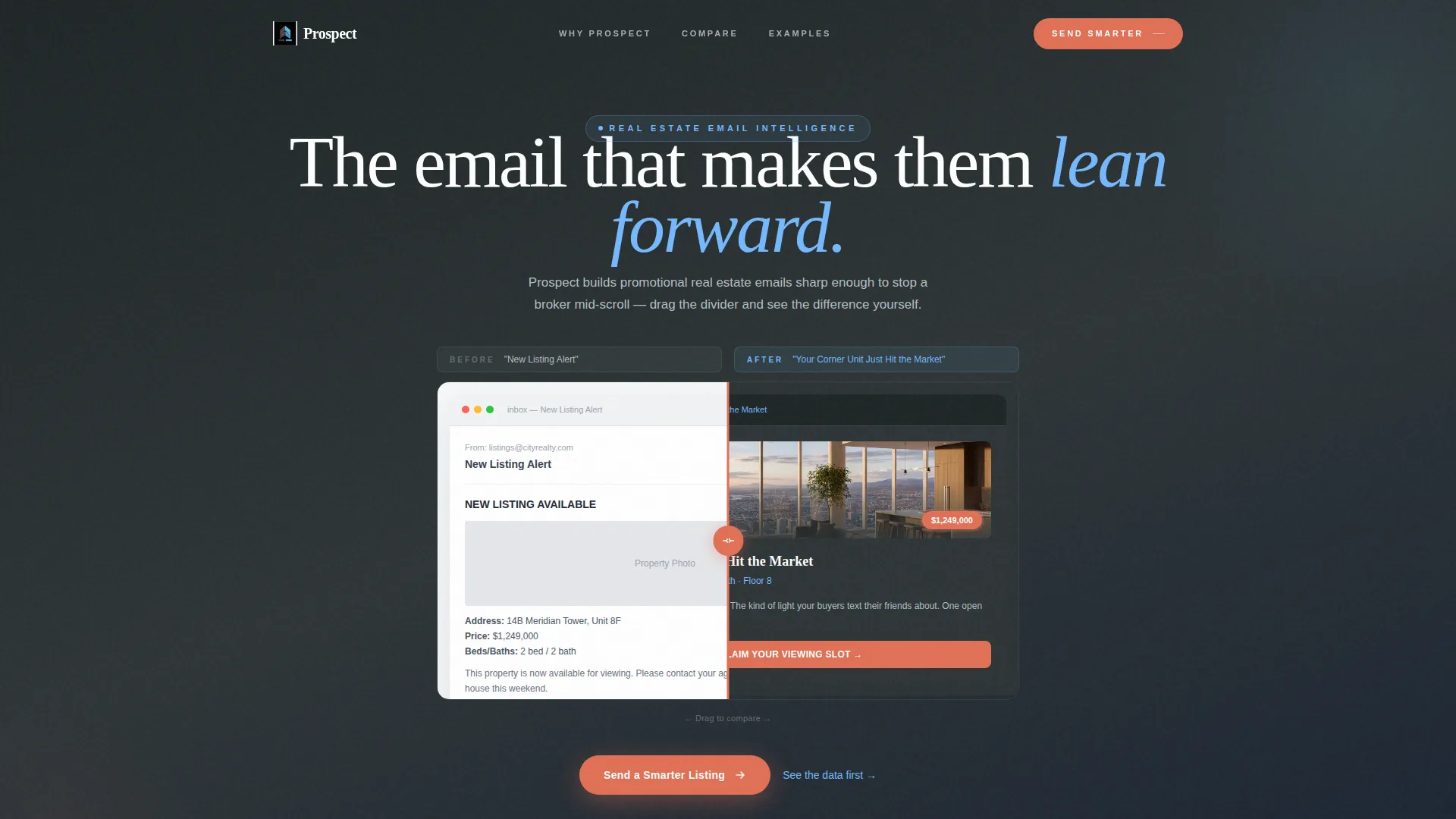
- An interactive split-screen header with a draggable Before/After divider and animated email preview
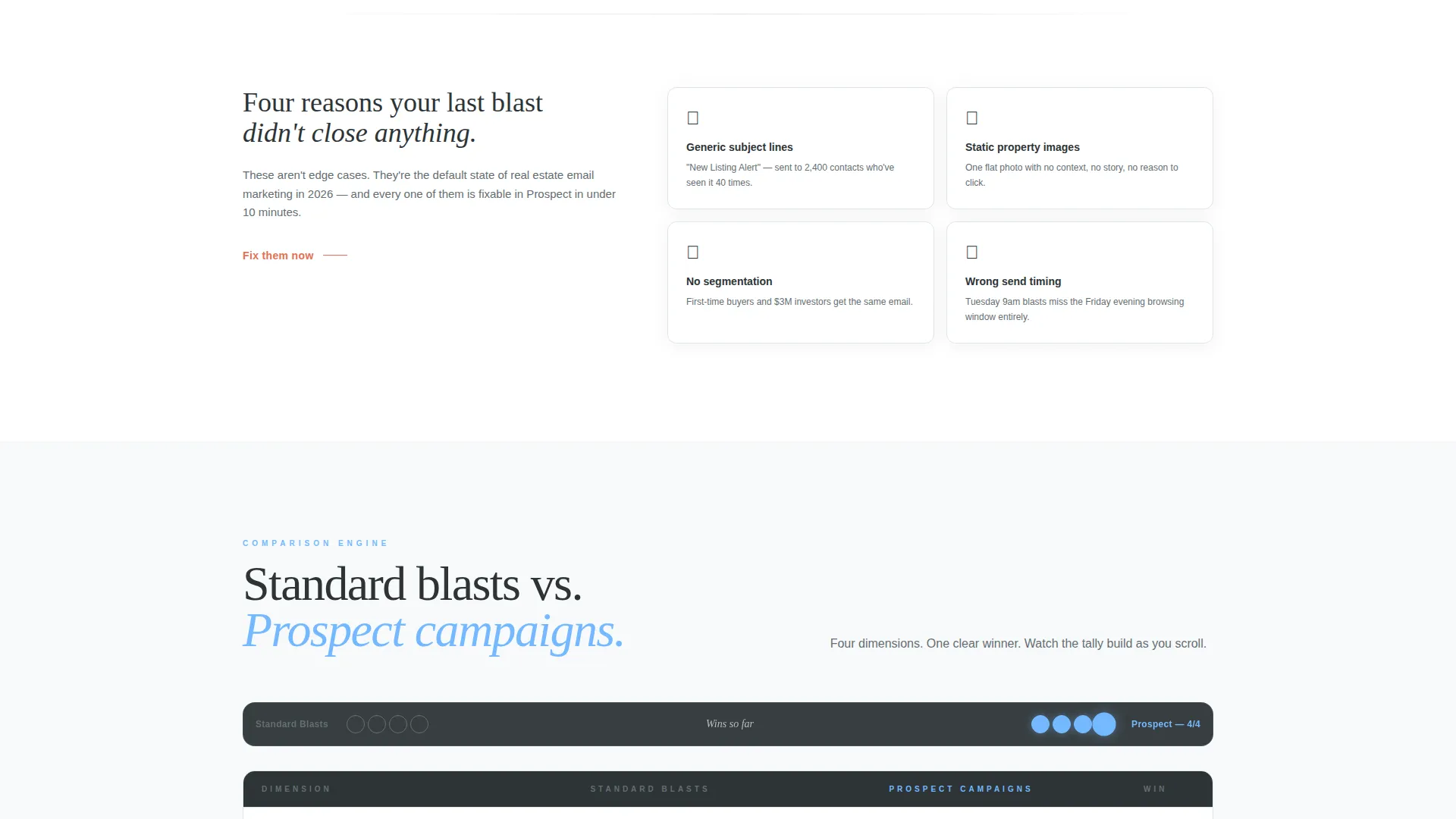
- A scroll-driven comparison engine with a sticky bar that tracks Standard Email Blasts versus Prospect-Built Campaigns
- A primary call-to-action form paired with a secondary lead magnet path for research-stage visitors
Feature list
This template ships with a focused set of interactive and visual components drawn directly from the design brief. Each one serves the conversion narrative.
Draggable Before/After Header
The header splits the viewport in two. The left side shows a flat, generic real estate email. The right side shows an animated, design-forward version with parallax property images and pulsing price badges. A draggable divider lets visitors move between the two states in real time, making the value difference visceral before any copy is read.
Scroll-Driven Industry Report Layout
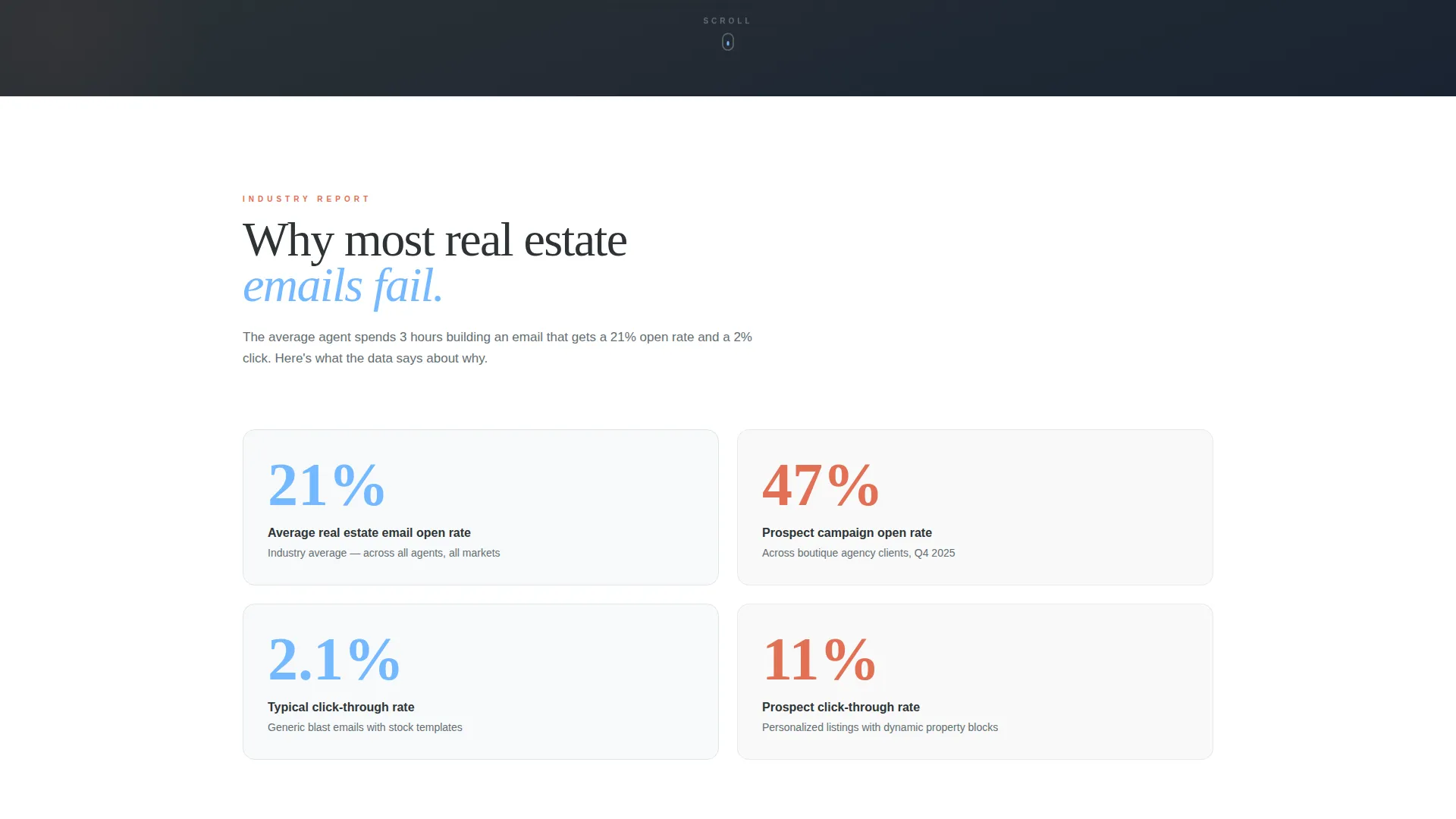
The page unfolds like a data-driven white paper. Each section pairs a hard performance stat on the left with a live email specimen on the right. Charts animate on scroll, email mockups rotate through seasonal campaigns, and pull-quotes from agents ground every claim in practical credibility.
Sticky Comparison Bar
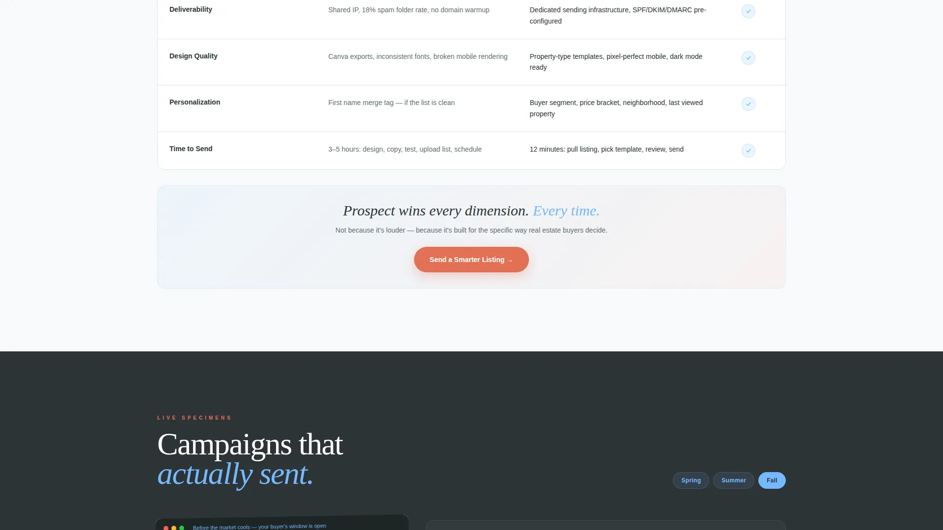
A persistent comparison bar follows the visitor as they scroll. It tracks wins across deliverability, design quality, personalization depth, and time-to-send, building a running case for why campaign-built emails outperform standard blasts.
Two-Field Qualifying Form
The primary call-to-action form collects work email and monthly send volume. Keeping the form to two fields reduces friction while the volume question immediately signals intent level, helping the sales team segment and prioritize follow-up.
Secondary Lead Magnet Path
Visitors who are not ready to commit can download the 2024 Real Estate Email Benchmark Report. This secondary path captures research-stage visitors and creates a return opportunity for buyers who need more time before deciding.
Dynamic Motion Theme
Animated chart reveals, rotating email mockup carousels, and smooth scroll transitions are built into the page rhythm. Motion is purposeful and tied to the narrative, not decorative. Every animation reinforces a content point rather than simply filling space.
Page sections overview
| Section | Purpose |
|---|---|
| Interactive Preview Header | Show Before/After email transformation with a draggable divider |
| Subject Line Contrast | Make copy quality difference visible above the fold instantly |
| Why Emails Fail | Open the problem narrative with real performance context |
| Stat and Specimen Pairs | Pair hard metrics with live email examples on scroll |
| Agent Pull-Quotes | Ground performance claims in real-world credibility |
| Animated Chart Section | Visualize open rates, click benchmarks, and conversion windows |
| Comparison Engine | Pit standard blasts against campaign-built emails side by side |
| Sticky Comparison Bar | Track running wins as visitors scroll down the page |
| Primary call to action Form | Capture work email and monthly send volume for qualification |
| Lead Magnet Path | Offer benchmark report download for research-stage visitors |
Design & branding system
The Slate & Sky color system gives this template a rooftop-terrace energy at golden hour. Deep charcoal slate dominates backgrounds and body text, keeping the page grounded and editorial. Sky blue activates headers and metric highlights, while penthouse-sunset coral appears only on calls to action and hover states.
- Slate (#2D3436) for backgrounds and body text, cloud-ceiling gray (#DFE6E9) for secondary surfaces, open-sky blue (#74B9FF) for headers and data highlights
- Coral (#E17055) is reserved strictly for call-to-action buttons and interactive hover states
- The Dynamic Motion theme layers scroll-triggered animations, parallax image scrolling, and badge pulse effects to keep the page alive without overloading the visitor
Mobile & speed optimization
The split-screen layout and motion elements are designed to translate cleanly to smaller viewports. The 50/50 structure stacks responsively, and animation complexity scales appropriately for mobile reading contexts.
- The draggable divider interaction adapts to touch input on mobile devices
- Animated sections are structured so they remain readable and functional when motion is reduced or the viewport is narrow
- The two-field form is minimal by design, reducing load and input friction on any screen size
How this template helps you convert
Every structural decision in this template is tied to a specific conversion moment. The page does not just look good; it builds a case from the first scroll to the final form field.
- The Before/After header creates an immediate emotional hook. Visitors feel the difference before they read a headline, which builds curiosity and forward momentum without relying on copy alone.
- The scroll narrative escalates from problem to proof to solution, mirroring how a persuasive sales conversation unfolds. By the time the comparison engine resolves, the visitor has already formed a preference.
- The dual-path call to action captures both the ready buyer with the two-field form and the research-stage visitor with the lead magnet, so no qualified traffic leaves the page empty-handed.
Other information about this template
This template is built for real estate email marketing services that need a landing page as polished as the campaigns they sell. It sits at the intersection of the Technology category and the Real Estate Email Templates subcategory, making it relevant for both marketing technology buyers and property industry professionals.
- The template style is Split Screen (50/50), meaning each content section presents two perspectives simultaneously rather than stacking them sequentially
- The creative direction follows an Industry Report format, giving the page authority and depth that typical service landing pages lack
- The header concept is an Interactive Preview, which is a relatively rare pattern in real estate marketing tools and immediately signals a higher level of product sophistication
- The Comparison/Versus landing-page direction is designed to resolve objections before they are spoken, making it particularly effective for buyers comparing this service against doing email marketing in-house
Theme
Dynamic Motion
Creative direction
Industry Report
Color system
Slate & Sky
Style
Split Screen (50/50)
Direction
Comparison/Versus
Page Sections
Draggable Before/after Email Preview
Scroll-driven Report Narrative
Sticky Comparison Bar
Two-field Qualifying Form
Secondary Lead Magnet Path
Dynamic Motion Theme
Related questions
Who is this landing page template designed for?
Can I customize the color system and copy?
What makes the header different from a standard hero section?
Does the template include both a primary and a secondary conversion path?
Is this a single-page template or a multi-page website?



