Data & Analytics Professional Website Template
The Ingest bold brutalist data warehouse landing page template is a bento grid landing page built for data infrastructure platforms. It leads with live stats, an interactive SQL console, and a stats-first scroll flow. The design embraces raw, high-contrast brutalism to communicate speed, cost, and reliability to data engineers, analytics leads, and CTOs without a single wasted word.
by Rocket studio
Quick summary
Ingest is a single-page brutalist landing page template built for data warehouse and lake platforms. It opens with a functioning bento grid that displays live throughput numbers, query latency, and storage costs before the visitor scrolls once. Every section after that drops a bold metric at full viewport scale, then earns it with proof. The result is a landing page that feels like product documentation and a sales argument at the same time.
Who this template is for
This template is purpose-built for technical go-to-market teams promoting data infrastructure products. It speaks directly to buyers who distrust marketing gloss and want to see numbers first. The brutalist website aesthetic signals honesty before a single sentence of body text is read.
- Data engineers who need to see pipeline reliability metrics, DAG recovery stats, and ingestion throughput before they trust any platform claim.
- Analytics leads evaluating query performance and cost-per-TB against existing Spark or legacy warehouse spend.
- CTOs who need to justify infrastructure decisions to a board and want a landing page that leads with defensible numbers.
What problem this template solves
Technical audiences skip past polished hero sections. They scroll for specs, benchmarks, and cost comparisons. Most landing page templates are built for conversion-first consumer products, not for infrastructure platforms where the audience reads before they click. This template solves that mismatch.
- Visitors abandon landing pages that lead with brand promises instead of evidence. This template opens with live metrics inside an interactive bento grid.
- Data buyers do not trust gradients and stock photography. The raw, high-contrast brutalist design signals technical honesty from the first pixel.
- Teams waste development time building custom proof sections. This template provides pre-structured stat reveal sections, a cost comparison grid, and a governance bento out of the box.
What you get with this template
The template delivers a complete, single-page bento grid layout with five major content zones and a developer-minimal footer. Every section is pre-wired for stats-first content. The design system is fully defined, so your team can focus on plugging in real numbers rather than making visual decisions.
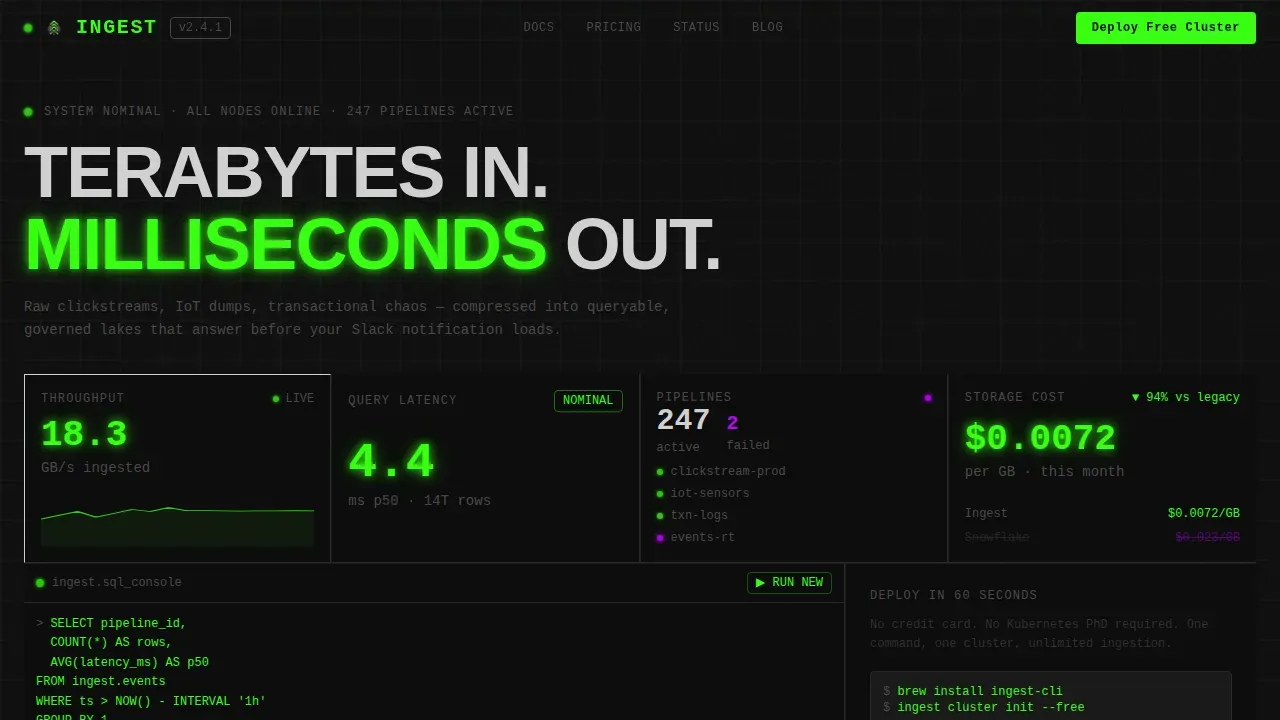
- An interactive hero bento grid with expandable tiles, live-updating stat displays, and a draggable SQL console that renders a mock result set.
- Five pre-built scroll sections covering speed, cost, reliability, governance, and a primary call-to-action tile with OS-detection routing.
- A design system based on void black, phosphor green, ultraviolet highlight, and aluminum gray, with JetBrains Mono for metrics and Manrope for body text.
Feature list
This template ships with a defined set of visible, prompt-backed features. Each one serves a specific function in the conversion flow.
Interactive Hero Bento Grid
The header is not a hero image. It is a functioning bento grid that acts as the product itself. Tiles display live-updating stats including ingestion throughput in gigabytes per second, query latency in milliseconds, active pipelines, and storage cost per terabyte. Visitors can click tiles to expand them, drag a simulated SQL query into a console tile, and watch a mock result set render. The interface runs in the browser before a visitor scrolls a single pixel.
Stats-First Scroll Sections
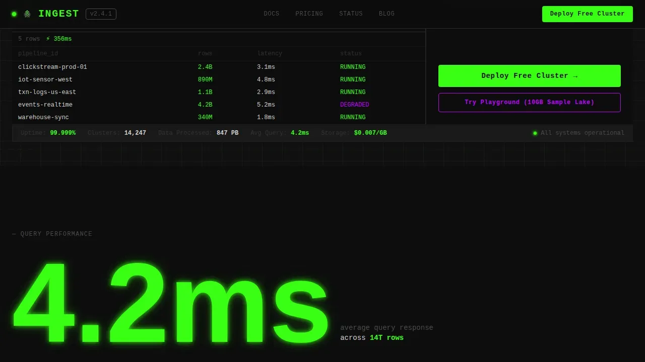
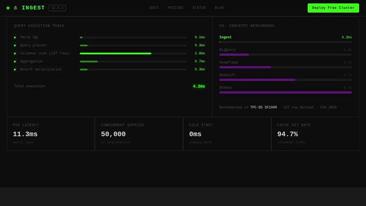
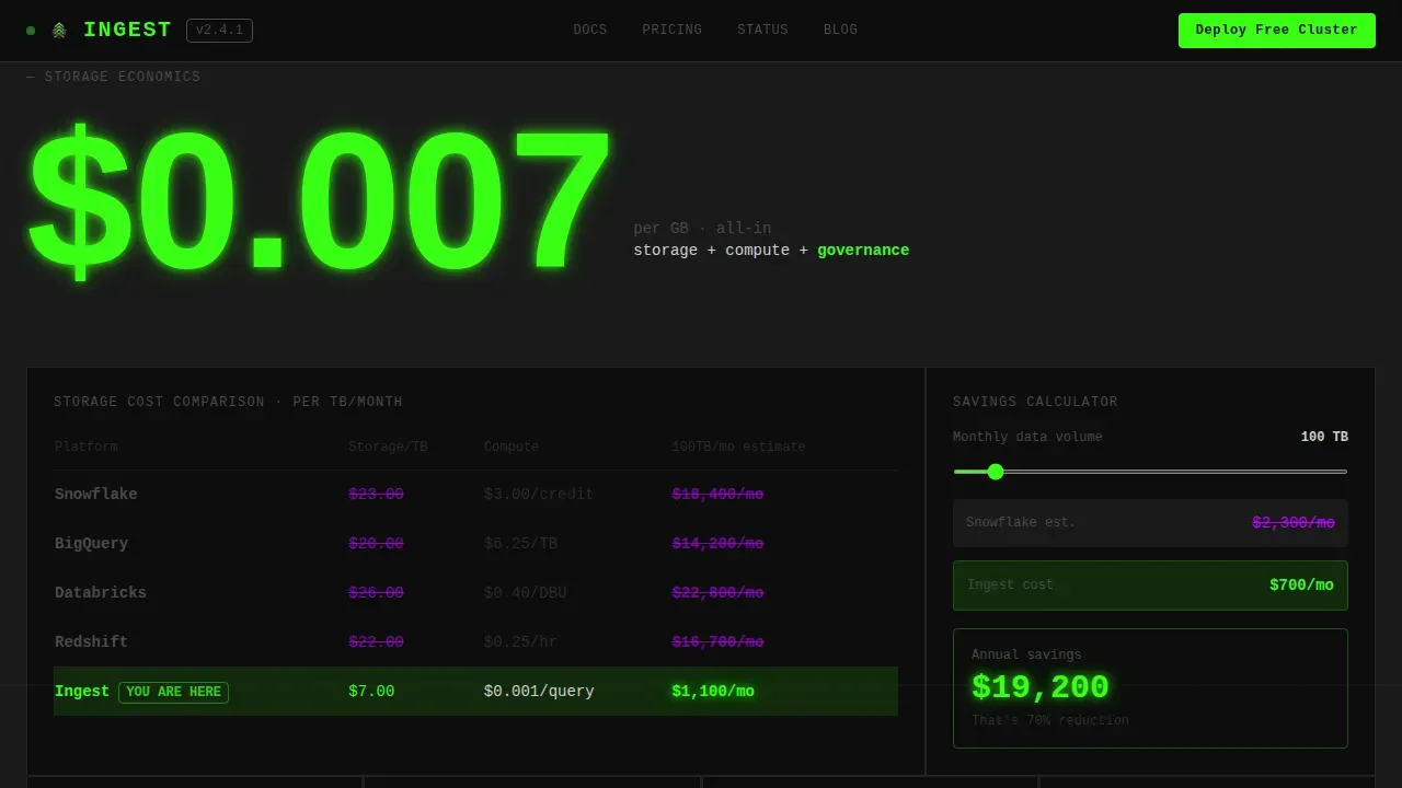
Each scroll depth opens with a bold metric at full viewport scale. "4.2ms" appears first, then the explanation materializes: average query response across 14 trillion rows. The next section hits with "$0.007/GB" followed by a competitor pricing grid. Every section escalates the proof, moving from speed to cost to reliability to governance. This structure keeps cognitive load low by giving users one number to anchor each idea.
Cost Comparison Grid
The cost section renders a side-by-side pricing table comparing storage costs against legacy warehouse pricing. The brutalist layout uses stark typography, visible gridlines, and sharp-edged boxes with no hidden borders or soft shadows. The numbers do the persuading; the design simply makes them impossible to ignore.
Governance and Compliance Bento
The governance section is its own bento grid showing compliance tiles, a data lineage graph, and access control indicators. This gives CTOs a visual description of governance posture without a wall of paragraph text. Each tile is an honest, direct display of a platform capability.
OS-Detection Call to Action
The primary call to action reads "Deploy Your Free Cluster" and routes visitors to the correct package manager command based on their operating system, covering brew, apt, and Docker pull, or a direct binary download. A secondary path offers "Try the Playground," a zero-install browser sandbox pre-loaded with a 10-gigabyte sample lake. Both paths are visible in the final bento tile on desktop and in a persistent bar on mobile.
Developer-Minimal Footer
The footer follows a developer-minimal style, keeping links raw and functional. No decorative elements, no gradients, no soft rounded corners. The footer is honest to the design ethos of the entire page: visible structure, clear hierarchy, nothing hidden.
Page sections overview
| Section | Purpose |
|---|---|
| Interactive Hero Bento | Live stats, SQL console, expandable tiles as the product pitch |
| Speed Proof Section | Full-viewport "4.2ms" stat with query performance context |
| Cost Comparison Section | "$0.007/GB" metric with legacy pricing comparison grid |
| Reliability Section | "99.999%" uptime stat with pipeline health and SLA context |
| Governance Bento Section | Compliance tiles, lineage graph, access control display |
| Primary call to action Tile | "Deploy Your Free Cluster" with OS-detection routing |
| Developer Footer | Minimal link structure, no decorative elements |
Design & branding system
The design system is rooted in brutalism: function before form, honesty before polish. Web design brutalism uses raw structure, visible construction, and bold contrasts to communicate transparency. This template takes that idea from brutalist architecture and applies it to a data platform landing page with precision.
- The color system uses void black (#0D0D0D) as the dominant background, phosphor green (#39FF14) for live data and primary actions, ultraviolet (#BF00FF) for hover states and critical metrics, and aluminum gray (#D0D0D0) for grid lines drawn like rebar through raw concrete.
- Typography uses JetBrains Mono for all metric displays and code elements, and Manrope for headings and body text. Bold typography appears at full viewport scale for each stat reveal. Stark typography in the bento grid reinforces the "under-the-hood" aesthetic without decoration.
- Visuals are intentionally flat and unadorned. Gradients, shadows, and rounded corners are absent by design. Images in the template resemble raw technical diagrams rather than polished photography.
Mobile & speed optimization
The template is designed desktop-first because data engineers work on large monitors and the SQL console needs horizontal space. Mobile layouts are responsive and retain the full content hierarchy, with the call to action surfaced in a persistent bottom bar so the conversion path is always visible.
- The persistent mobile bottom bar keeps "Deploy Your Free Cluster" and "Try the Playground" visible at every scroll depth without interrupting the reading flow.
- The design uses minimal CSS and avoids heavy images, which keeps the pages lean. Animations include live counter updates, bento tile expand interactions, scroll-triggered stat reveals, blinking LED indicators, and phosphor glow pulses on active elements.
- Client components handle the interactive bento grid and SQL console. Server components cover all static sections, keeping the site architecture clean and development-friendly.
How this template helps you convert
The conversion strategy is built on product exposure before the ask. Brutalist landing pages are designed to build product desire before presenting a call to action, and this template follows that principle with discipline. Every section earns the next one.
- The interactive hero bento grid lets visitors touch the product immediately. They see real throughput numbers, run a mock SQL query, and get a result in under 400 milliseconds. The product earns trust before a single marketing claim appears.
- The stats-first scroll sequence stacks proof section by section, moving from speed to cost to reliability to governance. Each number is introduced at full scale, then given context. By the time visitors reach the final bento tile, the case is already made.
- The OS-detection call to action removes friction at the moment of decision. Visitors get the exact install command for their environment, or they can try the browser sandbox with zero setup. Both paths are visible, neither requires a form.
Other information about this template
This template sits at the intersection of several current design trends: neo brutalism, brutalist web design principles, and the growing movement toward raw, functional web aesthetics in the developer tools space. It is well suited for data infrastructure brands, creative agency teams building for technical clients, and independent designers who need a portfolio-ready example of brutalism applied to a real product category.
- Neo brutalism adds character and personality on top of classic brutalism. This template leans toward classic web brutalism in its color system while using neo brutalism in its interactive tile behaviors and phosphor glow animations. The result is a brutalist website that feels alive without becoming decorative.
- Brutalism is not suited for every brand. It requires careful consideration of the audience. For data platforms, the raw concrete aesthetic and high contrast layout signal the same values the product itself is meant to deliver: honesty, directness, and raw power.
- The template is a strong portfolio example for designers exploring web design brutalism applied to business-to-business SaaS. It demonstrates how stark typography, exposed grid structures, and honest color systems can create a brutalist landing page that converts without compromising on design integrity.
- Key takeaways for teams evaluating this template: the bento grid layout is the pitch, the stats are the copy, and the design style ensures that every element on the page earns its place by serving a clear function.
Theme
Bold Brutalist
Creative direction
Stats-First Impact
Color system
Acid Digital
Style
Bento Grid
Direction
App Download
Page Sections
Interactive Bento Hero Grid
Stats-first Scroll Sections
Competitor Cost Comparison Grid
Governance and Compliance Bento
Os-detection Call to Action
Developer-minimal Footer
Related questions
Can I replace the mock stats with real live data from my platform?
Is this template suited for a creative agency building a client site?
What fonts are used and can I change them?
Does the OS-detection call to action require backend configuration?
Can I use this template for a portfolio page instead of a data platform?



