DataOps Technology Professional Website Template
Dataflow is a dark-themed, modular landing page template built for DataOps research labs. It features an interactive Feature Tab Switcher hero, a drag-and-compare versus card grid, and a gated benchmark form. Designed for principal engineers and data platform leads, it lets visitors experience pipeline orchestration, lineage tracing, and observability side by side before committing to a conversation.
by Rocket studio
Quick summary
Dataflow is a single-page, card grid landing page template for a DataOps research lab. It opens with a three-tab hero that visualizes orchestration, lineage, and observability in real time. The body runs a modular versus grid where visitors drag, click, and toggle to compare pipeline resilience at increasing failure complexity. Every third card row ends with a primary call to action.
Who this template is for
This template is built for technically sophisticated teams who need to communicate infrastructure value to equally technical buyers. It works best when the audience already lives inside the stack and needs proof, not persuasion.
- Principal engineers who debug cascade failures and need to show concrete recovery-time data
- Data platform leads building internal business cases for infrastructure rewrites
- Machine learning teams whose models keep training on stale data because pipeline ownership is unclear
What problem this template solves
Petabyte-scale data systems fail quietly. Jobs rot, schemas drift, and nobody owns the directed acyclic graph (DAG) until 2 AM. The real problem is not just the failure itself but the inability to show stakeholders the cost of staying with legacy tooling.
- Static feature lists and slide decks do not convince engineers who can read the logs themselves
- Competitor comparisons buried in PDFs lose the audience before the point lands
- Generic infrastructure pages fail to separate signal from noise for time-poor technical buyers
What you get with this template
The template ships as a fully structured, single-page layout with every section, interaction pattern, and visual component already in place. You get a design system and a content architecture built to move a skeptical engineer from curiosity to benchmark request.
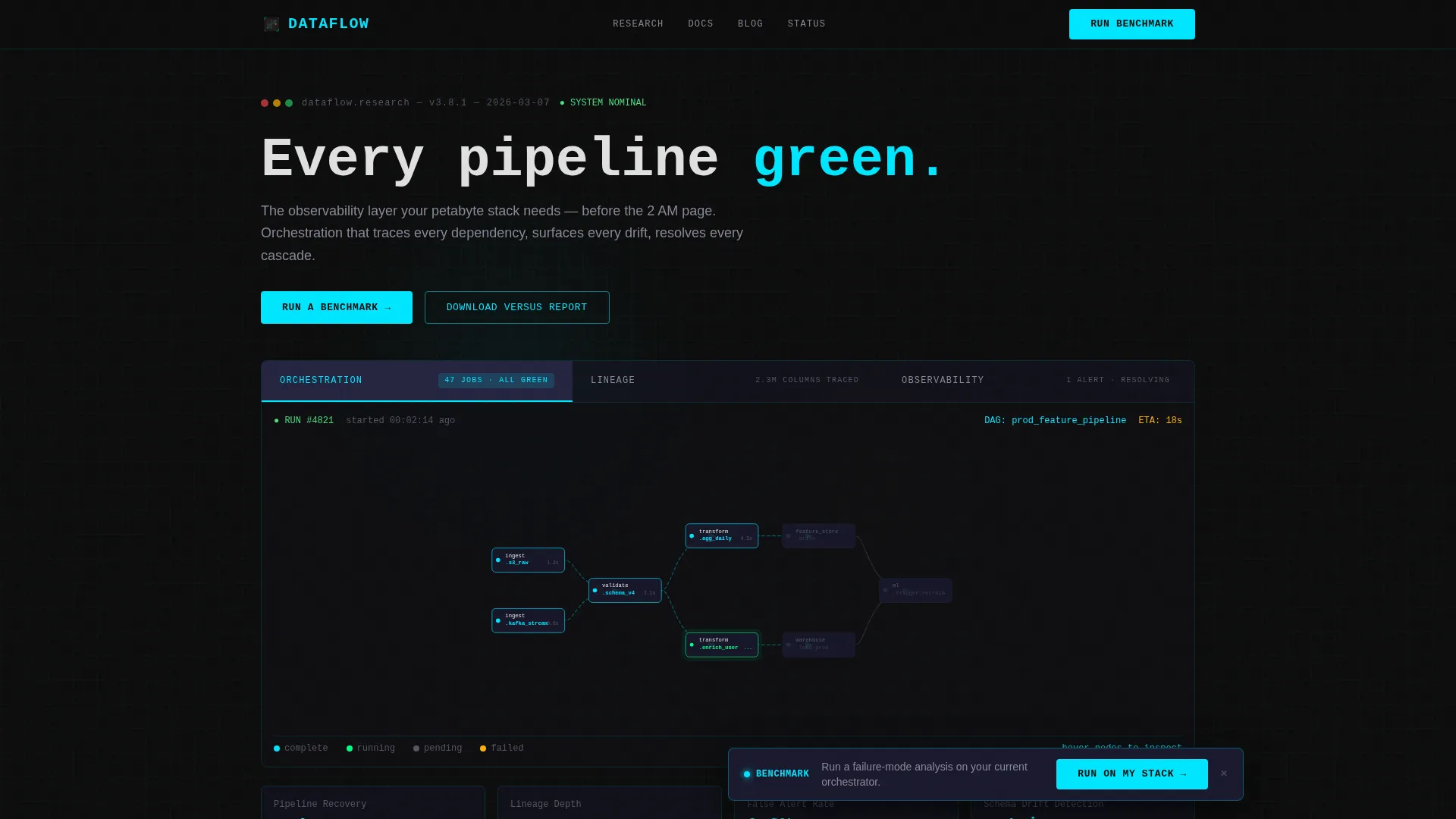
- A three-tab hero with animated DAG, column-level lineage graph, and anomaly detection dashboard
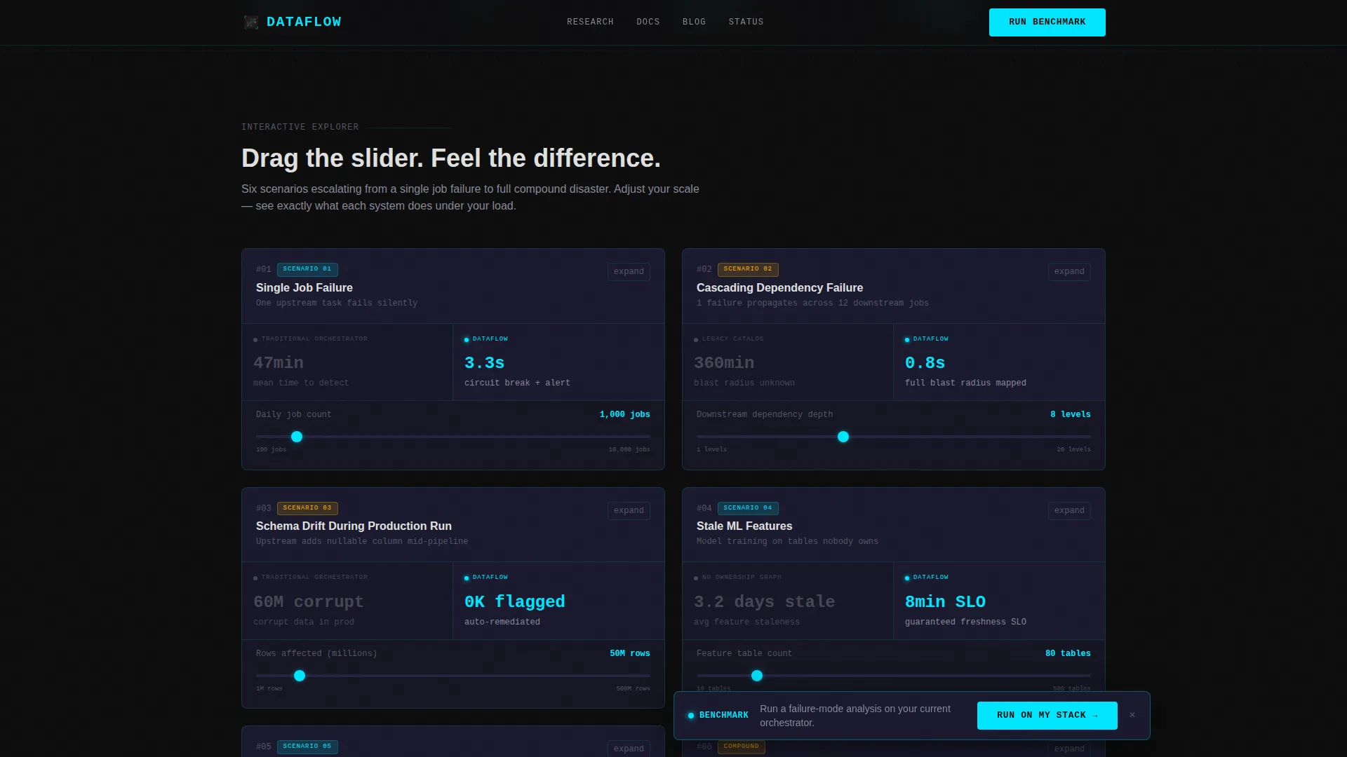
- A modular versus card grid with drag sliders, clickable nodes, and toggleable failure scenarios
- A floating benchmark call-to-action bar, a gated benchmark form, and a lower-commitment report download exit
Feature list
This template includes purpose-built interactive features grounded in how data engineers actually evaluate infrastructure tools.
Three-Tab Feature Hero
The hero uses a Feature Tab Switcher with three labeled tabs: Orchestration, Lineage, and Observability. Each tab reveals a distinct live-data visualization. Tabs switch with a vertical wipe transition, not a fade, so the experience feels like flipping between monitoring panes rather than browsing a marketing site.
Animated DAG Visualization
The Orchestration tab renders an animated directed acyclic graph where nodes pulse green as jobs complete. This gives visitors an immediate, visceral read on system health without requiring any explanation from surrounding copy.
Column-Level Lineage Graph
The Lineage tab displays a column-level dependency graph. Visitors hover over nodes to trace upstream dependencies in real time. This interaction lets data platform leads demonstrate lineage depth to skeptical stakeholders directly on the page.
Real-Time Observability Dashboard
The Observability tab shows a live anomaly detection dashboard with sparklines, service-level objective (SLO) gauges, and a single amber alert that resolves itself during the visitor's session. The self-resolving alert is a deliberate narrative device.
Interactive Versus Card Grid
The main body is a modular card grid where each card is a split comparison. The left half shows a legacy or traditional approach in muted graphite. The right half shows the lab's solution in full cyan-traced interactivity. Visitors drag sliders to compare recovery times and toggle failure scenarios that escalate in complexity across the grid.
Gated Benchmark Form and Report Download
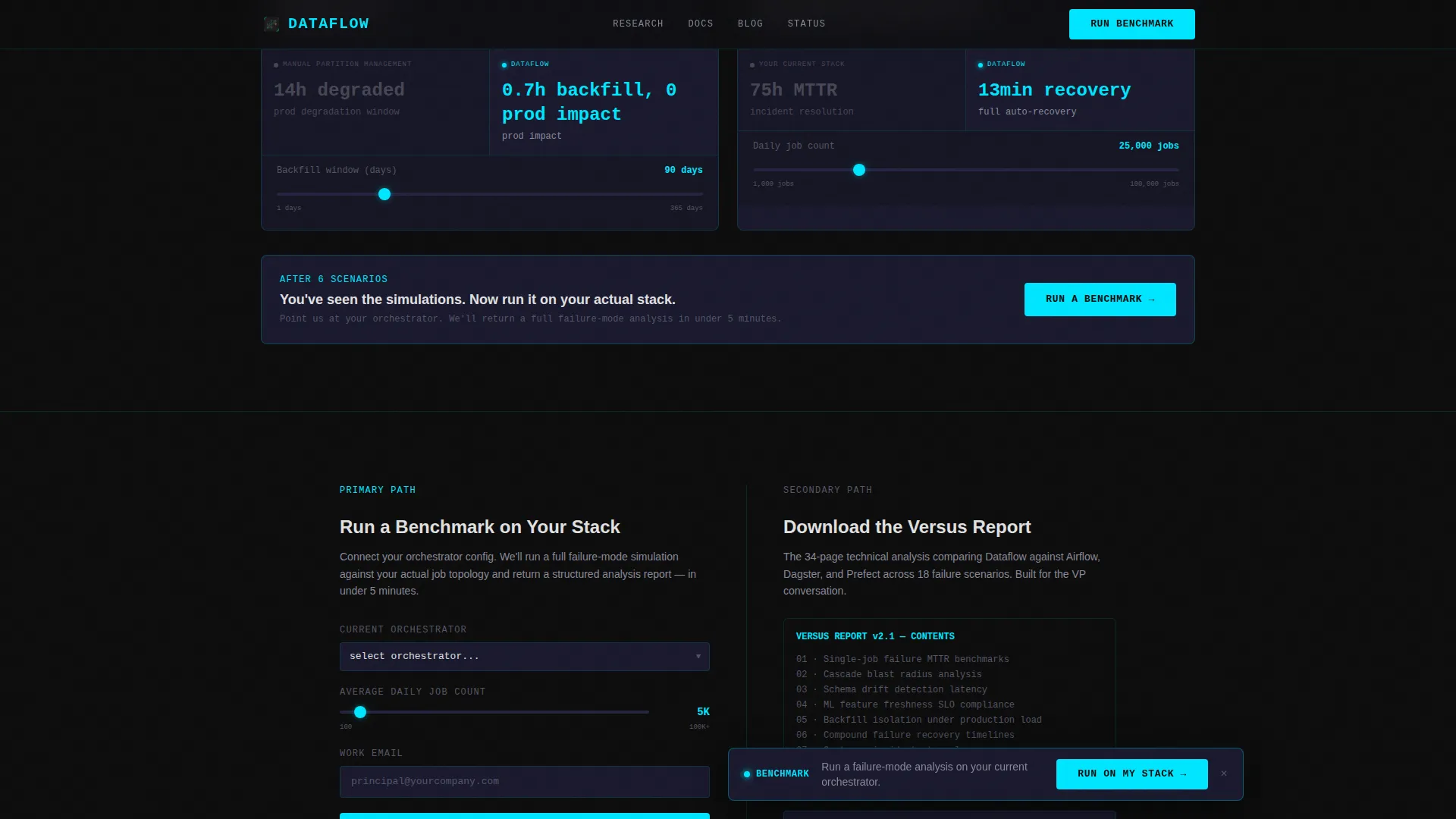
The primary conversion path is a benchmark form asking for current orchestrator, average daily job count, and work email. A secondary path offers a downloadable versus report gated behind email only, giving visitors who are still building internal buy-in a lower-commitment exit.
Page sections overview
| Section | Purpose |
|---|---|
| Feature Tab Hero | Showcase Orchestration, Lineage, Observability tabs |
| Versus Card Grid | Interactive competitor comparison across failure scenarios |
| Floating call to action Bar | Pin benchmark prompt after sixth card |
| Benchmark Form | Capture orchestrator type, job count, and email |
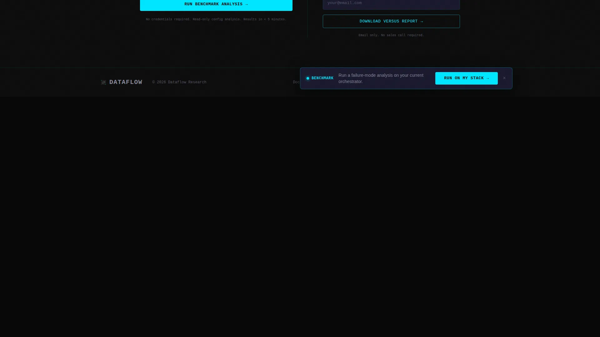
| Report Download call to action | Lower-commitment exit for early-stage visitors |
| Developer Minimal Footer | Lightweight close consistent with technical audience |
Design & branding system
The visual identity follows a Data Command theme built around a Carbon Fiber color system. Every color decision is functional. Nothing is decorative. The palette reads like the interior of a server rack at night, with matte dark surfaces marked by purposeful status lights.
- Core palette: substrate black (#0D0D0D), woven graphite (#1A1A2E), telemetry cyan (#00E5FF) for interactive borders and hover states, and fault-line amber (#FFB300) reserved exclusively for alerts, warnings, and competitive differentiators
- Typography: JetBrains Mono handles all code elements and metrics; DM Sans handles prose copy for readable contrast between terminal and narrative layers
- Text renders in terminal white (#E0E0E0) against the dark substrate, with cyan tracing interactive borders like signal current running through a circuit board
Mobile & speed optimization
The template is designed desktop-first. Principal engineers reviewing infrastructure tools typically work on large monitors, often late at night. The layout, interactivity density, and typography scale are calibrated for that context.
- Animation layer uses GPU-accelerated transforms and requestAnimationFrame for sparkline rendering to keep interactions smooth at high frame rates
- The card grid is modular, so individual versus cards load and initialize independently without blocking the full page
- Desktop-first priority does not exclude smaller screens; the modular structure supports responsive adaptation for secondary device contexts
How this template helps you convert
This template converts by letting visitors experience the value difference before the lab asks for anything. The interaction sequence is designed to raise stakes progressively, so each touchpoint builds rather than interrupts intent.
- The Feature Tab Switcher gives visitors an immediate, interactive signal of system health, establishing credibility in the first seconds without a single marketing claim
- The versus card grid escalates from simple job-failure comparisons to compound schema-drift scenarios, making the cost of legacy tooling tangible and specific before the benchmark call to action appears
- The dual conversion path (benchmark form for ready buyers, versus report download for visitors still building buy-in) ensures the page captures intent at both stages of the evaluation cycle
Other information about this template
The Dataflow template sits at the intersection of DataOps infrastructure marketing and high-interactivity technical landing pages. It is a strong fit for teams evaluating alternatives to traditional orchestrators and needing a credible, demo-quality web presence.
- The footer follows a GitHub Developer Minimal pattern, keeping the close understated and consistent with a developer-native audience
- Social proof is embedded directly inside comparison cards as concrete metrics: recovery time, lineage depth, and SLO compliance figures
- The versus grid is structured to escalate scenario complexity: single job failure, cascading dependency failure, then schema drift during a production run
- The benchmark form dropdown includes Airflow, Dagster, Prefect, and an Other option to cover the full range of common orchestrator contexts
Theme
Data Command
Creative direction
Interactive Explorer
Color system
Carbon Fiber
Style
Card Grid (Modular)
Direction
Comparison/Versus
Page Sections
Three-tab Feature Hero Switcher
Animated DAG with Node Pulses
Hover-traceable Lineage Graph
Live Anomaly Detection Dashboard
Interactive Versus Card Grid
Dual Conversion Path with Benchmark Form
Related questions
Who is this landing page template designed for?
Can I adapt the versus card grid to show my own comparison metrics?
What is the primary call to action on this landing page?
Is there a lower-commitment conversion option for visitors not ready to benchmark?
What interaction and animation features does this template include?



