Fashion Rental & Resale Professional Website Template
Deadstock is a bold brutalist landing page template built for sneaker resale platforms. It pairs an obsidian and gold visual identity with a scroll-driven seasonal narrative that turns missed drops into upgrade motivation. Designed for collectors, resellers, and consignment platforms, it guides visitors from cultural proof to a frictionless three-tier upgrade path.
by Rocket studio
Quick summary
Deadstock is a storybook single-page landing page template built for the sneaker resale and consignment market. Its bold brutalist design uses void black, anthracite gray, and molten gold to make every product moment feel premium. The scroll structure is built around cultural drop moments, not feature lists, and the entire page is engineered to make upgrading feel inevitable.
Who this template is for
This template is built for operators in the sneaker resale space who need a landing page that commands attention and earns trust fast. The audience is confident, culturally fluent, and accustomed to premium presentation.
- Sneaker resale platform founders who offer tiered consignment or membership access
- Collectors and resellers scaling from side hustles to full consignment infrastructure
- Marketplace builders targeting hypebeasts and serious rotators hunting exclusive colorways
What problem this template solves
Most resale platforms look like generic storefronts. They list inventory but fail to communicate urgency, exclusivity, or the real cost of being on the wrong tier. Deadstock solves the trust and conversion gap specific to the sneaker market.
- Visitors leave without upgrading because the page never shows what they actually missed
- Generic layouts fail to reflect the premium, vault-level brand that serious collectors expect
- No clear escalation path turns casual browsers into committed, paying members
What you get with this template
You get a complete storybook landing page layout that covers every stage of the buyer journey, from first impression to tier selection. The structure is sequential and intentional, each section earning the next.
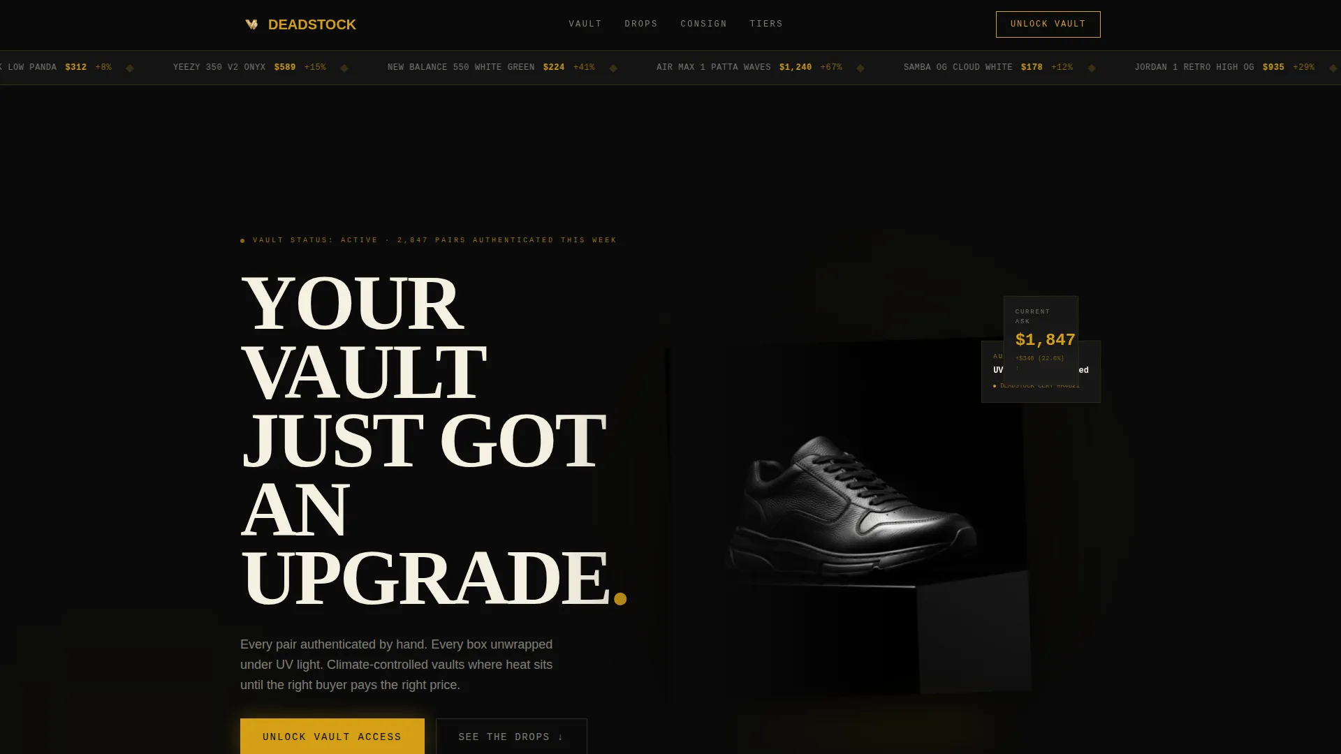
- A dramatic portrait header with a chiaroscuro sneaker hero shot and oversized brutalist headline
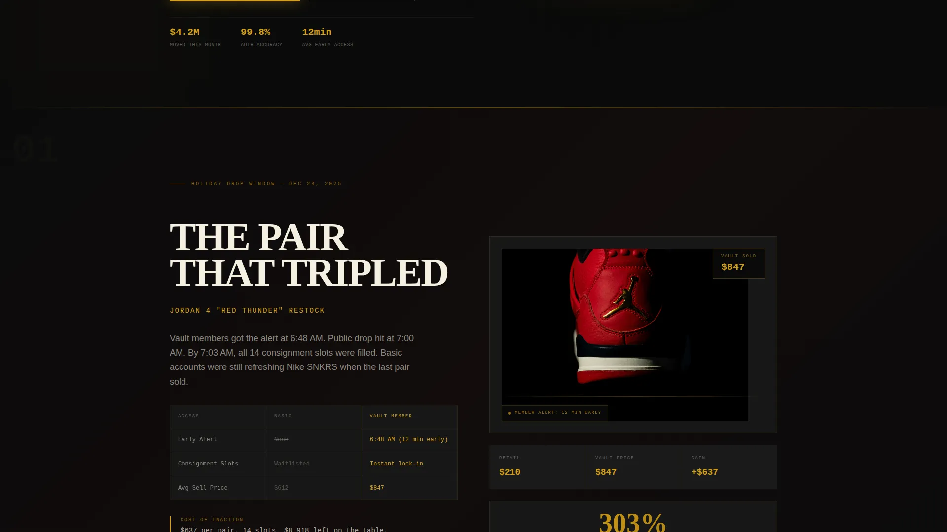
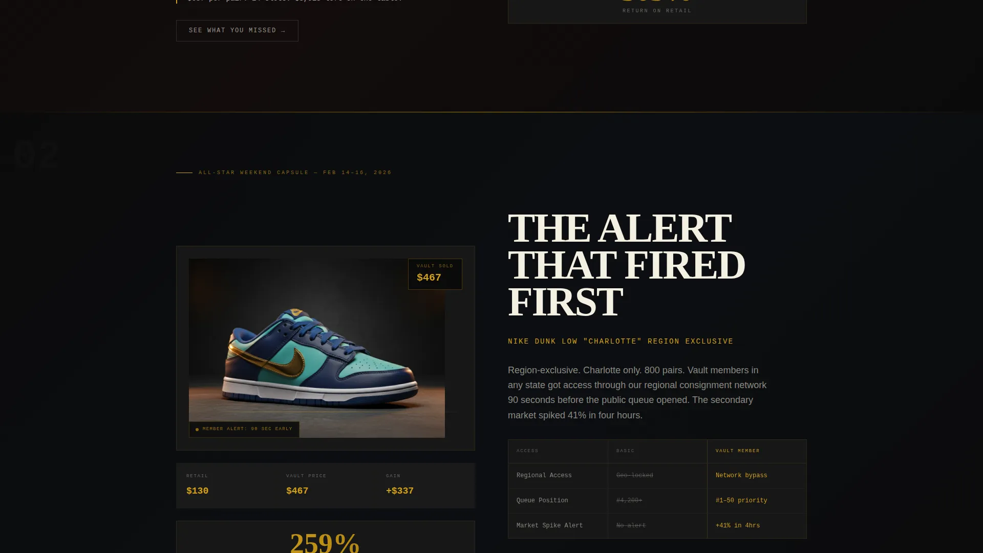
- Seasonal drop sections that build proof through missed-opportunity narratives before presenting the upgrade path
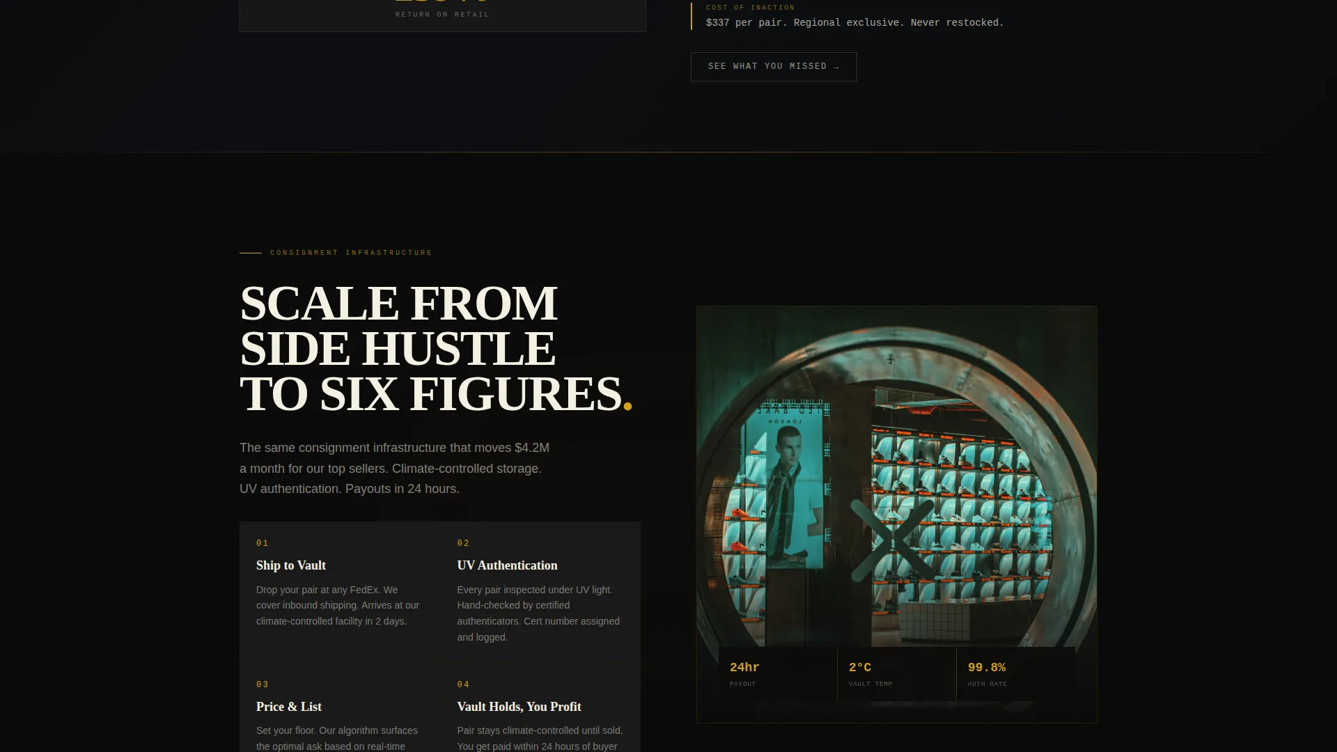
- A three-tier pricing comparison, a pinned upgrade call to action, and a modal that reveals blurred transaction data only on higher plans
Feature list
This template comes with a set of purpose-built layout components designed specifically for sneaker resale conversion. Each feature reflects a deliberate structural or visual decision tied to how this market thinks and buys.
Chiaroscuro Portrait Header
The full-viewport header places a single sneaker in dramatic side lighting against obsidian space. The shoe fills the frame from sole to toe, with sharp leather texture detail and a cream brutalist headline kerned tight above it. Gold punctuation replaces the period to signal value from the first second.
Seasonal Drop Story Sections
The page scrolls through cultural moments rather than feature bullets. Each full-page section represents a real drop window, such as a holiday release, an All-Star Weekend capsule, or a back-to-school liquidation wave. Every section shows what free-tier users missed versus what upgraded members accessed early.
Pinned Upgrade Call to Action
After the second section scroll, a persistent call to action reading "Unlock Vault Access" locks to the bottom of the viewport in gold on black. It stays visible throughout the remaining scroll, keeping the upgrade decision always within reach without interrupting the content flow.
Missed-Drop Modal
A secondary call to action labeled "See What You Missed This Month" opens a modal overlay showing real transaction data from the current month. Prices appear blurred for lower-tier visitors and sharpen only when the user selects an upgraded plan, making the value gap visible and personal.
Three-Tier Pricing Layout
The upgrade path presents three membership tiers side by side. This section appears only after the seasonal proof sections have run their full narrative arc, so the visitor arrives at pricing already aware of the cost of inaction. The form requires only a tier selection and card confirmation.
Obsidian and Gold Design System
Gold appears exclusively where money moves: price tickers, upgrade badges, call-to-action borders, and hover states. Cream type handles all primary headlines. Anthracite gray surfaces cards and secondary containers. The color logic is strict and functional, not decorative.
Page sections overview
| Section | Purpose |
|---|---|
| Portrait Hero Header | Establish premium brand tone and headline the vault concept |
| Holiday Drop Moment | Show a seasonal release window and the access gap between tiers |
| All-Star Weekend Capsule | Demonstrate a high-value cultural moment that rewarded upgraded members |
| Back-to-School Wave | Illustrate a liquidation cycle and consignment timing advantage |
| Missed-Drop Modal Trigger | Prompt visitors to see blurred transaction data and feel the access gap |
| Three-Tier Pricing | Present membership options after the proof narrative is complete |
| Pinned Vault call to action | Keep the upgrade action visible throughout the scroll journey |
Design & branding system
The visual identity is built on a strict obsidian and gold palette where every color choice serves a functional role. The brutalist typographic style uses tight kerning, oversized cream headlines, and zero decorative flourishes so the product always sits at the center of attention.
- Void black (#0B0B0B) fills full viewport sections; anthracite gray (#1A1A1A) surfaces card containers; cream (#F5F0E1) is reserved for headline type only
- Molten gold (#D4A017) appears exclusively on price tickers, upgrade badges, call-to-action borders, and hover states, never on body copy
- The overall aesthetic is described as a velvet-lined safe deposit box under a single overhead bulb, everything receding so the product glows
Mobile & speed optimization
The storybook full-page layout is structured for vertical scroll on any screen size. The portrait header composition is naturally suited to phone viewports, and the sequential section flow keeps the hierarchy intact as screen width changes.
- Full-viewport sections and portrait-oriented hero imagery translate directly to mobile without cropping or recomposition
- The pinned call-to-action bar is designed to sit at the bottom of the screen, matching the natural thumb zone on mobile devices
- Modal overlays and tier comparison panels are laid out to reflow cleanly on smaller screens
How this template helps you convert
The conversion strategy is baked into the scroll sequence itself. The page never asks for the upgrade until it has already shown the visitor what they missed. That sequencing is intentional and directly tied to how sneaker resale buyers make decisions.
- Each seasonal section escalates the cost of inaction, showing the pair that tripled in value, the alert that fired twelve minutes before public, and the consignment slot that sold out in ninety seconds, building urgency before a single price is shown.
- The blurred-price modal creates a personal, real-time demonstration of the access gap, making the upgrade feel like recovering something already lost rather than spending on something new.
- The frictionless tier form, requiring only a plan selection and card confirmation on file, removes every barrier at the exact moment motivation peaks.
Other information about this template
This template is categorized under Fashion and Lifestyle, specifically within the Fashion Rental and Resale subcategory, with a niche focus on sneaker resale platforms. It carries an intersection match score of 13, indicating a high degree of alignment between the design system, creative direction, and the target niche.
- The template style is Storybook and Full-Page, meaning the layout is designed as a single continuous narrative scroll rather than a tabbed or multi-page structure
- The creative direction is Seasonal and Moment-driven, structuring the page around drop calendars and cultural release windows rather than product feature tours
- The header concept is Vertical and Portrait, placing the sneaker as a monolithic subject in full-viewport chiaroscuro lighting
- The landing page direction is Upsell and Upgrade, with every design and copy decision oriented toward moving visitors from a free or basic tier to a paid membership
Theme
Bold Brutalist
Creative direction
Seasonal/Moment
Color system
Obsidian & Gold
Style
Storybook/Full-Page
Direction
Upsell/Upgrade
Page Sections
Chiaroscuro Portrait Hero Header
Seasonal Drop Story Sections
Pinned Vault Upgrade Call to Action
Blurred-price Missed-drop Modal
Three-tier Membership Pricing Layout
Strict Obsidian and Gold Color System
Related questions
Who is this landing page template designed for?
Can I adapt the seasonal sections to match my own drop calendar?
How does the missed-drop modal work in the template?
Does the template include the three-tier pricing section?
Can I use this template if my platform is just getting started?



