Online Skill Courses Specialist FAQ Website Template
Deck is a modular card-grid landing page built for a live presentation design course. It speaks directly to marketing managers, graduate students, and startup founders who need to build better slides fast. A Persona Selector header, FAQ-driven scroll, before-and-after visuals, and a seat-limited registration flow turn anxious visitors into enrolled learners.
by Rocket studio
Quick summary
Deck is a single-page, card-grid template designed for a cohort-based presentation design course. It opens with a Persona Selector, scrolls through FAQ-anchored module cards with before-and-after slide thumbnails, and closes the loop with a live seat counter and a three-field registration form. Every section is built to convert hesitation into enrollment.
Who this template is for
This template is built for course creators, educators, and independent instructors who teach presentation or slide-design skills. It works especially well when your audience already knows their problem but needs proof that your course solves it.
- Marketing managers preparing quarterly business reviews and pitch decks
- Graduate students defending dissertations or research presentations
- Startup founders building investor-facing slide decks under tight constraints
What problem this template solves
Most course landing pages list modules in order and hope visitors care. This template flips that logic. It leads with the learner's fear, not the curriculum outline, so visitors feel seen before they feel sold to.
- Generic course pages bury the value under long module lists that feel abstract
- Visitors leave before scrolling because nothing mirrors their specific anxiety
- Urgency feels fake when it relies on countdown timers rather than real class limits
What you get with this template
You get a fully structured, single-page layout with distinct, purpose-built sections that guide a visitor from self-identification all the way to seat registration. Every component is defined in the brief and ready to be built out.
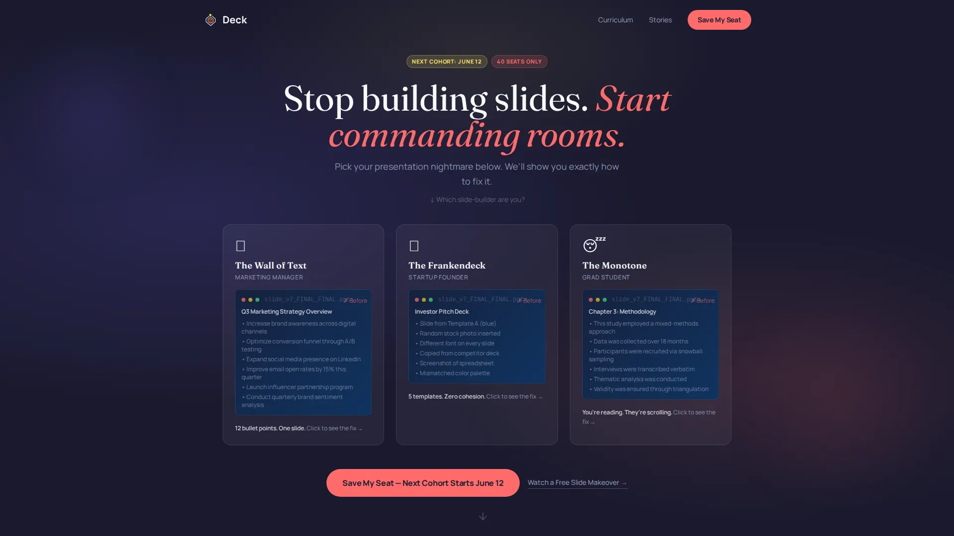
- A clickable Persona Selector header with three illustrated learner cards and micro-animation slide transformations
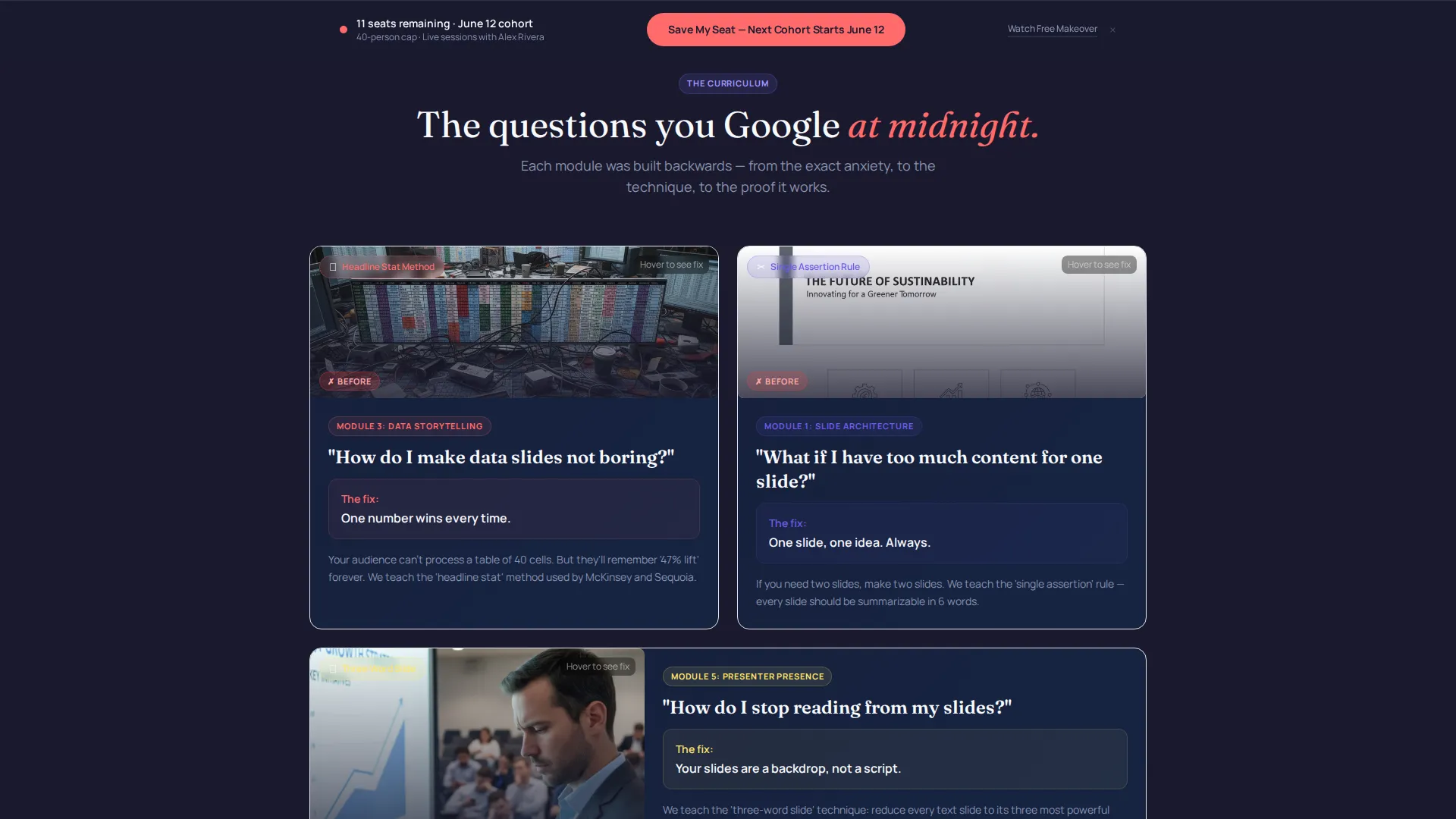
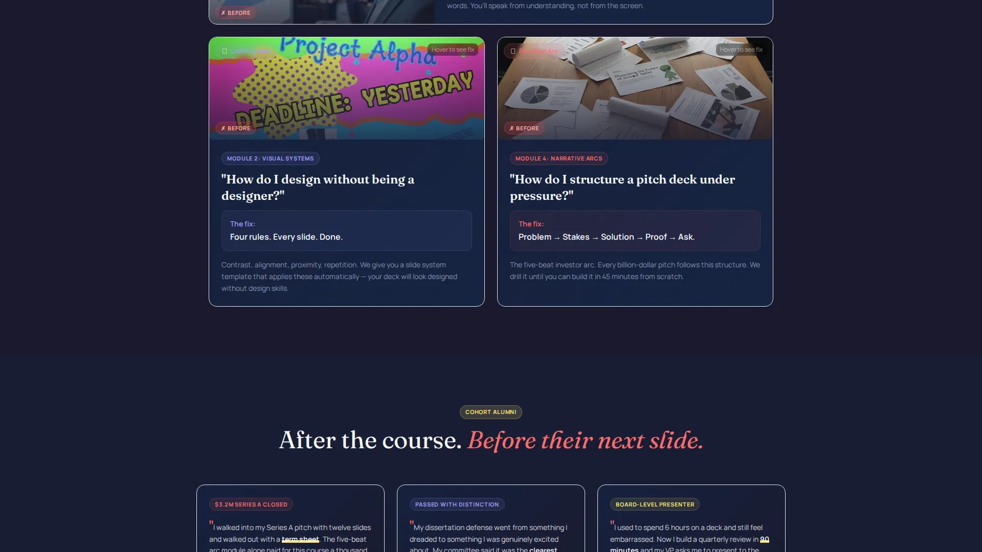
- FAQ-anchored card clusters, each pairing a learner question with a before-and-after thumbnail and a looping video preview
- A floating registration bar, a live seat counter, and a secondary free-preview capture path
Feature list
This template packs several purpose-built features, each designed to move a specific type of learner closer to registration without pressure.
Persona Selector Header
Three illustrated cards open the page, each depicting a familiar presentation failure. Selecting a card triggers a micro-animation where the bad slide transforms into a redesigned version, and the headline updates dynamically to match the chosen persona.
FAQ-Driven Card Grid
The scroll is organized by the anxious questions learners actually search for, not by module numbers. Each card cluster includes the question as a header, a before-and-after slide thumbnail, a fifteen-second looping technique video, and the module tag it belongs to.
Floating Registration Bar
A sticky bottom bar activates after the visitor passes the second card cluster. It holds the primary call to action for the next cohort session and stays visible without blocking content.
Live Seat Counter
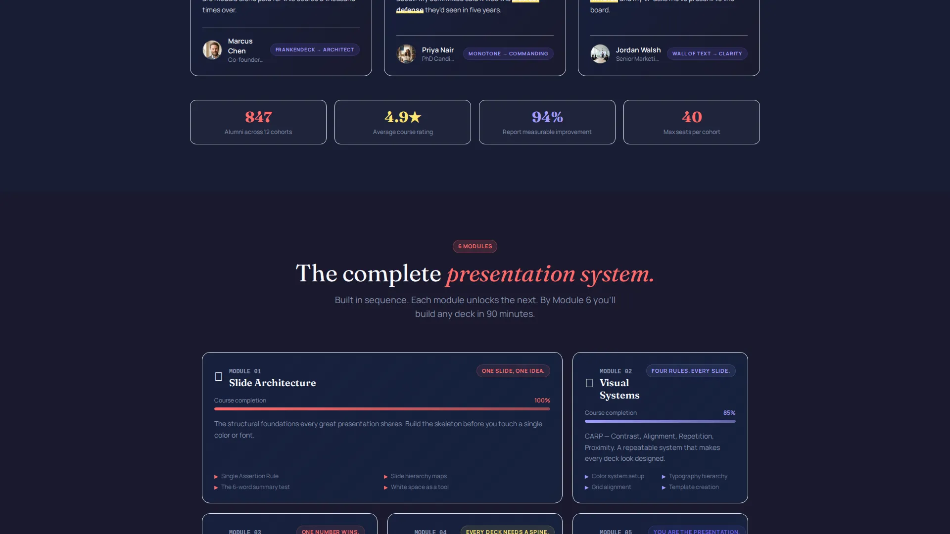
The registration area shows remaining cohort seats in real time, drawn from a fixed class size of forty learners. This creates honest scarcity tied to an actual enrollment cap, not a scripted timer.
Sequential Registration Form
The sign-up form presents three fields in order: first name, email, and a persona toggle that mirrors the header selector. The familiar choice closes the loop and reinforces the learner's self-identified journey.
Free Slide Makeover Path
A secondary call to action offers a free slide makeover video for visitors who are not ready to register. It captures an email address through demonstrated value before asking for a commitment.
Page sections overview
| Section | Purpose |
|---|---|
| Persona Selector Header | Opens the page with three learner-type cards and dynamic headline personalization |
| Hero Headline Block | Delivers the core course promise once a persona is selected |
| FAQ Card Cluster One | Pairs the first learner question with a before-and-after thumbnail and looping video |
| FAQ Card Cluster Two | Continues the question-relief-proof rhythm with a second technique card group |
| FAQ Card Cluster Three | Closes the card sequence, resolving a third common presentation fear |
| Module Tag Strip | Labels each card cluster with its corresponding course module reference |
| Free Makeover Offer | Secondary call-to-action block capturing email before asking for full registration |
| Seat Counter Block | Displays remaining cohort spots to communicate real class-size scarcity |
| Registration Form | Three-field sequential form mirroring the persona selector for loop closure |
| Floating Bottom Bar | Pinned sticky bar with the primary seat-saving call to action |
Design & branding system
The visual identity follows an Educational Guide theme expressed through a Dopamine Pop color system. Dark backgrounds anchor each module card like a slide canvas, while energizing accent colors drive attention to the right elements at the right moments.
- Deep presentation-dark (#1A1A2E) as the primary canvas, electric coral (#FF6B6B) for all clickable elements and the primary call to action, and highlighter yellow (#FFE66D) marking progress and celebration moments
- Crisp deck-white (#F8F9FE) for text and card surfaces, with ultraviolet (#6C5CE7) reserved for hover states and progress indicators that spark to life on interaction
- The palette is described as dragging a neon highlighter across the most important line in your notes: vibrant and energizing, but never chaotic
Mobile & speed optimization
The card-grid layout is inherently well-suited to reflow across screen sizes. Each modular card cluster stacks naturally on narrower viewports without losing the question-to-answer rhythm.
- Modular card structure adapts the multi-column grid to a single-column scroll on smaller screens
- The floating registration bar and live seat counter remain accessible at any scroll depth on mobile
How this template helps you convert
This template earns trust through specificity before it asks for anything. Every design decision reduces the gap between a visitor's fear and their decision to enroll.
- The Persona Selector lets visitors self-identify in the first second, making every word that follows feel personally relevant rather than generic.
- The FAQ-driven card grid resolves objections one by one in the visitor's own language, so by the time they reach the registration form, their hesitation has already been addressed.
- Real scarcity from a forty-seat class cap, combined with the secondary free-makeover path, gives both ready and nearly-ready visitors a clear next step.
Other information about this template
This template is purpose-built for cohort-based online courses in the presentation and slide design space. It is especially relevant for instructors positioning a course as a transformational skill upgrade rather than a library of passive video lessons.
- The emotional tone of the page is designed to feel like clicking "Present" when every slide is finally perfect: that shift from nervousness to total confidence
- The three learner personas (the Wall of Text manager, the Frankendeck founder, and the Monotone lecturer) reflect real behaviors common in PowerPoint and presentation design courses
- The before-and-after thumbnail format and looping technique videos make the curriculum tangible without requiring visitors to read a syllabus
- This template suits instructors running live cohorts on platforms that support course registration and email capture, where a fixed class size is a genuine selling point
Theme
Educational Guide
Creative direction
FAQ-Driven
Color system
Dopamine Pop
Style
Card Grid (Modular)
Direction
Event Registration
Page Sections
Persona Selector Header
Faq-driven Card Grid
Floating Registration Bar
Live Seat Counter
Sequential Three-field Form
Free Slide Makeover Path
Related questions
Who is this landing page template built for?
Can I use this template for a self-paced course instead of a live cohort?
What makes the FAQ-driven scroll different from a standard curriculum section?
How does the Persona Selector work on the page?
Is there a way to capture leads from visitors who are not ready to register?



