Live Extraction Analytics Landing Page Template
Seam is a real-time mining analytics dashboard landing page template built for operations teams who track every tonne, truck, and bench decision around the clock. Built on a bento grid layout with a dark control-room aesthetic, it combines animated widgets, frosted glass panels, and a structured conversion flow to showcase a unified mining intelligence platform.
by Rocket studio
Quick summary
The Seam real time mining analytics dashboard landing page template delivers a high-impact, single-page experience for mining SaaS products. It uses a bento grid layout, animated data widgets, and a dark control-room visual identity to communicate operational power instantly. Mine planners, operations managers, and geology teams are the natural audience, and the page guides each of them toward a free trial signup.
Who this template is for
This template suits product teams and agencies building landing pages for heavy-industry technology platforms. It works especially well when the product consolidates data from multiple sources into a unified analytics dashboard.
- Mine planners and operations managers who need to demonstrate real time data clarity to prospects
- Geology and grade control teams presenting dashboard insights to executive customers
- SaaS vendors and agencies creating modern, conversion-focused landing pages for mining technology products
What problem this template solves
Fragmented point solutions cost mining operations millions in misallocated resources. Teams struggle to connect blast data, haul truck telemetry, and ore grade reports without a single view that stays current. The right analytics dashboard template removes that fragmentation before a prospect even reads a headline.
- Disjointed tools force manual reconciliation, slowing informed decision making at shift change
- Generic dashboard templates fail to communicate the urgency and scale of 24-hour mining operations
- Prospects abandon landing pages that do not demonstrate the product working before the call to action
What you get with this template
You get a fully structured, single-page layout that acts as a command center for your product story. Every section is designed to demonstrate operational intelligence and drive trial signups.
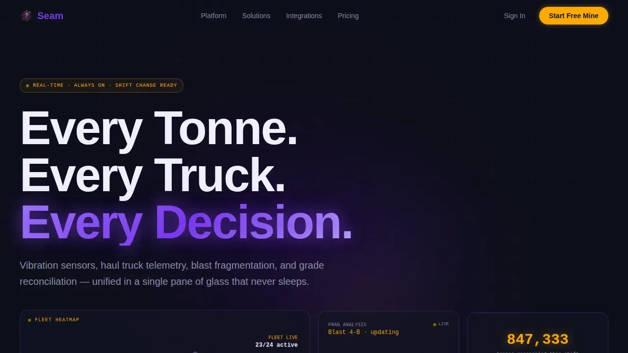
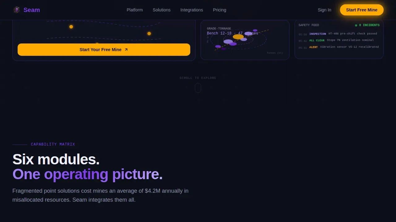
- A hero section with frosted glass bento panels, live-styled dashboard widgets, parallax depth layers, and micro-animations showing fleet heatmaps, fragmentation histograms, and grade-tonnage scatter charts
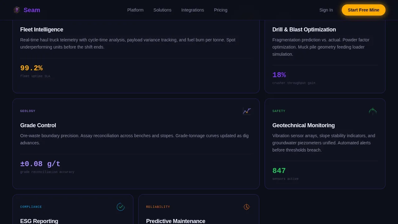
- A feature matrix section with expandable bento cells covering Fleet Intelligence, Drill and Blast Optimization, Grade Control, Geotechnical Monitoring, ESG Reporting, and Predictive Maintenance
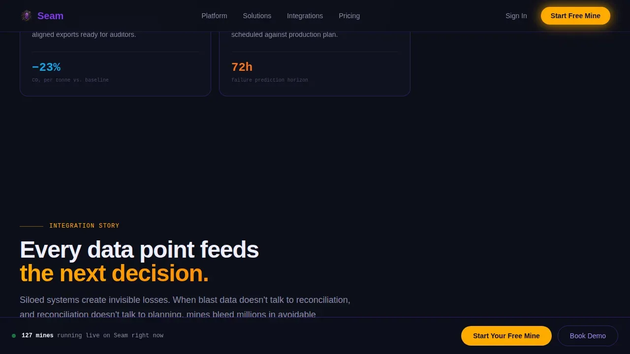
- An integration story section, a social proof section with operational metrics, and a dual-call to action section with a sticky bottom bar
Feature list
This template includes purpose-built sections and components that support an analytics dashboard product at enterprise scale.
Dark Glass Bento Hero Panel
The hero presents a grid of frosted, translucent cards floating over a near-black background. Each panel contains a live-styled dashboard widget: a fleet heatmap with trucks pulsing along haul roads, a fragmentation histogram mid-update, a grade-tonnage scatter plot with confidence ellipses, and a real-time safety incident ticker. Subtle parallax separates the panels into depth layers, and micro-animations make the dashboard feel alive before a single word is read.
Expandable Feature Matrix Grid
The feature matrix structures the scroll as a systematic reveal of capability modules arranged in bento cells that expand on hover or tap. Each cell contains a feature category with a looping animation showing the actual interface. The grid rearranges subtly between sections using spring-eased motion, so the page itself feels like a living dashboard with organic, data-driven patterns.
Integration Pipeline Narrative
A dedicated section shows how blast data feeds reconciliation, which feeds planning, which feeds cost modeling. This pipeline narrative builds the case that fragmented tools cost mines real money, while the unified analytics dashboard resolves that at every stage. It transforms individual feature charts into a connected performance story.
Alert-Ready Color System
Color-coding indicates operational status at a glance across every widget. High-vis amber is reserved for alerts and active states, making threshold breaches visible instantly. Built-in logic supports alerts when key performance indicators such as truck idle times or payload rates drop below or spike above defined thresholds, delivering immediate notifications for safety incidents or operational bottlenecks.
Dual Conversion call to action Architecture
The primary call to action, "Start Your Free Mine," appears inside the hero's largest glass panel and again as a sticky bottom bar after the third scroll section. A three-step signup flow lets users select operation type, connect a sample data source or use a preloaded demo mine, and enter a work email without a credit card. The secondary path, "Book a Pit-to-Port Demo," serves enterprise prospects who need to analyze the full pipeline before committing.
Tailwind CSS Bento Grid Foundation
The layout is built on Tailwind CSS, giving developers a structured, utility-first foundation to customize every cell, spacing value, and color token. The minimalist design keeps the interface focused on data rather than decoration, with a responsive user interface that scales from desktop control rooms to tablet devices used by field personnel. Tailwind CSS classes make it straightforward to connect new data sources and adjust the dashboard without touching complex stylesheets.
Page sections overview
| Section | Purpose |
|---|---|
| Hero Glass Panels | Communicate value proposition instantly with animated dashboard widgets and parallax depth |
| Feature Matrix Grid | Reveal capability modules through expandable bento cells with looping interface animations |
| Integration Pipeline Story | Show how blast, reconciliation, planning, and cost data connect into one analytics dashboard |
| Social Proof Section | Build trust with operational metrics, mine planner testimonials, and company logos |
| Dual call to action Section | Drive free trial signups and enterprise demo bookings with sticky bottom bar |
| Linear Footer | Close the page cleanly with a single-row footer pattern |
Design & branding system
The visual identity follows a Dynamic Motion theme with an Electric Indigo color system. Every design decision reinforces the feeling of stepping into a darkened control room at shift change, screens glowing, data streaming, and operations running around the clock.
- Color tokens: deep shaft black (#0D0F1A) as the base, indigo ore (#4B0082) for depth, charged violet (#7C3AED) for headlines and active states, and high-vis amber (#FFAA00) strictly for alerts and primary calls to action
- Typography pairing: Manrope for headings and body text, JetBrains Mono for data labels, metrics, and live counters to maintain a modern, technical aesthetic
- Motion system: high-intensity animations including parallax scrolling, spring physics on grid rearrangement, staggered section reveals, and pulsing data widgets that keep the dashboard visually alive
Mobile & speed optimization
The template is built desktop-first to serve the control-room aesthetic, with a responsive user interface that adapts for tablets and other devices used by field personnel. Mining managers often access reports on tablets or phones while in the field, so the layout scales without breaking critical dashboard panels.
- GPU-accelerated transforms power the parallax and spring animations, keeping performance high even during complex multi-widget renders
- Intersection Observer triggers staggered section reveals only when elements enter the viewport, reducing unnecessary processing and keeping the page fast
- The hero includes a "Last Updated" timestamp indicator, demonstrating low-latency capabilities and building technical trust with prospects who know that a 10-minute delay can cost thousands
How this template helps you convert
The page is structured so that value is demonstrated before the ask. Animated bento cells show the product working, so clicking the call to action feels like reaching for controls you have already been watching, not a leap of faith.
- The hero immediately communicates the unique value proposition through live-styled widgets and a charged violet headline, keeping the attention ratio focused on the primary call to action
- The feature matrix escalates stakes progressively, moving from individual metrics to integration stories that show the bottom line impact of unifying fragmented data sources into one analytics dashboard
- The sticky call to action bar remains available after the third scroll section, and the streamlined three-step signup flow removes friction by requiring only an operation type selection, a data source connection, and a work email
Other information about this template
This template supports teams across technology vendors, SaaS agencies, and enterprise sales organizations who need structured, high-converting landing pages for complex data products. It is particularly effective for visualizing data pipelines that span multiple operational domains.
- The bento grid layout is built on Tailwind CSS, which makes it practical to customize color tokens, spacing scales, and widget layouts without rebuilding components from scratch
- Tailwind CSS utility classes define the responsive grid, so developers can scale the dashboard from wide desktop screens to narrower tablet viewports by adjusting a single configuration
- The dashboard interface follows a minimalist design philosophy, minimizing non-data ink so that charts, tables, graphs, and gauges remain the dominant visual elements rather than decorative user interface chrome
- Teams familiar with tools like Google Sheets, Google Analytics, or other data sources can use the integration story section to demonstrate seamless integration with external platforms
- Google Analytics event tracking can be connected to the call to action buttons to monitor website traffic patterns, track conversion rates, and measure landing page effectiveness without modifying the core layout
- The social proof section supports operational metrics, company logos, and named testimonials, giving customers and prospects concrete evidence of real-world output and productivity gains
- Pre-built widgets cover production metrics, equipment performance, equipment utilization, and safety compliance, which are the key categories that define a high-quality mining analytics dashboard template
- The template is suitable for sales presentations, internal business reports, and product demos where a comprehensive overview of mining operations needs to be communicated quickly
- Among the best analytics dashboard templates for heavy industry, Seam stands out by combining enterprise-grade visual density with a freemium conversion architecture designed to scale with growth
Theme
Dynamic Motion
Creative direction
Feature Matrix
Color system
Electric Indigo
Style
Bento Grid
Direction
Freemium/Trial
Page Sections
Dark Glass Bento Hero with Live Widgets
Expandable Feature Matrix Bento Grid
Integration Pipeline Narrative Section
Alert-ready Color-coded Widgets
Dual Call to Action with Sticky Bottom Bar
Tailwind CSS Responsive Grid Foundation
Related questions
Can I customize the color tokens and bento grid layout?
Does the template support real time data connections?
Who is the primary audience for this template?
How does the three-step signup flow work?
Is this template suitable for presentations and internal reports?



