Real-Time Infrastructure Degradation Notice Board Landing Page
Degrade is a split-screen landing page template built for infrastructure monitoring products. It pairs a dark glass panel header with an industry-report scroll flow to surface degradation events, packet loss, latency spikes, certificate expiry, before they page your team. The freemium conversion model asks for a work email only, lowering friction to near zero.
by Rocket studio
Quick summary
Degrade is a single-page template for real-time infrastructure degradation notice boards. It uses a 50/50 split-screen layout, a Monochrome Steel color system, and an evidence-led scroll flow to build trust fast. The primary call to action is freemium signup with a work email only, no name, no credit card required.
Who this template is for
This template is built for technical teams who live and die by uptime. It speaks the language of engineers who need proof before they click anything.
- Platform engineers running distributed systems across multiple cloud providers
- Site reliability engineering leads who get paged over issues they should have caught days earlier
- DevOps teams managing many microservices who need one clear view of what is degrading
What problem this template solves
Infrastructure teams often lack a single, clear surface that shows degradation events before they escalate. By the time an alert fires, the damage is already spreading. This template addresses that gap directly.
- Visitors arrive skeptical; the page front-loads real aggregate data to prove the problem is real
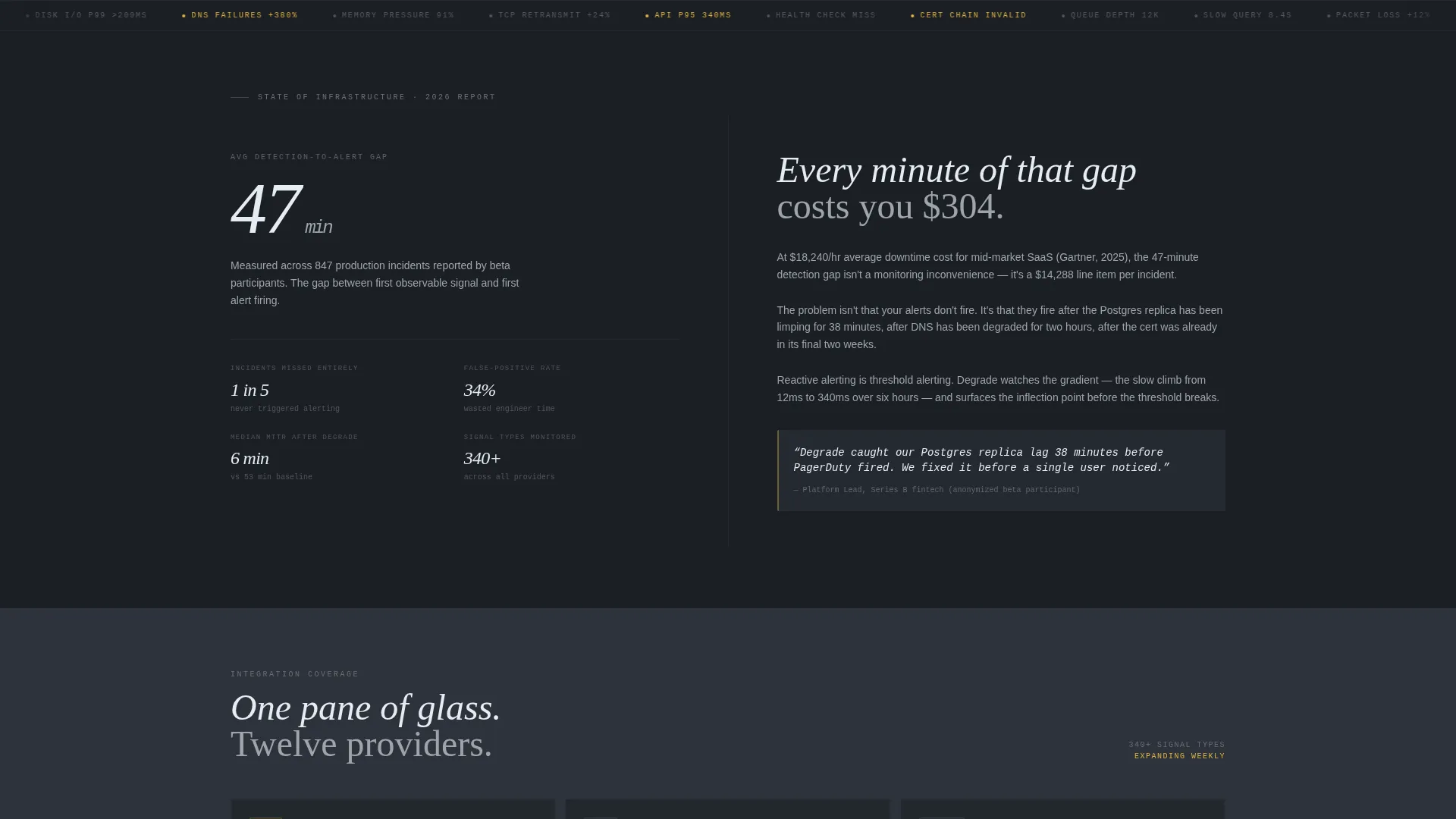
- The average detection-to-alert gap of 47 minutes is stated early, making the cost of inaction concrete
- The layout removes friction from signup by asking only for a work email, cutting the most common drop-off point
What you get with this template
You get a fully structured, single-page layout ready to represent a degradation notice board product. Every section serves a specific role in the evidence-to-conversion funnel.
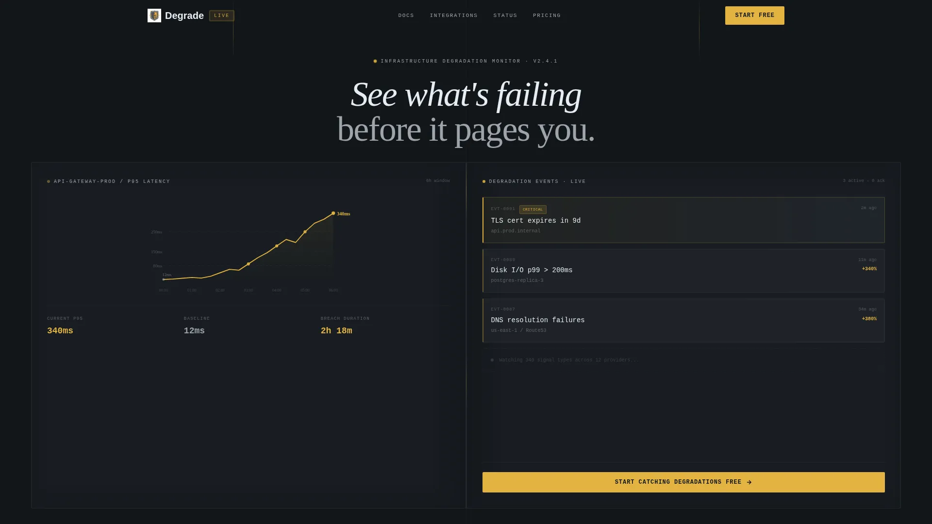
- A dark glass panel header with a live-style latency timeline and three stacked degradation event cards
- An alternating split-screen scroll body that pairs hard data on the left with narrative context on the right
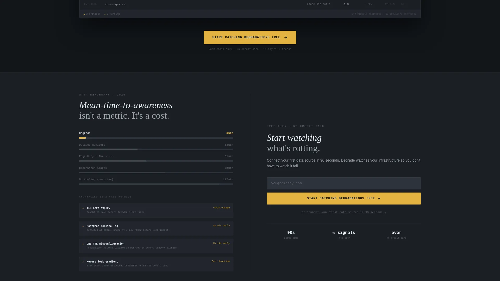
- A freemium call-to-action block with a single work-email field and a secondary quickstart link
Feature list
This template ships with purpose-built sections and visual components matched to the infrastructure monitoring niche.
Split-Screen Glass Panel Header
Two frosted-glass panels fill the viewport 50/50. The left panel renders a stylized latency timeline climbing from 12ms to 340ms over six hours, with amber tick marks at threshold breaches. The right panel shows a live-style notice board with three stacked event cards covering certificate expiry, disk I/O latency, and DNS failure rates.
Industry Report Scroll Flow
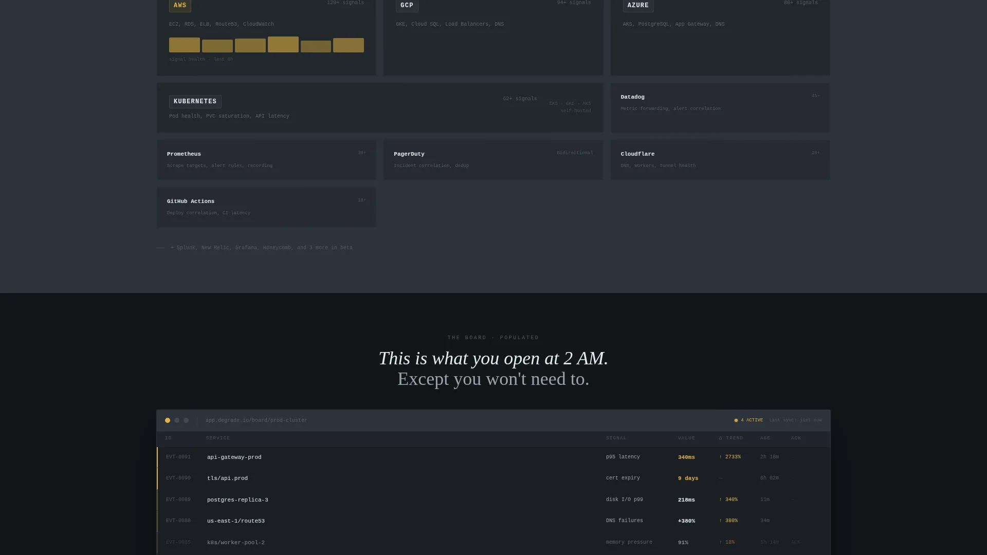
The scroll rhythm below the header alternates hard data on the left with narrative interpretation on the right. Stat blocks, detection benchmarks, integration coverage across major cloud providers, and anonymized beta-user case metrics build a dense evidence case section by section.
Full-Width Product Screenshot Break
A single full-width dark-mode product screenshot appears midway through the page. It shows the actual degradation board populated with live events, providing a concrete product preview before the final conversion push.
Freemium Conversion Block
The primary call-to-action button reads "Start Catching Degradations Free" in caution amber on gunmetal. The signup form captures a work email only. A secondary path below the form links to a documentation quickstart described as connectible in 90 seconds.
Caution Amber Signal System
The amber accent color (#E3B341) appears no more than twice per viewport, reserved exclusively for degradation indicators and primary call-to-action elements. This constraint makes every amber appearance feel like a genuine alert rather than a decoration.
Dark Terminal Visual Identity
The Monochrome Steel palette uses deep gunmetal (#1B1F24), brushed chrome (#9EA4AB), panel-edge charcoal (#2D333B), and near-white (#E6EDF3) for headings. Backgrounds alternate between gunmetal and charcoal to create panel depth. The overall feel evokes a server rack interior at 2 AM, functional, cold, and clear.
Page sections overview
| Section | Purpose |
|---|---|
| Glass Panel Header | Introduces the product with a latency timeline and live degradation event cards |
| Stat Block Left | Surfaces the 47-minute detection-to-alert gap as the opening data point |
| Cost Context Right | Translates the detection gap into downtime cost terms |
| Detection Benchmarks | Presents measurable detection performance data |
| Cloud Integration Coverage | Shows integration reach across major cloud providers |
| Awareness Time Comparison | Compares mean-time-to-awareness against competitor baselines |
| Beta Case Metrics | Shares anonymized real-world metrics from beta users |
| Product Screenshot Break | Full-width dark-mode board screenshot mid-page |
| Primary call to action Block | Freemium signup with work-email field and quickstart secondary link |
Design & branding system
The Monochrome Steel color system is built to feel like the inside of a server rack. Every color choice serves a functional signal rather than an aesthetic preference.
- Deep gunmetal (#1B1F24) and panel-edge charcoal (#2D333B) alternate as section backgrounds to create visual depth without decoration
- Brushed chrome (#9EA4AB) carries body text; near-white (#E6EDF3) is reserved for headings, keeping the hierarchy crisp
- Caution amber (#E3B341) appears at most twice per viewport, used only for degradation indicators and primary calls to action so it always reads as an alert
Mobile & speed optimization
The layout is designed with a split-screen structure that adapts to narrower viewports without losing its core hierarchy. The minimal asset approach, no hero images, no stock photography, keeps the page lean.
- The frosted-glass panel effect and latency timeline are rendered as design elements, not heavy image assets
- Event cards and stat blocks stack cleanly on smaller screens, preserving the data-first reading order
- The single-field signup form stays prominent and usable at all viewport sizes
How this template helps you convert
The page is structured as a progressive evidence case. Each scroll section adds one more reason to trust the product before the visitor ever sees a signup field.
- The header immediately shows the product in action with real degradation event labels and a threshold-breach timeline, so visitors understand the value before reading a single line of body copy.
- The alternating data-and-narrative scroll flow builds a dense, credible case using detection benchmarks, cloud integration breadth, and anonymized beta metrics, so by the time the call to action appears, the visitor already believes the problem is worth solving.
- The freemium model with a work-email-only form removes every common objection at the moment of conversion, and the secondary quickstart link gives impatient engineers an immediate hands-on path.
Other information about this template
This template is categorized under Documentation and Support, with a specific focus on the Status and Monitoring subcategory and the Degradation Notice Board niche. It is built on the Startup Velocity theme and follows the Industry Report creative direction.
- The header concept is Dark Glass Panels, a composition style designed for technical product credibility rather than lifestyle or brand storytelling
- The template style is Split Screen (50/50), meaning content is always presented in paired left-right columns at full viewport width
- The landing-page direction is Freemium/Trial, optimizing every section toward a low-friction first step rather than a direct purchase or demo request
Theme
Startup Velocity
Creative direction
Industry Report
Color system
Monochrome Steel
Style
Split Screen (50/50)
Direction
Freemium/Trial
Page Sections
Split-screen Glass Panel Header
Industry Report Scroll Flow
Freemium Conversion Block
Full-width Product Screenshot Break
Caution Amber Signal System
Dark Terminal Visual Identity
Related questions
Who is this template designed for?
What does the header section include?
How does the conversion flow work?
Can I adapt the color system for my own brand?
What makes this different from a generic SaaS landing page?



