Instant Grocery Marketplace Landing Page Template
The Dispatch white label grocery delivery app comparison landing page template is built for grocery chains ready to stop paying per-order aggregator fees. It leads with a live savings calculator, moves into side-by-side competitor comparison tables, and closes with a low-friction lead capture form. The result is a delivery app solution that makes the financial case before a single sales call happens.
by Rocket studio
Quick summary
Dispatch is a single-page, section-led landing page template designed to convert grocery chain operators into white label delivery app customers. The page opens with a branded logo marquee and a stark headline, drops visitors immediately into a live savings calculator, and builds its argument through structured comparison tables before capturing leads. Every section earns the next click.
Who this template is for
This template is built for operators who already know the cost of relying on third-party delivery platforms. It speaks the language of margin, control, and brand ownership rather than feature lists and marketing jargon.
- Regional grocery owners and operations directors who pay per-order delivery fees to aggregator platforms and want to reclaim that margin through a flat-license white label delivery app
- Chief technology officers at cooperative grocery stores who need a fully branded, API-connected grocery delivery app without building or staffing an internal engineering team
- Store owners exploring their first online delivery business and wanting to understand exactly how a white label food delivery app compares financially against building in-house or continuing with aggregators
What problem this template solves
Every order processed through a third-party aggregator is an order where the grocery chain surrenders margin, customer data, and brand touchpoints. The core problem is visibility: operators often do not see their total annual loss in one place until a tool forces the number onto the screen.
- Aggregator delivery fees erode per-basket margin silently, and most operators lack a clear side-by-side view of what a white label delivery app would actually cost versus what they currently spend
- Without owning the customer app, grocery chains lose access to order history, customer data, and the ability to run targeted marketing campaigns or loyalty programs under their own brand identity
- Building a custom grocery delivery app from scratch can cost between $40,000 and $400,000, leaving operators caught between an expensive build and a margin-destroying rental, with no clear third path illustrated
What you get with this template
This template delivers a fully structured, high-interactivity landing page designed around one goal: showing operators their exact financial case for switching to a white label delivery app. Every section is pre-built and purposeful.
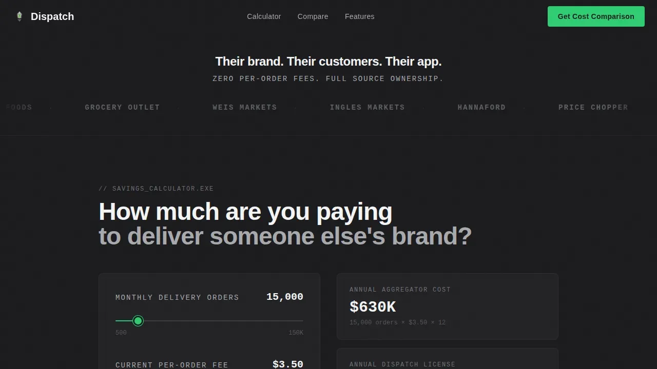
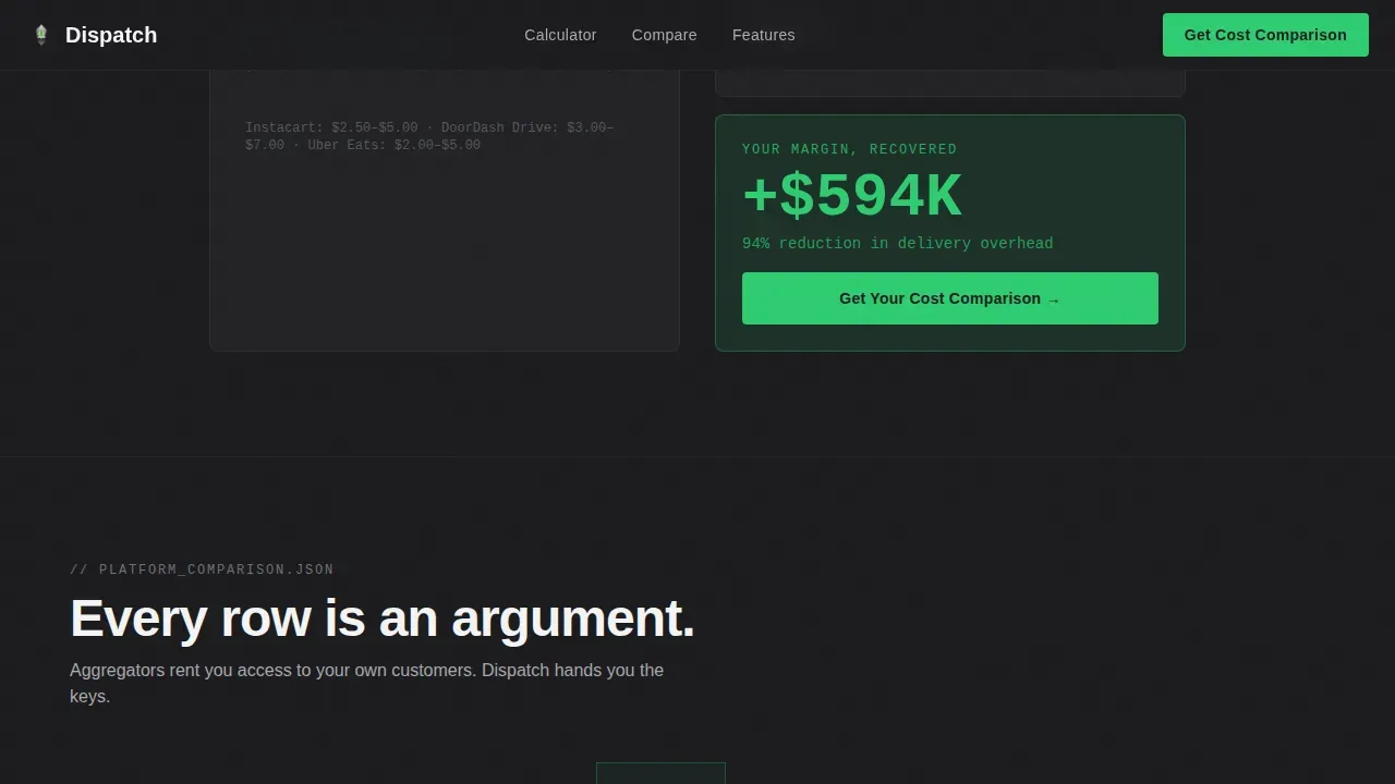
- A live savings calculator with two sliders covering monthly delivery volume and current delivery fee per order, outputting the annual cost delta between aggregator spend and platform licensing cost, with the recovered margin displayed in signal green
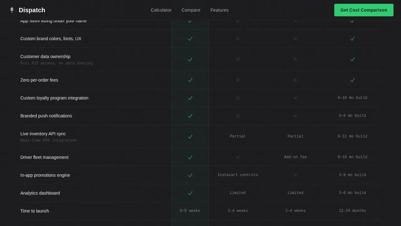
- A structured comparison table section pitting the platform against aggregator delivery service options and in-house app development across line items such as customer data ownership, branded push notifications, custom loyalty integration, and app store listing under the chain's own name
- A low-friction lead capture form collecting company name, monthly delivery volume via dropdown, current delivery partner via dropdown, and work email, with the calculator result auto-populating into the lead record so the sales team opens every conversation with the prospect's own numbers already visible
Feature list
This template includes a focused set of interactive and structural components, each built to serve the conversion goal of the delivery business audience.
Live Savings Calculator with Slider Inputs
The calculator sits immediately below the header and functions as the primary conversion engine. Two sliders let visitors set their monthly delivery requests volume and their current per-order delivery fee. The output box calculates the annual aggregator spend versus the annual platform licensing cost. The margin delta appears in signal green, labeled as recovered margin. This tool does the selling before any comparison table is read.
Side-by-Side Competitor Comparison Tables
The comparison section covers the platform versus multiple aggregator delivery service models and the in-house app development path. Each row in the table addresses a specific line item relevant to a delivery business operator: customer data ownership, real time tracking capability, branded push notifications, custom loyalty integration, route optimization support, delivery zones control, and app store listing under the chain's name. Checkmarks and cross marks make each row a quiet, specific argument.
Branded Logo Marquee Header
The header section runs a horizontal scroll of grocery brand logos at a speed calibrated to imply scale without rushing. Beneath the logos, a single line of stark white text on forge black delivers the core message. A second line in aluminum gray adds the key supporting claim. No hero image. No illustration. The social proof is the visual itself, keeping the page focused on credibility.
Low-Friction Lead Capture Form
The lead form appears twice: once anchored below the calculator output and again after the final comparison table. It collects company name, monthly delivery volume via a four-tier dropdown, current delivery partner via dropdown including a "no delivery yet" option, and work email. No phone field. The calculator result auto-populates into the lead record, giving the sales team the prospect's own numbers at the start of every conversation.
Feature Control Panel Section
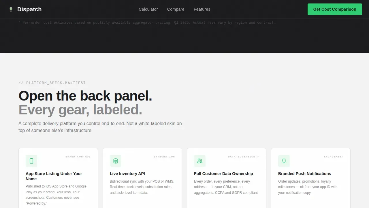
Below the comparison tables, a dedicated section details exactly what the operator owns when they license the platform. This includes the customer app, the driver app, inventory management connections, payment gateways, delivery zones configuration, operating hours settings, and order details access. Each owned component is labeled clearly, reinforcing that the entire process sits under the chain's brand identity rather than a third-party platform.
Monochrome Steel Visual System
The design system uses forge black, brushed aluminum, panel white, and signal green as its only four values. Backgrounds alternate between forge black and panel white to create hard section breaks. Signal green appears exclusively on call-to-action elements and positive comparison checkmarks. Typography pairs Manrope for headings with JetBrains Mono for numbers and labels, keeping the calculator output and comparison data visually distinct from body copy.
Page sections overview
| Section | Purpose |
|---|---|
| Logo Marquee Header | Establish scale and brand credibility through grocery chain logos and a stark primary headline |
| Savings Calculator | Show operators their exact annual margin loss in real time using two interactive sliders |
| Comparison Table Block | Compare the platform against aggregator delivery services and in-house app development row by row |
| Feature Control Panel | Detail every component the operator owns under their brand when licensing the platform |
| Lead Capture Form | Collect qualified company details and auto-attach the calculator result to each lead record |
| Footer Row | Provide a clean single-row footer with essential contact details and navigation |
Design & branding system
The visual identity follows a Directory and Discovery theme executed through a Monochrome Steel palette. The effect is precise and industrial: a server rack in a clean room, where every surface reflects competence and nothing is decorative.
- The four-value color system uses forge black (#1B1B1E) for primary dark backgrounds, brushed aluminum (#A8A9AD) for body text on dark sections, panel white (#F4F4F5) for light section backgrounds, and signal green (#2ECC71) reserved exclusively for call-to-action elements and positive checkmarks in comparison rows
- Typography pairs Manrope for all headings and descriptive copy with JetBrains Mono for numerical outputs, labels, and comparison table data, creating a clear visual distinction between narrative content and hard operational numbers
- Every interactive element including the calculator sliders, toggle states, and hover effects uses signal green as its active state color, creating a consistent visual signal that guides the eye toward action without decorative noise
Mobile & speed optimization
The template is designed desktop-first, reflecting the real working context of its primary audience: operations directors and technology leaders who evaluate vendor platforms on desktop screens during working hours. The layout prioritizes clarity at larger viewports where comparison tables and the calculator output are most readable.
- The page uses server-rendered static components for all non-interactive sections including the logo marquee, comparison tables, and feature panel, with client-side rendering scoped only to the live calculator, keeping load behavior lean
- The marquee scroll animation, slider interactions, and staggered reveal effects are calibrated at medium intensity to maintain visual engagement without introducing layout instability or competing with the comparison table content on any viewport size
- Delivery times for page sections are kept predictable by separating static and interactive rendering responsibilities, ensuring the calculator does not block the rest of the landing page from appearing on slower connections or mobile device access
How this template helps you convert
The conversion architecture of this landing page is built on a single principle: show the prospect their own numbers before asking them to do anything. Every section reinforces the financial and operational argument established in the calculator.
- The savings calculator output creates a personalized, data-specific reason to act before the visitor reads a single comparison row. By displaying the annual aggregator spend versus the platform licensing cost, it makes the case in the prospect's own currency, so the sales team opens every follow-up conversation with a number the prospect already trusts.
- The comparison tables translate abstract platform claims into specific, scannable ownership statements covering customer data, branded push notifications, loyalty programs, route optimization, and app store listing under the chain's name. Each row removes one more reason to stay with an aggregator delivery service, building the case from money saved to features gained to control reclaimed.
- The dual placement of the lead capture form, anchored below the calculator and again after the final comparison table, catches prospects at two distinct moments of conviction, while the low-field structure and calculator result auto-population reduce friction to the point where completing the form feels like a natural continuation of the tool they just used.
Other information about this template
This template is built specifically for the white label food delivery market, where grocery chains need a delivery app solution that reflects their brand rather than a third-party platform's. It is relevant to any delivery business evaluating white label solutions for their online delivery business.
- The white label food delivery app space presents a specific app development challenge: businesses launch on aggregators quickly but lose customer loyalty, customer engagement, and all the data that drives data driven decisions over time
- White label food delivery platforms allow store owners to retain complete control over their customer app, driver app, delivery agents, and delivery personnel, which supports seamless ordering, real time notifications, and delivery confirmation under their own brand identity
- The template supports coverage of essential features buyers evaluate during the development process, including route optimization, optimized routes for delivery agents, manage orders tools, manage pickup workflows, secure payments, multiple payment gateways, digital wallets, and secure payment gateways
- It is well-suited for showcasing white label food delivery capabilities such as real time tracking, order history access, delivery status visibility, delivery zones configuration, delivery times management, and push notifications that keep customers informed
- From a delivery business perspective, the template frames white label food delivery as a path to business growth, explaining how businesses launch their own branded grocery app, boost sales, generate revenue, and eliminate per-order delivery fee exposure through a flat licensing model
- The template can also highlight operational details relevant to buyers: operating hours configuration, contact details fields in the lead form, track payments tools, fuel costs visibility for delivery agents, inventory management connections, and post launch support expectations
- White label food delivery app development is significantly faster than custom builds. A white label delivery app can typically launch in four to six weeks, compared to months for custom grocery delivery app development, and at a fraction of the cost
- White label solutions also support targeted marketing campaigns, customer feedback collection, and customer loyalty programs that are simply not available to chains renting delivery access from aggregators
- The Dispatch white label grocery delivery app comparison landing page template is an ideal starting point for any grocery chain or food delivery platform operator who wants to present a clear, conversion-focused case for owning their delivery stack
Theme
Directory & Discovery
Creative direction
Calculator/Tool First
Color system
Monochrome Steel
Style
Comparison Table
Direction
Lead Generation
Page Sections
Live Savings Calculator
Side-by-side Comparison Tables
Branded Logo Marquee Header
Low-friction Lead Capture Form
Feature Control Panel
Monochrome Steel Design System
Related questions
What sections are included in this landing page template?
Can the comparison tables be customized for different competitor delivery services?
How does the calculator result connect to the lead capture form?
Who is this template primarily designed for?
How does this template differ from a generic food delivery landing page?



