Dental Digital Presence Pricing & Packages Website Template
Dentalmenu is a modular card-grid landing page template built for dental practices ready to replace printed fee sheets with a living digital menu. It showcases real-time insurance estimates, animated 3D procedure previews, and an interactive treatment plan builder inside a sleek wall-mounted display experience. The design follows a Problem-to-Solution arc that earns every click before asking for one.
by Rocket studio
Quick summary
Dentalmenu is a single-page, card-grid landing page template designed for dental technology platforms replacing outdated printed fee schedules. The layout follows a Problem-to-Solution arc, moving visitors from pain-point cards to glowing solution cards. The primary call to action routes visitors to a demo booking page with near-zero friction.
Who this template is for
This template speaks directly to the people who feel the daily cost of outdated fee communication. It works equally well for lean solo practices and large multi-location groups.
- Multi-location dental service organizations (DSOs) looking to standardize case acceptance across every operatory
- Solo practitioners whose patients forget verbal price quotes by the time they reach the parking lot
- Office managers who re-print updated fee schedules every quarter and want a faster, cleaner alternative
What problem this template solves
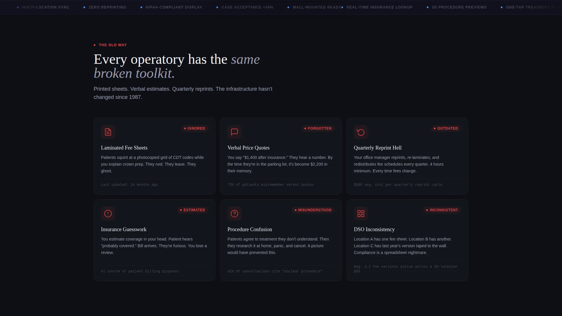
Printed laminated fee sheets are easy to ignore and impossible to update in real time. When a patient hears a price verbally and walks out without booking, the practice loses the case silently. This template frames those broken workflows as visible pain points, then resolves each one with a mirrored solution card.
- Patients disengage from laminated sheets that look generic and feel impersonal
- Verbal quotes disappear from memory before a patient decides, killing case acceptance
- Outdated fee lists create trust gaps and force staff to reprint materials repeatedly
What you get with this template
You get a fully structured, modular card-grid landing page built around a wall-mounted dental digital menu concept. Every component is purpose-built to support a click-through conversion path, not a form-heavy lead funnel.
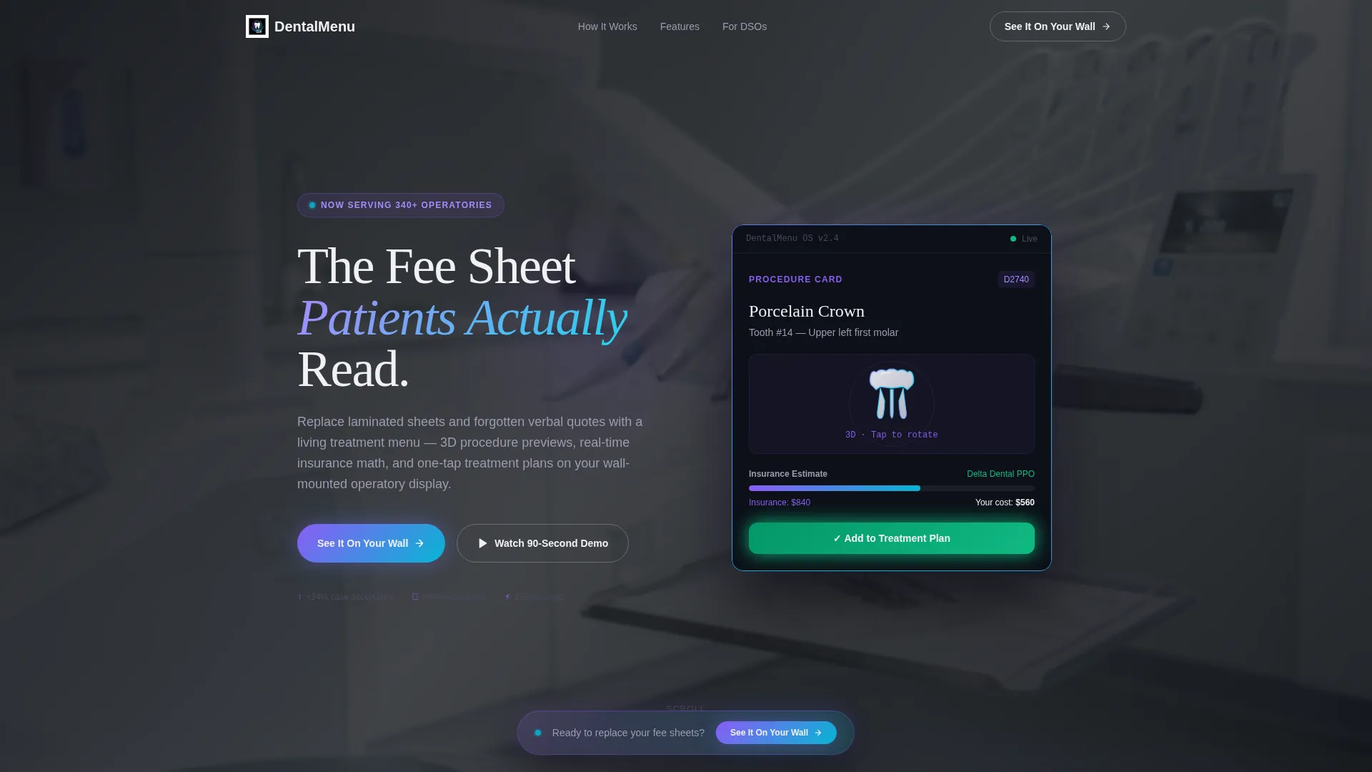
- A pixel-perfect product screenshot header showing the digital menu running on a wall-mounted operatory display
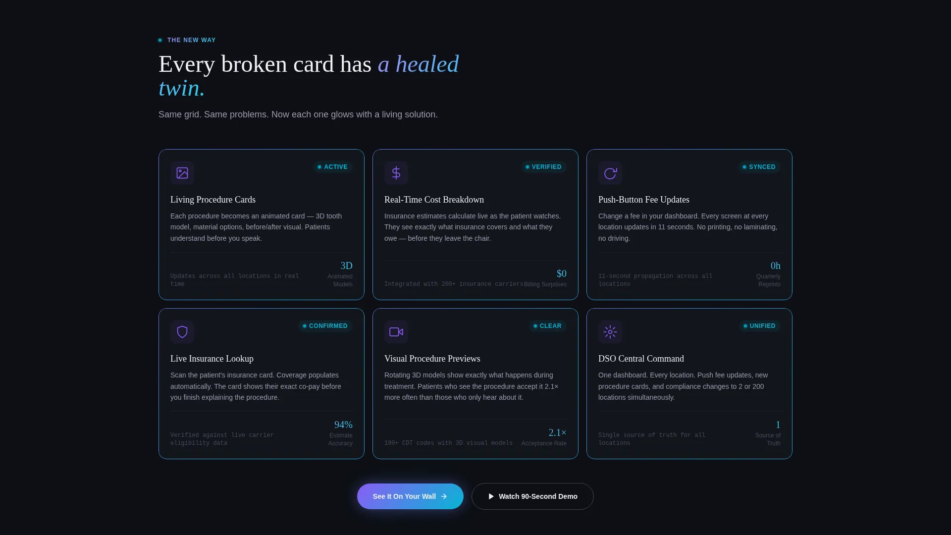
- A mirrored Problem-to-Solution card grid with red status indicators on pain-point cards and iridescent borders on solution cards
- A persistent floating call-to-action bar that resurfaces after every third card row, plus an inline secondary video path
Feature list
This template covers the full scope of what a dental digital menu landing page needs to persuade and convert. Each feature below maps directly to a component described in the brief.
Problem-to-Solution Card Grid
The scroll opens with a grid of pain-point cards, each carrying a small red status indicator. Mid-page, the layout transitions to solution cards that mirror the same grid structure but glow with iridescent violet-to-cyan borders. The visual transformation makes the contrast immediate and visceral.
Animated 3D Procedure Previews
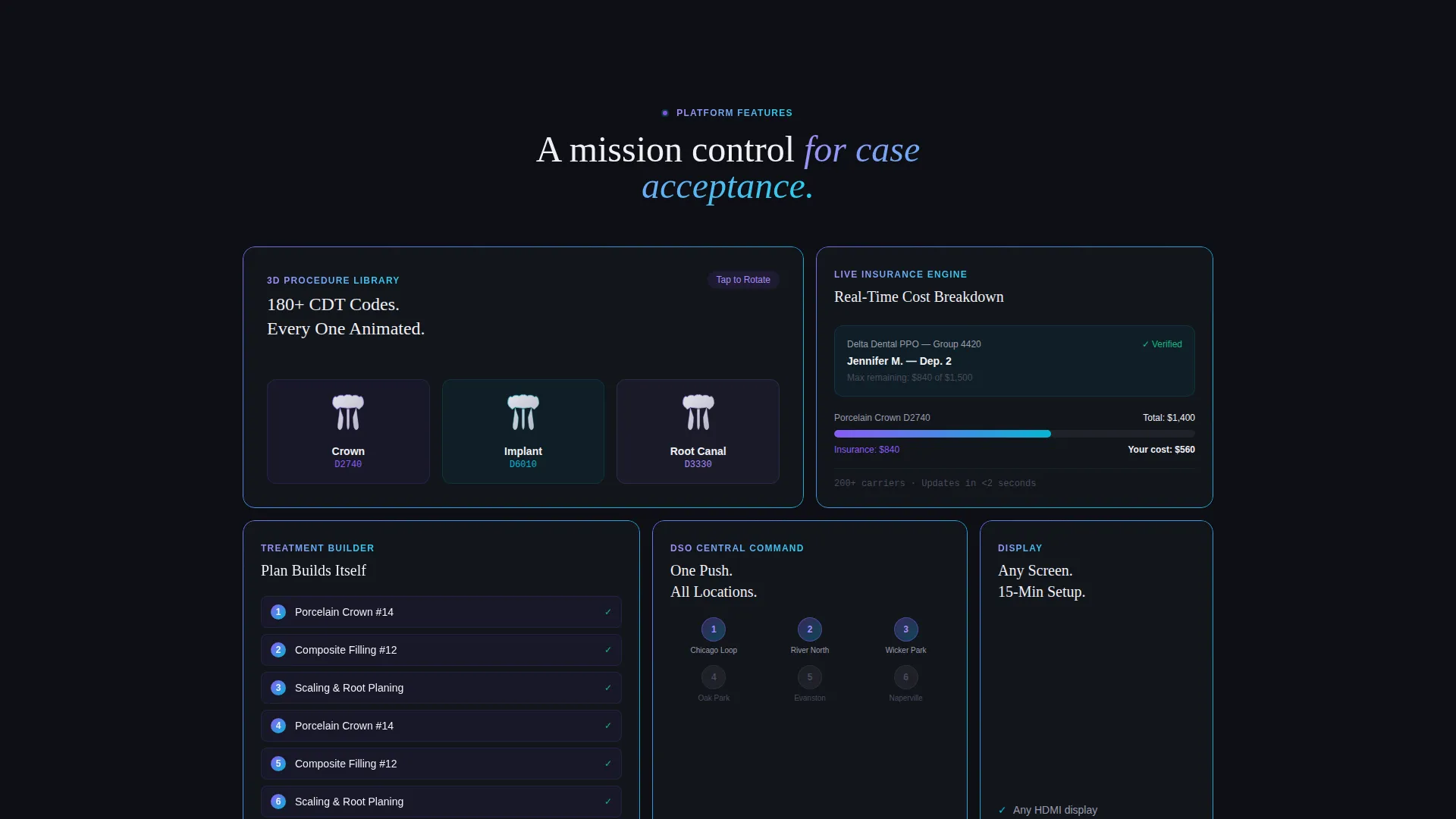
Each treatment card in the digital menu display features a 3D rotating tooth model. This gives patients a visual reference for what a procedure actually involves, reducing the anxiety that often delays booking.
Real-Time Insurance Cost Breakdown
A sliding insurance-versus-out-of-pocket cost calculator is built into the treatment card layout. Patients see their estimated share before they ask, removing the most common objection before it surfaces.
Interactive Treatment Plan Builder
As the dentist taps through procedure cards, the treatment plan assembles itself on screen. This replaces verbal back-and-forth with a structured, visible record the patient can follow in the moment.
Click-Through Conversion Path
The primary call to action, "See It On Your Wall," appears first as a ghost button inside the header screenshot. It resurfaces as a persistent floating bar after every third card row. No form is required, keeping friction as low as possible.
Inline Secondary Video
A secondary call to action, "Watch a 90-Second Operatory Demo," opens an inline video for visitors who are not ready to click through yet. This keeps undecided visitors engaged inside the page rather than losing them to a bounce.
Page sections overview
| Section | Purpose |
|---|---|
| Header Screenshot | Shows the digital menu live on a wall-mounted display inside a real operatory |
| Pain-Point Cards | Opens the scroll with a red-flagged grid of broken fee-communication problems |
| Solution Card Grid | Mirrors the pain-point layout with iridescent-bordered cards showing each fix |
| Floating call to action Bar | Resurfaces the primary call to action after every third card row |
| Inline Demo Video | Gives hesitant visitors a 90-second operatory demo without leaving the page |
Design & branding system
The visual identity follows a Data Command theme using an AI Iridescent color system. The palette blends sterile clinical precision with the soft prismatic shimmer of light refracting through a ceramic crown.
- Deep command-center black (#0D0F14) dominates the background, making each modular card float like a separate screen
- Holographic violet (#8B5CF6) and shifting cyan (#06B6D4) gradient across interactive borders and hover states, while clinical pearl white (#F0F0F5) holds typography crisp against the void
- The header image is angled slightly to show depth, with the operatory background intentionally blurred to ground the product in its real environment without competing with the interface
Mobile & speed optimization
The modular card-grid structure is built to reflow cleanly across screen sizes. Each card is a self-contained unit, which makes responsive stacking straightforward without sacrificing the visual contrast between pain and solution rows.
- Individual card units stack vertically on smaller screens while preserving the red-versus-iridescent visual distinction
- The floating call-to-action bar adapts to bottom-screen placement on mobile, keeping the primary conversion path accessible at all times
- Inline video is embedded rather than auto-playing, so it loads on demand without slowing the initial page render
How this template helps you convert
The conversion strategy is built into the scroll sequence itself. Visitors do not arrive at a pitch; they arrive at a mirror showing their current problem.
- The Problem-to-Solution arc creates emotional momentum by making the old workflow feel outdated before the product is ever shown, so the solution cards land with more impact
- The ghost button inside the header screenshot introduces the call to action early, while the persistent floating bar keeps it visible without blocking content, giving visitors multiple low-pressure entry points to the demo booking page
Other information about this template
This template is part of the Dental Digital Presence subcategory under the broader Technology category. It is designed for the dental digital menu niche and pairs well with practice management platforms, chairside technology vendors, and patient communication tools serving the modern dental operatory.
- The template style is Card Grid (Modular), making it straightforward to add, remove, or reorder cards as the product offer evolves
- The creative direction follows a Problem-to-Solution Arc with a Click-Through landing page direction, meaning the entire page is engineered to route visitors toward a demo rather than capture a form submission
- The header concept is a Product Screenshot, which grounds the digital interface in a real operatory environment and builds immediate credibility with clinical buyers
Theme
Data Command
Creative direction
Problem→Solution Arc
Color system
AI Iridescent
Style
Card Grid (Modular)
Direction
Click-Through
Page Sections
Problem-to-solution Card Grid
Animated 3D Procedure Previews
Real-time Insurance Cost Breakdown
Interactive Treatment Plan Builder
Persistent Floating Call to Action Bar
Inline 90-second Demo Video
Related questions
Who is this landing page template designed for?
Does this template include a form or lead-capture component?
Can the card grid layout be customized to show different procedures?
What makes the Problem-to-Solution Arc effective for dental buyers?
Is there a way for visitors who are not ready to book a demo to stay engaged?



