Dentalsite - Powerful Builder Landing Page Template
Dentalsite is a comparison table landing page template built for dental website builder platforms. It guides office managers, solo practitioners, and multi-location operators through a benchmarking narrative, an interactive preview header, and a three-step lead capture form. The layout moves visitors from live product exploration to conversion proof to a clear call to action.
by Rocket studio
Quick summary
Dentalsite is a single-page, conversion-focused template for dental website builder platforms. It opens with an interactive builder preview, walks visitors through a scored comparison table across twelve criteria, and closes with a progressive lead capture form. The design uses a Data Command theme with a Teal Catalyst color system to communicate clinical precision and modern confidence.
Who this template is for
This template is designed for dental software companies and platform teams that need to turn product interest into qualified sign-ups. It speaks directly to the people making the buying decision inside dental practices.
- Office managers running outdated multi-tab website setups who need a faster, cleaner solution
- Associate dentists launching their first solo practice and evaluating builder platforms for the first time
- Dental service organization operations leads rolling out multiple locations under a tight quarterly deadline
What problem this template solves
Most dental website builder pages fail to justify the switch. They show screenshots and list features, but they never prove the gap between what a practice has now and what it could have. Dentalsite closes that gap with a data-led narrative that turns comparison into conviction.
- Visitors leave without understanding how generic builders fall short on dental-specific needs like insurance verification and appointment funnels
- Practices with an existing site have no clear entry point and no reason to audit what they already have
- The absence of live product interaction means visitors evaluate features without ever experiencing the builder itself
What you get with this template
The template delivers a complete, single-page lead generation layout built around three distinct conversion zones. Each zone escalates the visitor's confidence before asking for anything in return.
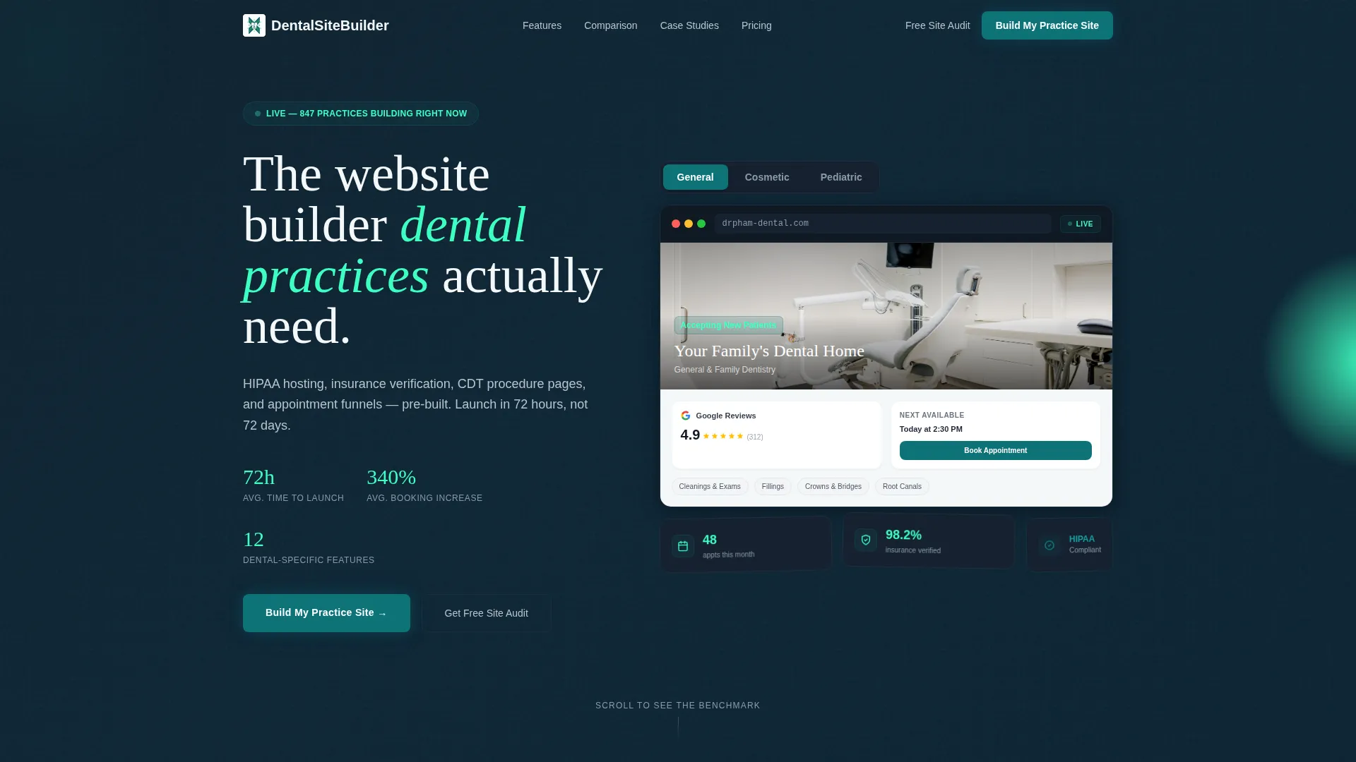
- An interactive header mockup that lets visitors toggle between three dental specialty previews before scrolling
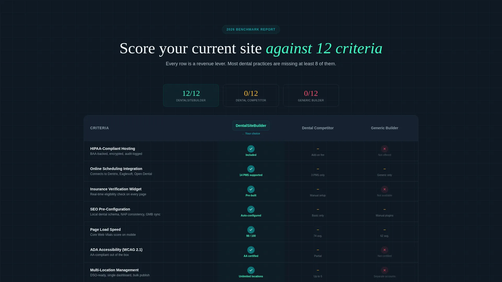
- A twelve-criteria comparison table with animated checkmarks and scores that benchmarks competitors against this platform
- A three-step progressive lead capture form with a secondary audit path for practices that already have a website
Feature list
This template packages several purpose-built components that work together to move a dental practice buyer from curiosity to commitment.
Interactive Builder Preview Header
The header embeds a functioning website builder mockup directly in the viewport. Visitors toggle between pediatric, cosmetic, and general dental template styles and watch the preview pane rebuild in real time. A live patient-booking widget, a Google review score, and a swapping hero image are all visible before anyone scrolls. A data overlay in the corner ticks upward, showing appointments booked that month.
Twelve-Criteria Comparison Table
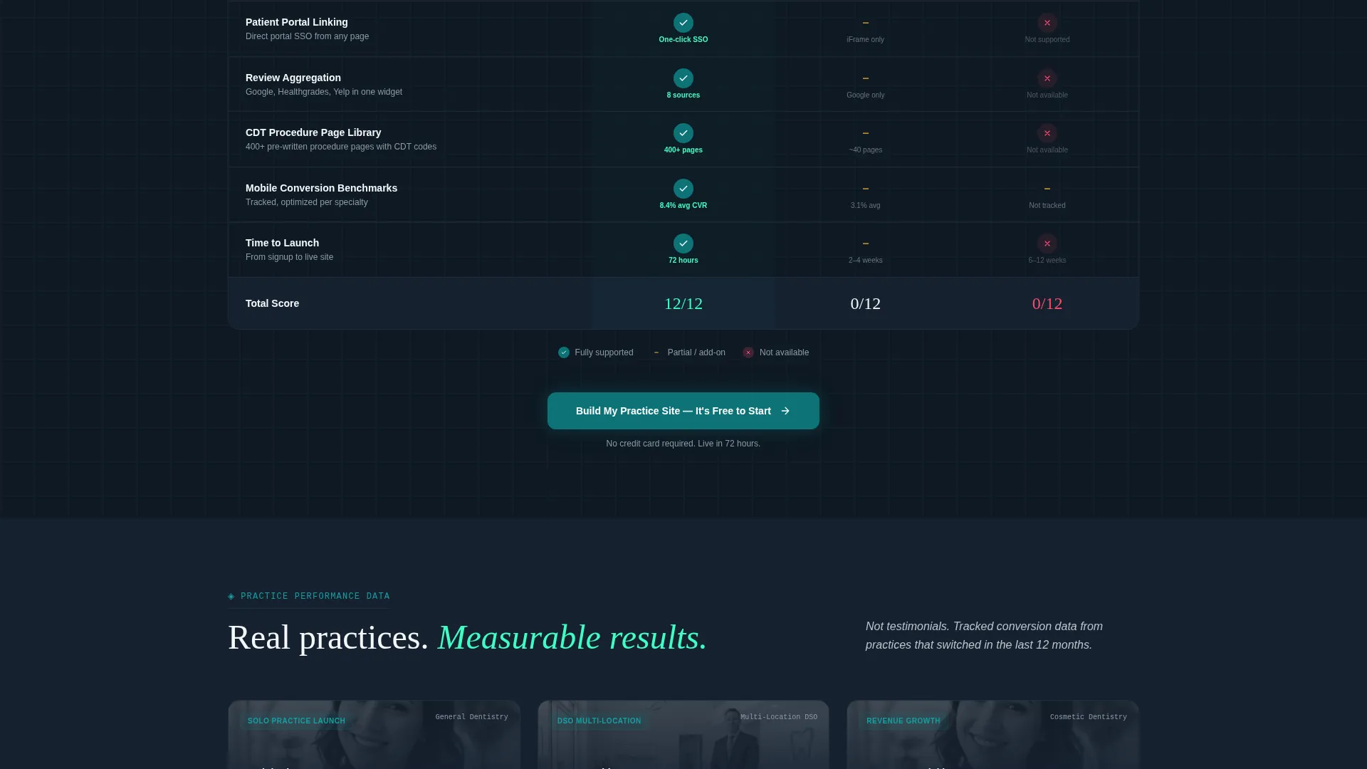
The comparison table scores generic builders, dental-specific competitors, and this platform across twelve criteria. Criteria include online scheduling integration, insurance verification widget, multi-location management, CDT (Current Dental Terminology) procedure page library, and time-to-launch, among others. Each row animates its checkmarks and scores as it enters the viewport, turning a static table into an active proof sequence.
Case Study Data Cards
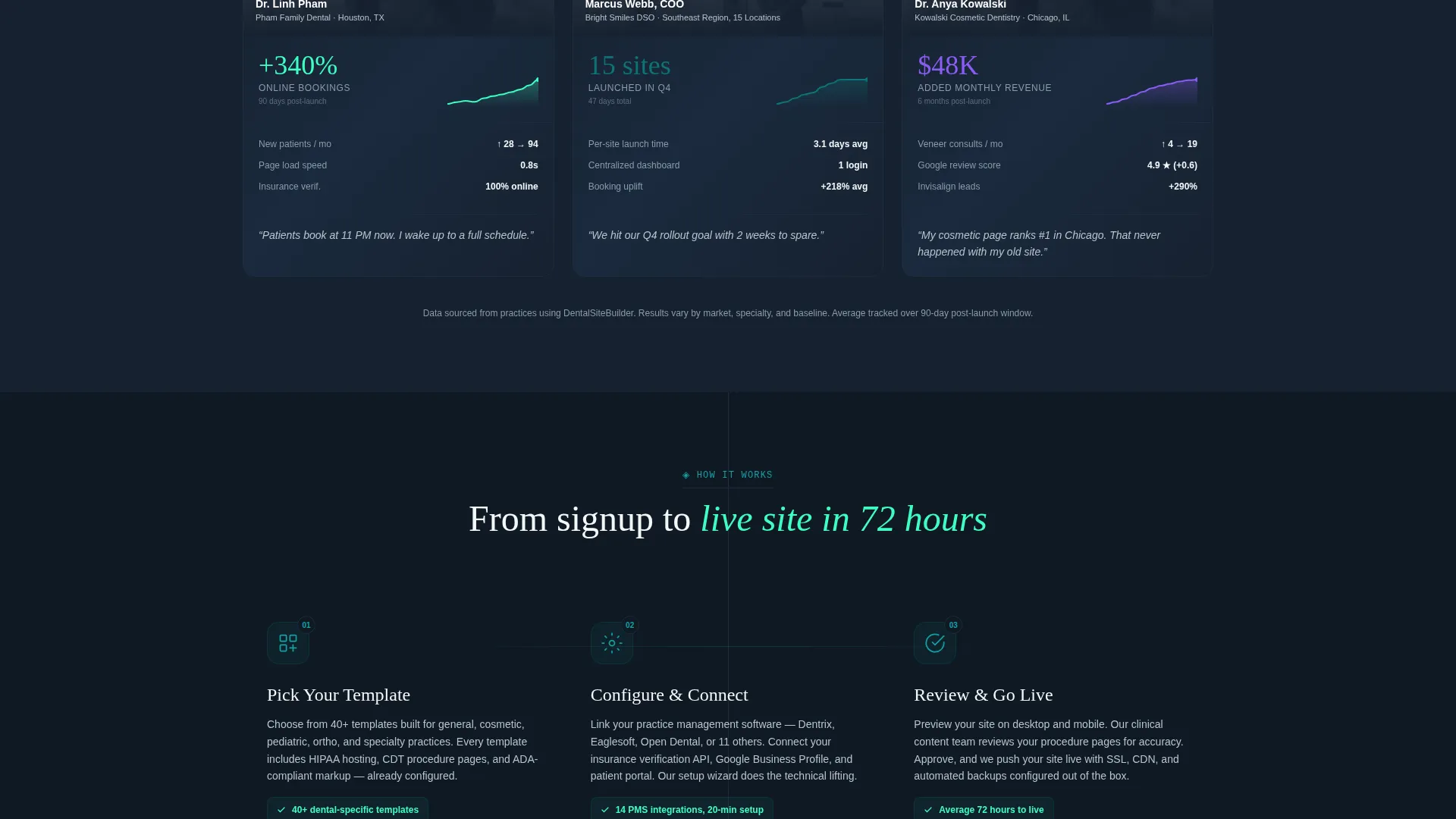
Below the comparison table, case study cards present real conversion metrics styled as data cards with spark-line graphs. They read like research findings rather than testimonials, showing outcome figures and timelines. This format maintains the industry report tone and adds a layer of credibility grounded in practice-level results.
Three-Step Progressive Lead Form
The lead capture form breaks the sign-up process into three focused steps. Step one collects practice name and specialty type. Step two asks for the current website URL, with a toggle for practices that do not have one yet. Step three captures email address and preferred launch timeline. This sequence reduces friction by asking only one thing at a time.
Sticky Call-to-Action Bar
A sticky bottom bar appears after the comparison table clears the viewport. It anchors the primary call to action, "Build My Practice Site," so the prompt is always available without interrupting the content narrative. The bar activates at the moment visitors have the most context and the clearest reason to act.
Secondary Site Audit Path
Visitors who already have a dental website are offered a parallel conversion path through a "Get Your Free Site Audit" prompt. This feeds a separate nurture sequence rather than forcing every visitor into the same funnel. It captures intent from a segment that would otherwise leave without converting.
Page sections overview
| Section | Purpose |
|---|---|
| Interactive Preview Header | Lets visitors experience the builder live before reading a single claim |
| Specialty Toggle Controls | Switches the preview between pediatric, cosmetic, and general dental layouts |
| Live Booking Widget | Shows an active patient-booking interface inside the preview mockup |
| Appointment Counter Overlay | Displays a ticking metric to signal real platform activity |
| Platform Comparison Table | Scores three platform types across twelve dental-specific criteria |
| Animated Row Reveals | Draws attention to score differences as each row enters the viewport |
| Case Study Cards | Presents outcome metrics as data cards with spark-line graphs |
| Sticky call to action Bar | Keeps the primary sign-up prompt accessible after the table scrolls past |
| Three-Step Lead Form | Captures practice details, website status, and launch timeline progressively |
| Site Audit Secondary call to action | Offers an audit path for visitors with an existing dental website |
Design & branding system
The visual identity follows a Data Command theme built around the Teal Catalyst color system. Every color choice is intentional and traceable to a specific interface function, creating a palette that feels like a vitals monitor in a modern dental operatory.
- Deep operatory teal (#0D7377) anchors primary brand elements; midnight chart background (#0F1923) frames data-dense sections; clinical white (#F4F7F9) provides breathing room between content blocks
- Catalyst spark (#3DFFC2) activates on hover states, active toggles, and metric highlights to draw the eye exactly where attention belongs
- The overall effect is dark, precise, and confidence-inducing, with a single neon-green pulse that signals the platform is live and performing
Mobile & speed optimization
The template is structured to maintain its interactive and data-heavy layout across screen sizes without breaking the conversion sequence. The progressive form and sticky bar are particularly important to get right on smaller viewports.
- The three-step form collapses cleanly on mobile so each step fills the screen without crowding
- The comparison table is designed to scroll horizontally on narrow screens, preserving all twelve criteria without truncation
- The sticky call-to-action bar remains anchored at the bottom of the viewport on all device sizes, keeping the primary prompt accessible throughout the scroll
How this template helps you convert
The page is built as a conversion escalator. Each section adds a layer of evidence before the ask appears, so visitors arrive at the form having already made their case internally.
- The interactive preview header puts the product in the visitor's hands immediately, creating a sense of ownership before any comparison begins.
- The animated comparison table surfaces the gap between a visitor's current solution and this platform across twelve scored criteria, making the value case concrete and self-generated rather than salesperson-delivered.
- The three-step progressive form and dual conversion paths mean both new practices and established ones have a clear, low-friction next step that matches exactly where they are right now.
Other information about this template
This template is categorized under Technology, specifically within the Dental Software and Software as a Service subcategory. It is built for the dental website builder niche and is optimized for lead generation as its primary page direction. The creative direction is Industry Report, giving the page a benchmarking and research narrative rather than a promotional tone. The header concept is Interactive Preview, meaning the product experience is front-loaded rather than deferred. The template style is Comparison Table, making it well-suited for platform teams competing in a defined market with clear alternative options.
- The template supports the full buyer journey from initial exploration through comparison, proof, and form submission on a single page
- It is suitable for platforms targeting solo dental practices, group practices, and dental service organizations with multiple locations
- The Data Command theme and Teal Catalyst color system are pre-configured and ready for brand customization within the established palette
Theme
Data Command
Creative direction
Industry Report
Color system
Teal Catalyst
Style
Comparison Table
Direction
Lead Generation
Page Sections
Interactive Builder Preview Header
Twelve-criteria Comparison Table
Case Study Data Cards
Three-step Progressive Lead Form
Sticky Call-to-action Bar
Secondary Site Audit Conversion Path
Related questions
Who is this template designed for?
Can I customize the comparison table criteria?
What does the three-step form capture?
Do I need to use both conversion paths?
Is this a single-page layout or a multi-page template?



