Space Debris Removal Landing Page Template
Deorbit is a dashboard-style landing page template built for space debris removal operations. It uses a cinematic mission-control aesthetic, a side-by-side compliance audit grid, and a pinned risk-audit call to action to move satellite operators, government agencies, and insurance underwriters from concern to commitment.
by Rocket studio
Quick summary
Deorbit is a single-page, data-command landing page template for a fleet operations company that removes dead satellites and spent rocket stages from low Earth orbit. The design channels a real mission operations center: dark panels, amber telemetry, and a structured audit grid that turns orbital risk into a clear business case.
Who this template is for
This template is built for high-stakes aerospace and defense audiences who need hard evidence before making a decision. It speaks the language of operators, procurement teams, and risk analysts simultaneously.
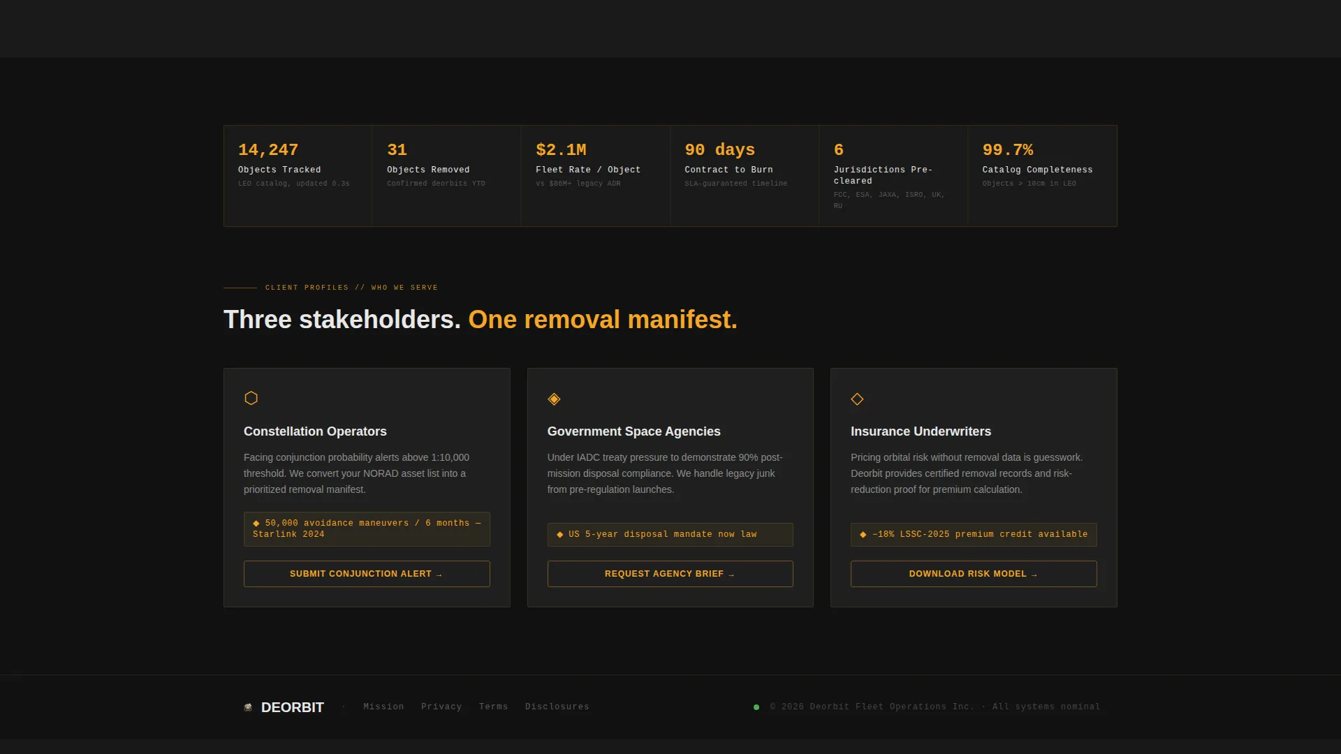
- Satellite constellation operators receiving collision-probability alerts who need a removal partner they can trust
- Government space agencies operating under treaty pressure to clean legacy debris from active orbital regimes
- Insurance underwriters pricing orbital risk who need proof that active debris removal is a fundable, executable plan
What problem this template solves
Most space debris removal companies struggle to translate technical capability into a compelling business case. Whitepapers and spec sheets get filed and forgotten. This template solves that by structuring the entire page as a compliance audit, making the financial and operational consequences of inaction impossible to ignore.
- Visitors can immediately compare legacy approaches against a full Deorbit mission profile, row by row
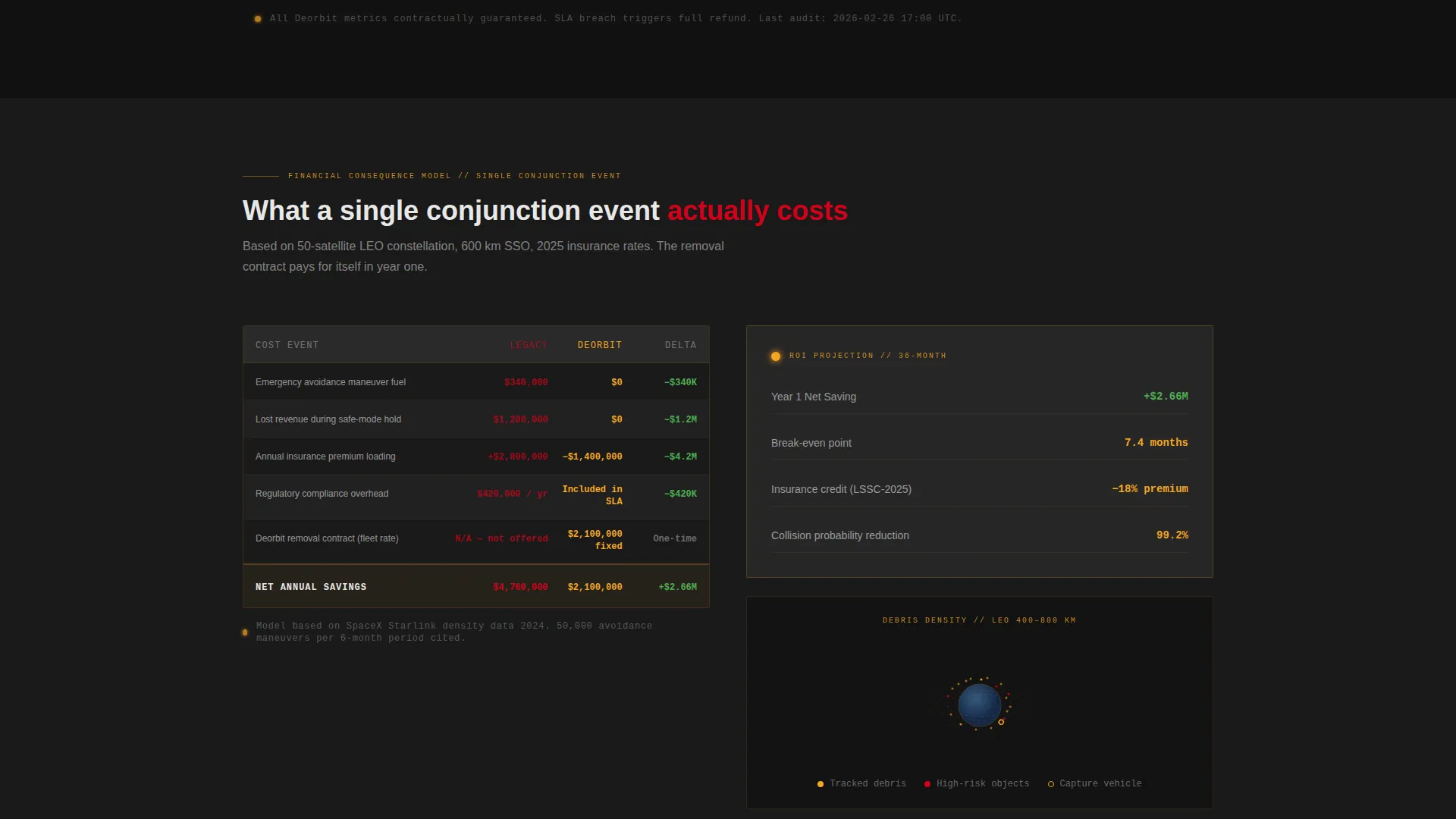
- The escalating scroll moves from technical specs into cost consequences, fuel burn, revenue loss, and premium hikes
- Two conversion paths capture visitors at different readiness levels, from asset-data submission to a spec-sheet download
What you get with this template
The template delivers a complete, conversion-focused landing page layout structured around a dashboard and data grid visual system. Every section is purposefully sequenced to build trust and move toward action.
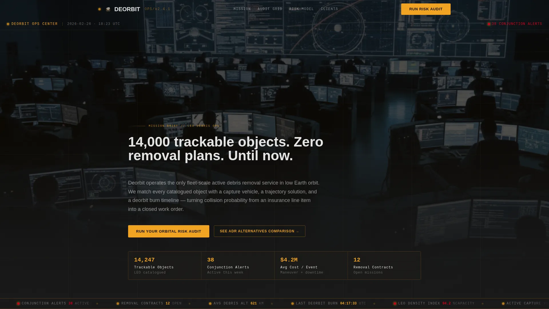
- A full-bleed cinematic header with a typed headline reveal and an orbital debris map on the central display wall
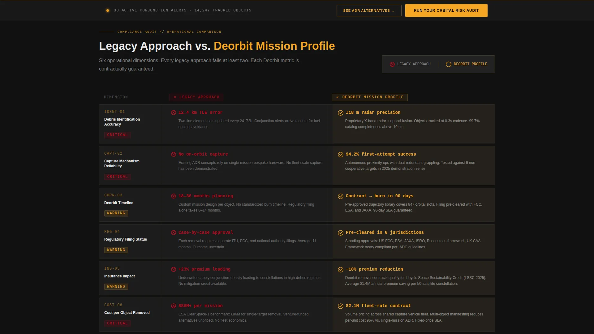
- A side-by-side compliance audit grid comparing legacy operations to the Deorbit mission profile across six operational dimensions
- A pinned amber call-to-action bar with a three-step orbital risk audit form and a secondary spec-sheet download path
Feature list
This template includes a focused set of layout and interaction components, each grounded in the operational brief.
Cinematic Full-Bleed Header
The header uses a dark, grain-textured mission operations center photograph. Rows of amber-lit monitors, silhouetted operators, and a central orbital debris map set the tone immediately. After a two-second pause, a single headline types itself across the bottom third of the screen.
Side-by-Side Compliance Audit Grid
The core section is structured like a formal audit table. The left column covers the legacy approach with gray text and red caution icons. The right column animates in with amber checkmarks and live-looking data, including specific percentages, hour counts, and cost-per-object figures.
Pinned Amber Risk Audit Bar
After the visitor scrolls past the third comparison row, a slim amber bar pins to the bottom of the viewport. It holds the primary call to action: "Run Your Orbital Risk Audit." This placement ties the conversion moment directly to the point where the business case becomes undeniable.
Three-Step Orbital Risk Audit Form
Clicking the primary call to action opens a three-step form. Step one collects the constellation name or NORAD catalog numbers. Step two offers a dropdown for orbit regime selection, covering Low Earth Orbit, Medium Earth Orbit, Sun-Synchronous Orbit, and Geostationary Transfer Orbit. Step three captures an email address for the delivered audit report.
Secondary Spec-Sheet Download Path
A second conversion path targets visitors who are not yet ready to submit asset data. The link reads "See How We Compare to ADR Alternatives" and leads to a detailed spec-sheet download gated only by an email address, designed for those building an internal briefing.
Financial Consequence Escalation Rows
The audit grid escalates as the visitor scrolls. Early rows focus on debris identification accuracy and capture mechanism reliability. Later rows shift to financial outcomes: maneuver fuel costs, lost revenue windows, and insurance premium increases versus the fixed cost of a removal contract.
Page sections overview
| Section | Purpose |
|---|---|
| Full-Bleed Header | Sets cinematic mission-control tone and delivers the typed headline reveal |
| Typed Headline Reveal | Introduces the core value statement after a two-second pause |
| Orbital Map Display | Shows clustered debris fields as amber point clouds around Earth |
| Audit Grid Header | Labels the left Legacy Approach and right Deorbit Mission Profile columns |
| Debris Identification Row | Compares identification accuracy between legacy systems and Deorbit |
| Capture Mechanism Row | Contrasts capture reliability with red caution icons versus amber checkmarks |
| Deorbit Timeline Row | Shows timeline commitment figures side by side |
| Regulatory Filing Row | Addresses regulatory status for each approach |
| Insurance Impact Row | Highlights premium consequences of no active removal plan |
| Cost Per Object Row | Closes the technical section with fixed-cost removal figures |
| Financial Consequence Rows | Escalates comparison into fuel costs, revenue loss, and premium hikes |
| Pinned call to action Bar | Locks the primary call to action at the viewport bottom after row three |
| Risk Audit Form | Collects asset data in three steps to deliver a personalized audit report |
| Spec-Sheet Download | Captures email for a detailed alternative-comparison document |
Design & branding system
The visual identity follows a Data Command theme built entirely around a Charcoal and Amber color system. Every color choice serves a functional purpose, the way indicator lights work on an actual operations console.
- Deep console black (#1A1A1A) as the base, graphite panel gray (#2E2E2E) for raised surfaces, amber alert (#F5A623) as the primary action and focus color, and cold status white (#E8E8E8) for typography and data labels
- A single emergency vermillion (#D0021B) appears exclusively on collision-probability badges, preserving its signal value by using it nowhere else
- The overall palette reads like the backlit face of a radar scope: dark enough for a dim operations room, with amber drawing the eye to what matters most
Mobile & speed optimization
The template is structured to remain readable and functional across screen sizes. The data-dense audit grid and pinned call-to-action bar are both designed with responsive layout behavior in mind.
- The side-by-side audit grid is built to reflow cleanly on narrower viewports without losing the left versus right comparison structure
- The pinned amber bar at the viewport bottom is sized for thumb-friendly interaction on mobile devices
How this template helps you convert
The entire page is sequenced as a conversion funnel, not a brochure. Every section builds toward a moment where the visitor has enough evidence to act.
- The typed headline and cinematic header create immediate credibility and signal that this is a serious operational company, not a concept deck
- The compliance audit grid makes the cost of inaction concrete, turning debris risk from an abstract concern into a line-item business case before the visitor reaches the call to action
- Two distinct conversion paths, one for operators ready to submit asset data and one for those building an internal case, ensure that almost no qualified visitor leaves the page without sharing an email address
Other information about this template
This template sits at the intersection of aerospace and defense, space and satellite operations, and the emerging active debris removal sector. It is purpose-built for a niche where trust, precision, and technical credibility are non-negotiable.
- The template style is Dashboard and Data Grid, making it well suited to any space operations or orbital services company that needs to present complex data in a scannable, mission-critical format
- The Checklist and Audit creative direction is transferable to adjacent use cases such as satellite ground station services, launch vehicle operators, or orbital logistics providers
- The Comparison and Versus landing page direction means the layout structure could support any high-stakes B2B offer where a direct competitive comparison drives the purchase decision
Theme
Data Command
Creative direction
Checklist & Audit
Color system
Charcoal & Amber
Style
Dashboard/Data Grid
Direction
Comparison/Versus
Page Sections
Cinematic Mission-control Header
Side-by-side Compliance Audit Grid
Pinned Amber Conversion Bar
Three-step Risk Audit Form
Secondary Spec-sheet Download Path
Financial Consequence Escalation Rows
Related questions
Who is this landing page template designed for?
Can I adapt the audit grid rows to reflect my own service comparisons?
What conversion actions does this template support?
When does the pinned call-to-action bar appear on the page?
Can this template be adapted for a different type of orbital or aerospace service?


