Platform Engineering Training Landing Page Template
Deploy is a dashboard-style landing page template built for platform engineering training programs. It targets mid-level DevOps engineers, SREs, and engineering managers ready to level up into certified platform engineers. The template pairs an interactive module preview header with a data-dense spec grid, driving visitors toward a free first-module experience with zero friction.
by Rocket studio
Quick summary
Deploy is a single-page landing page template designed for platform engineering training and certification programs. It opens with a live interactive module preview and scrolls through a clinical spec-sheet grid that breaks down each curriculum module by hours, tools, and certification weight. The page is built to earn the click by showing the product running, not just describing it.
Who this template is for
This template is built for programs that sell technical credibility to a technically demanding audience. It suits any training platform where the visitor needs to see proof before they commit.
- SREs and DevOps engineers looking to move into platform engineering roles
- Engineering managers who need to justify a platform team investment
- Training program operators selling a serious, structured certification curriculum
What problem this template solves
Generic course landing pages lose technical audiences fast. A hero image and a bullet list of vague outcomes will not convince an engineer who reads Kubernetes (K8s) API specs for fun. This template solves the credibility gap by replacing marketing language with proof.
- Visitors bounce when the page looks like every other online course site
- Technical buyers need to see curriculum depth, tooling specifics, and a real learning environment before they trust a program
- Standard landing page templates have no way to demonstrate a live product experience without custom development
What you get with this template
You get a fully structured, single-page layout built around two core ideas: show the product working, and prove the curriculum is worth the time. Every design decision serves a technical audience that is skeptical by default.
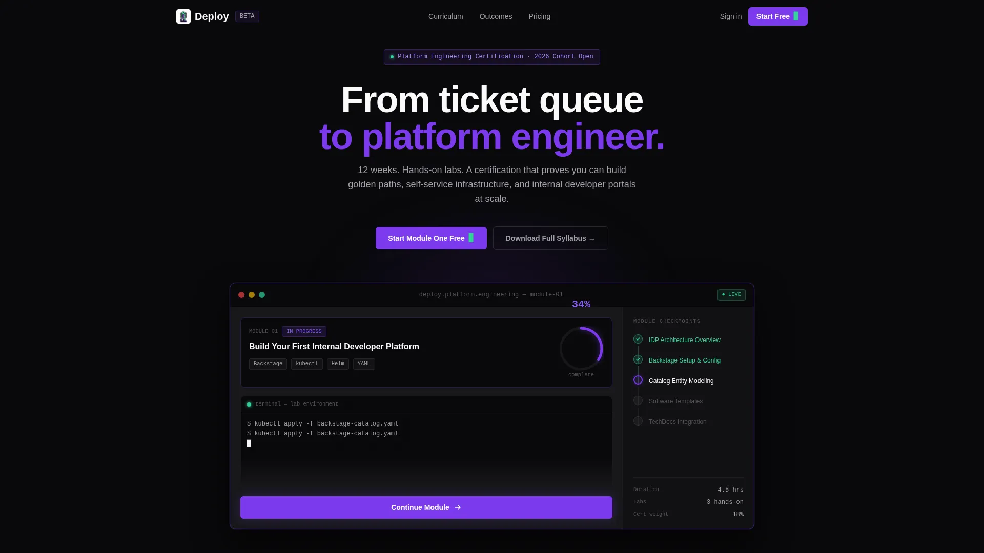
- An interactive header preview showing a real lesson tile, a progress ring, a terminal pane, and module checkpoint sidebar
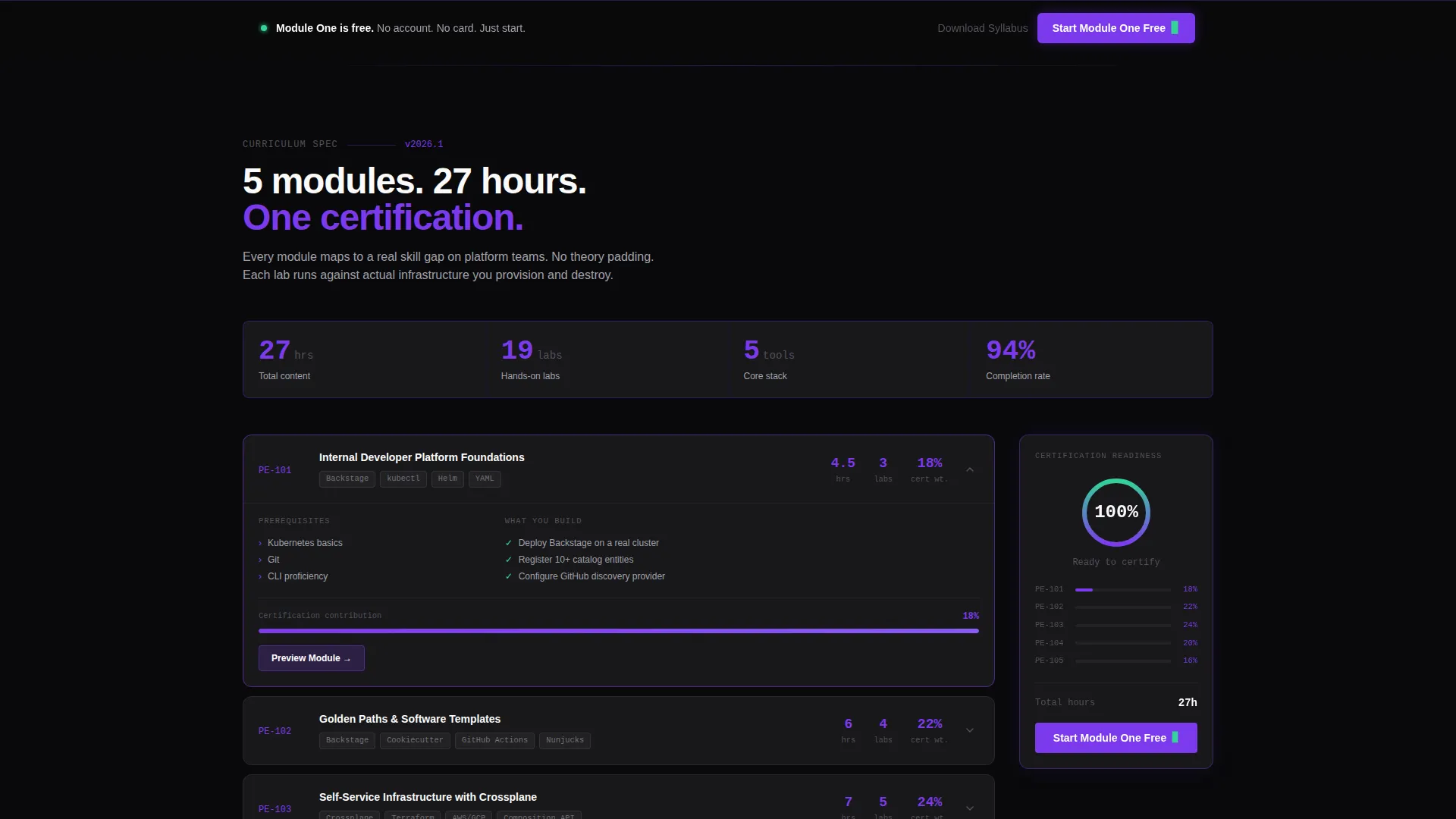
- A scrollable spec-sheet grid with module breakdowns, tool coverage columns, oversized violet data labels, and a sticky certification readiness tracker
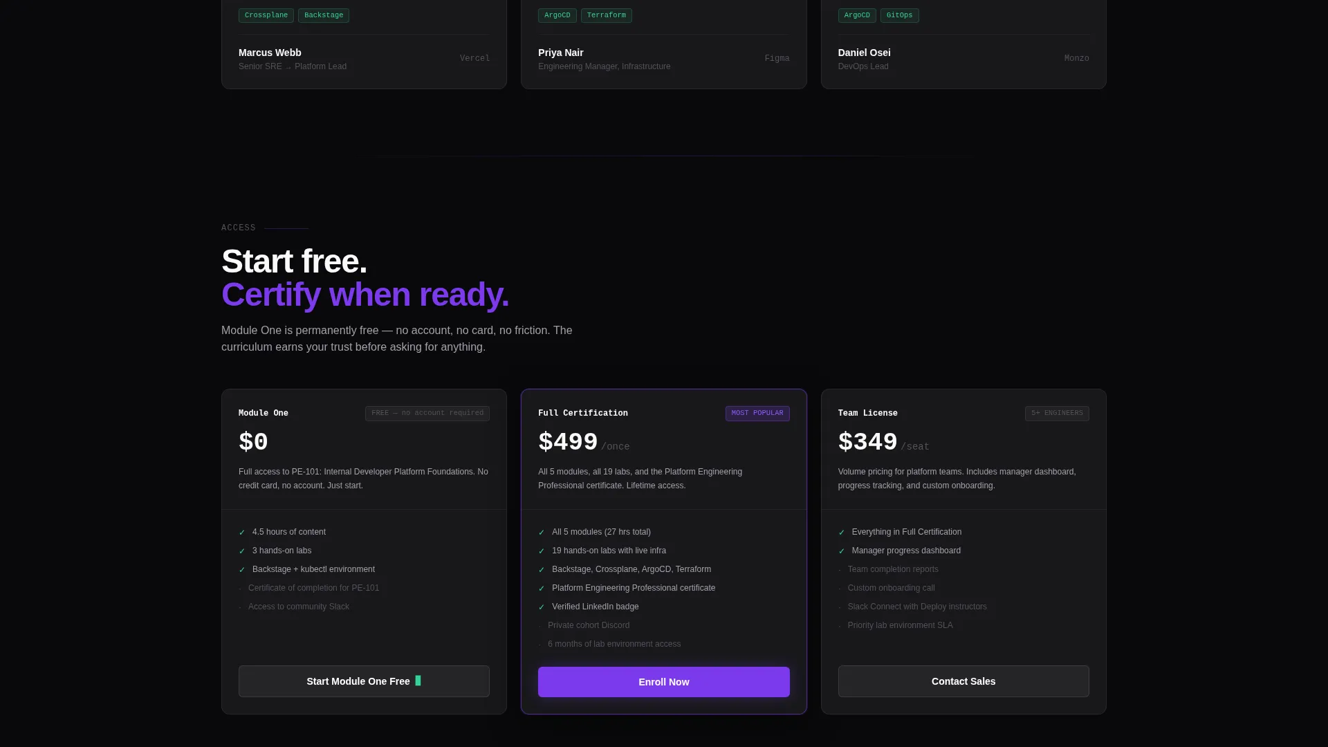
- A dual-call to action conversion system with a primary free-module button and a secondary syllabus download path
Feature list
This section outlines the core template capabilities backed directly by the source brief.
Interactive Module Header Preview
The header renders a functioning module interface directly in the viewport. It shows a real lesson tile titled "Build Your First Internal Developer Platform," a progress ring at 34 percent, and a terminal pane replaying an animated kubectl session. A sidebar lists module checkpoints with two marked complete. Visitors can hover cards, watch the terminal scroll, and click through to the learning environment.
Spec Sheet Data Grid Scroll
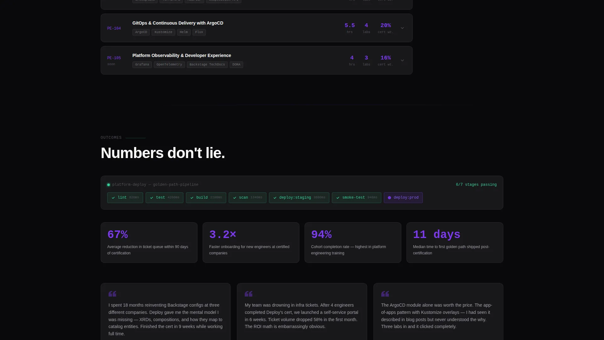
The page body is structured as a series of data-dense grid cards. Each card presents a module breakdown with hours to complete, tools covered, skill prerequisites, and certification weight percentage. Numbers are rendered oversized in electric violet, and tool logos appear in monochrome icon rows. The rhythm mirrors reading infrastructure documentation.
Sticky Certification Readiness Sidebar
A sticky sidebar tracks cumulative certification readiness as the visitor scrolls past each module section. The score fills progressively, giving the visitor a live sense of how the curriculum maps to a complete certification outcome.
Dual-Path Conversion System
The primary call to action, "Start Module One Free," uses a violet button with a mint terminal-cursor blink animation. It appears in the interactive header and repeats as a fixed bottom bar after the third scroll section. A secondary ghost-bordered button offers a full syllabus download in exchange for a work email only.
Void and Violet Design System
The entire template runs on a strict four-color palette. Void black backgrounds, terminal gray content cards with one-pixel violet borders, electric violet on every interactive surface, and sharp mint reserved exclusively for success states and completion badges. The visual language is instantly familiar to anyone who customizes their development environment.
No-Account First-Module Flow
The primary conversion path requires no account creation. Visitors click "Start Module One Free" and enter the learning environment immediately. This removes the biggest friction point for technical users who distrust sign-up walls before they have seen a product.
Page sections overview
| Section | Purpose |
|---|---|
| Interactive Header Preview | Show the live module interface and drive the primary click-through |
| Primary call to action Bar | Place the "Start Module One Free" button at first viewport |
| Module Spec Grid | Present curriculum depth with hours, tools, prerequisites, and certification weight |
| Sticky Readiness Sidebar | Build scroll momentum by filling a certification readiness score in real time |
| Fixed Bottom call to action Bar | Repeat the primary call to action after the third scroll section for late-scroll converters |
| Syllabus Download Section | Capture work email via secondary ghost-button for visitors not ready to start |
Design & branding system
The template runs a Startup Velocity theme built on the Void and Violet color system. Every color choice reinforces the feeling of a development environment running at midnight on a custom theme.
- Backgrounds use absolute void black (#09090B); content cards float on deep terminal gray (#18181B) with one-pixel electric violet (#7C3AED) borders
- Electric violet covers every interactive surface and progress indicator; sharp mint (#34D399) appears only on success states and completion badges
- Text uses crisp zinc white (#FAFAFA), never pure white, keeping contrast intentional rather than glaring
Mobile & speed optimization
The template is designed with a layout system that translates the data-grid experience to smaller screens without losing the density that makes it credible to a technical audience.
- Grid cards reflow to single-column stacks on mobile viewports, preserving readability of module spec data
- The sticky certification readiness sidebar adapts to a scroll-progress indicator at the top of the screen on narrow breakpoints
- The fixed bottom call to action bar is always visible regardless of viewport size, keeping the primary conversion action reachable
How this template helps you convert
The entire page is structured as a sequence of proof points that build trust before asking for a commitment. Each section adds a layer of evidence until the click feels obvious.
- The interactive header lets visitors experience the actual learning interface before reading a single marketing claim, establishing trust through direct product demonstration.
- The spec-sheet grid proves curriculum seriousness with quantified data: hours per module, tool coverage, and certification weight percentages that a technical reader can evaluate on their own terms.
- The no-account free module path removes the final objection by letting visitors start learning immediately, while the syllabus download captures leads who need more time to decide.
Other information about this template
This template is a strong fit for any platform engineering training program that needs to stand out in a market where technical audiences have high skepticism and low patience for vague promises.
- The curriculum spec grid is designed to showcase tooling such as Backstage, Crossplane, ArgoCD, and Terraform in monochrome icon rows alongside structured module metadata
- The page visual identity draws directly from the aesthetic of tools like a custom-themed integrated development environment, making it immediately legible to the DevOps and platform engineering community
- The template supports a golden path narrative: the page itself models the kind of opinionated, well-structured experience that platform engineers build for their own internal developer portals
Theme
Startup Velocity
Creative direction
Spec Sheet
Color system
Void & Violet
Style
Dashboard/Data Grid
Direction
Click-Through
Page Sections
Interactive Live Module Header
Data-dense Spec Sheet Grid
Sticky Certification Readiness Tracker
Dual-path Call to Action Architecture
Void and Violet Color System
Fixed Bottom Conversion Bar
Related questions
Does this template require a developer to set up?
Can I use this template for a certification program with multiple modules?
What makes this template different from a standard course landing page?
Is the syllabus download path included in the template?



