Containerization Newsletter Landing Page Template
Deploy is a containerization newsletter landing page template built for technically sharp audiences. It combines an interactive container health simulator, a twelve-dimension orchestration comparison table, and a dark terminal aesthetic to earn trust through utility. The app download flow is frictionless, with device-aware store badges and a scroll-triggered call-to-action that only appears after the visitor has engaged.
by Rocket studio
Quick summary
Deploy is a single-page landing page template for a containerization newsletter and community. It leads with an interactive pod health simulator, follows with a detailed platform comparison table, and drives app downloads through a scroll-triggered call-to-action. The void-black terminal aesthetic signals instant credibility to platform engineers and DevOps professionals.
Who this template is for
This template is built for technically fluent founders and content operators who need a high-signal landing page for a developer-focused newsletter or community. It suits people who want to convert skeptical engineers into subscribers and app users without relying on hype.
- Platform engineers and DevOps leads looking for a credible newsletter to bookmark
- Startup operators launching a containerization or infrastructure-focused publication
- Community builders targeting on-call engineers and infrastructure decision-makers
What problem this template solves
Most newsletter landing pages feel generic and soft. They rely on social proof copy and vague value propositions that developers skip past in under two seconds. This template flips that dynamic by delivering real utility before asking for anything.
- Visitors learn something concrete from the simulator and comparison table before a single email is requested
- The scroll-triggered call-to-action only appears after the visitor has already engaged, reducing friction and increasing intent
- The terminal visual language speaks directly to the audience, so the page feels like a tool rather than a sales pitch
What you get with this template
You get a fully structured single-page layout designed to convert technically minded visitors into newsletter subscribers and app users. Every section is purpose-built to move the visitor forward without wasted screen real estate.
- An interactive container health simulator embedded above the fold with three animated pod states
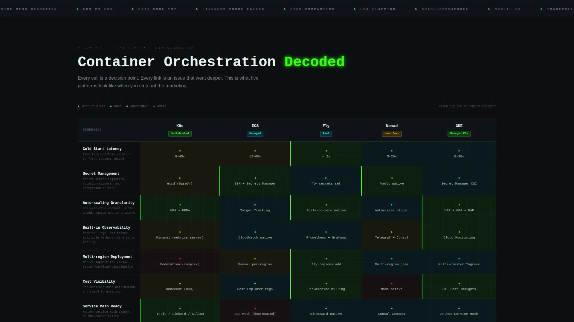
- A five-platform, twelve-dimension comparison table with scroll-reveal row animations
- A device-aware app download section with correct store badge detection and a pinned viewport call-to-action
Feature list
This template ships with purpose-built components that are directly relevant to the containerization niche. Each feature exists because the brief demands it, not as decoration.
Interactive Pod Health Simulator
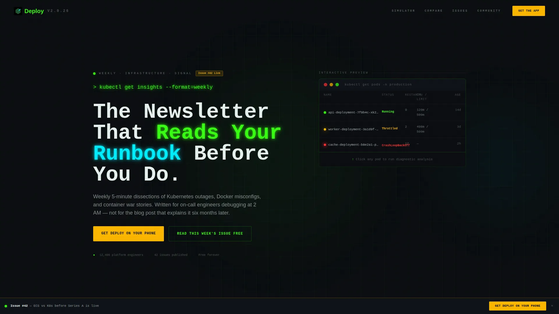
Three animated pods sit above the fold, each showing a distinct status: healthy, throttled, and in a restart loop. Visitors click any pod to reveal a diagnostic breakdown that mirrors the analysis style of the weekly newsletter. This interaction sets the editorial tone immediately.
Scroll-Triggered Comparison Table
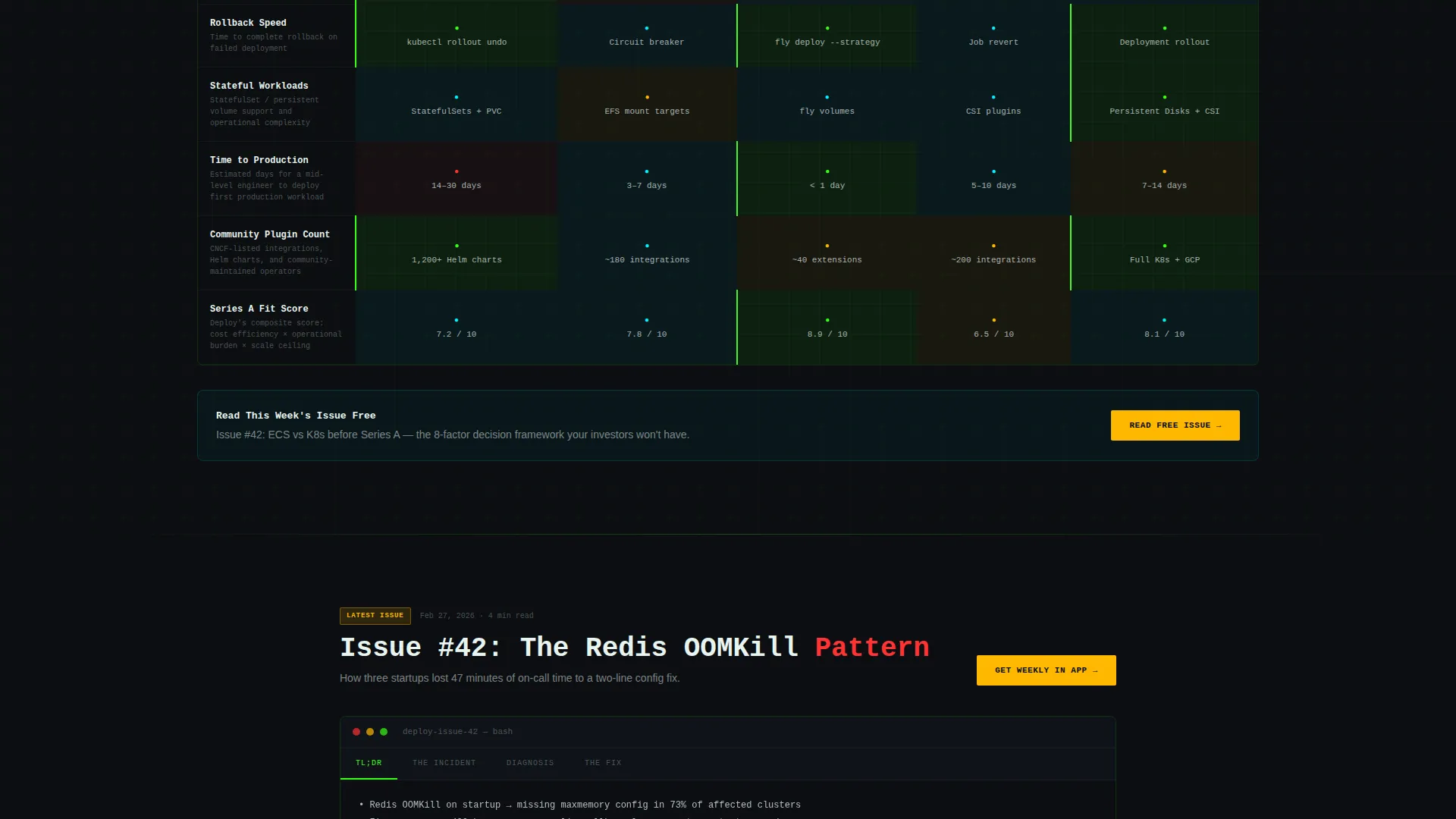
A five-platform orchestration comparison table covers twelve evaluation dimensions, including cold start latency, secret management, auto-scaling granularity, and community plugin count. Each row streams in on scroll like log output arriving in a terminal. Newsletter analysis is linked directly from individual table cells.
Scroll-Triggered Call-to-Action
The primary download button stays pinned to the bottom of the viewport but remains hidden until the visitor interacts with the simulator or scrolls past the first comparison row. This behavior earns attention before spending it, improving the quality of every click.
Device-Aware App Download Section
The primary call-to-action reads "Get Deploy on Your Phone" and detects the visitor's device to display the correct app store badge automatically. A secondary inline prompt after the comparison table offers a free issue as a low-friction entry point before the full app ask.
Typewriter Headline Animation
A monospaced headline types itself out character by character above the fold, rendering the string > kubectl get insights --format=weekly. The animation reinforces the terminal metaphor and signals to engineers that this page was built for them specifically.
Terminal-Style Visual Identity
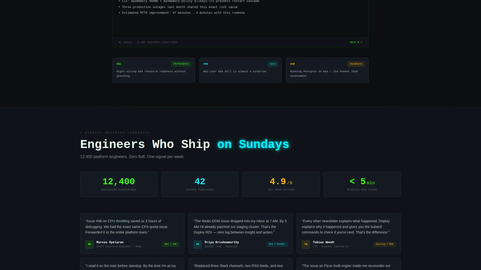
The layout uses void black as the base, with terminal phosphor green and electric cyan as alternating section accents. Warning amber is reserved exclusively for buttons, badges, and counters that require immediate attention. The result reads like a production dashboard rather than a marketing page.
Page sections overview
| Section | Purpose |
|---|---|
| Pod Health Simulator | Engages visitors above the fold with an interactive diagnostic tool |
| Typewriter Headline | Sets the terminal tone and communicates the newsletter format immediately |
| Orchestration Comparison Table | Delivers twelve-dimension platform analysis across five container systems |
| Inline Free Issue call to action | Offers a low-friction newsletter entry point after the comparison table |
| App Download Section | Drives the primary conversion with device-aware store badge detection |
| Pinned Viewport call to action | Keeps the download action visible after meaningful scroll engagement |
Design & branding system
The visual system is built around an Acid Digital color palette applied through a Startup Velocity theme. Every color has a defined job, and the hierarchy is strict: backgrounds stay dark, accents guide reading flow, and amber commands action.
- Void black (#0B0E11) forms all backgrounds, keeping the terminal atmosphere consistent throughout the scroll
- Terminal phosphor green (#39FF14) and electric cyan (#00F0FF) alternate as section accents, data highlights, and status indicators
- Hot warning amber (#FFB800) appears only on buttons, badges, and counters where the visitor's eye must stop and act
Mobile & speed optimization
The layout is designed to translate the terminal experience cleanly to smaller screens without losing the interactive components that make it work. The simulator and comparison table remain functional at mobile viewport widths.
- The pinned call-to-action button adapts to mobile bottom-bar positioning so it stays reachable without covering content
- The comparison table supports horizontal scroll on narrow screens so all twelve dimension columns remain accessible
How this template helps you convert
This template converts by proving value before asking for commitment. The sequence is deliberate: interact, learn, trust, act.
- The pod simulator creates an immediate hands-on moment that demonstrates the newsletter's analytical depth before a single word of copy is read
- The comparison table delivers genuine reference-grade information, so by the time the visitor reaches the download section they have already benefited from the page twice
- The scroll-triggered amber call-to-action appears only after earned engagement, which means the visitor who sees it has already signaled intent
Other information about this template
This template was designed specifically for the containerization newsletter and community niche, where audiences are highly skeptical of marketing language and respond better to demonstrated competence. The Calculator/Tool First creative direction means the page architecture prioritizes utility over persuasion copy.
- The template style is a comparison table layout, making it well-suited for any infrastructure or developer tooling newsletter that competes across multiple platform options
- The Interactive Preview header concept positions the simulator as the true above-the-fold hero, replacing a static headline-and-hero-image convention
- The App Download landing page direction aligns the entire scroll path toward a single primary outcome, with a secondary free-issue entry point as a softer funnel step
- The Startup Velocity theme and Acid Digital color system are reusable starting points for other developer-facing or infrastructure-focused products that need a high-contrast dark-mode identity
Theme
Startup Velocity
Creative direction
Calculator/Tool First
Color system
Acid Digital
Style
Comparison Table
Direction
App Download
Page Sections
Interactive Pod Health Simulator
Twelve-dimension Comparison Table
Scroll-triggered Pinned Call to Action
Device-aware App Store Badges
Typewriter Headline Animation
Acid Digital Terminal Color System
Related questions
Can I adapt the comparison table for a different set of container platforms?
Does the pod health simulator require a connection to real infrastructure?
How does the device-aware app store badge work?
Can I replace the app download call-to-action with an email subscribe form?
Is this template suitable for developer newsletters outside containerization?



