Instant Deployment Landing Page Template
Deploy is a bento grid landing page template built for deployment platforms. It follows a Problem→Solution Arc with dark glass panel visuals, a reactor teal accent system, and a freemium conversion flow. The design moves visitors from pain to proof fast, using animated status cards, a speed comparison grid, and a single-field GitHub signup to remove every barrier between interest and action.
by Rocket studio
Quick summary
Deploy is a single-page bento grid landing page template designed for deployment platforms. It opens with a mission-control aesthetic, dark glass panels floating over a void-black background, and drives visitors through a Problem→Solution Arc that ends at a frictionless freemium signup. The template is built for speed, clarity, and conversion.
Who this template is for
This template is built for teams and individuals who ship software fast and need a landing page that speaks their language. It is designed for technical founders, startup engineering leads, and developer-focused agencies.
- Solo founders who need a polished marketing page without hiring a designer
- Startup CTOs managing multiple services who want a credible product presence fast
- Agency teams deploying client projects under deadline pressure
What problem this template solves
Most deployment platform pages either look too generic or bury the value inside walls of text. Developers are skeptical. They need to feel the speed before they believe it. This template is structured to close that trust gap quickly.
- Visitors arrive to a visually immersive header that simulates the product experience rather than describing it
- The Problem→Solution Arc replaces static copy with a scroll journey that makes friction feel intolerable by the end
- The freemium conversion path removes every common signup blocker before the visitor can hesitate
What you get with this template
You get a complete, single-page bento grid layout with every section pre-designed and ready to customize. The template gives you a full visual system and a clear conversion path from the first scroll to the final call to action.
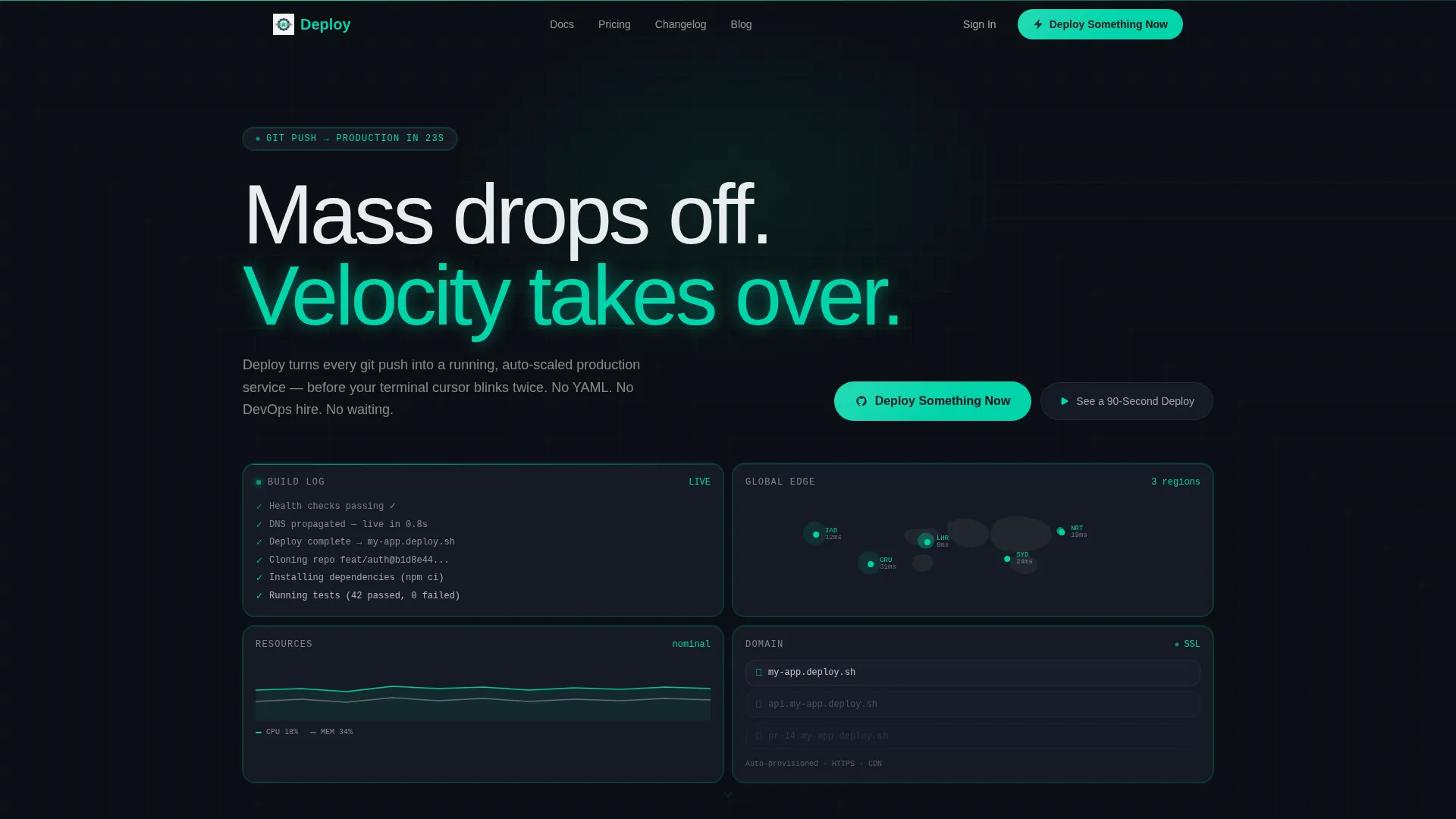
- A header section built from dark glass bento panels showing live deployment states: build logs, a world map with latency pings, resource graphs, and a domain lock panel
- A Problem→Solution Arc scroll sequence where cards flip between pain states and solution states, separated by a teal divider wipe
- A sticky bottom bar call to action, an inline video trigger, an integration mosaic, a pricing bento, and a single-field GitHub connect signup
Feature list
This template includes a focused set of design and layout features drawn directly from the brief. Each one serves a specific job in moving a visitor from skeptical to signed up.
Dark Glass Panel Header
The header is composed of frosted, translucent bento cards floating over the void-black background. Each panel displays a living fragment of the deployment experience: a streaming build log, a world map with latency pings, a resource graph, and a domain panel. Teal accent lines trace the card borders like circuit current, and glass refraction adds subtle depth at every edge.
Problem to Solution Bento Arc
The scroll journey begins with a bento grid arranged around pain: cards showing YAML configuration issues, failed pipelines, a DevOps cost clock, and a staging failure message. A single teal divider line wipes across the viewport, and every card flips to its solution state. This transition is the emotional core of the page.
Sticky Conversion Bar
After the first scroll, a sticky bottom bar appears with the primary call to action. It stays visible through the speed comparison, integration, and pricing sections so the conversion path is never more than one tap away.
Inline Video Trigger
A secondary call to action, "See a 90-Second Deploy," opens an inline video without leaving the page. This gives proof-first visitors a low-commitment way to experience the product before they decide to sign up.
Integration Mosaic Section
A dedicated section displays a grid of integration logos covering source control, container tools, and database services. It gives technical visitors a fast visual confirmation that their existing stack is supported.
Freemium Signup Flow
The final section anchors the primary call to action and opens a single-field signup form with only a GitHub connect button. No email, no password, no credit card. The form design reflects the platform's core promise: zero friction from decision to first deploy.
Page sections overview
| Section | Purpose |
|---|---|
| Dark Glass Header | Immerses visitors in the deployment experience immediately |
| Problem Bento Grid | Surfaces the pain of slow, broken deployment workflows |
| Teal Divider Wipe | Marks the emotional pivot from problem to solution |
| Solution Bento Grid | Shows resolved states: one-click deploys, health checks, previews |
| Speed Comparison Grid | Proves the platform's velocity advantage against the status quo |
| Integration Mosaic | Confirms compatibility with common developer tools and services |
| Pricing Bento Panels | Presents plan tiers side by side in glass panel cards |
| Final call to action Section | Anchors the freemium signup with a single GitHub connect button |
Design & branding system
The visual identity follows a Startup Velocity theme built around the Teal Catalyst color system. Every color choice is intentional, and nothing in the design is decorative for its own sake.
- Void black (#0B0F14) as the primary background, cockpit gray (#1A1F2B) for card surfaces, reactor teal (#00D4AA) for calls to action and status indicators, and signal white (#E8ECEF) for all typography
- Bento grid layout with frosted glass panel cards, subtle depth and refraction effects at card edges, and teal accent borders that trace each card like live circuit lines
- The overall aesthetic feels like a mission control dashboard at T-minus ten: dark, focused, and every glowing element carries purpose
Mobile & speed optimization
The bento grid layout is structured to reflow cleanly across screen sizes, keeping the visual hierarchy intact whether viewed on a desktop workstation or a mobile device.
- Bento panels stack and resize in a logical reading order so the Problem→Solution Arc remains coherent on smaller screens
- The sticky bottom bar is designed to stay functional and non-intrusive on mobile viewports throughout the scroll
- Animations and interaction states are kept tight and fast so the page's own behavior reinforces the platform's speed message
How this template helps you convert
The conversion strategy is built into the page structure itself. Every design decision reduces the distance between first impression and signup action.
- The header immerses visitors in a simulated product experience before a single word of persuasion is read, so trust builds from the first second
- The Problem→Solution Arc creates a felt sense of momentum, making visitors feel the relief of the solution rather than just reading about it
- The GitHub connect signup removes every traditional form barrier so the only decision left is a single button click
Other information about this template
This template is part of a broader Startup Velocity theme collection and pairs naturally with developer-focused product and SaaS marketing contexts. It is a strong fit for teams building in the deployment platform and cloud infrastructure space.
- The template style is a bento grid, which suits developer audiences who scan rather than read and respond to data-dense, modular layouts
- The freemium and trial conversion model is baked into the page flow, making it suitable for products offering a free tier or a no-credit-card trial
- The creative direction, Problem→Solution Arc, is a proven structure for developer tools where skepticism is high and proof of value must come before any ask
- The Teal Catalyst color system is designed to evoke precision and velocity, which aligns with how deployment platforms communicate their core value to engineering audiences


Theme
Startup Velocity
Creative direction
Problem→Solution Arc
Color system
Teal Catalyst
Style
Bento Grid
Direction
Freemium/Trial
Page Sections
Dark Glass Panel Header
Problem to Solution Bento Arc
Sticky Conversion Bar
Inline Video Trigger
Integration Mosaic Section
Frictionless Freemium Signup
Related questions
Can I customize the bento card content for my own platform?
Does the template include the inline video player layout?
Is the GitHub connect signup form functional out of the box?
How does the sticky bottom bar behave on mobile devices?
Can this template work for developer tools beyond deployment platforms?


