IT Services Company Reviews Website Template
Deploy is a split-screen mission control landing page built for managed IT service providers. It pairs a dark Data Command aesthetic with a spec-sheet layout to turn visitor skepticism into confident clicks. Every section earns trust through real SLA figures, named tools, and second-person scenarios. The result is a high-conversion landing page that moves operations managers, CTOs, and office managers toward a single, clear goal: reviewing your service plans.
by Rocket studio
Quick summary
Deploy is a 50/50 split-screen landing page template designed for B2B managed IT service providers. It uses a mission control aesthetic to communicate operational authority from the first scroll. The page clusters all persuasion into a single goal: routing qualified visitors to a service plans page. No forms, no friction, no distractions. Just the data, the design, and the desired action.
Who this template is for
This landing page is built for businesses that sell managed IT services and need to project immediate technical credibility. It works best when the sales cycle involves skeptical, detail-oriented buyers who respond to facts rather than marketing language.
- Managed service providers who want to generate leads by showing prospects exactly what they get, with real uptime figures and named response windows.
- IT consultancies that need a landing page to drive traffic from paid campaigns or email sequences toward a pricing or service plans page.
- In-house marketing teams at IT companies looking to create a standalone web page for a specific campaign without rebuilding their full website.
What problem this template solves
Most IT service landing pages suffer from the same common mistakes: vague promises, generic stock imagery, and a layout that forces visitors to search for the information they actually need. Technical buyers lose confidence fast when a page feels like a brochure. Static pages often fail to engage technical audiences who want to see how a solution actually works.
- Decision paralysis: Presenting too many options on a single web page raises the bounce rate. This template keeps the layout focused on a single goal, guiding each user toward one specific action.
- Lack of proof: Buyers in buying mode need evidence before they decide. The template surfaces SLA percentages, response-time windows, and tool-stack details at exactly the right moment in the scroll.
- Friction and distraction: Standard website navigation pulls visitors away from the desired action. This landing page removes those links and keeps the user locked onto the clear call to conversion.
What you get with this template
You get a fully structured, single-page layout built around a mission control center aesthetic. Every section is pre-configured to serve a specific persuasion function, so you spend your time customizing content rather than making layout decisions from scratch.
- Seven distinct page sections: Hero, Services Spec Sheet, Metrics Bento, Testimonials, Call-to-Action Rail, and a minimal footer, all arranged to escalate trust as the user scrolls.
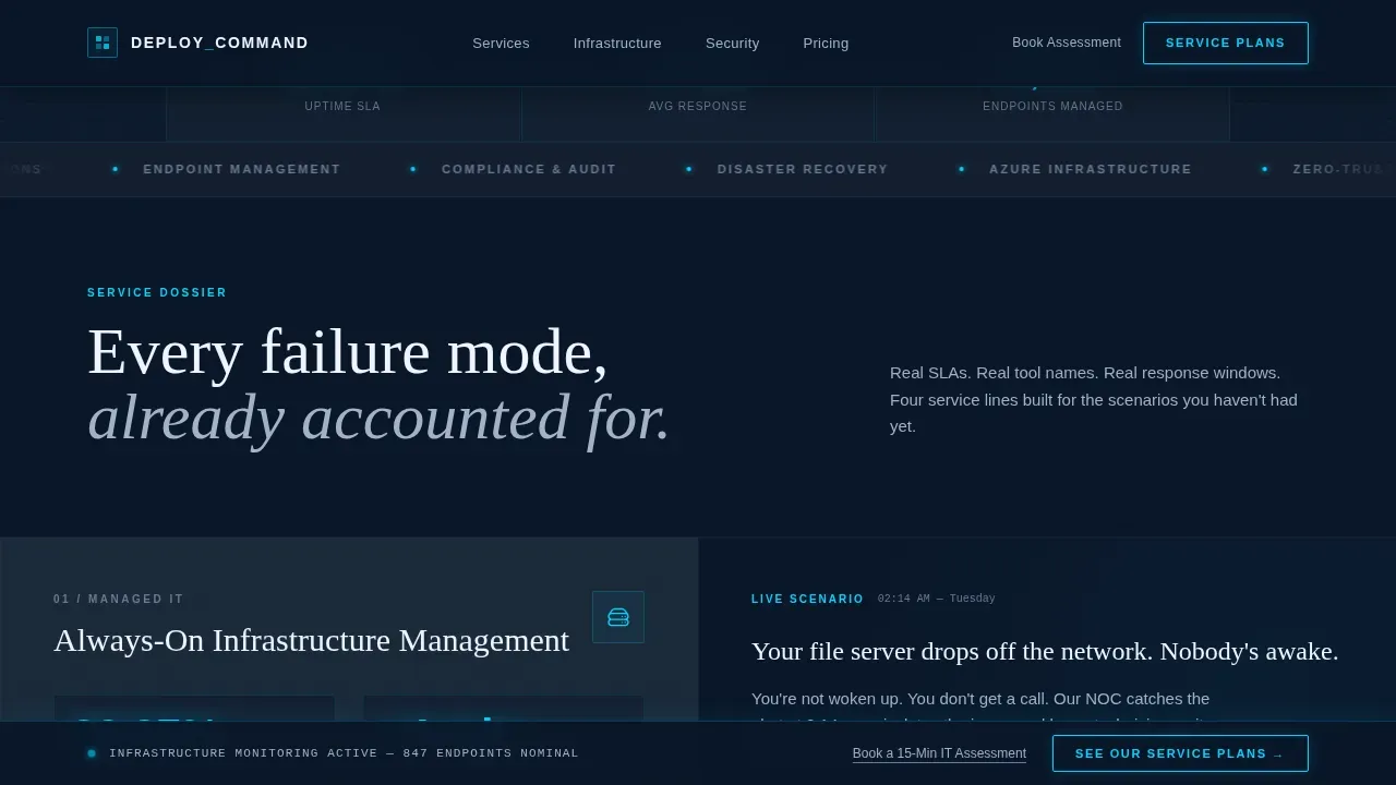
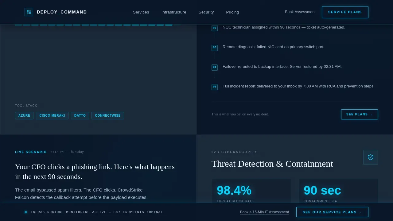
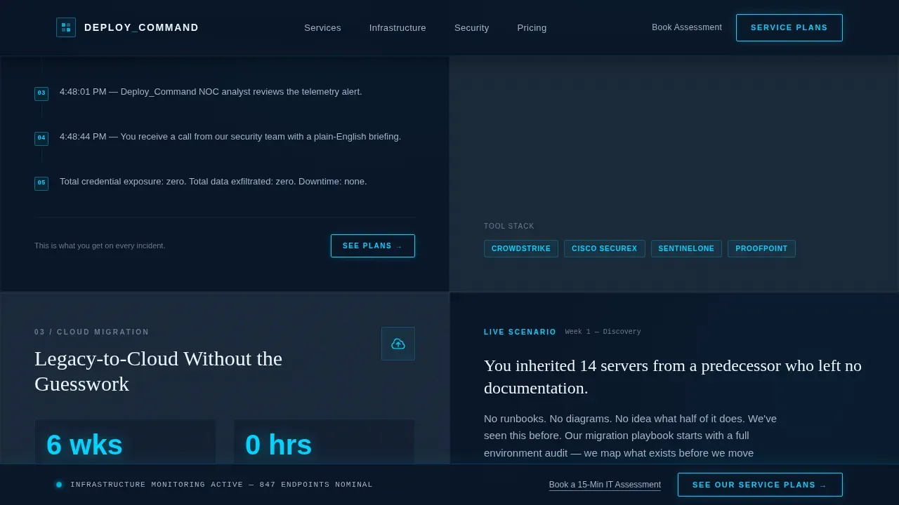
- Split-screen service modules: Four 50/50 service blocks, each pairing a technical spec card on the left with a real-world second-person scenario on the right, so customers immediately understand what each service means in practice.
- Persistent conversion architecture: A sticky bottom bar carries the primary call to action across the entire page, and an inline call to action repeats after each spec module, giving every user a clear path forward at any scroll depth.
Feature list
This landing page is built around six core capabilities that work together to move a skeptical IT buyer from first impression to confident click.
Mission Control Hero with Animated Node Mesh
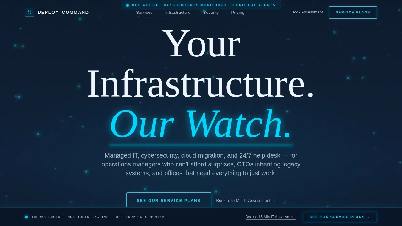
The hero section fills the full viewport in deep terminal navy, with a canvas-rendered network node mesh that pulses slowly in status-glow cyan. The headline, "Your Infrastructure. Our Watch.", renders in white with a cyan underline glow. This above-the-fold configuration places the compelling headline, value proposition, and primary call to action in immediate view without scrolling, matching the standard for high-conversion landing pages.
Split-Screen Spec Sheet Service Modules
Four service areas, managed IT, cybersecurity, cloud migration, and help desk, each get their own 50/50 module. The left side presents a technical spec card with an icon, uptime SLA percentage, response-time guarantee, and a tool-stack row. The right side delivers a single real-world scenario written in second person. This format gives the user concrete data and an emotional anchor in the same visual exchange, keeping conversion rate progress steady as they scroll.
Metrics Bento Dashboard Panel
A bento-style grid presents live-feel operational statistics, including uptime percentage, average time to response, and total number of incidents resolved. The layout echoes real dashboard views from a network operations center. Dashboard elements like progress indicators and status readouts communicate reliability without requiring a single word of explanation.
Testimonials Spotlight Section
Client testimonials are formatted as spotlight cards with hover effects. Each card focuses on a specific outcome rather than a generic compliment, giving customer stories the quantifiable detail that reduces purchase anxiety for IT buyers. Case studies and specific results are surfaced here to keep the trust signal strong heading into the final call-to-action section.
Persistent Sticky Call-to-Action Bar
The primary call to action, "See Our Service Plans," appears as a cyan-glowed button anchored in a persistent bottom bar across the full page. This single call to action ensures that no matter where a user pauses, the path to conversion is always visible. A secondary text link, "Book a 15-Min IT Assessment," provides a direct-to-calendar route for visitors already in buying mode, creating a clear call for two distinct intent levels without adding visual noise.
Minimal Developer-Style Footer
The footer follows a GitHub Developer Minimal pattern, keeping the base of the page clean and uncluttered. Navigation links are intentionally sparse so the user experience stays focused on the primary service message rather than branching into unrelated resources or pages.
Page sections overview
| Section | Purpose |
|---|---|
| Hero Viewport | Establish mission control authority and surface headline, value proposition, and primary call to action above the fold |
| Managed IT Module | Split-screen spec card plus real-world scenario for managed IT service |
| Cybersecurity Module | Split-screen spec card plus incident scenario illustrating security response speed |
| Cloud Migration Module | Split-screen spec card plus migration scenario with named tool stack |
| Help Desk Module | Split-screen spec card plus everyday support scenario for non-technical buyers |
| Metrics Bento Panel | Live-feel operational stats including uptime, response time, and resolved incidents |
| Testimonials Section | Spotlight cards with specific client outcomes and quantifiable results |
| call to action Rail | Persistent bottom bar plus inline calls to action after each service module |
| Minimal Footer | Developer-style base with sparse links and no navigation distractions |
Design & branding system
The visual identity is built on a Data Command theme that evokes a network operations center after dark. Every color choice is purposeful. Navy dominates backgrounds in deep gradients, cyan appears sparingly as scan-lines, border glows, and call to action pulses, while steel gray keeps long-form text readable without breaking the nocturnal atmosphere.
- Color palette: Deep terminal navy (#0A1628) for backgrounds, operational charcoal (#1B2838) for cards, status-glow cyan (#00D4FF) for interactive elements and hover states, and cold steel gray (#A3B1C6) for body text.
- Typography: DM Sans handles all user interface and body text for clarity at small sizes; Fraunces is used for display headlines to add editorial authority.
- Motion and texture: A canvas-rendered animated node mesh, scan-line effects, staggered scroll reveals, and a cursor-reactive background create the sense that the page is a living system being monitored in real time.
Mobile & speed optimization
This template is designed desktop-first to match how operations managers and CTOs typically access vendor resources, at a workstation, during or after business hours. That said, a solid mobile fallback is built into the layout so the experience stays complete on smaller devices.
- Responsive layout: The 50/50 split-screen modules reflow cleanly on smaller devices, ensuring that all text, spec details, and call-to-action buttons remain accessible and readable without horizontal scrolling.
- Performance-aware animation: Heavy canvas animations are handled through client-side components only, keeping static content delivered efficiently. Interactive elements on all devices maintain a usable minimum target size, following best practice for mobile interaction.
- Sticky call to action on all screen sizes: The persistent bottom bar remains enabled across desktop and mobile devices, so the conversion path is never lost regardless of screen size or scroll depth.
How this template helps you convert
A high-conversion mission control IT services landing page acts as a command center for the user, combining high-tech visuals with benefit-driven messaging and trust-building elements. This template is architected to lift conversion rate by removing every common obstacle between a qualified visitor and the click that matters.
- Single conversion goal, zero friction: The page is built around a single call to action routing visitors to a service plans page. No form on this landing page means no friction. Every design decision, from the removal of standard navigation to the sparse footer, keeps the user focused on one specific action. A single goal produces a cleaner path and a measurably lower bounce rate.
- Proof before persuasion: Real SLA numbers, named response windows, and specific tool details appear before any ask. This approach follows the principle that IT buyers need verified evidence first. Showing data rather than adjectives answers the credibility question before it forms. Live-feel metrics, customer stories, and case studies complete the proof cluster so the user arrives at the call to action already convinced.
- Escalating trust architecture: The page scrolls like a mission dossier. Each section builds on the previous one, moving from reactive support to proactive architecture. By the time a visitor reaches the final call-to-action rail, they have seen four service scenarios, a metrics panel, and testimonial evidence. That progression converts passive interest into a specific action with a natural sense of progress and momentum.
Other information about this template
This section covers additional context that helps buyers, developers, and marketing teams understand the full scope of the template and how it fits into a broader marketing strategy.
- Campaign alignment: This landing page is designed to receive traffic from paid search, outbound email, or direct referral links. It functions as a standalone web page, separate from a full website, so it can be deployed for a specific campaign without touching existing site configuration or default values in your main navigation.
- Marketing goals and conversion rate tracking: Because the page routes all visitors toward a single call to action, it is straightforward to monitor conversion rate and bounce rate using any standard analytics tool. Marketing teams can set up tracking without complex configuration since the page has a clear, singular conversion event.
- Common mistakes to avoid: Do not add extra navigation links to this landing page after installation. Doing so raises the bounce rate by pulling users away before they reach the call to action. Similarly, avoid replacing the spec-sheet service modules with generic paragraph text; the data-forward format is what sustains the conversion rate for this audience. These are among the most common mistakes teams make when adapting a technical landing page for a non-technical audience.
- Customization and configuration: All service details, SLA values, response-time figures, and tool-stack references are placeholder content. You configure each spec card with your own appropriate values to reflect the actual services you offer. The default values in the template are illustrative only and should be replaced during setup. If your team uses a yaml file or similar configuration format for deployment, the template structure supports that kind of systematic content exchange during installation.
- Testing and iteration: A/B testing different headlines, button colors, and call to action copy is one of the most effective ways to increase your conversion rate after launch. The template's clean single-call to action layout makes testing straightforward since there is only one variable to optimize. Regular testing cycles help you remediate issues quickly and determine which message resonates best with your specific audience. Common mistakes in post-launch testing include running too many variables at once; keep each test focused on a single element to get a clean answer.
- Reconciliation status of content: The template is pre-configured with illustrative data to show the layout at its best. The reconciliation status of your live configuration versus the default template state should be reviewed before go-live. Swap all placeholder metrics, customer names, and tool references with verified data from your own operations.
- Access and resources: Once you access the template, all source files are available for editing. Resources include the full component set, motion configuration, color tokens, and typography settings. New features or layout variants can be added following the same component pattern established in the base template.
- Related topics and use cases: This template is suited for IT service providers who want to generate leads from mid-market and enterprise buyers. Related topics that inform its design include network operations center visibility, managed service provider positioning, and click-through landing page best practices. Offering valuable content like live-feel metrics and real-world scenarios is what separates this template from generic IT landing pages. The following command structure of the layout, section by section escalation, mirrors how mission control center operators process status information, giving technical buyers a familiar and reassuring reading experience.
- Drive traffic and marketing strategy: To drive traffic effectively, pair this landing page with a focused marketing strategy that sends a specific audience to a specific message. Marketing teams that use paid search or account-based outreach will find this layout especially effective because it mirrors the precision those buyers expect. Tailor your marketing goals to the single conversion event this page is designed to capture, and align your ad copy with the compelling headline already present in the hero section.
Theme
Data Command
Creative direction
Spec Sheet
Color system
Midnight Blue
Direction
Click-Through
Page Sections
Animated Mission Control Hero
Split-screen Spec Sheet Modules
Live-feel Metrics Bento Panel
Spotlight Testimonials with Hover Effects
Persistent Sticky Call-to-action Bar
Data Command Visual Identity System
Related questions
Can I use this landing page template without coding experience?
How do I customize the SLA figures and service details?
Does this landing page include a contact form?
Is this template usable on mobile devices?
Can I run A/B testing on this landing page after launch?



