Interactive Containerization Comparison Landing Page
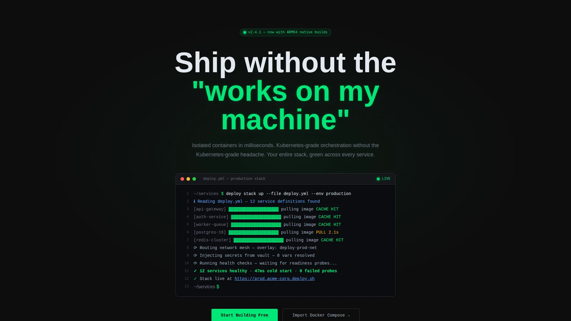
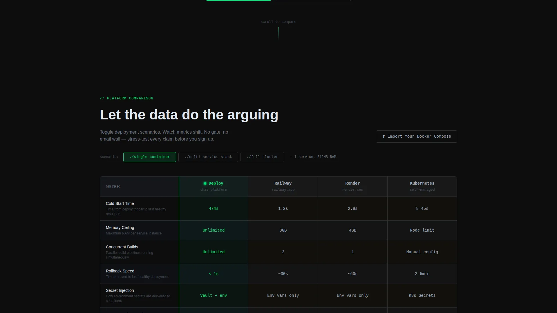
Deploy is a dark-themed, interactive comparison landing page built for containerization platforms. It features a live terminal header, a togglable scenario-driven comparison table, and a sticky "Start Building Free" call to action. Designed for DevOps leads, platform engineers, and startup CTOs, it turns complex container metrics into a hands-on, self-service buying experience.
by Rocket studio
Quick summary
Deploy is a single-page comparison template built for containerization platforms. It opens with a syntax-highlighted terminal header and leads visitors into an interactive table where they toggle deployment scenarios and watch real metrics shift. The Carbon Fiber visual system and Dashboard Pro theme signal craft to engineers from the first scroll.
Who this template is for
This template speaks directly to technical decision-makers evaluating container infrastructure. It is built for people who would rather read a deploy.yml file than a marketing brochure.
- DevOps leads managing microservices across staging and production environments
- Platform engineers building internal developer portals
- Startup CTOs who need serious container orchestration without heavy operational overhead
What problem this template solves
Most comparison pages give engineers a static table and ask them to trust the numbers. That approach fails with a technical audience that wants to probe claims before committing. Deploy solves this by making the comparison interactive and exploratory.
- Removes the frustration of static, unverifiable competitor comparisons
- Eliminates the need to gate content behind email walls before visitors have seen the evidence
- Replaces stock-photo marketing with a code-first presentation that earns credibility on sight
What you get with this template
You get a fully structured, dark-theme landing page ready to present your containerization platform against competitors. Every section is purpose-built for a technical audience that values precision over polish.
- A live terminal header block with a syntax-highlighted
deploy.ymlsnippet and blinking cursor - An interactive comparison table where visitors toggle between single container, multi-service stack, and full cluster scenarios
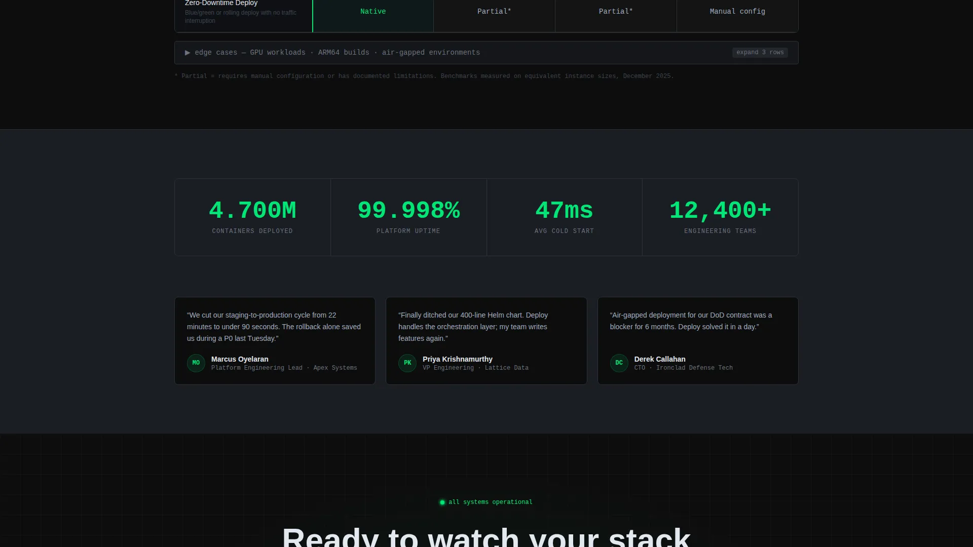
- Expandable rows covering edge cases such as GPU workloads, ARM builds, and air-gapped environments
- A sticky navigation bar with a status-green primary call to action that appears after the first scroll
- A secondary "Import Your Docker Compose" path targeting visitors already running containers
Feature list
This section covers the core interactive and visual capabilities built into the Deploy template.
Live Terminal Header Block
The header renders a monospaced, syntax-highlighted deploy.yml code block inside a dark editor frame. It includes subtle line numbers, traffic-light window chrome, and a blinking cursor that executes on page load. The final output line prints a confirmation of 12 healthy services at a 47-millisecond cold start.
Interactive Scenario Comparison Table
Visitors toggle between three deployment scenarios: single container, multi-service stack, and full cluster. As the scenario changes, each table row animates its values live. Tracked metrics include cold start time, memory ceiling, concurrent build limits, rollback speed, and secret injection method.
Expandable Edge-Case Rows
Rows for GPU workloads, ARM builds, and air-gapped environments are built into the table but revealed on demand. This lets the template surface differentiating detail without overwhelming the initial view. Competitors who leave these cells blank or asterisked are exposed by the contrast.
Sticky Navigation with Primary Call to Action
A sticky navigation bar pins the "Start Building Free" call to action in status-green after the first scroll. It stays visible throughout the comparison experience so the conversion path is never out of reach. Visitors never have to scroll back to the top to act.
Secondary Migration Entry Point
A "Import Your Docker Compose" link sits beside the comparison table header row. It targets engineers who are already running containers on another platform and are ready to migrate. This secondary path reduces friction for a high-intent visitor segment.
Carbon Fiber Dashboard Theme
The visual system uses deep carbon black, graphite panel gray, status-green accents, cold aluminum secondary text, and warning amber on competitor columns. Every color carries functional meaning, mirroring the activity LED logic of real server hardware.
Page sections overview
| Section | Purpose |
|---|---|
| Terminal Header Block | Opens with live code execution and health-check output |
| Sticky Navigation Bar | Keeps the primary call to action visible after first scroll |
| Scenario Toggle Controls | Lets visitors switch deployment scenarios before the table |
| Interactive Comparison Table | Animates metric rows live as the active scenario changes |
| Expandable Edge-Case Rows | Reveals GPU, ARM, and air-gapped detail on demand |
| Secondary call to action Row | Surfaces the Docker Compose migration path beside the table |
Design & branding system
The Carbon Fiber color system is applied with deliberate functional logic. Every color choice maps to a real meaning, the same way status lights work on physical server hardware.
- Backgrounds use deep carbon black (#0D0D0D) and graphite panel gray (#1A1D23) for all surfaces
- Status-green (#00E676) marks every positive indicator, live accent, and interactive element including the primary call to action
- Cold aluminum (#A0AEC0) handles secondary text, and warning amber (#FFB300) appears sparingly on competitor table columns
Mobile & speed optimization
The template is designed to remain usable and readable at smaller viewport sizes. The dark surfaces and high-contrast color system translate cleanly across screen sizes without losing legibility.
- The comparison table supports horizontal scrolling on narrow screens so no metric column is hidden
- The sticky navigation bar and primary call to action remain accessible regardless of viewport width
How this template helps you convert
Deploy earns the conversion by letting engineers verify claims themselves before any ask is made. There is no email gate, no locked content, and no pressure before the visitor has explored the full table.
- The interactive table lets visitors stress-test platform claims across three real deployment scenarios, building confidence before the call to action appears
- The sticky "Start Building Free" button in status-green stays visible the entire time the visitor is in the comparison, so the moment they are convinced, the action is one click away
Other information about this template
This template is built within the Dashboard Pro theme framework and uses the Carbon Fiber color system as its visual foundation. It is designed as a single-page, section-led landing page rather than a multi-page site.
- The template style is a Comparison Table, making it well-suited for containerization platforms competing in a crowded DevOps tooling market
- The creative direction follows an Interactive Explorer pattern, which is especially effective when your audience includes platform engineers who expect to interact with data rather than just read it
- The header concept is a Code Snippet, a deliberate choice that signals technical authenticity without relying on any imagery
- The landing page direction is Comparison/Versus, meaning every structural decision prioritizes side-by-side evaluation and clear differentiation
- This template fits the Technology category and the Containerization Technology subcategory, making it a natural fit for teams positioning a containerization platform against established alternatives

Theme
Dashboard Pro
Creative direction
Interactive Explorer
Color system
Carbon Fiber
Style
Comparison Table
Direction
Comparison/Versus
Page Sections
Live Terminal Header with Code Animation
Interactive Deployment Scenario Toggle
Expandable Edge-case Table Rows
Sticky Green Call to Action Bar
Secondary Docker Compose Migration Path
Carbon Fiber Dashboard Visual System
Related questions
Can I customize the deployment scenarios in the comparison table?
Does the terminal header require a live backend connection?
Is this template suitable for platforms that do not use Kubernetes?
How does the secondary Import Your Docker Compose call to action work?
Can I add or remove rows from the comparison table?



