Deploy - Powerful ERP Landing Page Template
Deploy is a hub-and-spoke ERP landing page template built for self-hosted infrastructure. It features a live cost-estimator header, interactive module explorers, and a frosted Tech Glass visual identity. Designed for technical buyers who want full ownership of their data and stack, it converts through a freemium trial model with a single-step signup form.
by Rocket studio
Quick summary
Deploy is a single-page ERP landing page template built for teams selling self-hosted enterprise software. It opens with a live cost estimator, guides visitors through interactive module demos, and closes with a frictionless trial signup. The Tech Glass visual identity and Teal Catalyst color system give it the precise, controlled feel that technical buyers expect.
Who this template is for
This template is built for founders, operators, and developers selling a self-hosted ERP platform to technically sophisticated buyers. It speaks directly to people who want infrastructure ownership, not another monthly SaaS invoice.
- CTO-founders running manufacturing businesses of around 50 people who have outgrown entry-level accounting tools
- Operations directors at mid-market distributors managing too many disconnected software subscriptions
- System administrators who require full control over inventory data and cannot share it with third-party cloud tenants
What problem this template solves
Most ERP landing pages look like feature comparison tables. They list capabilities but never help a technical buyer feel the product. This template fixes that by turning the page itself into an interactive product experience.
- Visitors arrive skeptical about switching from existing SaaS stacks and need a concrete cost comparison before they engage
- The buying journey for self-hosted enterprise software is long, so the page must reward curiosity and reduce commitment anxiety early
- Technical decision-makers will not fill out a form before they understand what the install actually looks like
What you get with this template
You get a fully structured, single-page ERP landing page with a working estimator header, six interactive module explorer sections, and a freemium conversion flow. Every section is pre-built and ready to customize.
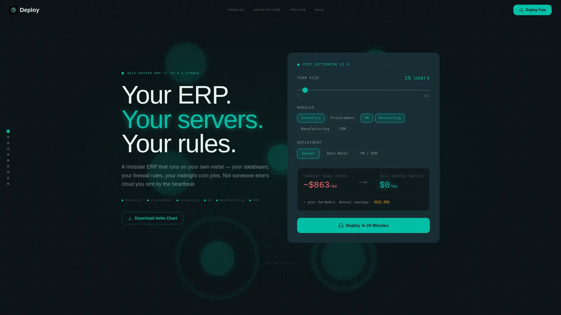
- A frosted-glass calculator header with animated network topology, slider inputs, and real-time cost comparison output
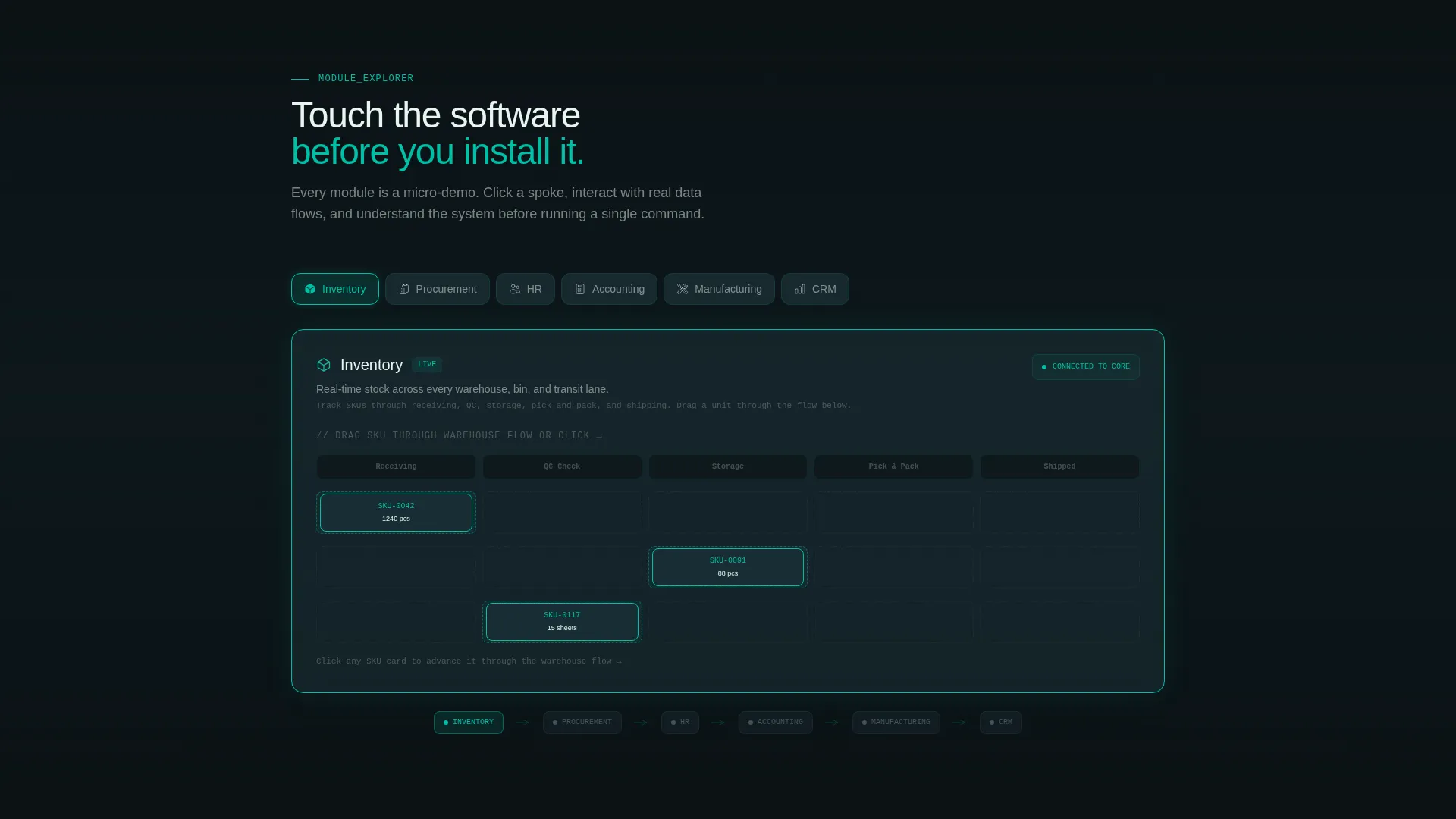
- Six anchor-navigated module spokes covering Inventory, Procurement, HR, Accounting, Manufacturing, and CRM, each with an interactive micro-demo concept
- A floating primary call-to-action button, a single-step signup form pre-set to Docker deployment, and a secondary Helm Chart download path
Feature list
This template ships with several distinct interactive and visual capabilities drawn directly from the design brief.
Live Cost Estimator Header
A frosted-glass panel floats over a subtly animated network topology diagram. Visitors set user count, select module chips, and choose a deployment type. A real-time cost comparison then animates into view with counter-roll number effects, showing current SaaS spend against a self-hosted total.
Hub and Spoke Anchor Navigation
A fixed left-rail navigation links directly to each ERP module section. Visitors can click any spoke to jump to that module or scroll naturally through the page. The hub center displays animated data-flow lines showing how all modules connect to each other.
Interactive Module Explorers
Each module section goes beyond a feature list. The Inventory spoke includes a drag-through warehouse flow, the Accounting spoke shows a filterable general ledger waterfall chart, and the HR spoke offers a rearrangeable org-chart builder. Visitors experience the product logic before installing anything.
Frosted Glass Card System
Every module section uses a frosted-glass card surface that lifts on hover with a teal edge-glow effect. Cards use the deep terminal black background, frosted panel fills, and crisp signal white typography to maintain a clean-room aesthetic throughout.
Freemium Conversion Flow
The primary call-to-action, "Deploy in 20 Minutes," appears inside the estimator results and as a persistent floating button. It activates after a visitor interacts with any two module explorers. Clicking opens a minimal single-step form: email, deployment method, and an optional company size toggle.
Helm Chart Secondary Path
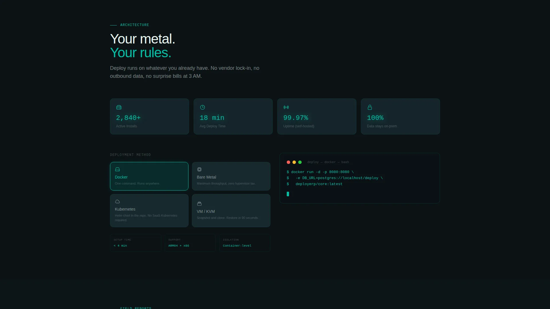
Kubernetes users get a direct download path with zero forms. A secondary call-to-action links straight to the repository. This path captures a lightweight analytics event without requiring the visitor to submit any personal information.
Page sections overview
| Section | Purpose |
|---|---|
| Cost Estimator Header | Opens with live SaaS-versus-self-hosted cost comparison tool |
| Anchor Nav Rail | Keeps module navigation fixed and always reachable |
| Inventory Module | Drag-through warehouse flow micro-demo |
| Procurement Module | Interactive procurement workflow explorer |
| HR Module | Rearrangeable org-chart builder demo |
| Accounting Module | Filterable general ledger waterfall chart |
| Manufacturing Module | Module capability explorer for production ops |
| CRM Module | Customer relationship module explorer |
| Hub Connection View | Animated data-flow lines between all modules |
| Trial Signup Form | Single-step form with Docker pre-selection |
| Helm Chart Download | Zero-form secondary path for Kubernetes users |
Design & branding system
The visual identity follows a Tech Glass theme powered by the Teal Catalyst color system. The palette feels like peering through smoked glass into a clean room, with every element precisely lit in teal bioluminescence.
- Deep terminal black (#0B1215) as the base, primary teal (#00BFA6) for glow effects and key data values, frosted glass panel (#1A2E35) for card surfaces, and signal white (#E8F5F1) for body typography
- Electric amber (#FFB300) appears only on interactive hotspots and active-state indicators, keeping the accent restrained and meaningful
- No stock photography or hero images anywhere on the page; the animated estimator and module explorers are the visual anchors
Mobile & speed optimization
The layout is designed to translate the interactive desktop experience into a structured, touch-friendly flow on smaller screens. Modular sections stack cleanly without losing the hierarchy of the anchor navigation.
- Frosted-glass cards and module explorer sections are built as self-contained blocks that reflow at narrower viewports
- The fixed left-rail anchor nav collapses appropriately for mobile contexts so the content remains the focus
- The floating call-to-action button and single-step form are sized for touch interaction without requiring layout overrides
How this template helps you convert
This template is built around a core idea: let visitors experience the product before asking them to commit. Every conversion element earns its click by reducing friction and proving value first.
- The cost estimator delivers a personalized financial reason to switch in the first 30 seconds, using the visitor's own inputs to generate the comparison
- The interactive module explorers reward continued scrolling and build product confidence before the floating call-to-action button even appears
- The two-path conversion model serves both form-averse developers (Helm Chart download) and decision-makers ready to start a trial (Deploy in 20 Minutes form), so no qualified visitor hits a dead end
Other information about this template
This template is categorized under Technology, specifically the self-hosted enterprise software subcategory. It is purpose-built for the self-hosted ERP niche and scored a strong intersection match across theme, creative direction, and conversion model alignment.
- The template style is Hub and Spoke with Anchor Navigation, a format that supports long-form product pages with multiple distinct capability areas
- The header concept is a Calculator and Estimator, which is particularly effective for buyers evaluating total cost of ownership against existing software spend
- The creative direction is Interactive Explorer, meaning the scroll journey doubles as a product tour rather than a static marketing page
- The conversion model is Freemium and Trial, designed to reduce signup friction by letting visitors self-qualify through the estimator and module interactions before committing
Theme
Tech Glass
Creative direction
Interactive Explorer
Color system
Teal Catalyst
Style
Hub & Spoke (Anchor Nav)
Direction
Freemium/Trial
Page Sections
Live Cost Estimator with Counter Animation
Hub and Spoke Anchor Navigation
Interactive Module Explorer Sections
Frosted Glass Card Design System
Two-path Freemium Conversion Flow
Related questions
What type of buyer is this template designed for?
Does this template include the actual ERP software?
How does the cost estimator section work?
Can a Kubernetes user download without filling out a form?
Is this a single-page layout or a multi-page site?



