Self-Hosted Enterprise Software Reviews Website Template
Deploy is a self-hosted HRM landing page template built for organizations that run their own infrastructure. It showcases payroll, leave management, org charts, and performance cycles through an interactive dashboard preview. The design uses a Tech Glass aesthetic with a Void and Violet color system, and every section builds a data-driven case for ditching per-seat SaaS fees.
by Rocket studio
Quick summary
Deploy is a single-page HRM landing page template designed for self-hosted workforce platforms. It opens with a live, clickable dashboard preview and scrolls through an industry-report-style argument: SaaS cost data, a feature comparison grid, and a total-cost-of-ownership calculator. Every section earns the visitor's trust before the call to action appears.
Who this template is for
This template speaks directly to technical decision-makers and operations leads who manage sensitive employee data on their own terms. It is not built for general HR software vendors. It is built for people who already know they want control and need a page that proves it is the right call.
- Chief Technology Officers at mid-sized manufacturers facing data-residency audit failures
- IT directors at healthcare organizations where staff data cannot touch third-party cloud environments
- Startup operations leads whose per-seat SaaS spending has grown to rival a full engineering salary
What problem this template solves
Most HRM software landing pages sell convenience. This template sells control. The core tension it resolves is the gap between what a self-hosted platform actually offers and how poorly that story is usually told to skeptical, budget-conscious buyers.
- Visitors arrive with compliance anxiety and cost fatigue, and the page addresses both immediately
- The absence of a live product preview makes self-hosted platforms feel abstract and hard to evaluate
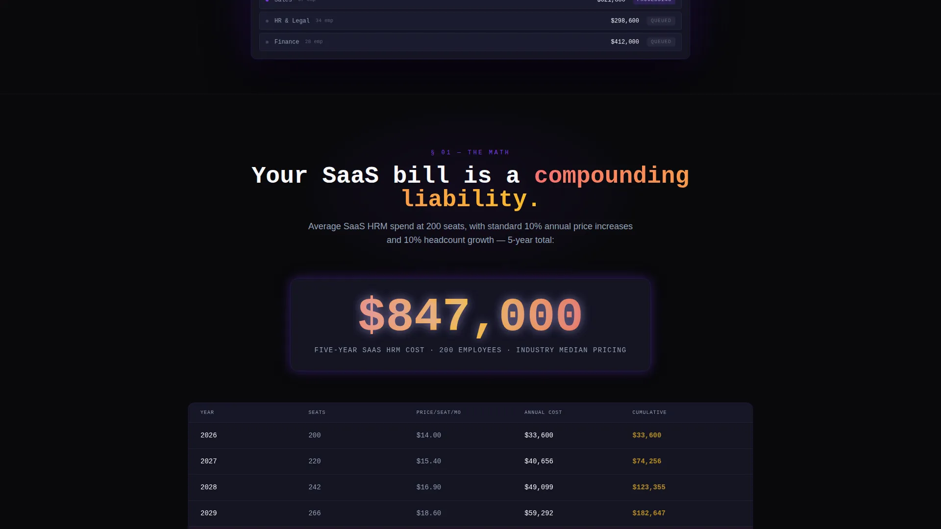
- Per-seat SaaS fees compound silently, and most pages never show buyers the five-year math
What you get with this template
You get a fully structured, single-page layout built around an interactive product demo, a rigorous comparison grid, and a financial calculator section. The design is complete and opinionated. The conversion logic is baked into the scroll flow.
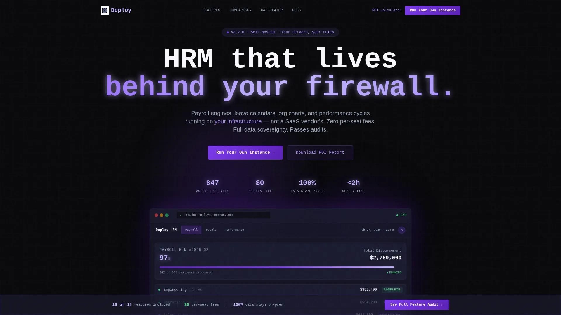
- An interactive frosted-glass browser chrome hero with a live HRM dashboard showing real module data
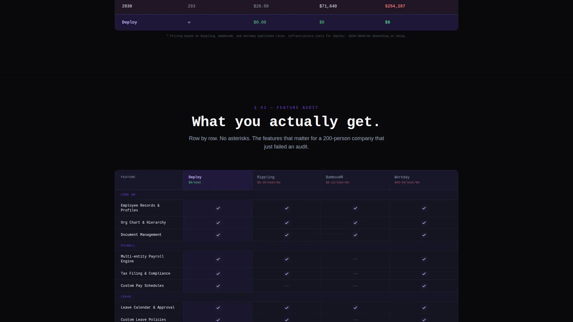
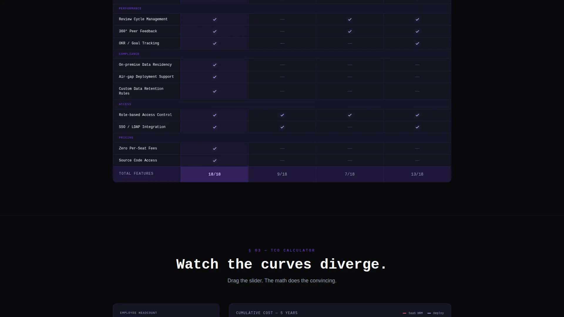
- A feature comparison grid pitting the platform against three named SaaS competitors with visual win and void states
- A total-cost-of-ownership calculator section where headcount input drives two diverging five-year cost curves
Feature list
This template ships with six purpose-built components that carry the self-hosted argument from first impression to final click.
Interactive Dashboard Hero
The header is a fully rendered, clickable HRM dashboard inside frosted-glass browser chrome. It floats above the void background with a parallax shadow effect. Visitors toggle between Payroll, People, and Performance tabs, and each tab surfaces live data panels showing metrics like 847 active employees, 23 pending leave requests, and a payroll run at 97% completion.
Industry Report Scroll Structure
The page is laid out like a data-driven white paper, not a feature brochure. Section one drops a compounding SaaS spend statistic. Section two opens the comparison grid. Section three runs the cost calculator. The escalating structure turns scroll momentum into a financial and compliance conviction before any contact details are requested.
Feature Comparison Grid
A structured comparison table places the self-hosted platform against three named SaaS competitors. Feature rows run down the left column. Competitor columns run across the top. Wins render as violet-lit icons and missing features appear as dim void states, making the visual argument instantly readable.
Total-Cost-of-Ownership Calculator
This interactive section lets visitors input their headcount and watch two cost curves diverge over a five-year timeline. The visual output makes the financial case concrete and personal. It is placed directly before the second primary call to action for maximum conversion timing.
Sticky Comparison Summary Bar
Once a visitor scrolls past the comparison grid, a sticky bar appears at the bottom of the viewport. It summarizes the platform's wins with a live counter showing something like "14 of 18 features included, $0 per-seat fees" and a button labeled "See Full Feature Audit." It keeps the strongest argument visible at all times without interrupting the scroll.
Gated ROI Report Download
A secondary conversion path offers a downloadable self-hosted return-on-investment report. It is gated behind a single work-email field. This gives undecided visitors a low-friction next step while capturing qualified leads who are still in the evaluation phase.
Page sections overview
| Section | Purpose |
|---|---|
| Dashboard Preview Hero | Opens with a live, interactive HRM module preview inside frosted-glass browser chrome |
| SaaS Spend Stat | Drops a compounding per-employee SaaS cost figure to anchor the financial argument |
| Feature Comparison Grid | Compares platform against three SaaS competitors row by row with visual win states |
| TCO Calculator | Lets visitors input headcount and visualize five-year cost divergence interactively |
| Primary call to action Block | Places "Run Your Own Instance" after the calculator to capture high-intent visitors |
| ROI Report Gate | Offers a downloadable report behind a single email field as a secondary conversion path |
| Sticky Feature Bar | Summarizes comparison wins in a persistent bottom bar with a feature audit button |
Design & branding system
The visual identity is built on a Tech Glass theme using a Void and Violet color system. Every color choice is intentional. The palette evokes a network operations center at night, where every glow signals something live and responsive.
- Core palette: absolute void black (#09090B), frosted glass panel (#1A1A2E), electric violet (#7C3AED), pale holographic lilac (#C4B5FD) for data labels, and ultraviolet (#5B21B6) bleeding through glassmorphic card edges
- Glassmorphic cards use smoked-acrylic frosted surfaces with violet light leaking through edges, giving depth without relying on photography or illustration
- Typography and data labels use the holographic lilac tone to stay readable against void backgrounds while maintaining the cold, technical atmosphere
Mobile & speed optimization
The layout is structured to remain navigable and visually coherent on smaller screens. The interactive components are designed to scale without losing the dashboard-first visual hierarchy.
- The frosted-glass browser chrome hero adapts to narrower viewports while keeping module tab navigation accessible
- The comparison grid and TCO calculator sections reflow for vertical scrolling on mobile, preserving readability of feature rows and cost curves
- The sticky summary bar remains functional on mobile, keeping the conversion counter and feature audit button in reach throughout the scroll
How this template helps you convert
The conversion logic in this template is structural, not decorative. Every section is designed to increase buyer confidence before asking for a commitment.
- The interactive dashboard hero removes abstraction immediately. Visitors experience the product before reading a single feature claim, which builds trust faster than any headline could.
- The comparison grid and sticky summary bar keep the competitive advantage visible throughout the entire page scroll, so the value proposition never leaves the visitor's attention.
- The TCO calculator personalizes the financial argument by headcount, making the self-hosted case feel relevant to each visitor's specific situation before either call to action appears.
Other information about this template
This template is built specifically for the self-hosted HRM niche, where compliance, data residency, and total cost of ownership drive the buying decision more than feature lists alone. It is a strong fit for teams evaluating alternatives to established cloud-based platforms.
- The template category sits within self-hosted enterprise software, a growing segment as organizations face stricter data-residency and audit requirements
- The "Industry Report" creative direction is intentional: it positions the product as a serious infrastructure investment, not a subscription convenience
- This template is suitable for product teams, founders, or agencies building marketing pages for self-hosted human resources management platforms
- The Tech Glass theme and Void and Violet system are pre-configured, making visual customization straightforward without breaking the overall NOC-room atmosphere
Theme
Tech Glass
Creative direction
Industry Report
Color system
Void & Violet
Style
Dashboard/Data Grid
Direction
Comparison/Versus
Page Sections
Interactive Dashboard Hero Preview
Feature Comparison Grid
Total-cost-of-ownership Calculator
Sticky Comparison Summary Bar
Gated ROI Report Download
Industry Report Scroll Structure
Related questions
What kind of product is this template designed to promote?
Can I update the dashboard metrics shown in the hero section?
Does the TCO calculator require a live backend connection?
Is this template a good fit for healthcare or manufacturing buyers?
How does the gated ROI report section work?



