Deploy - Powerful SaaSbuilder Landing Page Template
Deploy is a dark-themed, card grid landing page template built for SaaS website builder platforms. It leads with hard performance numbers, a frosted-glass header displaying live stats, and a stats-first scroll flow designed to move startup founders, growth marketers, and agency operators from first impression to email capture in seconds.
by Rocket studio
Quick summary
Deploy is a single-page, card grid template built for SaaS website builder products. It opens with four dark glass stat panels, guides visitors through a staggered modular grid, and closes with a low-friction lead capture form. Every scroll position leads with a number before explaining a feature. The design runs on an Acid Digital color system anchored in void black and electric lime.
Who this template is for
This template is built for teams and individuals who need to launch a high-performance SaaS product page fast. It suits roles where speed and credibility matter from the very first screen.
- Startup founders under launch-deadline pressure who need a page that proves product velocity immediately
- Growth marketers managing multiple campaigns who need a modular, repeatable page structure they can iterate quickly
- Agency operations leads who want to hand clients a polished, ready-to-go login experience rather than a project timeline
What problem this template solves
Most SaaS landing pages lead with a tagline and a stock illustration. Visitors leave before they understand what the product does. Deploy solves this by leading with proof: hard numbers, live-feeling stats, and interactive demo entry points that earn the click before asking for it.
- Teams lose conversions because their pages talk about speed without demonstrating it
- Growth marketers waste time rebuilding pages from scratch for every campaign variant
- Agency clients grow impatient when handed a timeline instead of a working product page
What you get with this template
Deploy delivers a fully structured, single-page layout built around a modular card grid. Every section is purpose-built to move a visitor from curiosity to conversion with minimal friction.
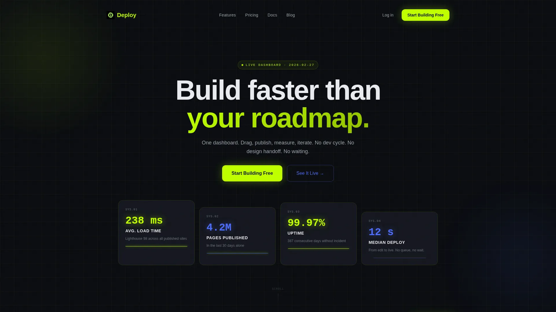
- A four-panel dark glass header displaying live-style performance stats as the visual hero
- A staggered card grid with expand-on-click interactions that reveal features and case study content
- A progressive lead capture form that collects email on first touch and qualifies on confirmation
Feature list
This template packages a complete set of conversion-oriented layout components. Each one is grounded in the Stats-First Impact creative direction and the Data Command visual theme.
Dark Glass Stat Header
Four translucent, frosted-glass cards float against a pure black background. Each card displays a single hard metric: average load time, pages published, uptime record, and median deploy speed. A thin electric lime underline pulses beneath each figure. The headline "Build faster than your roadmap" sits tight above the composition in a medium-weight grotesque typeface.
Staggered Modular Card Grid
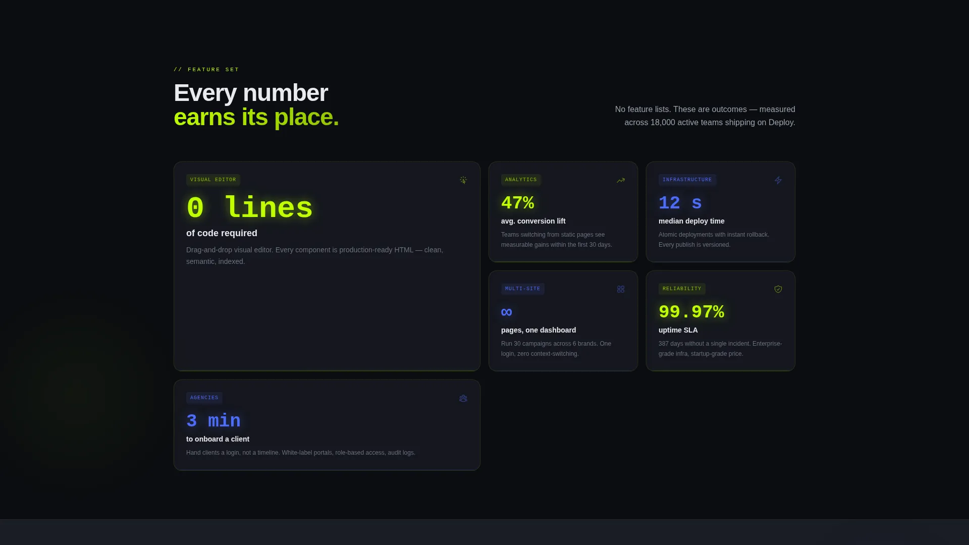
The main content area uses a card grid layout where each card leads with a number before explaining the feature behind it. Cards rise into view with staggered timing as the visitor scrolls, creating the sensation of a dashboard populating in real time. Each card is individually expandable to reveal deeper content.
Expand-on-Click Feature Reveals
Individual grid cards open on click to show extended content. A card reading "0 lines of code" expands to display the visual editor context. A card reading "47% conversion lift" opens a case study view. This interaction keeps the grid clean while rewarding curiosity.
Full-Width Live Preview Panel
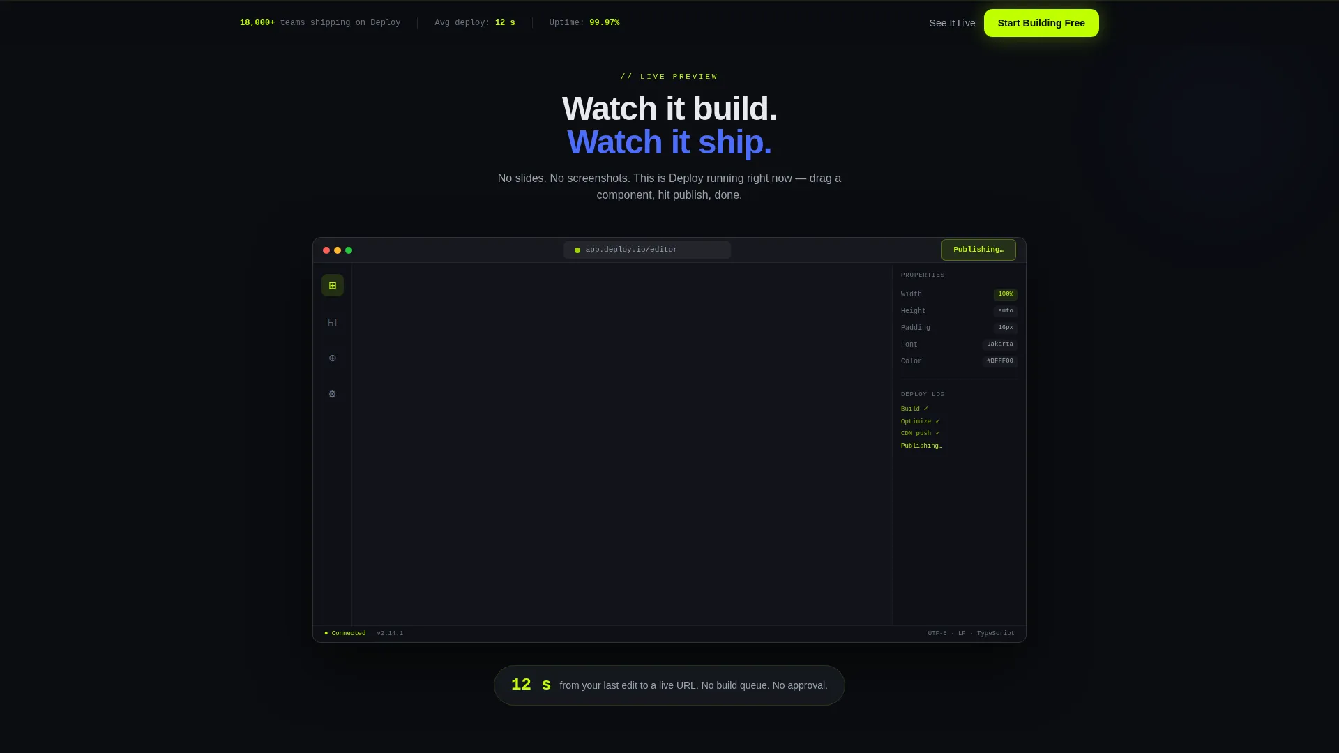
A full-width dark panel breaks the card grid midway through the page. It displays a browser chrome mock-up with an embedded website preview. A cursor moves autonomously inside the mock-up, dragging components and simulating a publish action. This section demonstrates product velocity without a single word of explanation.
Progressive Lead Capture Form
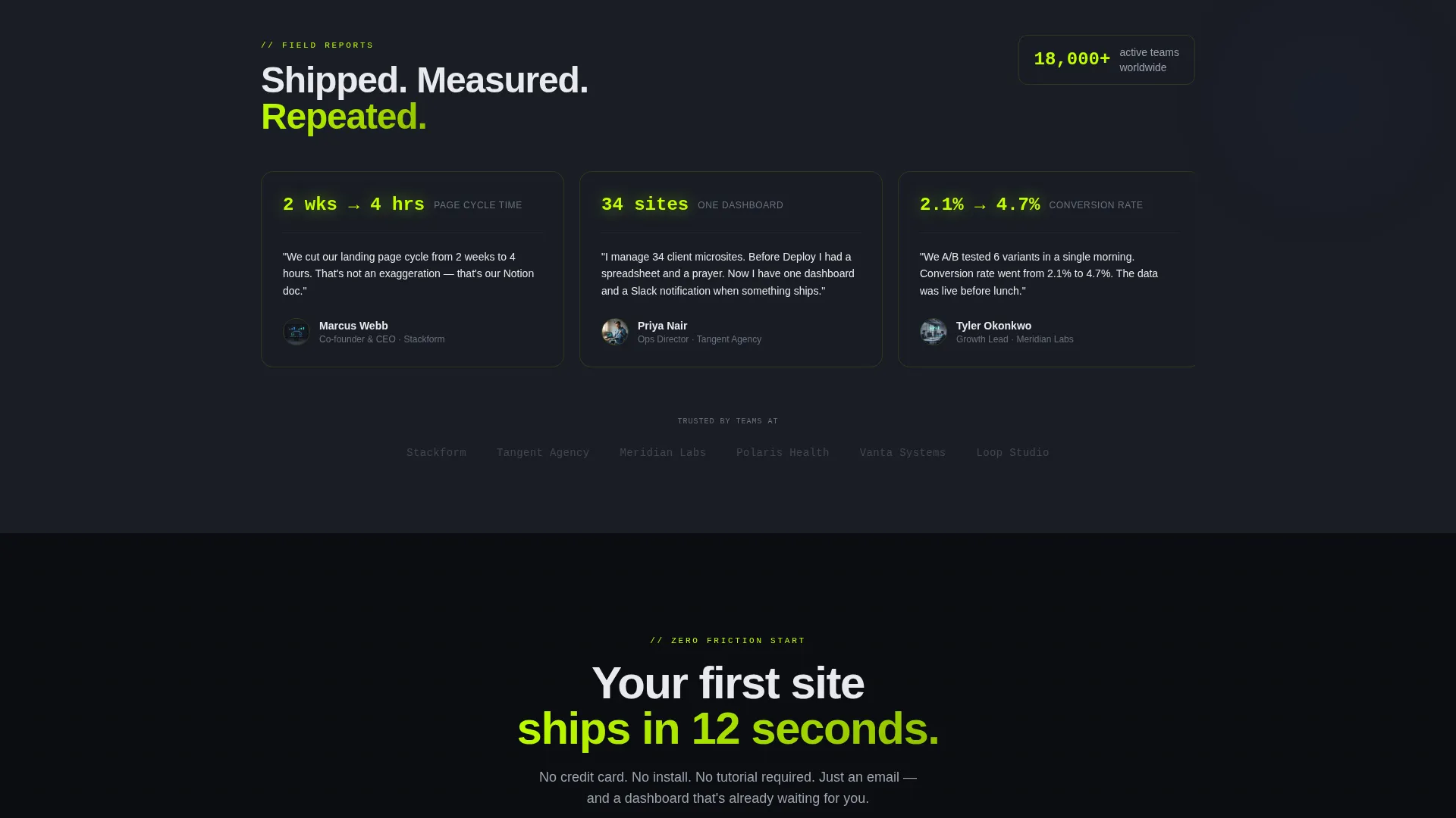
The primary call to action is "Start Building Free" in electric lime on void black. A secondary path labeled "See It Live" opens an interactive sandbox demo gated by email only. On confirmation, two dropdowns ask for company size and use case. Friction is kept near zero by design.
Pinned Conversion Bar
After the first scroll, a slim bottom bar locks to the viewport and repeats the primary call-to-action button. This keeps the conversion entry point visible at every scroll depth without interrupting the content experience.
Page sections overview
| Section | Purpose |
|---|---|
| Dark Glass Header | Opens with four live-stat panels and the primary headline |
| Stat Card Grid | Leads each feature reveal with a hard number |
| Expand Detail Cards | Delivers feature depth and case study content on click |
| Live Preview Panel | Demonstrates product velocity inside a browser mock-up |
| Lead Capture Form | Collects email with a two-step progressive qualification flow |
| Pinned call to action Bar | Keeps the primary conversion action visible after first scroll |
Design & branding system
The visual identity follows a Data Command theme using an Acid Digital color palette. Every color decision is purposeful: backgrounds stay dark, bright accents appear only where the eye needs to go.
- Core palette: void black (#0B0D11) and terminal charcoal (#1A1D25) for all backgrounds; electric lime (#BFFF00) for primary accents, metrics, and call-to-action elements; cold UV blue (#4D6CFA) for secondary interactive states
- Card surfaces lift one shade above the background with subtle glass-morphism borders, and lime hits only on metrics, active toggles, and primary call-to-action buttons
- Typography uses a tight, medium-weight grotesque typeface; phosphorescent text glows against matte black surfaces for a dark integrated development environment aesthetic
Mobile & speed optimization
The card grid layout is built to reflow cleanly across screen sizes. The staggered animation timing and dark glass surfaces are designed to remain legible and performant on smaller viewports.
- Modular card structure adapts column count for tablet and mobile breakpoints without breaking the stats-first content hierarchy
- The pinned bottom conversion bar remains accessible on mobile, keeping the primary call to action reachable at every scroll position
- The full-width live preview panel scales inside its browser chrome mock-up to maintain visual clarity on narrower screens
How this template helps you convert
Deploy is built as a lead generation landing page from the ground up. Every layout decision is made to reduce friction and increase the likelihood of a first click.
- The page leads with hard performance numbers before asking for any user input, so visitors arrive at the form already convinced by proof rather than by claims
- The progressive form flow captures email on the first touch only, then qualifies with two dropdowns on the confirmation screen, keeping the initial ask as small as possible
- The pinned bottom bar and repeated "Start Building Free" call to action ensure the conversion entry point is never more than a glance away, regardless of scroll depth
Other information about this template
Deploy is categorized under Technology, specifically within the SaaS Software and SaaS subcategory, targeting the SaaS website builder niche. It is well suited for teams evaluating modern no-code or low-code publishing tools.
- The template style is Card Grid (Modular), making it straightforward to reorder, add, or remove cards to match different product messaging or campaign variants
- The layout direction is Lead Generation, meaning every structural decision prioritizes email capture and demo sign-up over passive content consumption
- This template can support product-led growth positioning where the product's own performance metrics serve as the primary sales argument
- The asymmetric header composition and autonomous cursor animation in the preview panel are intentional design choices that signal a live, active product rather than a static showcase
Theme
Data Command
Creative direction
Stats-First Impact
Color system
Acid Digital
Style
Card Grid (Modular)
Direction
Lead Generation
Page Sections
Dark Glass Stat Header
Staggered Modular Card Grid
Expand-on-click Feature Cards
Full-width Live Preview Panel
Progressive Lead Capture Form
Pinned Conversion Bar
Related questions
Who is the Deploy template designed for?
Can I change the stats shown in the header panels?
Does this template support multiple campaign variants?
Is the interactive demo path included in the template?
What makes this template different from a standard SaaS landing page?



