Deploy - Powerful Whitelabel Landing Page Template
Deploy is a bold brutalist landing page template built for white-label food delivery app platforms. It opens with a live stats wall, leads visitors straight into a commission savings calculator, and guides them through anchor-nav spokes covering customization, integrations, timelines, and case studies. The primary call to action drives a free app launch sign-up in three fields.
by Rocket studio
Quick summary
Deploy is a single-page hub-and-spoke landing page template for platforms that give restaurant chains and ghost kitchens their own branded delivery app. It pairs a real-time metrics header with a conversion-first calculator, and every section opens with a hard stat before expanding into detail. The visual identity is bold brutalist, built on a carbon fiber color system.
Who this template is for
This template is designed for founders and operators who run white-label food delivery app platforms. It speaks directly to the buyers those platforms need to reach and convinces them fast.
- Multi-location restaurant operators who want to stop paying aggregator commissions
- Franchise directors managing unified ordering across many storefronts
- Cloud kitchen founders building direct customer relationships through branded apps
What problem this template solves
Restaurant operators lose enormous margin to third-party delivery aggregators every month. They need a page that makes the financial case immediately, not after three paragraphs of pitch copy.
- The template leads with a calculator, so the savings argument lands before any sales language appears
- It removes friction for hesitant visitors by offering a secondary path back to the calculator instead of forcing a sign-up decision
- It replaces generic hero imagery with live proof, using real-time counters that show the platform is already running at scale
What you get with this template
You get a fully structured hub-and-spoke landing page with an anchor navigation bar, interactive components, and a carbon fiber visual system ready to present a white-label food delivery app platform.
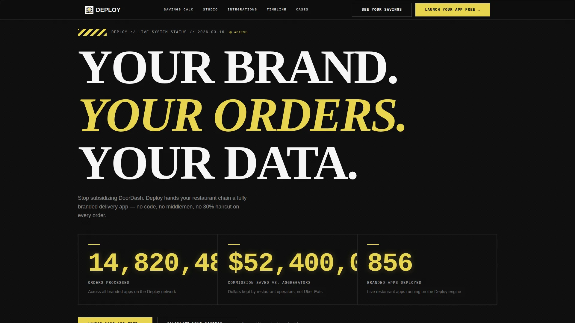
- A live stats wall header with three real-time counters for orders, savings, and active apps
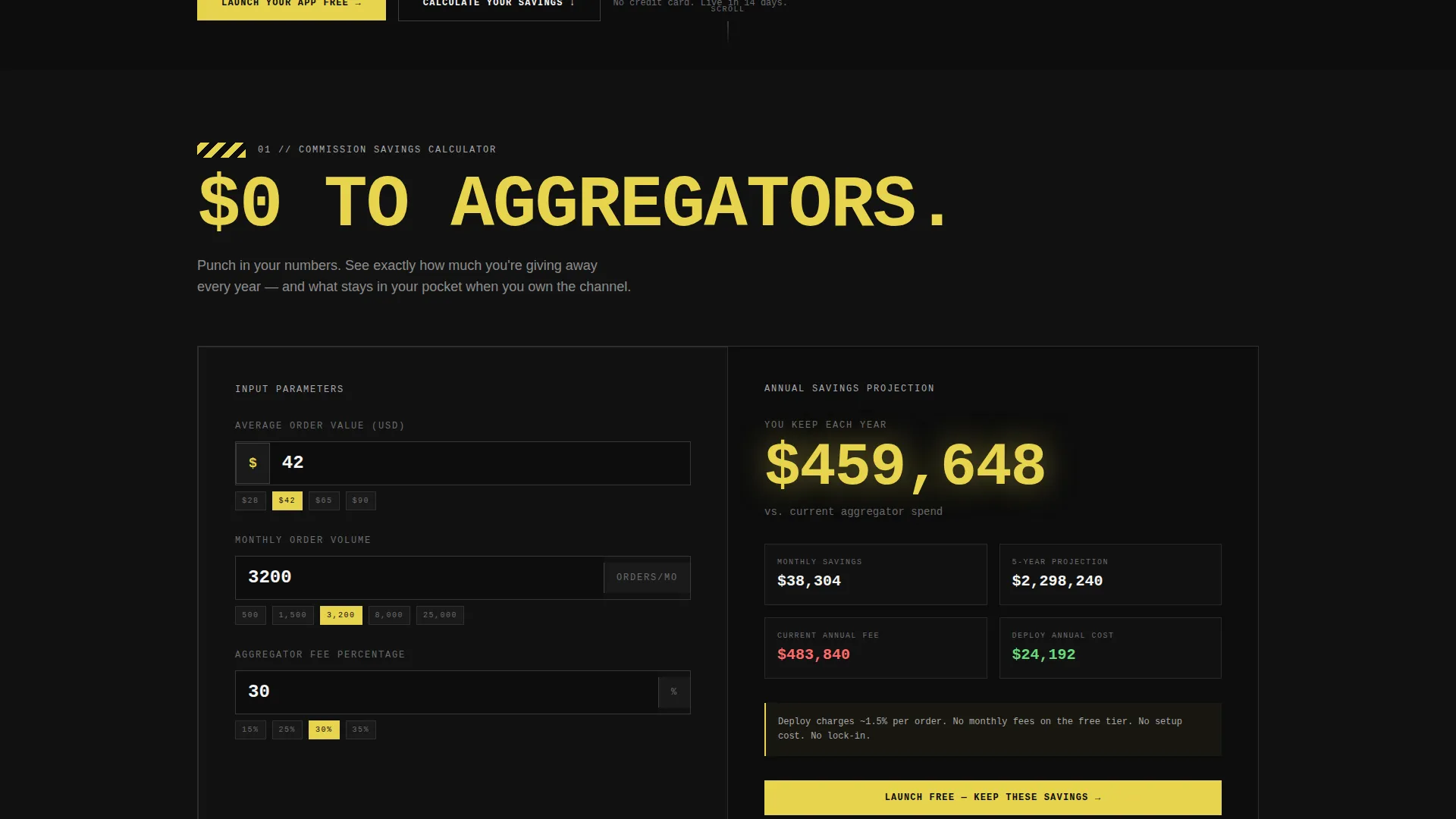
- An interactive Commission Savings Calculator as the first spoke, with inputs for order value, monthly volume, and aggregator fee percentage
- Five anchor-nav spokes: Calculator, Customization Studio, Integration Map, Launch Timeline, and Case Studies
Feature list
This template includes purpose-built components that move a visitor from curious to convinced without relying on illustration or soft persuasion.
Live Stats Wall Header
Three oversized counters tick upward in real time against a pure carbon black background. They display total orders processed, commission dollars saved versus aggregators, and active branded apps deployed. Numbers are set in a monospaced industrial typeface at billboard scale, giving the page immediate credibility before a visitor reads a single word of copy.
Commission Savings Calculator
Visitors enter their average order value, monthly order volume, and current aggregator fee percentage. The tool returns an annual savings figure rendered in hazard-stripe yellow at bold scale. This calculator acts as the primary conversion engine, doing the selling so the sign-up form only needs to catch the already-convinced.
Hub and Spoke Anchor Navigation
A sticky anchor nav keeps the primary call to action, "Launch Your App Free," pinned and visible at all times. Each spoke section is one click away, and the nav also includes a "See Your Savings" secondary link that scrolls back to the calculator for visitors who need more convincing.
Freemium Sign-Up Form
The conversion form requires only three fields: restaurant name, number of locations, and email address. Low friction and a clear free-trial offer reduce drop-off at the commitment stage.
Section-by-Section Stat Openings
Every spoke section opens with a single brutal stat before expanding into supporting detail. This structure keeps the scroll from feeling like persuasion and makes it feel like proof.
Bold Brutalist Visual System
The carbon fiber color palette, industrial typography, and hard-edged layout are built into the template structure. Yellow detonates only on interactive elements and data callouts, white text cuts through dark backgrounds, and the overall aesthetic reads like the dashboard of a high-performance machine.
Page sections overview
| Section | Purpose |
|---|---|
| Live Stats Header | Show real-time platform scale |
| Anchor Navigation Bar | Keep call to action and spokes accessible |
| Commission Savings Calculator | Deliver the financial argument interactively |
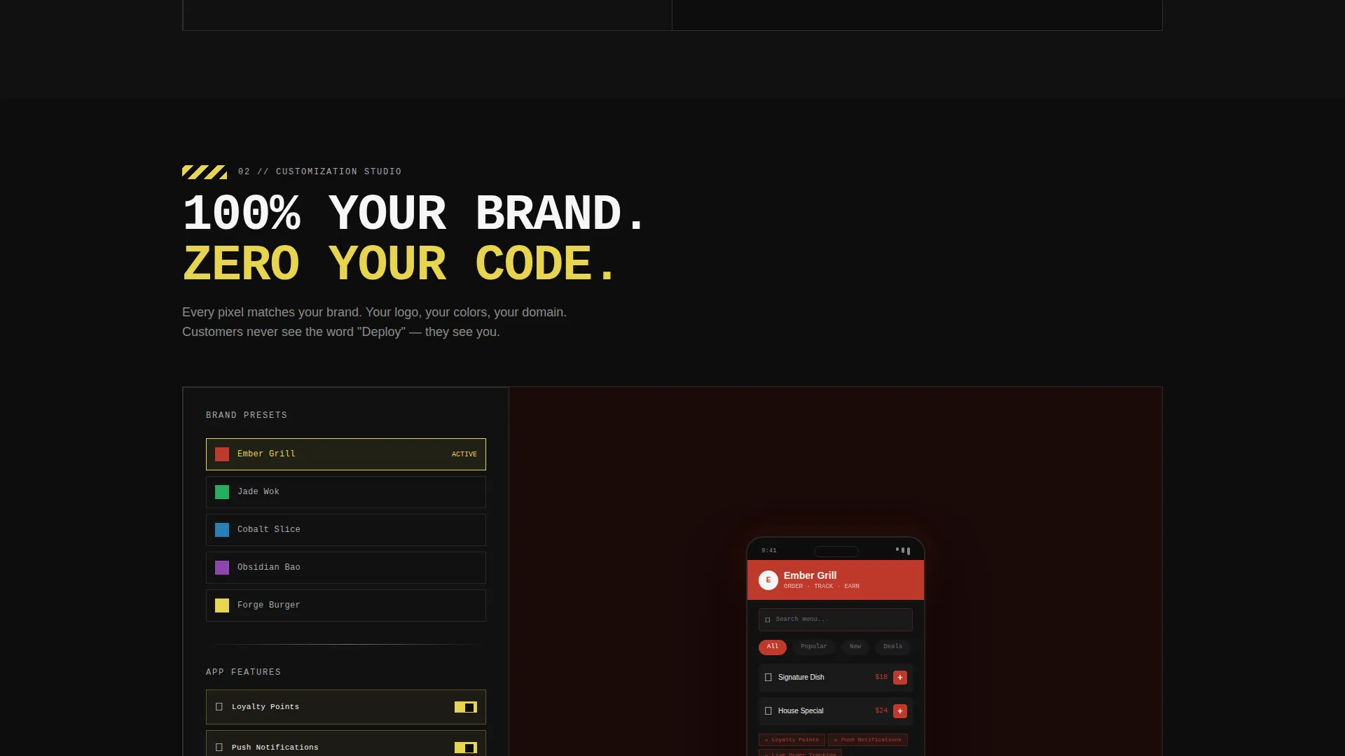
| Customization Studio | Show branded app flexibility |
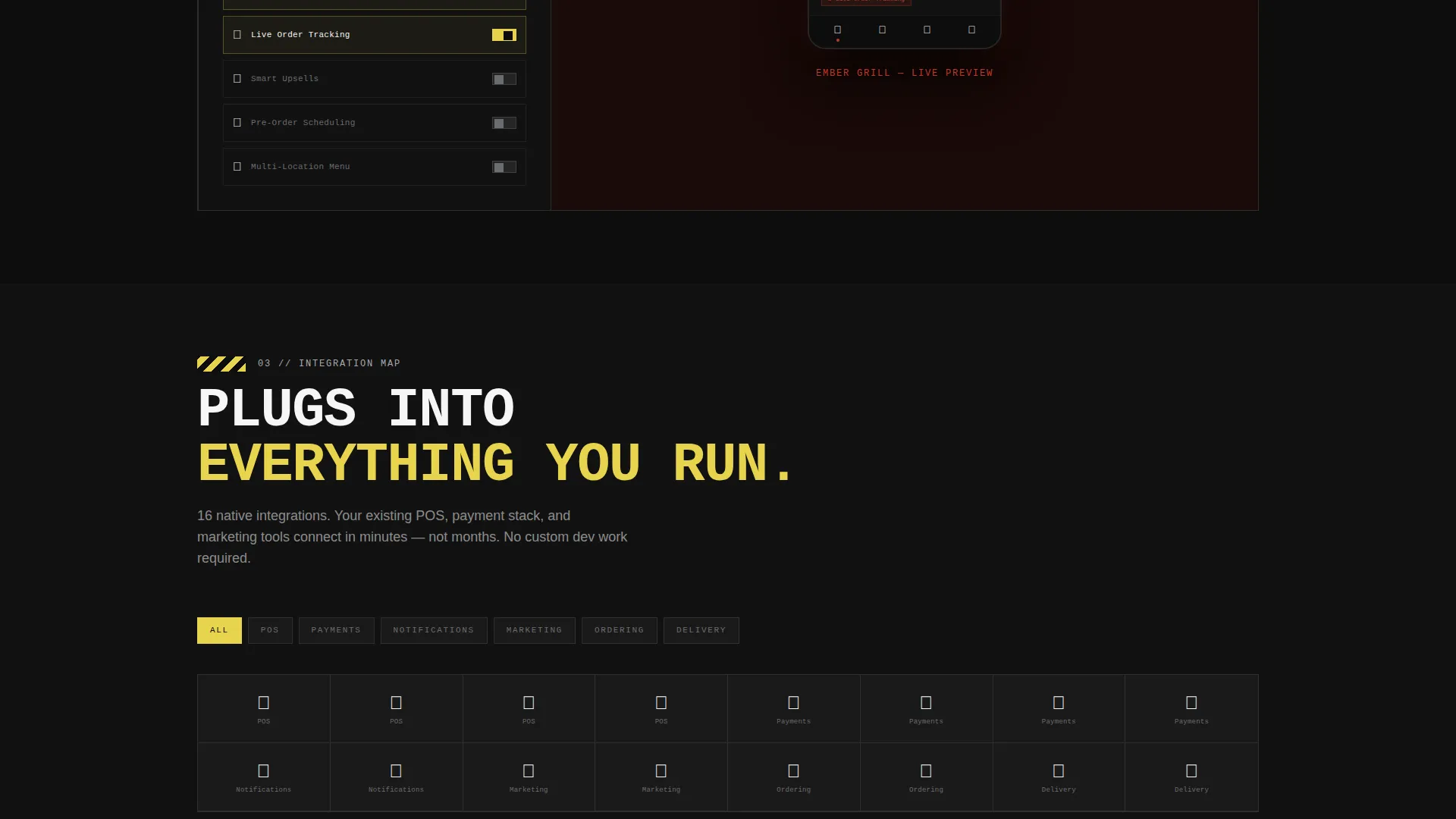
| Integration Map | Display platform connection options |
| Launch Timeline | Set delivery expectations clearly |
| Case Studies | Provide social proof by example |
| Freemium Sign-Up Form | Capture restaurant name, locations, email |
Design & branding system
The template uses a carbon fiber color system built around four precise values that together feel like the interior of a matte-black performance vehicle.
- Deep carbon black (#0D0D0D) and machined aluminum (#A8A9AD) form all backgrounds, with surfaces that suggest a weave-textured industrial material
- Hazard-stripe yellow (#E8D44D) fires only on interactive elements, calculator outputs, and data callouts, making every actionable moment impossible to miss
- Emergency-exit white (#F5F5F5) carries all body text, cutting through dark backgrounds with the clarity of headlights on night asphalt
Mobile & speed optimization
The template is structured to remain clear and navigable on smaller screens without sacrificing the bold visual weight of the brutalist design.
- The anchor navigation collapses cleanly for mobile viewports, keeping the primary call to action reachable at all times
- Oversized monospaced counters and large-type section openers scale down without losing their industrial impact on phone screens
How this template helps you convert
Deploy is engineered around a calculator-first conversion philosophy. Every layout decision pushes a visitor toward the sign-up form through evidence rather than persuasion.
- The real-time stats wall opens the page with hard proof that the platform is live and active, building immediate credibility before any pitch language appears
- The Commission Savings Calculator personalizes the financial argument, showing each visitor their own specific annual savings figure in bold yellow before they reach any call-to-action copy
- The "See Your Savings" secondary link gives hesitant visitors a low-pressure re-engagement path, cycling them back to the calculator rather than losing them to the back button
Other information about this template
Deploy fits naturally into a broader ecosystem of white-label restaurant technology tools. A few additional details worth knowing before you customize and launch it.
- The template style is hub and spoke with anchor navigation, meaning every content section is reachable from a single persistent nav bar without requiring full-page reloads or separate pages
- The Bold Brutalist theme is intentionally polarizing, built to signal engineering credibility rather than consumer softness, which aligns with the platform's B2B operator audience
- The creative direction is Calculator/Tool First, a pattern proven effective for platforms where the financial case is the primary purchase driver
- The header concept is a Stats/Metrics wall, which is a stronger trust signal for a platform product than a traditional hero image or tagline
- The template supports a freemium or free-trial landing page direction, making it suitable for platforms that convert operators through a no-cost entry point before upselling on volume or features
Theme
Bold Brutalist
Creative direction
Calculator/Tool First
Color system
Carbon Fiber
Style
Hub & Spoke (Anchor Nav)
Direction
Freemium/Trial
Page Sections
Live Real-time Stats Wall
Interactive Commission Savings Calculator
Sticky Hub and Spoke Anchor Nav
Low-friction Freemium Sign-up Form
Stat-first Section Architecture
Bold Brutalist Carbon Fiber Layout
Related questions
Can I customize the color system and typography in the Deploy template?
Does the Commission Savings Calculator require any coding to configure?
Is this template suitable for a single ghost kitchen brand, or only for platforms?
What fields does the primary sign-up form collect?
What is the secondary call to action, and how does it work?



