Serverless Enterprise Software Complete Professional Website Template
Deploy is a serverless HRM landing page template built for developer-led teams. It uses a split-screen layout, a glassmorphic dark design system, and a feature matrix that scrolls like a live database. The template pairs a live TypeScript code snippet with a real employee onboarding card, making the "write code, get HR" value proposition immediately clear to any technical visitor.
by Rocket studio
Quick summary
Deploy is a single-page, split-screen landing page template for a serverless human resource management platform. It combines a dark glassmorphic visual system with a scrollable feature matrix and two low-friction conversion paths: a one-click CLI install command and a sandbox link backed by GitHub login. The template is built to convince technical buyers fast.
Who this template is for
This template speaks directly to technical decision-makers and people-operations leads who want HR infrastructure without traditional software overhead. It is designed for teams that think in API calls, not support tickets.
- CTOs at early-stage startups scaling headcount quickly and needing a lean HR stack
- Solo DevOps engineers who want clean integrations without stitching together legacy HR tools
- People-ops leads managing distributed teams across multiple time zones from a single workflow
What problem this template solves
Most HR software landing pages look like they were built for procurement committees. This template solves the presentation problem for developer-first platforms that need to earn trust from engineers before they ever ask for a click.
- Communicates platform speed and reliability through real API response data, not marketing copy
- Removes friction from the conversion path by replacing forms with a clipboard command and a GitHub login
- Gives technical visitors the "it just works" certainty they need before committing to an install
What you get with this template
You get a fully structured single-page layout that works as a complete, conversion-ready landing page. Every section is built from the brief and requires only copy and branding updates to go live.
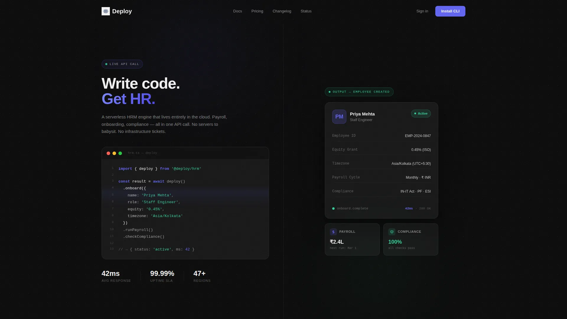
- A split-screen hero with a syntax-highlighted TypeScript code snippet on the left and a live-output onboarding card on the right
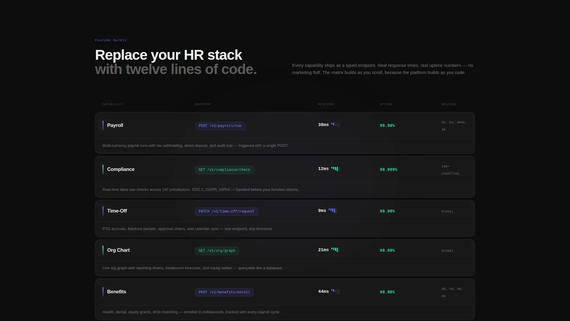
- A scrollable feature matrix showing payroll, compliance, time-off, org chart, and benefits capabilities alongside API specs
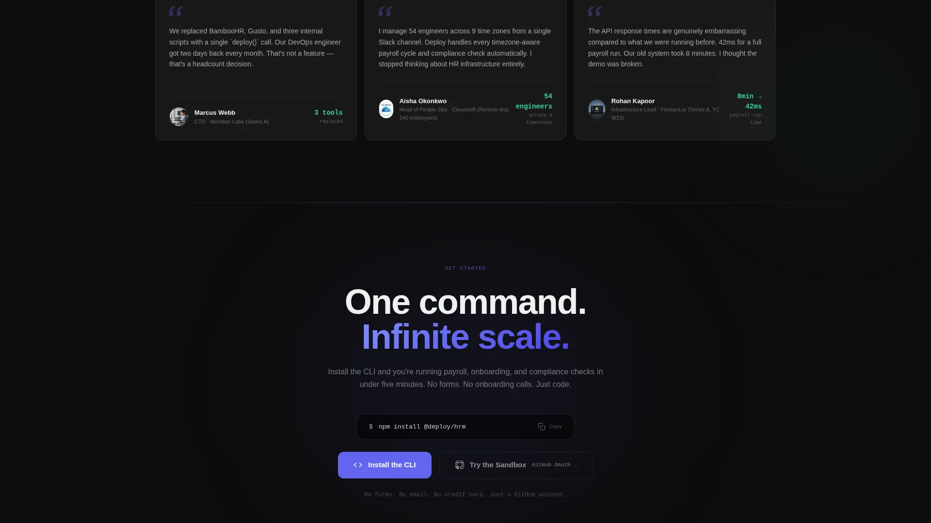
- Dual conversion paths: a primary "Install the CLI" terminal command block and a secondary "Try the Sandbox" GitHub OAuth link
Feature list
This section details the core template capabilities drawn directly from the design brief.
Split-Screen Hero Section
The header divides the viewport evenly. The left half renders a live-style TypeScript deploy() function with indigo keyword highlights and mint string literals against a dark terminal background. The right half shows the resulting frosted-glass employee onboarding card, complete with name, role, equity grant, and a mint "Active" badge. The juxtaposition makes the platform's value clear in under three seconds.
Scrollable Feature Matrix
Each row in the matrix splits the screen between a capability label and a frosted interactive spec card. The spec card displays the API endpoint, response time in milliseconds, uptime percentage, and supported regions. Rows build as the visitor scrolls, stacking evidence row by row like a live database populating in real time.
Glassmorphic Card System
Every spec card and onboarding panel shares the same frosted-glass shape: translucent panels at rgba(255,255,255,0.08) with a 12-pixel blur, borders catching faint white light at 10 percent opacity. The consistent shape creates visual trust. The eye learns the pattern quickly and reads new data without effort.
CLI Install Command Block
A prominent terminal block displays the npm install @deploy/hrm command with a one-click copy-to-clipboard interaction. It appears at the midpoint of the page and repeats as a sticky bar on mobile. This is the primary conversion touchpoint and requires zero form input.
Sandbox Access Path
A secondary call to action links to a browser-based sandbox environment. Access requires only a GitHub OAuth tap, with no email fields or sign-up forms. This gives hesitant visitors a zero-friction proof-of-concept path before committing to an install.
Hover and Success Micro-interactions
Interactive elements pulse electric indigo on hover. Every successful action, such as copying the install command, blooms cool mint to signal completion. These micro-interactions reinforce the "everything just works" feeling without adding visual noise.
Page sections overview
| Section | Purpose |
|---|---|
| Split-Screen Hero | Show code input and HR output side by side |
| TypeScript Code Panel | Display syntax-highlighted deploy() function |
| Onboarding Output Card | Show what the API call creates in real time |
| Feature Matrix | Scroll-built rows of API capability specs |
| Payroll Spec Card | Detail payroll endpoint, response time, regions |
| Compliance Spec Card | Show compliance check specs and uptime data |
| Time-Off Spec Card | Present time-off API details and coverage |
| Org Chart Spec Card | Display org structure endpoint information |
| Benefits Spec Card | Cover benefits API specs and regions |
| CLI Install Block | Primary call to action with copy-to-clipboard command |
| Sandbox call to action Section | Secondary path via GitHub OAuth login |
| Mobile Sticky Bar | Repeat install command as persistent mobile call to action |
Design & branding system
The visual identity is built around the "Startup Velocity" theme expressed through a glassmorphic color system. The palette feels like a dark integrated development environment with one function highlighted. Everything recedes except the element that demands attention.
- Base layer is deep void black (#0D0D0D) with frosted translucent panels; primary accents use electric indigo (#6366F1) for interactive states, and cool mint (#34D399) marks all success confirmations and positive metrics
- Typography uses anti-flash white (#F0F0F0) on dark backgrounds for crisp legibility; borders hold faint white light at 10 percent opacity to separate layers without breaking the dark atmosphere
- The overall system channels the feeling of watching a clean terminal run all green at 2 a.m.: purposeful, precise, and quietly electric
Mobile & speed optimization
The template is structured to keep the conversion experience intact on smaller screens. The mobile layout preserves both the code snippet and the onboarding card output without sacrificing the split-screen impact.
- The CLI install command repeats as a sticky bottom bar on mobile, keeping the primary conversion action always visible without requiring scroll
- Frosted-glass card components are sized and spaced to remain readable and tap-friendly at mobile viewport widths
- The feature matrix stacks cleanly at smaller breakpoints so spec data stays organized and scannable on any screen size
How this template helps you convert
The template is designed to remove every possible reason a technical visitor might leave without acting. It builds confidence through demonstration rather than persuasion.
- The split-screen hero shows real code and real output in the same view, eliminating the gap between "what it does" and "what I get" before the visitor reads a single word of body copy.
- The scrollable feature matrix accumulates specific, technical proof points row by row. Each card shows actual API data rather than feature bullet points, so trust builds through evidence.
- Both conversion paths ask for nothing upfront. The install command is a single clipboard copy. The sandbox requires only a GitHub login. Zero forms means zero drop-off friction at the moment of decision.
Other information about this template
This template is categorized under Technology and Serverless Enterprise Software. It is designed specifically for the serverless HRM niche and is production-ready as a landing page starting point.
- The template style is Split Screen (50/50), making it visually distinctive in a category where most competitors use standard centered layouts
- The creative direction is built around a Feature Matrix pattern, which is well-suited to developer audiences who evaluate tools by their specifications rather than their marketing language
- The header concept uses a Code Snippet, a choice that signals technical credibility instantly to the CTOs, engineers, and people-ops leads this platform targets
- The landing page direction is App Download, meaning every design and copy decision pushes toward the CLI install as the primary conversion action
- The Intersection Match Score for this template is 13, indicating a high degree of alignment between the template style, theme, niche, and conversion direction
Theme
Startup Velocity
Creative direction
Feature Matrix
Color system
Glassmorphic
Style
Split Screen (50/50)
Direction
App Download
Page Sections
Split-screen Code and Output Hero
Scrollable API Feature Matrix
One-click CLI Install Block
Zero-friction Sandbox Path
Glassmorphic Card System
Indigo and Mint Micro-interactions
Related questions
Can I replace the TypeScript code snippet in the hero with my own API example?
Do I need coding skills to customize this template?
Can I add more rows to the feature matrix beyond the five shown?
How is the sandbox button connected to a real environment?
Why does this template use a code snippet in the hero instead of a product screenshot?



