Serverless Enterprise Software Complete Cost Calculator Website Template
Deploy is a Bold Brutalist serverless supply chain management landing page template built for technical buyers. It leads with a live-formatted code snippet header, drops straight into a hard-data comparison table, and sequences through architecture diagrams and post-migration metrics. A pinned cost calculator call to action earns the click before asking for an email.
by Rocket studio
Quick summary
Deploy is a single-page comparison landing page template for a serverless supply chain management platform. It opens with a terminal-style code snippet that collapses infrastructure complexity in real time, then sequences through a head-to-head comparison table, architecture diagrams, and customer-reported metrics. Every section is built around hard data, not marketing language.
Who this template is for
This template is built for technical teams who need to justify an infrastructure migration with numbers, not slides. If your buyers read spec sheets before they read sales decks, this layout speaks their language.
- DevOps leads at mid-market e-commerce companies carrying over-provisioned cloud instances from peak traffic seasons
- Logistics and supply chain technology leaders migrating legacy enterprise resource planning connectors to modern infrastructure
- Platform engineers with a mandate to reduce infrastructure spend significantly before a hard quarterly deadline
What problem this template solves
Most infrastructure product pages lead with feature bullets and testimonial carousels. Technical buyers skip all of it. They want cost-per-transaction data, cold-start latency figures, and a direct comparison against what they are running today. This template is built to answer those questions before the buyer has to ask.
- Traditional hosted supply chain management pages bury proof behind contact forms and demo requests
- Engineers evaluating serverless platforms need deployment time, scaling behavior, and connector support in one place
- Decision-makers under cost-reduction pressure need a calculator that returns a real savings number before committing to a call
What you get with this template
You get a fully structured, single-page layout designed for comparison-driven conversion. Every section is ordered to build a technical case file, row by row and exhibit by exhibit.
- A live-formatted terminal header with crossed-out legacy configuration lines collapsing to a serverless function definition
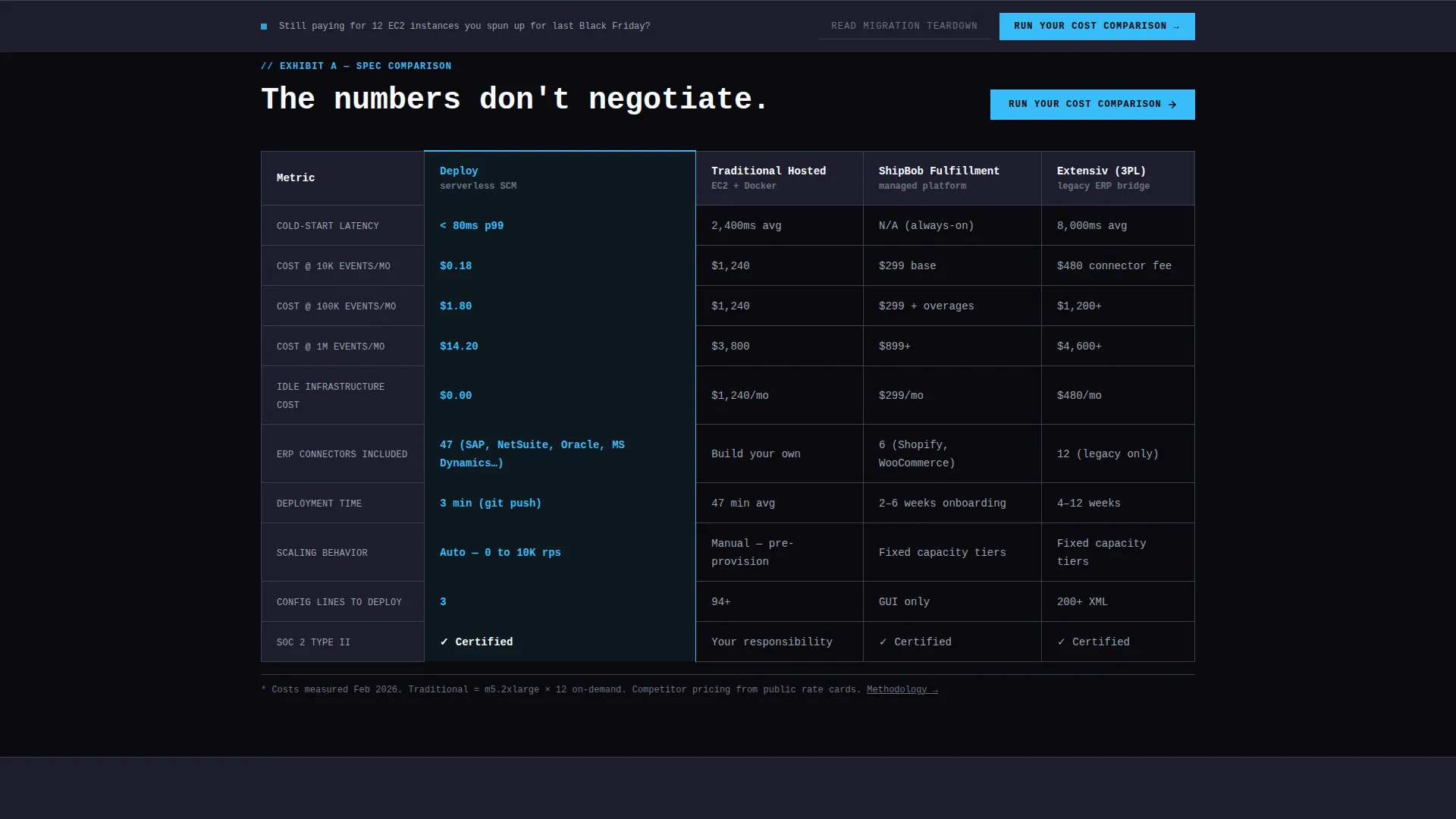
- A head-to-head comparison table covering latency, cost per transaction, connector support, deployment time, and scaling behavior
- A pinned cost calculator bar that returns a projected savings figure before asking for an email address
Feature list
This template includes purpose-built components grounded in the source brief. Each one serves a specific role in the comparison-driven page flow.
Terminal Code Snippet Header
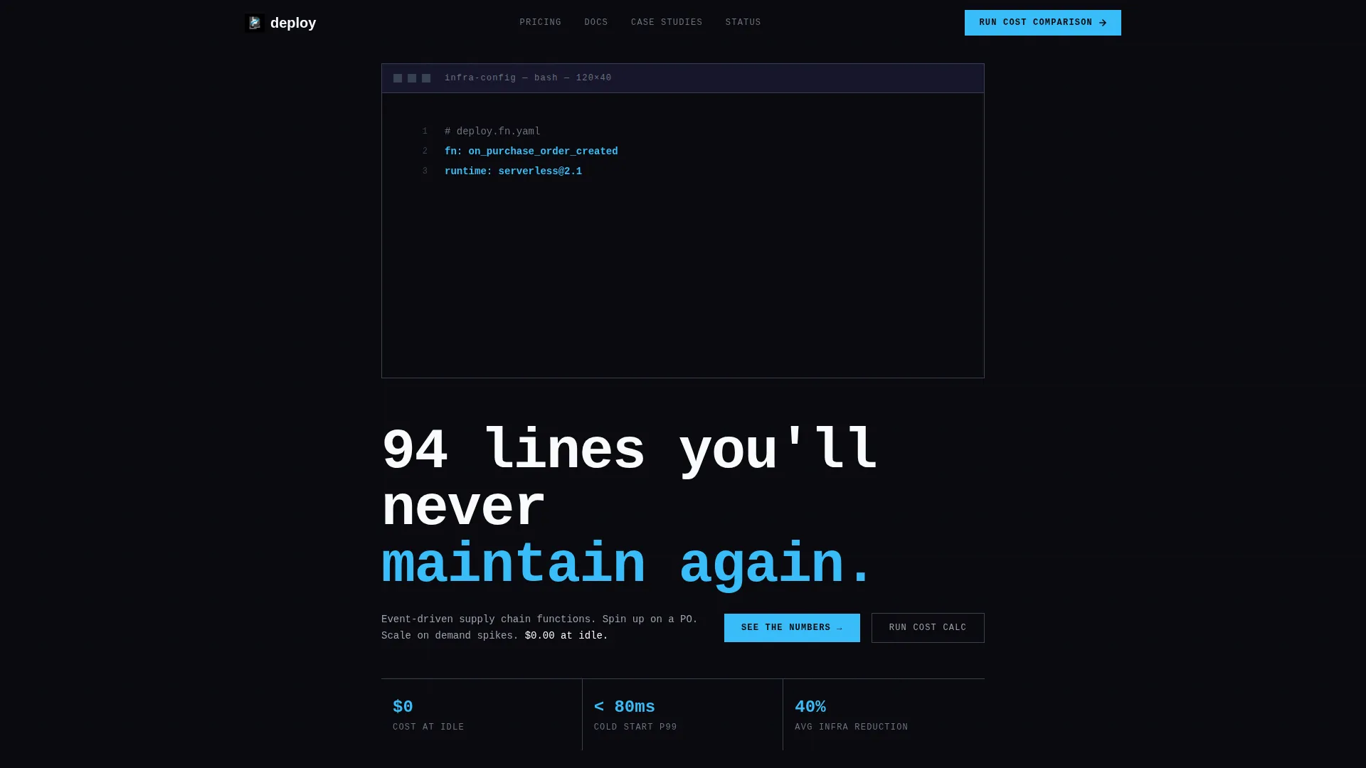
The header fills the full viewport with a pitch-black terminal background. Twelve lines of traditional supply chain management infrastructure configuration, written in formats like Terraform, Docker Compose, and Kubernetes manifests, are visibly crossed out in concrete gray. They collapse in real time to three lines of a serverless function definition highlighted in sky blue. A cursor blinks once at the end. The headline below reads in oversized monospace type.
Head-to-Head Comparison Table
The comparison table stacks the platform against traditional hosted supply chain management and two named competitors. Rows cover cold-start latency in milliseconds, cost per transaction at three volume tiers, supported enterprise resource planning connectors, deployment time in minutes, and scaling behavior. Every cell contains a hard figure or a defined label, no adjective-based claims.
Pinned Cost Calculator Bar
The primary call to action is placed at the top of the comparison table and pinned to the bottom of the viewport throughout the scroll. Clicking it opens a three-field calculator: current monthly infrastructure spend, average monthly order volume, and primary enterprise resource planning system. The tool returns a projected savings number in real time before requesting an email address.
Architecture Diagrams Section
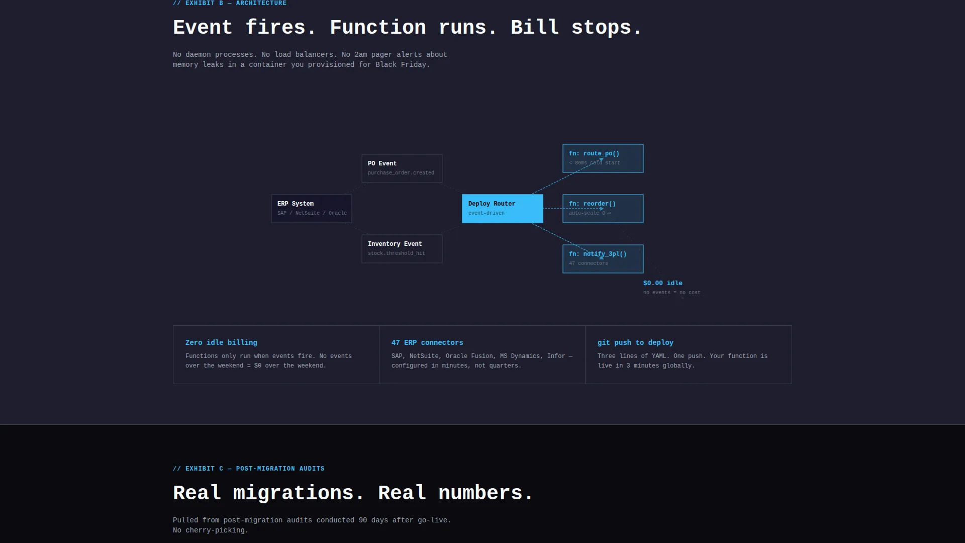
Below the comparison table, the page renders architecture diagrams in the same brutalist line style as the rest of the layout. These diagrams visualize the event-driven function flow for supply chain orchestration, showing how functions spin up on a purchase order event and scale with demand.
Post-Migration Metrics Section
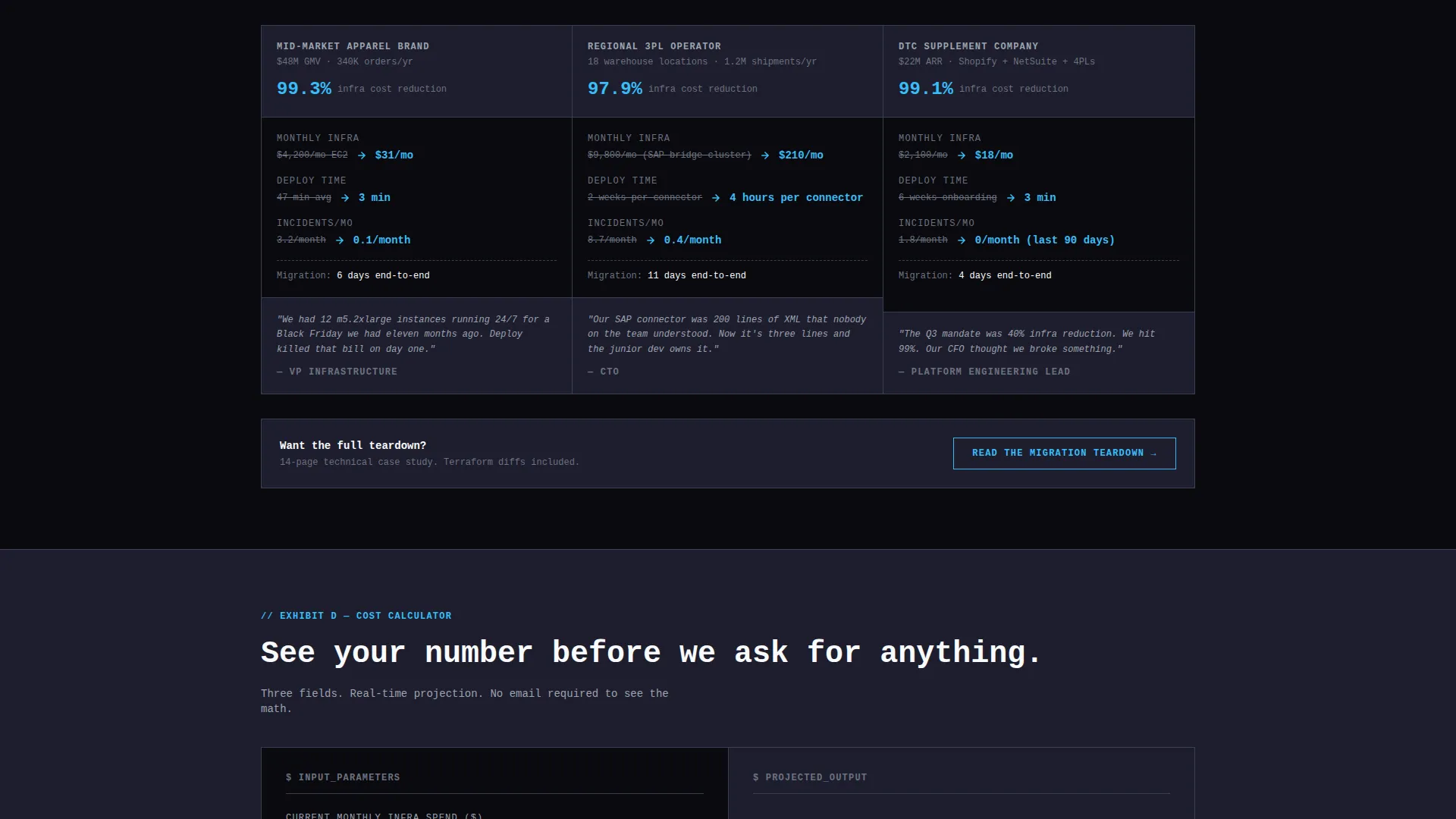
Customer-reported metrics from real post-migration audits are displayed as structured data blocks. This section provides evidence-based proof points in the same visual language as the comparison table, continuing the case-file rhythm of the page.
Secondary Case Study Path
A secondary call to action labeled "Read the Migration Teardown" links to a technical case study. This path captures engineers who are not ready to enter cost numbers but want documented proof before moving forward.
Page sections overview
| Section | Purpose |
|---|---|
| Terminal Header | Opens with crossed-out legacy config collapsing to serverless definition |
| Brutalist Headline | Anchors the value statement in oversized monospace type |
| Comparison Table | Stacks platform against competitors with hard latency and cost data |
| Cost Calculator Bar | Pinned call to action returning projected savings before email capture |
| Architecture Diagrams | Visualizes event-driven function flow in brutalist line style |
| Post-Migration Metrics | Displays customer-reported audit data as structured proof blocks |
| Secondary call to action | Links to technical case study for engineers not ready to calculate |
Design & branding system
The visual identity follows a Bold Brutalist theme using a Slate and Sky color system. The palette is industrial and deliberate, with no gradients, no rounded corners, and every element placed on a visible structural grid.
- Hard charcoal (#1E1E2E) as the primary surface, exposed-concrete mid-gray (#6B7280) for secondary panels and table borders, cold sky blue (#38BDF8) as the sole accent on interactive elements and winning-column highlights, and raw white (#F8FAFC) for monospaced text and data cells
- Backgrounds stay dark and flat; gutters are structural and visible, not decorative
- Typography uses oversized monospace typefaces throughout, reinforcing the spec-sheet and terminal aesthetic
Mobile & speed optimization
The layout is structured to remain scannable and functional at smaller viewport sizes. The comparison table and pinned calculator bar are the highest-priority components for mobile readability.
- The comparison table is designed for horizontal scroll or column-priority stacking on narrow screens
- The pinned cost calculator bar maintains its fixed position at the bottom of the viewport across screen sizes
- The terminal header animation is contained within the viewport to prevent layout overflow on mobile devices
How this template helps you convert
This template earns the click before asking for anything. The page is sequenced so every section adds a new layer of proof, moving technical buyers from recognition to calculation to commitment.
- The terminal header creates immediate recognition for the target audience by dramatizing the complexity they already live with, then shows the reduction in three lines
- The comparison table delivers the hard data buyers need to justify a decision internally, removing the need to chase a sales rep for numbers
- The pinned cost calculator closes the loop by returning a personalized savings figure before requesting an email, lowering the barrier to the first conversion action
Other information about this template
This template is categorized under Technology and Serverless Enterprise Software. It is designed specifically for the serverless supply chain management niche, where technical credibility must be established before any sales motion begins.
- The template style is a Comparison Table layout, matched to a Comparison and Versus conversion direction
- The header concept is a Code Snippet, consistent with the Bold Brutalist theme and Slate and Sky color system
- The creative direction follows a Spec Sheet approach, meaning every section functions as an exhibit in a structured technical argument
- This template is suitable for teams building landing pages for serverless platforms, event-driven infrastructure products, or any technical product where buyers evaluate cost and performance data before engaging sales
Theme
Bold Brutalist
Creative direction
Spec Sheet
Color system
Slate & Sky
Style
Comparison Table
Direction
Comparison/Versus
Page Sections
Terminal Code Snippet Header
Head-to-head Comparison Table
Pinned Cost Calculator Bar
Architecture Diagrams Section
Post-migration Metrics Display
Secondary Case Study Path
Related questions
Who is the primary audience for this template?
What does the cost calculator component do?
Can I update the comparison table with my own data?
Does this template include the case study content?
What makes this layout different from a standard SaaS landing page?



