Warehouse Management Landing Page Template
Depot is a hub-and-spoke landing page template built for warehouse portfolio management platforms. It combines a glassmorphic dark-theme design with animated dashboard widgets, sticky anchor navigation, and a freemium trial conversion flow. The layout guides regional asset managers, logistics directors, and REIT analysts from first impression to sign-up with minimal friction.
by Rocket studio
Quick summary
Depot is a single-page landing page template designed for real estate warehouse management platforms. It pairs a deep charcoal glassmorphic design with five anchor-nav spokes, live-feeling animated widgets, and a focused freemium trial funnel. Every section is built to reflect the daily reality of industrial portfolio operators before asking for a single click.
Who this template is for
This template speaks directly to software teams building platforms for industrial real estate operators. If your product serves people who manage large warehouse networks, Depot communicates exactly what they need to see.
- Regional asset managers overseeing dozens of industrial properties across multiple states
- Third-party logistics directors who report occupancy efficiency to retail clients
- Real estate investment trust analysts who pull quarterly net operating income reports under deadline pressure
What problem this template solves
Managing a large warehouse portfolio means juggling vacancy rates, lease timelines, dock utilization, and maintenance queues across dozens of facilities at once. A generic software landing page cannot convey that operational depth. Visitors bounce because they never see their own problem reflected on screen.
- The template lacks a way to show live data complexity in a static design
- Prospects managing fifty or more properties need an enterprise conversion path, not just a generic sign-up form
- The page must earn trust before asking for credentials, especially from time-pressured operators
What you get with this template
Depot delivers a complete, structured landing page layout built around five named content spokes. Each section is pre-wired for a specific audience pain point and visual treatment, so your team starts from a strong foundation rather than a blank canvas.
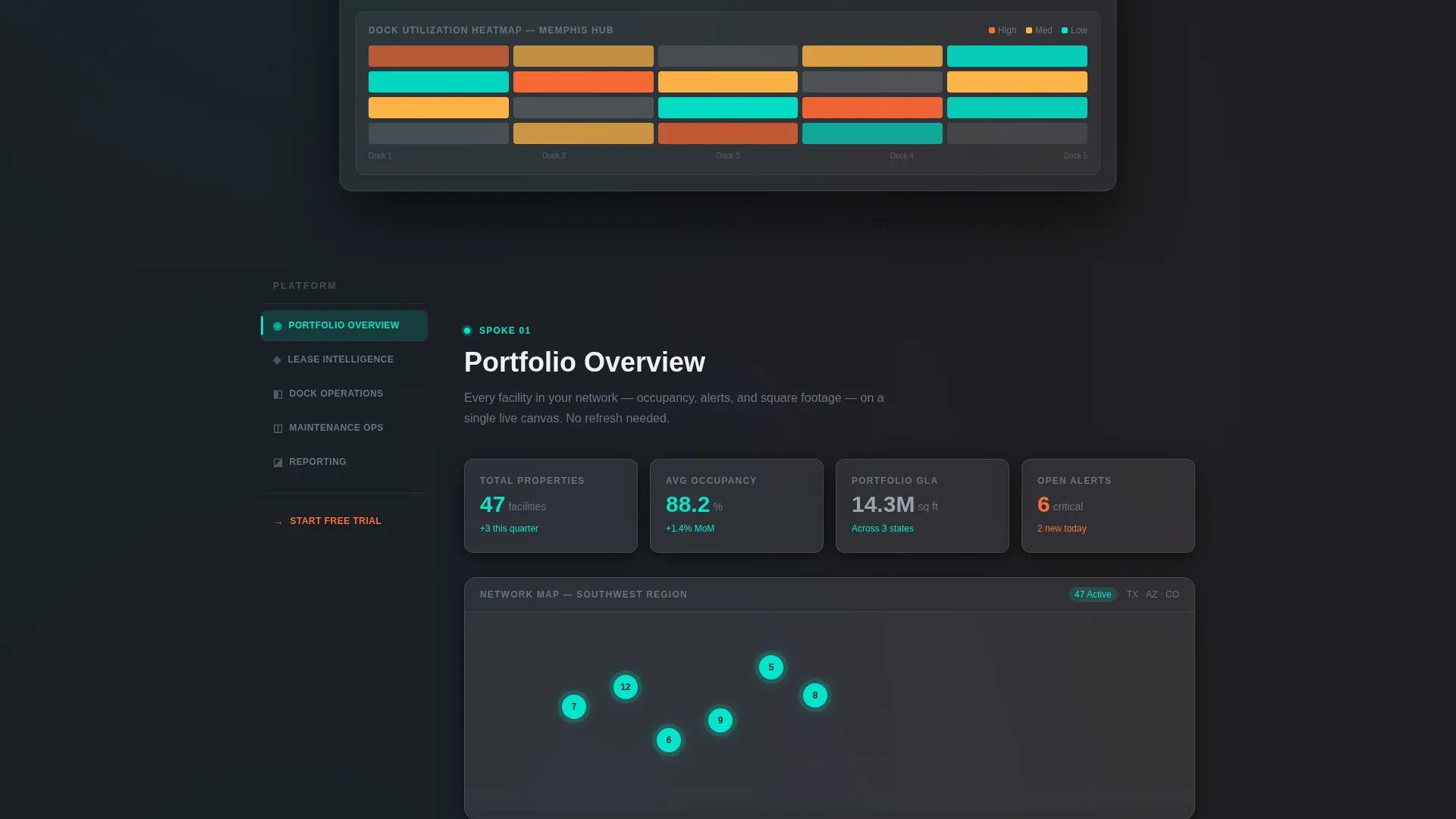
- A sticky side navigation with five anchor links: Portfolio Overview, Lease Intelligence, Dock Operations, Maintenance Ops, and Reporting
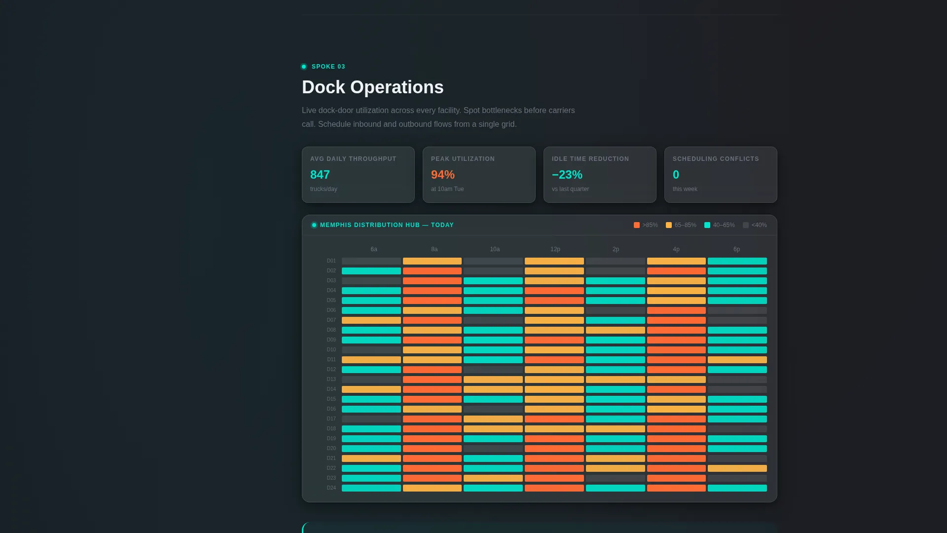
- Animated glassmorphic widget cards including a vacancy gauge, lease expiration timeline, and dock utilization heatmap
- A dual conversion flow covering both a freemium trial path and an enterprise booking path
Feature list
This section describes the key built-in capabilities that make Depot ready to use out of the box.
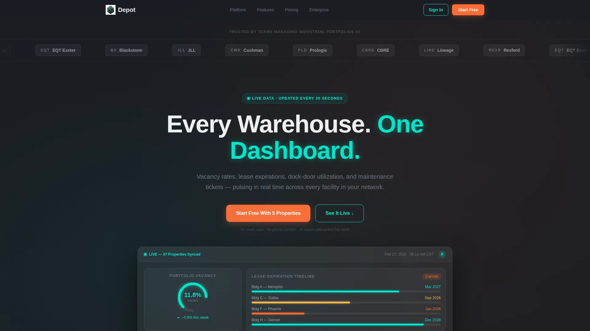
Animated Dashboard Header Mockup
The header section includes a live-feeling user interface mockup with subtle two-second animation loops. A vacancy gauge ticks between values, a lease expiration timeline shifts colored bars, and a dock utilization heatmap cycles between warm and cool zones. This communicates product depth before a visitor reads a single feature description.
Hub and Spoke Anchor Navigation
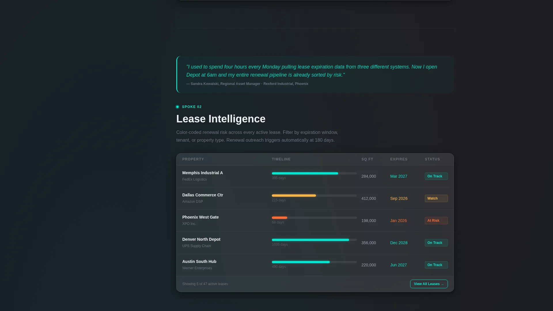
A sticky side navigation panel links to five named spokes: Portfolio Overview, Lease Intelligence, Dock Operations, Maintenance Ops, and Reporting. Each spoke section slides in from the edges with a glassmorphic card treatment and a unique micro-interaction, such as a pie chart filling, a map populating location pins, or a Gantt bar extending.
Logo Bar Credibility Strip
The header opens with a horizontal scrolling strip of logistics and real estate investment trust brand logos. This establishes platform credibility before any feature copy appears, which is critical for reaching asset managers who assess trust signals quickly.
Dual Conversion Funnel Design
The primary call to action, labeled "Start Free With 5 Properties," appears beneath the header mockup and repeats as a persistent floating button after the second spoke. A secondary path labeled "Book a Portfolio Walkthrough" targets enterprise prospects managing fifty or more properties and links to a calendar embed.
Minimal Trial Signup Form
The freemium trial form collects only a work email address and a portfolio size selection from a dropdown. No credit card and no phone number are required. This intentionally low-friction design reduces hesitation for first-time visitors.
Boardroom-Ready Reporting Panel
The final Reporting spoke culminates in a full-width dark panel showing a generated board deck. Pages fan out visually to signal that the platform produces polished, presentation-ready output. Embedded teal italic testimonial quotes from asset managers appear between spokes as human interruptions to the user interface rhythm.
Page sections overview
| Section | Purpose |
|---|---|
| Logo bar strip | Establish credibility with recognizable industry logos before copy begins |
| Hero headline area | Deliver the core value proposition with bold sans-serif type |
| Animated dashboard mockup | Show the product doing real work through subtle looping widget animations |
| Primary call to action block | Capture freemium trial sign-ups with a minimal two-field form |
| Portfolio Overview spoke | Introduce multi-facility visibility as the first anchor section |
| Lease Intelligence spoke | Highlight lease expiration tracking and timeline visualization |
| Dock Operations spoke | Present dock-door utilization data through a heatmap micro-interaction |
| Maintenance Ops spoke | Cover maintenance ticket management with a dedicated card section |
| Reporting spoke | Close the feature arc with a full-width board deck preview panel |
| Floating call to action button | Keep the trial sign-up accessible after the second spoke throughout scroll |
| Enterprise booking path | Offer a calendar-linked walkthrough option for large portfolio prospects |
Design & branding system
Depot uses a Dashboard Pro theme expressed through a glassmorphic color system. The visual language is calm and data-forward, built to feel like an active operations room rather than a marketing brochure.
- Core palette: deep warehouse charcoal (#1A1D23) background, frosted glass panels at 8 to 12 percent opacity, electric teal (#00E5CC) for live-data accents and active navigation states, muted dock-gray (#6B7280) for secondary text, and signal-orange (#FF6B35) reserved exclusively for alerts and primary calls to action
- Card treatment: 1-pixel translucent white borders with layered box shadows that create genuine depth and separation from the background
- Typography: bold sans-serif headline for the hero, with tight spacing that reinforces the operations-room tone throughout
Mobile & speed optimization
Depot is structured for clean rendering across device sizes. The layout prioritizes readability and interaction clarity for visitors who may access the page outside of a desktop environment.
- Glassmorphic card components and the sticky side navigation are designed with responsive stacking in mind so the spoke structure remains navigable on smaller screens
- Animated elements use short two-second loops with subtle transitions, keeping the motion purposeful rather than heavy
How this template helps you convert
Depot is designed so that visitors experience the platform's value through the page itself before they are ever asked to act. The conversion architecture is deliberate and sequenced.
- The animated header mockup shows real operational data in motion, so the visitor's own pain point is reflected immediately on arrival, before any feature list appears.
- The low-friction trial form, requiring only a work email and a portfolio size dropdown, removes the most common barriers to freemium sign-up, while the persistent floating button keeps the action reachable at every scroll depth.
- The enterprise booking path gives high-value prospects managing large portfolios a dedicated route to a personalized walkthrough, so the page converts both self-serve and sales-assisted buyers.
Other information about this template
Depot is built specifically for the real estate warehouse management software category, where buyers are operationally sophisticated and skeptical of generic marketing. The template's visual and structural choices are calibrated for that audience.
- The Launch Energy creative direction means sections get progressively shorter and denser as the visitor scrolls, accelerating the sense that the platform handles more than expected
- The template style is Hub and Spoke with Anchor Navigation, making it straightforward to repurpose spoke sections for different platform feature sets or to reorder spokes based on your audience's priorities
- The freemium and enterprise dual-path structure reflects real conversion patterns in industrial real estate software, where some buyers self-serve and others require a consultative sales step
Theme
Dashboard Pro
Creative direction
Launch Energy
Color system
Glassmorphic
Style
Hub & Spoke (Anchor Nav)
Direction
Freemium/Trial
Page Sections
Animated Dashboard Header Mockup
Hub and Spoke Anchor Navigation
Logo Bar Credibility Strip
Dual Conversion Funnel Design
Minimal Trial Signup Form
Boardroom-ready Reporting Panel
Related questions
Who is this landing page template built for?
Can I change the five spoke sections to match my platform's features?
Does this template include the animated dashboard widgets?
What does the trial signup form collect?
Is there a separate conversion path for enterprise buyers?



