Architecture Digital Presence Specialist Professional Website Template
Blueprint is a dynamic motion landing page template built for architecture mobile app marketing. It combines a live-coded header animation, a visceral competitor comparison table, and looping phone mockup demos to prove app capability before asking for a tap. The result: a single-page scroll that moves visitors from skeptical to convinced without a single static screenshot.
by Rocket studio
Quick summary
Blueprint is a single-page landing page template designed to market a professional architecture mobile app. It opens with an animated code snippet that assembles a 3D building model in real time, drives momentum through a feature comparison table, and closes with a full render demo inside a phone frame. Every section earns the click before asking for it.
Who this template is for
This template is built for teams and individuals who need to sell a powerful mobile tool to a skeptical, workstation-trained audience. The target visitor already knows what desktop software can do and needs to be shown, not told, that a mobile app can match it.
- Solo architecture practitioners who work across job sites and need a convincing product page
- Junior associates and studio partners who evaluate tools on the go and appreciate direct, proof-first copy
- App developers or product marketers launching a professional-grade architecture mobile app
What problem this template solves
Most app landing pages show a static screenshot and list bullet-point features. That approach fails for professional tools because it does not demonstrate capability, it only describes it. Architects and technical buyers need to see the product working before they trust it.
- Static screenshots fail to convey real-time collaboration, offline editing, or walkthrough rendering
- Generic feature lists do not communicate competitive advantage over established desktop software
- A passive page loses visitors who arrive skeptical and leave unconvinced
What you get with this template
You get a fully structured, scroll-driven landing page built around proof and motion. Every section has a defined job: the header demonstrates, the comparison table differentiates, the micro-animation demos validate, and the calls to action convert.
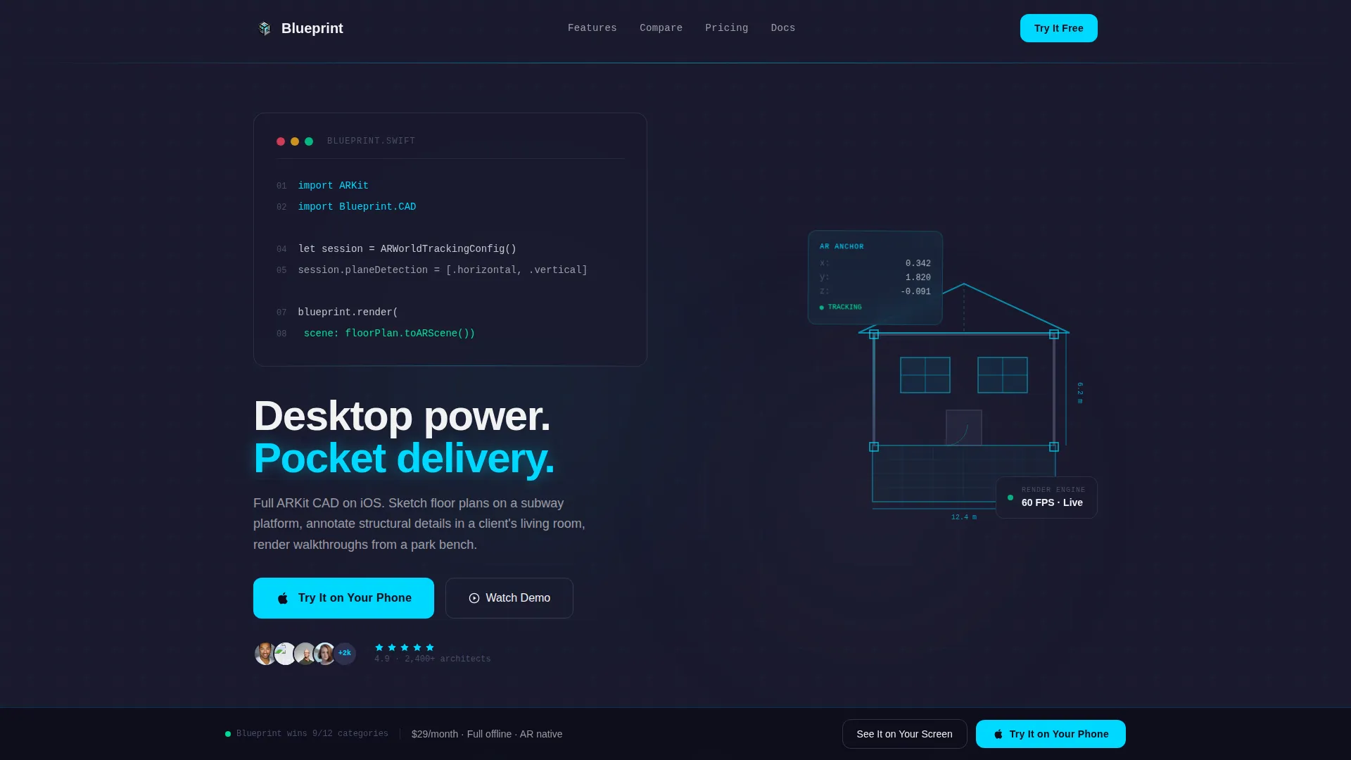
- An animated header section with a live-typed code snippet and a real-time assembling 3D model
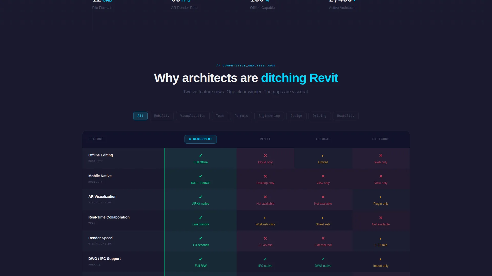
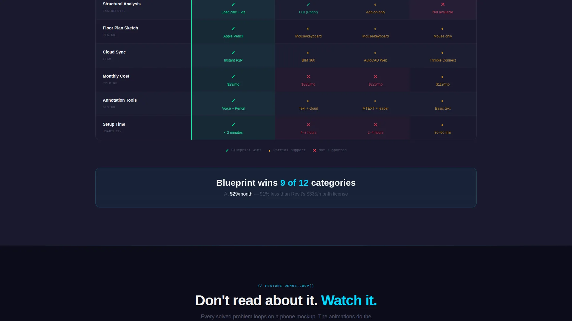
- A twelve-row competitor comparison table with red-to-green cell coloring across critical feature categories
- Two strategically placed calls to action, including a sticky bottom bar and a full-width block with an SMS-to-download flow
Feature list
This section covers the core functional components included in the Blueprint landing page template.
Live-Coded Header Animation
The header viewport contains a styled block of coordinate code that types itself line by line. Each line triggers a corresponding architectural element, a wall rising, a window cutting through, a roof plane snapping into place, assembling a 3D model beside the snippet in real time. The headline types itself below the final line.
Competitor Comparison Table
A twelve-row feature comparison table stacks this app's capabilities directly against desktop-only competitors. Rows cover offline editing, real-time collaboration, file format support, and render speed. Red-to-green cell coloring makes the competitive gaps immediately visible without requiring any explanation.
Looping Phone Mockup Demos
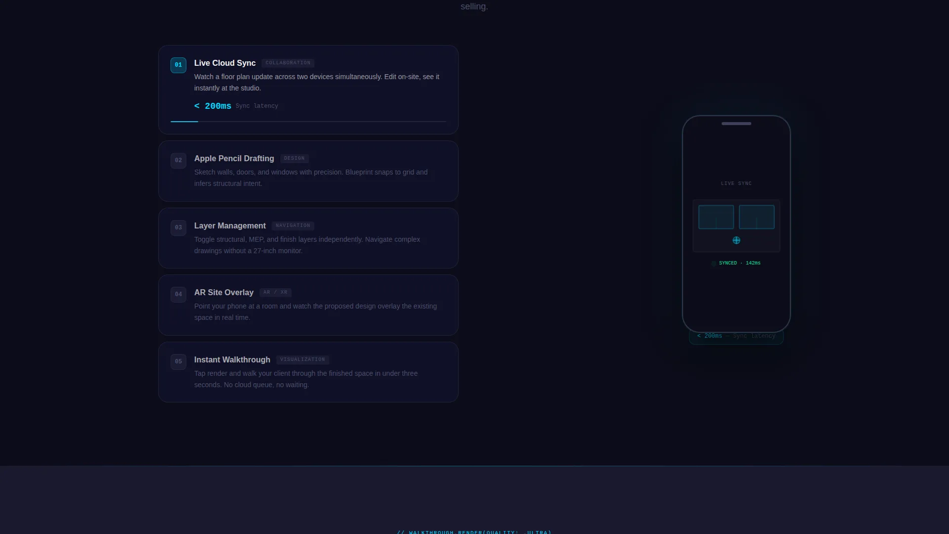
After the comparison table, each solved problem triggers a looping micro-animation displayed inside a phone mockup frame. Visitors watch cloud sync update a drawing across two devices simultaneously, and the sequence escalates from convenience features through structural analysis tools to a full walkthrough render.
Dual Call-to-Action System
The primary call to action, "Try It on Your Phone," appears first as a sticky bottom bar after the comparison table and again as a full-width block after the final render demo. A secondary call to action, "See It on Your Screen," triggers an SMS-to-download flow requiring only a phone number.
Problem-to-Solution Scroll Arc
The page is structured as a pressure-valve narrative. Section one stacks the pain using the comparison table. Section two resolves each pain point with a corresponding animation. Stakes escalate deliberately, ending on the highest-impact demo so the visitor arrives at the final call to action already convinced.
Dynamic Motion Theme
The entire page follows a Dynamic Motion visual identity. Interactive states, hover lines, and call-to-action pulses fire in reactive cyan. Backgrounds stay in deep carbon black. The result is a page that feels alive and technical without adding visual noise.
Page sections overview
| Section | Purpose |
|---|---|
| Animated Code Header | Opens the page with a live-typed code snippet and a real-time 3D model assembly |
| Competitor Comparison Table | Displays twelve feature rows comparing this app against desktop-only alternatives |
| Feature Animation Demos | Shows each solved problem as a looping micro-animation on a phone mockup |
| Structural Analysis Showcase | Escalates the demo sequence to professional-grade tools and walkthrough rendering |
| Sticky call to action Bar | Locks in the primary call to action after the comparison table confirms advantage |
| Full-Width call to action Block | Closes the page with a direct app store link and the SMS-to-download field |
Design & branding system
The Carbon Fiber color system is built for technical credibility. Every color choice signals precision and intentionality, and nothing competes with the content for attention until an interaction demands it.
- Deep carbon black (#1A1A2E) dominates all backgrounds; titanium mid-gray (#4A4E69) structures section dividers and table rows; precision white (#F2F2F2) carries all body text and labels
- Reactive cyan (#00D9FF) activates only on interactive states, hover lines, and call-to-action pulses, keeping motion meaningful and never decorative
- The overall palette reads like a matte-black drafting instrument: technical, tactile, and zero ornamentation
Mobile & speed optimization
The landing page is designed around a mobile-first experience from the ground up. The product being marketed is a mobile app, so the template mirrors that context at every touchpoint.
- Phone mockup frames host every demo animation, keeping the visitor mentally inside the product throughout the scroll
- The SMS-to-download call to action requires a single field and one tap, reducing friction to near zero for mobile visitors
- Sticky bottom bar placement ensures the primary call to action is always within thumb reach after the comparison table section
How this template helps you convert
Blueprint is structured so that conversion feels like a natural conclusion rather than a sales push. The page builds trust incrementally, and the calls to action appear only after capability has been demonstrated.
- The animated header creates immediate impact and signals that the product is genuinely different from desktop software, earning attention before the visitor decides to scroll
- The comparison table delivers a visual proof of competitive advantage at the moment visitors are most likely to question whether an app can replace a workstation
- The escalating animation sequence resolves every remaining doubt feature by feature, so both the sticky bar and the full-width call to action land when the visitor is already convinced
Other information about this template
Blueprint is a single-page landing page template suited to any team marketing a professional mobile application in the architecture or construction technology space. It is built on a Dynamic Motion theme with a Carbon Fiber color system and follows a Problem-to-Solution Arc creative direction, making it adaptable to other technical app categories with similar positioning needs.
- The template style is a Comparison Table layout, making it well-suited for markets where a new mobile product must justify itself against entrenched desktop software
- The header concept is a Code Snippet animation, which communicates technical sophistication without requiring visitors to read technical documentation
- The lp direction is Click-Through, routing the primary call to action directly to an app store listing while the secondary SMS flow captures visitors who prefer to download later
Theme
Dynamic Motion
Creative direction
Problem→Solution Arc
Color system
Carbon Fiber
Style
Comparison Table
Direction
Click-Through
Page Sections
Live-coded Header Animation
Twelve-row Competitor Comparison Table
Looping Phone Mockup Demos
Dual Call-to-action System
Problem-to-solution Scroll Arc
Related questions
What type of page is Blueprint?
Who is this template designed for?
How do the two calls to action work?
Can the comparison table be customized?
Does the template include the animation assets?



