Specialist Coworking Digital Presence Professional Website Template
Desk is a split-screen coworking landing page template built on a Tech Glass aesthetic. It pairs a void black and deep violet color system with an interactive showroom experience. Web designers can re-skin it in an afternoon and drop clients into a live demo. It sells space, community, and connectivity without looking like every other coworking clone.
by Rocket studio
Quick summary
Desk is a single-page coworking landing page template designed for web designers who need to deliver results fast. It uses a 50/50 split-screen layout, a Void and Violet color system, and an interactive explorer structure. Every section is built to show the template in motion rather than describe it in static copy.
Who this template is for
This template is built for web designers who work with coworking space operators. If you have multiple coworking clients in your pipeline and need a layout that closes the gap between pitch and delivery, Desk was made for exactly that situation.
- Web designers with coworking operators as active clients
- Freelancers who need a polished starting point they can re-skin quickly
- Studio teams pitching to seed-stage founders or remote creative businesses
What problem this template solves
Most coworking templates feel generic. They recycle the same stock photography, the same hero headlines, and the same grid of amenity icons. Desk solves the problem of standing out in a saturated market by making the product itself the visual centerpiece.
- Visitors expect another WeWork-style clone and instead get a dark, glass-lit interactive experience
- Operators struggle to communicate space variety and community value on a single page
- Designers waste time building comparison logic and interactive preset toggles from scratch
What you get with this template
Desk delivers a fully structured single-page layout ready for customization. The design system, interaction patterns, and content sections are all included from the start.
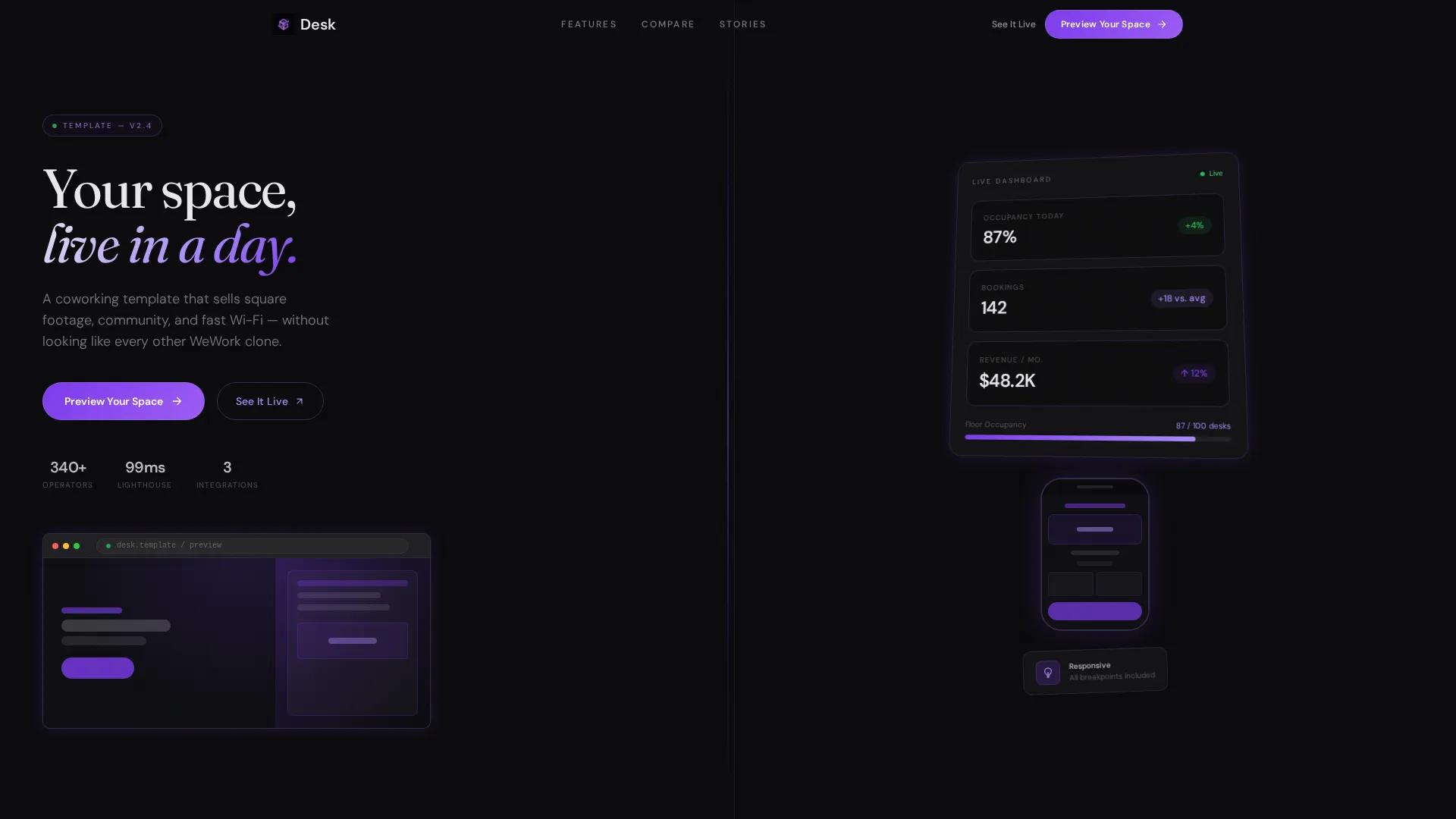
- A 50/50 split-screen layout with a Product Screenshot header showing browser and mobile views side by side
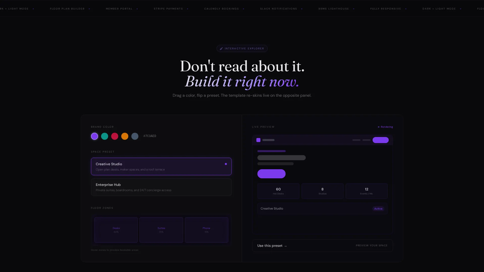
- An interactive color picker, preset toggles for "Creative Studio" and "Enterprise Hub," and a hover-activated floor plan
- A sticky comparison toggle with a feature matrix and two distinct calls to action: "Preview Your Space" and "See It Live"
Feature list
This template is built around a set of deliberate, interconnected features. Each one serves a specific purpose in moving a visitor from curiosity to action.
Split-Screen Product Header
The header divides the viewport cleanly in half. The left side renders the template hero inside a browser frame against void black. The right side shows a mobile view alongside a live stats dashboard displaying occupancy rate, bookings today, and revenue this month, all tilted at a slight isometric angle.
Live Customization Explorer
Visitors interact with the template directly on the page. A drag-and-drop color picker lets them re-skin the layout in real time. A preset toggle switches the full design between "Creative Studio" and "Enterprise Hub" modes, with results rendered instantly on the opposite panel.
Interactive Floor Plan Section
A hoverable floor plan highlights bookable zones as the cursor moves across them. This turns a static amenity description into a spatial, tactile experience. Visitors understand the space layout through interaction, not through a bulleted list.
Sticky Comparison Toggle
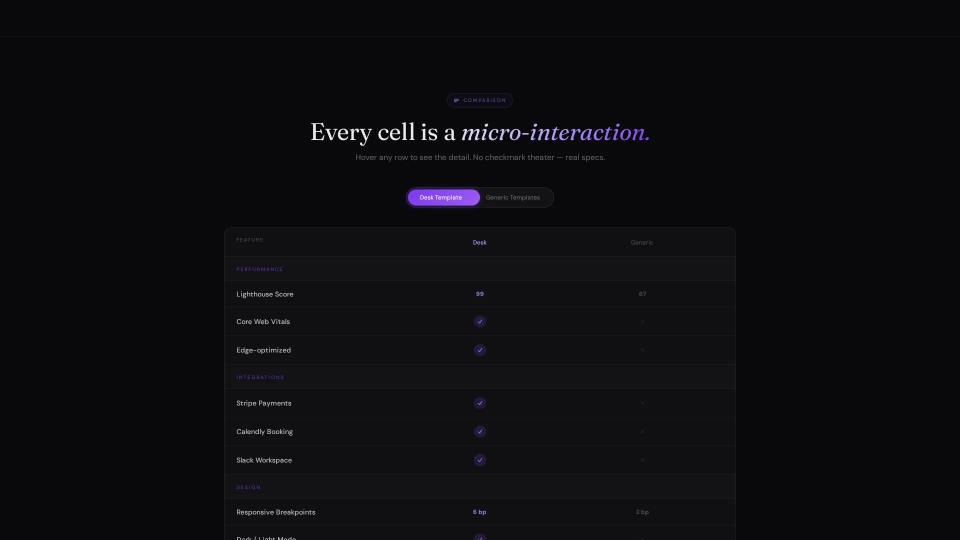
A persistent toggle at the top of the page lets visitors flip into a "Desk versus. Competitors" view. The feature matrix covers template speed scores, included integrations, and responsive breakpoints. Every cell in the table is a micro-interaction rather than a flat checkmark.
Dual Call-to-Action Path
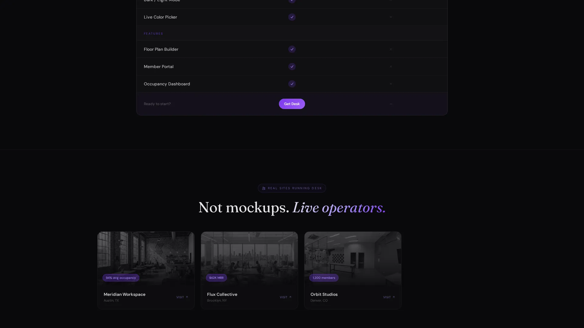
"Preview Your Space" drops the visitor into a full interactive demo seeded with their chosen preset. "See It Live" links to three real coworking sites already running the template. Both paths reduce hesitation by replacing claims with direct experience.
Accelerating Scroll Pace
The page is structured so engagement builds progressively. The first section is calm and visual. The second introduces motion. The third gives the visitor full interactive control. By the fourth section, they have essentially assembled their own personalized demo.
Page sections overview
| Section | Purpose |
|---|---|
| Split hero header | Show template in browser and mobile frames with a live stats overlay |
| Color picker panel | Let visitors re-skin the template with a drag-and-drop color tool |
| Preset toggle section | Switch between Creative Studio and Enterprise Hub layout modes |
| Floor plan explorer | Highlight bookable zones on hover across an interactive layout map |
| Comparison matrix | Compare template features against competitors with micro-interaction cells |
| Dual call to action block | Route visitors to a live demo or three real coworking site examples |
Design & branding system
The visual identity is built around the Tech Glass theme. Every color choice, shadow, and glow is intentional. The overall feeling is a flagship phone screen in a dark room: luminous edges floating against nothing.
- Core palette uses absolute void black (#09090B), deep orbital violet (#7C3AED), and frosted glass white (#E8E8ED)
- Neon lilac (#A78BFA) is reserved strictly for hover states and interactive element borders
- No lifestyle photography and no stock imagery; the rendered product interface is the only visual hero
Mobile & speed optimization
The template is designed with responsive behavior built into its core split-screen architecture. The mobile view is not an afterthought; it is part of the header itself, displayed prominently alongside the desktop frame.
- Responsive breakpoints are included and visible inside the comparison matrix so buyers can verify coverage before purchasing
- The mobile template view appears in the header as a first-class visual, reinforcing that the layout works at smaller sizes
- Layout sections are structured to reflow cleanly as screen width decreases
How this template helps you convert
Desk converts by letting visitors experience the template rather than read about it. The interaction model is the pitch.
- The interactive explorer structure means visitors perform customization actions themselves, which creates a sense of ownership before they have signed up
- The dual call-to-action system removes a binary decision and gives visitors two lower-friction entry points at different commitment levels
- The comparison matrix earns the final click by surfacing concrete differentiators through micro-interactions rather than marketing claims
Other information about this template
Desk is categorized under Technology, specifically within the Coworking Digital Presence subcategory. It was built to serve the coworking website template niche where design quality and interactivity are the primary buying signals.
- The template targets freelance developers, seed-stage founders, and remote creative teams as the end users of the coworking spaces it represents
- The intersection match score for this template's category, subcategory, and niche alignment is 13, indicating a strong contextual fit
- Included integration references in the comparison matrix cover Stripe, Calendly, and Slack, as listed in the source brief
- The template style is formally classified as Split Screen (50/50) under the Interactive Explorer creative direction
Theme
Tech Glass
Creative direction
Interactive Explorer
Color system
Void & Violet
Style
Split Screen (50/50)
Direction
Comparison/Versus
Page Sections
Split-screen Product Header
Live Color Picker and Preset Toggles
Interactive Floor Plan Explorer
Sticky Comparison Matrix
Dual Call-to-action System
Accelerating Scroll Experience
Related questions
How long does it take to re-skin this template for a new client?
Does this template include real interactive elements or just static mockups?
What are the two calls to action and when should I use each one?
Who is the intended end user of this landing page once deployed?
Can I use this template across multiple coworking client projects?



