Computer Vision Technology Portfolio Website Template
Detect is a Bold Brutalist landing page template built for computer vision consulting teams. It features a three-tab annotated image header, a stark eight-dimension comparison table, and expanding case study proof blocks. The Void and Violet color system keeps the page sharp and technical. The single primary call to action drives visitors straight to an assessment intake with zero form friction.
by Rocket studio
Quick summary
Detect is a single-page landing page template designed for computer vision consulting services. It opens with a live-annotated Feature Tab Switcher, moves through a brutal comparison table benchmarking three build approaches, then escalates through case study proof blocks before landing on a frictionless call-to-action bar. The design feels like a terminal window running inference at 2 a.m.
Who this template is for
This template is built for technical consulting teams that need to communicate hard capability to equally hard-nosed buyers. It is the right fit when your service is precise, your results are measurable, and your audience arrives skeptical.
- Computer vision consulting firms selling to operations directors, logistics managers, and startup chief technology officers
- Engineering teams that have real before-and-after metrics and want a page structure that leads with data
- Agencies or independent studios building a showcase page for a specialized machine-learning or imaging service
What problem this template solves
Selling a complex technical service is difficult when every competitor page looks the same. Buyers at manufacturing plants or logistics operations do not respond to vague promises. They respond to numbers, comparisons, and proof.
- The template replaces generic hero sections with annotated visual evidence that shows what your models actually do
- The comparison table eliminates the "why not just use an off-the-shelf API" objection before a prospect even asks it
- Expanding case study blocks turn abstract claims into concrete before-and-after results that build trust incrementally
What you get with this template
You get a fully structured single-page layout that moves a skeptical technical buyer from curiosity to commitment. Every section has a defined role in the conversion flow, and the copy structure is already calibrated for a high-scrutiny audience.
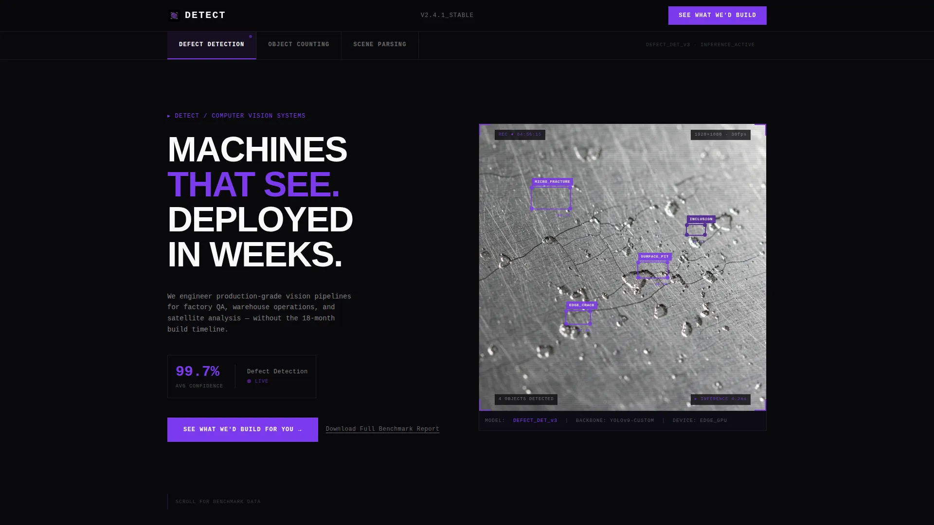
- A three-tab header switcher showing defect detection, object counting, and scene parsing with live-annotated imagery
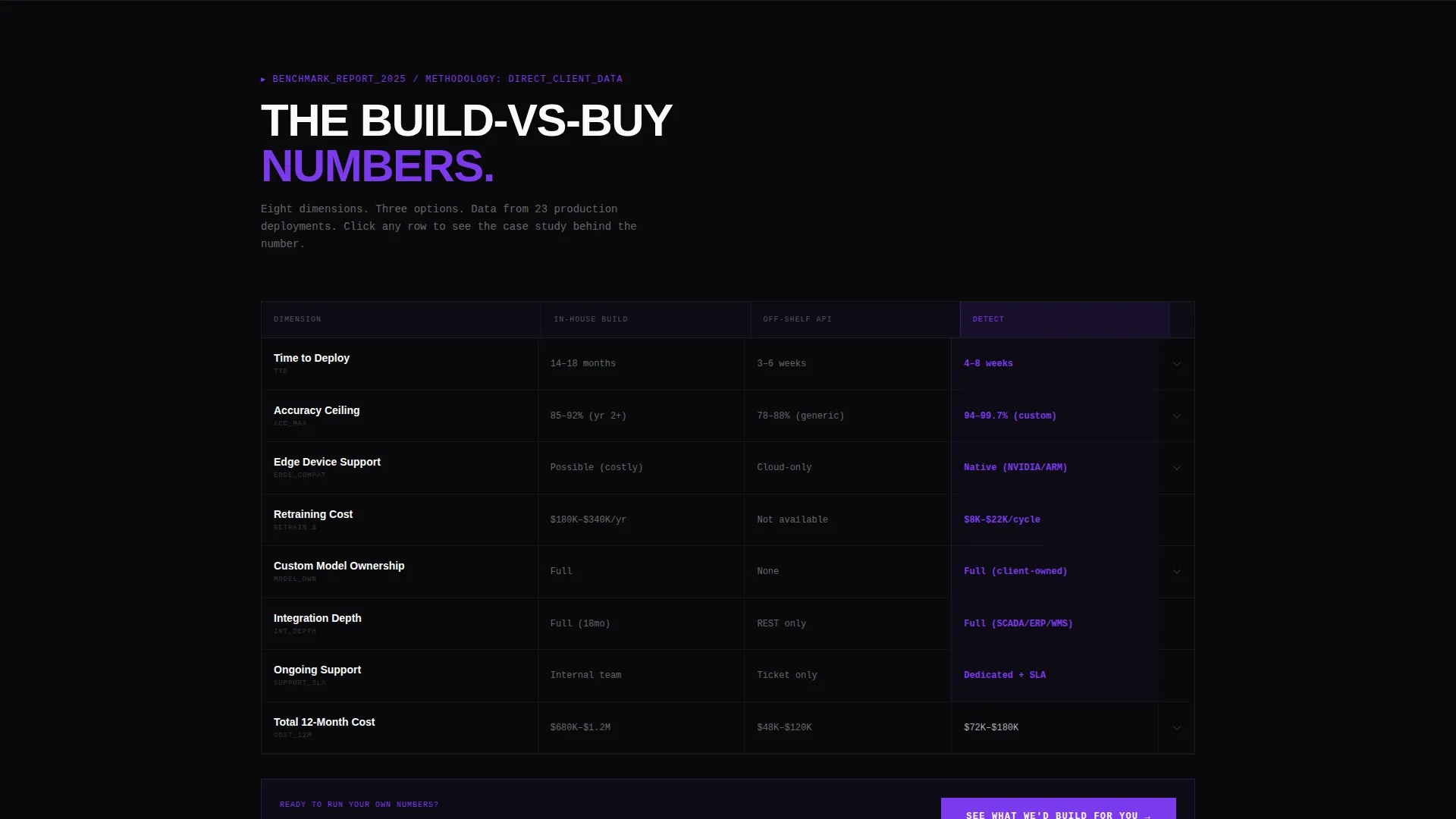
- An eight-dimension comparison table with stark, specific numbers across in-house build, off-the-shelf application programming interface (API), and consulting service columns
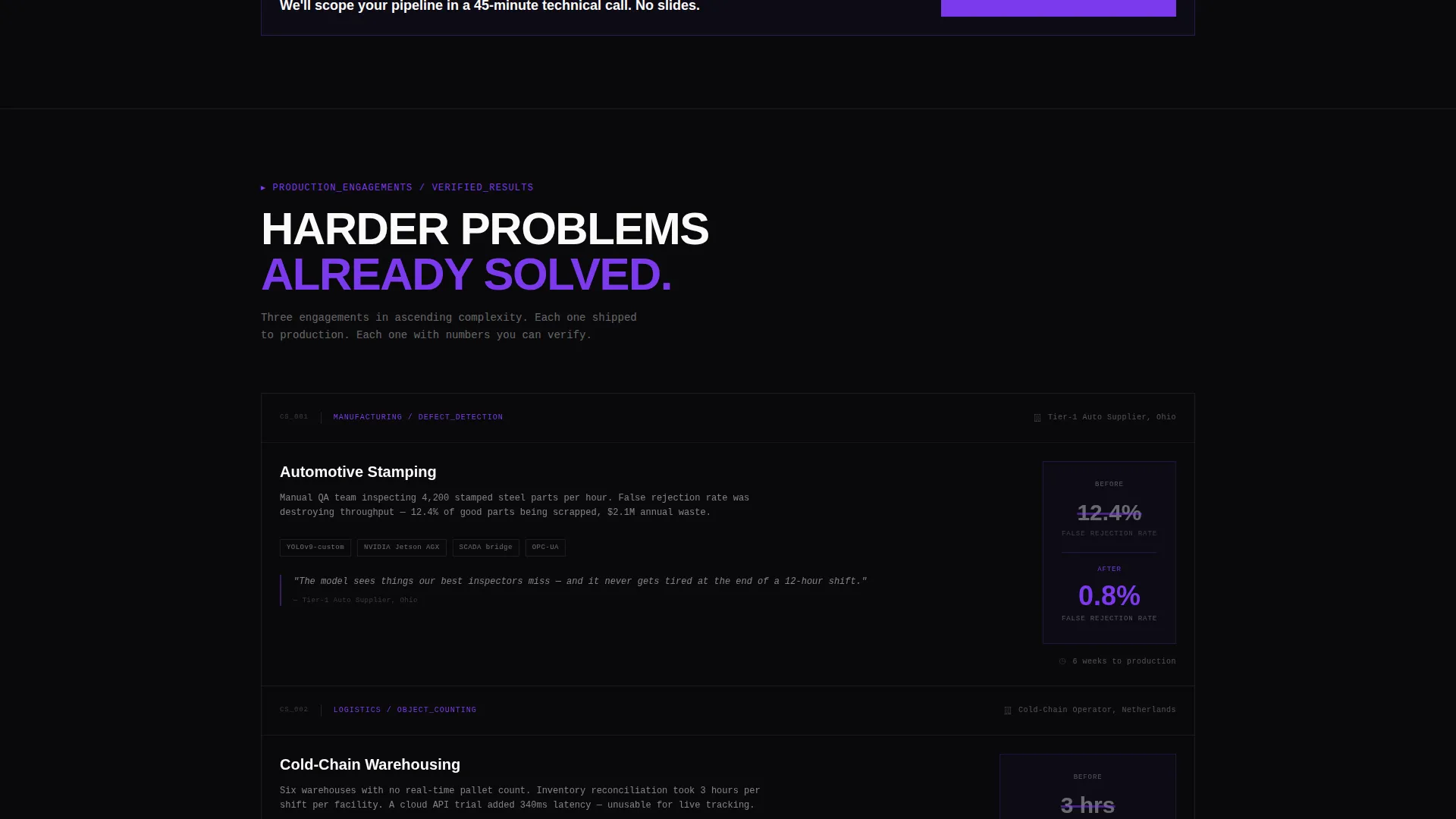
- Expanding case study rows beneath the table, a persistent floating call-to-action bar, and a secondary email-capture modal for the benchmark report download
Feature list
This section covers the core structural and functional components built into the Detect template.
Three-Tab Feature Switcher Header
The header presents three labeled tabs: Defect Detection, Object Counting, and Scene Parsing. Each tab reveals a different annotated image with bounding boxes, numbered overlays, or segmented zones. Tab transitions are instantaneous snap cuts with no easing, mirroring model inference speed.
Eight-Dimension Comparison Table
The comparison table benchmarks three approaches across time to deploy, accuracy ceiling, edge-device support, retraining cost, custom model ownership, integration depth, ongoing support, and total twelve-month cost. Numbers are specific and stark. The table sits above the fold after the header, making it the first analytical touchpoint for a data-driven buyer.
Expanding Case Study Proof Blocks
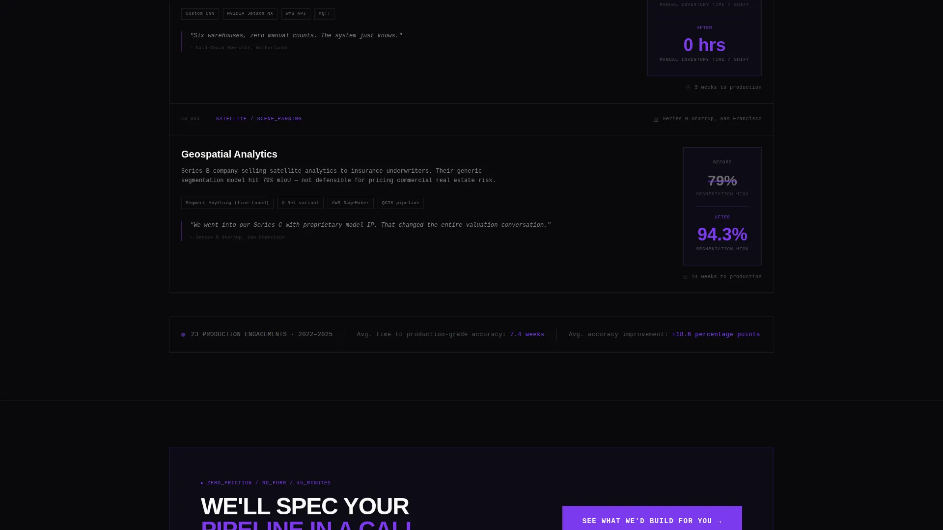
Each row of the comparison table expands into a mini case study drawn from real engagement metrics. The rhythm is claim, then proof, repeating and escalating in project complexity. This structure lets buyers self-identify with a problem that has already been solved.
Persistent Floating Call-to-Action Bar
After a visitor scrolls past the third case study, a floating bar locks to the bottom of the viewport. It carries the primary call to action linking to a detailed assessment intake page. The bar appears without interrupting the reading flow and stays visible for the remainder of the scroll.
Secondary Benchmark Report Modal
A text link labeled "Download the Full Benchmark Report" triggers an email-capture modal. This gives visitors who are not yet ready to engage a low-friction reason to leave contact information. No form appears on the main page itself.
Bold Brutalist Visual System
The layout uses absolute void black backgrounds with no gradients. Violet handles interactive elements, table headers, and data callouts. White monospaced and heavy grotesque type is slammed large with brutalist spacing. The visual language reinforces the precision and authority of the service.
Page sections overview
| Section | Purpose |
|---|---|
| Tab Switcher Header | Demonstrate three core vision capabilities with annotated imagery |
| Comparison Table | Benchmark three build approaches across eight measurable dimensions |
| Case Study Blocks | Expand table rows into before-and-after proof from real engagements |
| Floating call to action Bar | Keep the primary call to action visible after the third case study |
| Benchmark Report Modal | Capture email from visitors who want data before committing |
Design & branding system
The Detect template follows a Bold Brutalist theme built on the Void and Violet color system. The visual language is intentionally cold, precise, and technical. Every design decision reinforces the authority of a team that has solved hard problems.
- Core palette: absolute void black (#09090B) for all backgrounds, electric violet (#7C3AED) for interactive elements and table headers, deep ultraviolet (#4C1D95) for secondary accents, and clinical phosphor white (#FAFAFA) for all typography and borders
- Typography is set in monospaced or heavy grotesque faces, displayed large with brutalist spacing that treats whitespace as structural rather than decorative
- No gradients appear anywhere on the page; violet is reserved for elements that carry meaning, such as confidence score callouts, table header rows, and the primary call-to-action button
Mobile & speed optimization
The Detect template is structured to remain readable and functional on smaller viewports without sacrificing the brutalist visual weight that makes it distinctive.
- The comparison table collapses gracefully on narrow screens, keeping the eight dimensions readable without horizontal scrolling
- The floating call-to-action bar is designed to anchor correctly on mobile viewports so it does not overlap critical table content
- Tab switcher images are laid out to scale within the header frame while preserving the annotated overlay details that carry the core visual argument
How this template helps you convert
Every structural decision in this template is oriented toward one outcome: moving a skeptical technical buyer to click the primary call to action.
- The comparison table does the persuasion work early. By the time a visitor finishes reading the eight dimensions, the case for your service is already built without a single word of marketing language.
- The escalating case study structure creates progressive trust. Each proof block is harder than the last, so by the third or fourth case study the visitor understands your team has solved problems more complex than their own.
- The floating call-to-action bar removes the need to scroll back up. It appears exactly when the visitor has seen enough evidence, which is the moment they are most likely to click.
Other information about this template
This template is categorized under the Technology vertical with a Computer Vision Technology subcategory. It is purpose-built for the Computer Vision Consulting Service niche and reflects the intersection of that niche with a Bold Brutalist theme, an Industry Report creative direction, and a Click-Through landing-page strategy.
- The template style is a Comparison Table layout, which is a proven format for technical service positioning where buyers need to evaluate options side by side
- The header concept is a Feature Tab Switcher, a component that lets a single page demonstrate multiple distinct capabilities without requiring navigation to separate pages
- This template is a strong fit for teams presenting at pitch meetings or sharing a direct link in outbound sales sequences, where first impressions are made in seconds
Theme
Bold Brutalist
Creative direction
Industry Report
Color system
Void & Violet
Style
Comparison Table
Direction
Click-Through
Page Sections
Three-tab Annotated Image Header
Eight-dimension Comparison Table
Expanding Case Study Proof Blocks
Persistent Floating Call to Action Bar
Secondary Benchmark Report Modal
Bold Brutalist Void and Violet Layout
Related questions
Can I customize the eight comparison dimensions in the table?
Does this template include machine learning models or vision pipelines?
How does the email capture work on the benchmark report modal?
Is this template suitable for a team that offers only one type of vision service?
Who provides the before-and-after metrics for the case study proof blocks?



