College & University Specialist Professional Website Template
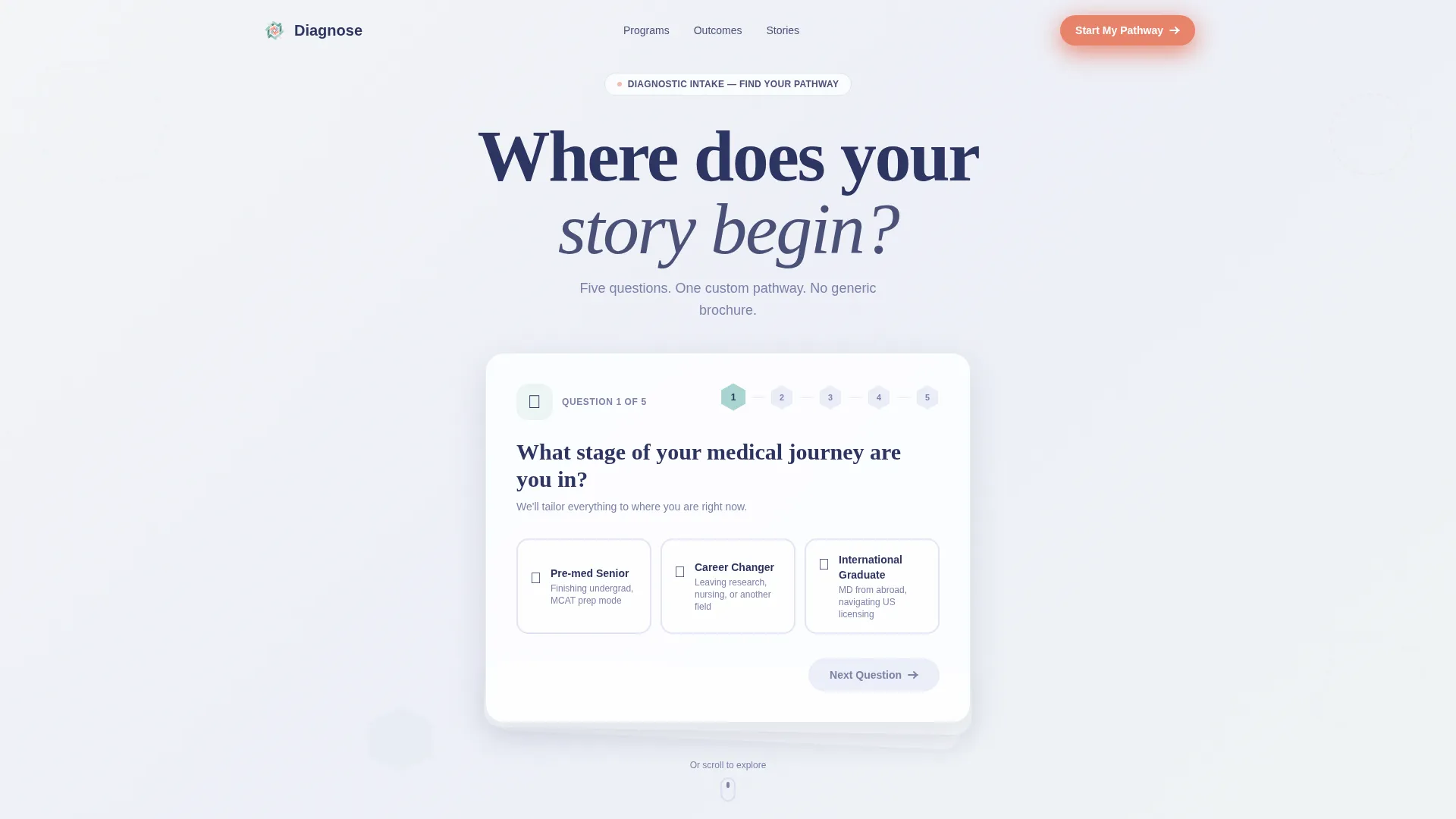
Diagnose is a personalized medical school landing page template built around a quiz-first experience. A multi-step diagnostic intake replaces the traditional hero image, guiding each visitor through targeted questions that surface a custom admission pathway. The Playful Geometric design and Soft Mist color palette keep the page clinical, warm, and conversion-ready.
by Rocket studio
Quick summary
Diagnose is a card-grid landing page template built for medical schools. It opens with a multi-step diagnostic form that identifies each visitor's journey stage, then rearranges content cards to match their path. The Soft Mist color system and Playful Geometric theme make it feel credible and approachable at the same time.
Who this template is for
This template is designed for medical school admissions teams that want to move beyond a static brochure page. It suits institutions ready to make their first impression feel personalized and interactive rather than generic.
- Admissions offices targeting pre-med seniors with active MCAT scores
- Outreach teams recruiting career-changers coming from nursing or bench research backgrounds
- International enrollment coordinators helping graduates navigate credential and licensing pathways
What problem this template solves
Most medical school landing pages show the same content to every visitor, regardless of where they are in their journey. That one-size approach loses prospective students who feel unseen before they ever submit an inquiry.
- Visitors with different backgrounds see irrelevant content and leave without converting
- Generic forms feel like paperwork rather than a guided, personalized experience
- No visible momentum or progress makes quiz completion feel like a chore
What you get with this template
You get a fully structured, single-page layout built around a quiz-and-personalize flow. Every component is designed to surface the right content for the right visitor at the right moment.
- A multi-step diagnostic intake as the hero, with staggered geometric card user interface and hexagon progress indicators
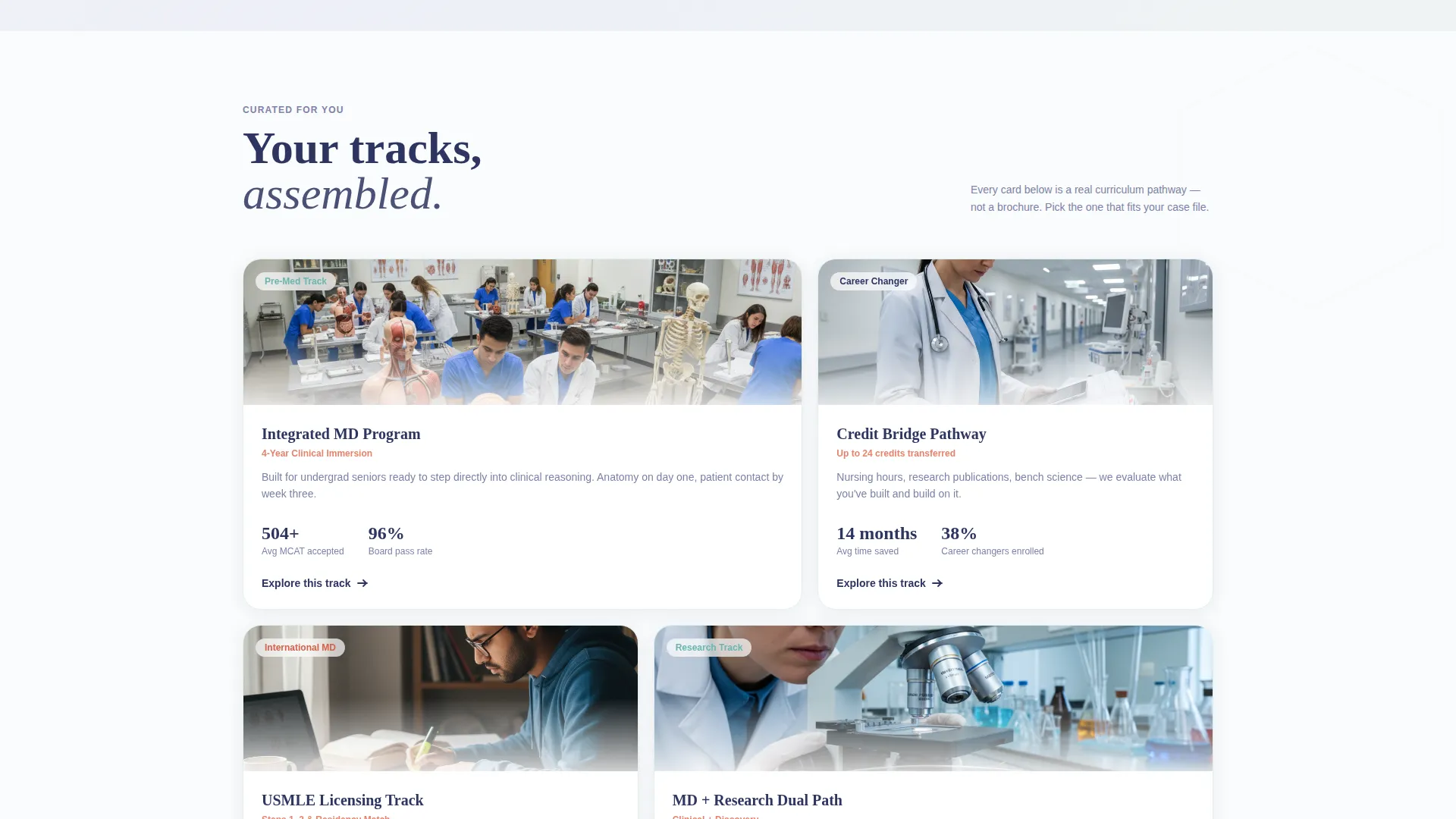
- A dynamic card grid that regroups and reveals relevant sections based on quiz answers
- A live-updating fit score in coral and a secondary email-capture path for early quiz abandoners
Feature list
This template delivers a focused set of interactive and visual components drawn directly from the design brief.
Diagnostic Multi-Step Hero Form
The header replaces a traditional hero image with three floating geometric cards in a staggered cascade. The first card is already open, asking visitors which stage of their medical journey they are in. Playful illustrated icons, a beaker, a stethoscope, and a globe, represent each distinct path.
Hexagon Progress Strand
Quiz progress is visualized as a connected strand of hexagons that fills with muted seafoam as the visitor advances. The molecular-chain metaphor reinforces the medical theme without relying on stock photography or clichéd imagery.
Personalized Card Grid Sections
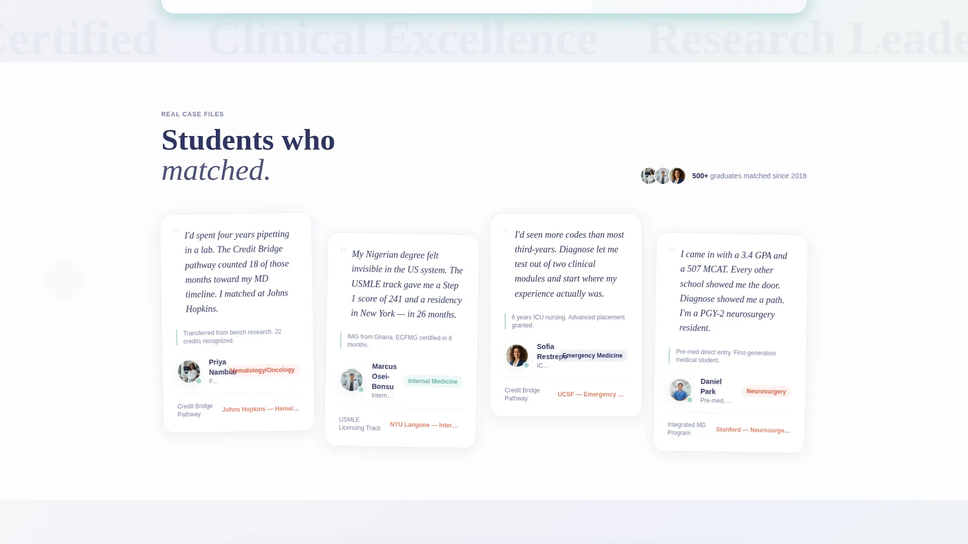
After capturing the visitor's stage, each scroll section regroups its card grid to surface relevant content. Pre-med seniors see curriculum tracks, career-changers see credit-transfer pathways, and international graduates see licensing guidance. Cards animate with geometric transitions, triangles folding into squares and circles splitting into pie segments.
Live Fit Score Indicator
A fit score displayed in warm coral updates in real time as the visitor answers each quiz question. The climbing number creates a sense of momentum and makes completing all five questions feel rewarding rather than effortful.
Primary and Secondary Conversion Paths
The primary call to action, "See My Admission Pathway," appears after the fifth question, when personalization feels earned. A secondary path, "Download the Curriculum Map," captures just an email address from visitors who exit the quiz early, ensuring no lead is completely lost.
Single-Tap Card Input Design
Each quiz question, covering grade point average range, MCAT status, undergraduate major, clinical hours, and preferred specialty interest, lives on its own card. One tap per step keeps the interaction fast and removes the friction of a long scrolling form.
Page sections overview
| Section | Purpose |
|---|---|
| Diagnostic Intake Hero | Opens with the multi-step form card cascade as the primary entry point |
| Hexagon Progress Bar | Visualizes quiz advancement using a seafoam-filled molecular strand |
| Personalized Curriculum Cards | Surfaces track options relevant to the visitor's declared journey stage |
| Credit Transfer Pathways | Guides career-changers through relevant pathway and credit information |
| Licensing Guidance Cards | Presents credential and licensing context for international graduates |
| Live Fit Score Panel | Displays the coral fit score that updates with each completed answer |
| Primary call to action Block | Delivers the "See My Admission Pathway" button after question five |
| Secondary Email Capture | Offers the curriculum map download as a fallback conversion option |
Design & branding system
The Soft Mist color system gives the page a clinical clarity that still feels human and approachable. Every color has an assigned role, so the visual hierarchy stays consistent from top to bottom.
- Backgrounds cycle through cool fog white (#F4F6F8) and lavender-gray (#C5CAE9), keeping the page light and airy
- Cards use subtle muted seafoam (#A8D5D2) borders to float elements without heavy shadow
- Warm coral (#E8836B) is reserved strictly for active states, progress indicators, fit score displays, and call-to-action buttons
Mobile & speed optimization
The single-tap card format is inherently well-suited for thumb-friendly mobile interaction. The modular card-grid structure means each section loads and renders as a contained unit.
- One question per card eliminates long scroll distances on small screens
- Geometric animations are contained within card boundaries, keeping transitions smooth on mobile viewports
- The staggered cascade layout adapts naturally to narrower screen widths without breaking the visual hierarchy
How this template helps you convert
The page is engineered around quiz-based conversion, where every interaction builds toward a final, personalized result that feels earned rather than pushed.
- The diagnostic form opens immediately as the hero, making the first action a low-commitment single tap that draws visitors in before they can disengage
- The live coral fit score rises with each answer, turning a five-step quiz into a visible progress loop that rewards completion
- The secondary "Download the Curriculum Map" path ensures that even visitors who leave the quiz early can be captured with just an email address
Other information about this template
This template is categorized under Education and Training, specifically within the College and University segment targeting the medical school niche. It is a strong fit for institutions that want a modern admissions presence without relying on stock imagery or conventional form layouts.
- Template style is Card Grid (Modular), making individual sections easy to reorder or adapt for different program offerings
- The Playful Geometric theme uses geometric transition animations, including triangles folding into squares and circles splitting into pie segments, to reinforce brand personality without sacrificing credibility
- The Quiz and Personalize creative direction aligns the page experience with the way prospective medical students actually research their options, by self-identifying their stage and seeking relevant guidance
- The header concept is a Multi-Step Form, meaning the very first thing a visitor encounters is an interactive and personalized intake experience, not a passive banner

Theme
Playful Geometric
Creative direction
Quiz & Personalize
Color system
Soft Mist
Style
Card Grid (Modular)
Direction
Quiz/Assessment
Page Sections
Diagnostic Multi-step Hero Form
Hexagon Progress Strand
Personalized Card Grid Sections
Live Coral Fit Score
Single-tap Card Input Design
Dual Conversion Path Layout
Related questions
Can this template handle visitors from different admission backgrounds?
What is the primary call to action on this landing page?
What happens if a visitor leaves the quiz before finishing?
How does the live fit score work?
Is this template built as a single-page layout?



