AI & Machine Learning Professional Website Template
Diagnose is a modular card grid landing page built for AI-powered healthcare diagnostic platforms. It leads with a live stats wall, cycles through clinical specialty modules, and drives visitors toward a clinical suite app download. The dark Data Command aesthetic uses carbon black and defibrillator blue to signal precision, urgency, and medical-grade credibility.
by Rocket studio
Quick summary
Diagnose is a single-page, card grid landing page template built for AI diagnostic platforms in healthcare. It opens with an animated stats wall, unfolds through clinical specialty modules, and closes with a dual-platform app download call to action. The design feels like a mission-critical medical dashboard: no stock photography, no decorative warmth, just performance data doing the talking.
Who this template is for
This template is built for teams launching AI-powered clinical diagnostic tools that need to win over skeptical, data-driven decision-makers. It speaks to buyers who respond to evidence before narrative.
- Hospital Chief Information Officers evaluating diagnostic AI for imaging departments
- Clinic administrators managing large read backlogs who need a fast, credible pitch
- Radiologists and clinical teams looking to present AI-assisted second-read capabilities
What problem this template solves
Healthcare AI products face a credibility problem. Buyers are cautious, procurement cycles are long, and vague feature lists do not move the needle. This template solves the trust deficit by front-loading hard clinical evidence before asking for any commitment.
- Diagnostic AI platforms struggle to convert skeptical hospital buyers without showing proof first
- Generic SaaS landing pages feel misaligned with the high-stakes tone clinical buyers expect
- Most templates bury performance data in footnotes instead of making it the centerpiece
What you get with this template
You get a fully structured, single-page layout built around a modular card grid system. Every section is designed to deliver one clinical data point before advancing the visitor further down the page.
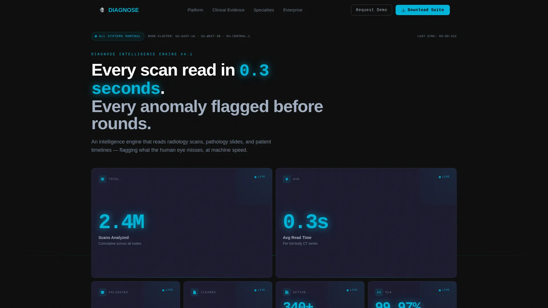
- An animated live stats wall header with real-time metric cards showing sensitivity rates, scan counts, read times, and cleared pathways
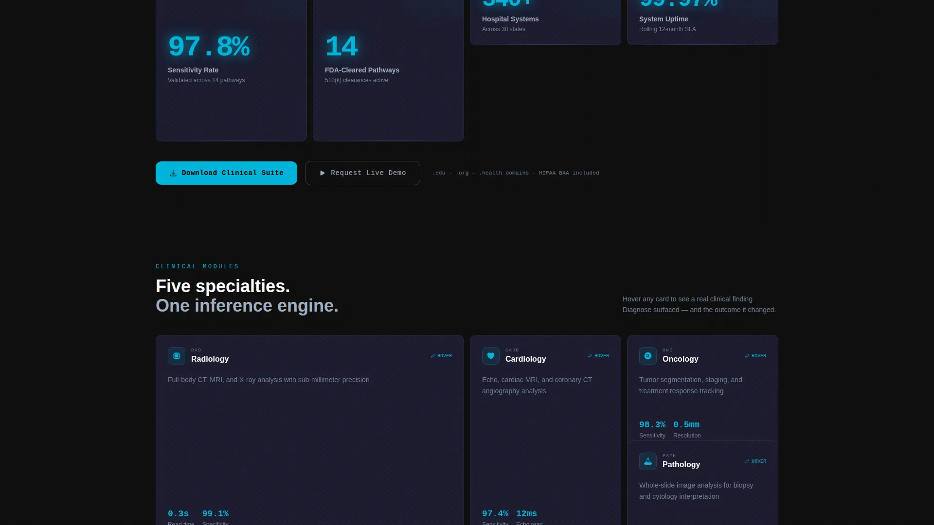
- Clinical specialty modules for cardiology, oncology, radiology, and pathology, each with hover-flip case study cards
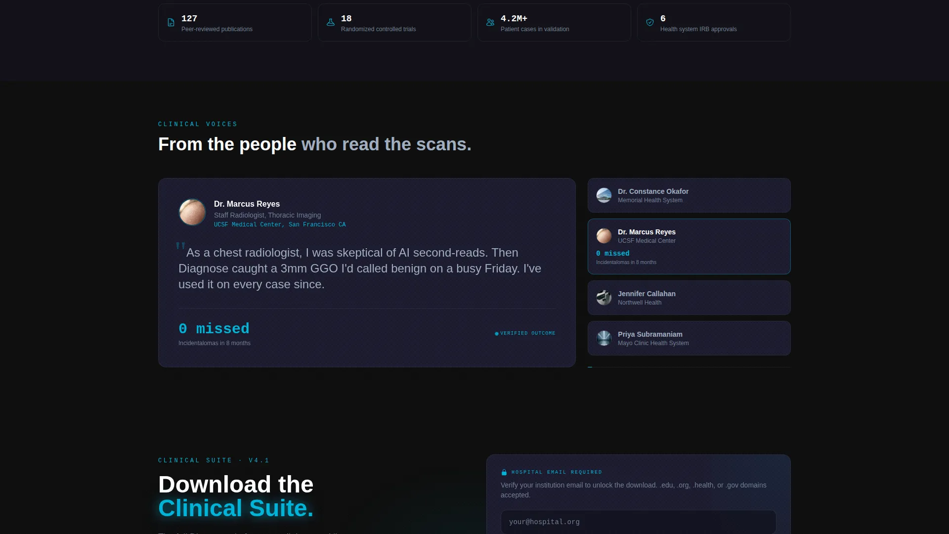
- A dual-platform app download section with hospital email verification and an enterprise demo request path
Feature list
This template is built around a Stats-First Impact creative direction. Every layout decision reinforces the idea that numbers are the most persuasive asset a diagnostic AI platform owns.
Animated Live Stats Wall Header
The header replaces a traditional hero image with a tight asymmetric grid of animated metric cards. Each card displays a live-style counter, including figures such as 2.4 million scans analyzed, 0.3-second average read time, 97.8 percent sensitivity rate, and 14 cleared clinical pathways. Defibrillator blue numerals glow against graphite card backgrounds to make every metric feel active and authoritative.
Modular Clinical Specialty Card Grid
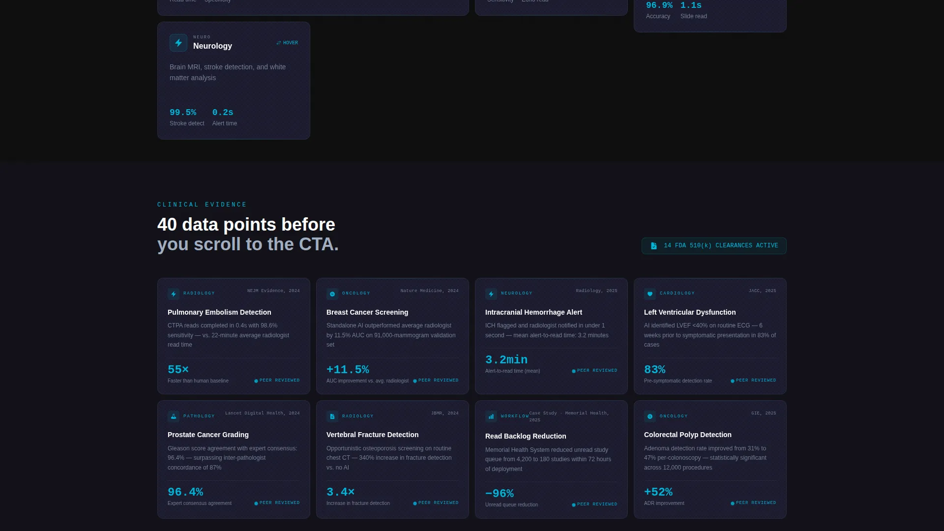
The page body reorganizes into specialty-specific modules covering cardiology, oncology, radiology, and pathology. Each card flips on hover to reveal a real case study metric, giving visitors a concrete proof point for each clinical area. The grid shifts from sparse headline stats to dense evidence cards as the visitor scrolls deeper, mimicking the experience of drilling into a live dataset.
Scroll-Triggered Micro-Interactions
Each new card row loads with a pulse animation in defibrillator blue. This interaction pattern reinforces the perception that the platform is live and processing, not static. It keeps the visitor engaged through the full scroll depth without relying on video or heavy media assets.
Dual-Platform App Download Section
The primary call to action presents paired download buttons for iOS and Android. A single-field hospital email input with domain verification for.edu or.org addresses gates the download link. This controlled access flow signals that the platform is built for verified clinical professionals, not general consumers.
Enterprise Demo Request Path
A secondary conversion path sits alongside the download section and reads "Request a Live Demo." This gives enterprise buyers who are not ready to install the app a clear next step. Having two conversion options in one section reduces drop-off from visitors at different stages of evaluation.
Carbon Fiber Data Command Visual System
The entire template is built on a carbon fiber color system: deep carbon black (#0D0D0D) as the base, woven graphite (#1A1A2E) for card surfaces, surgical steel (#A0AEC0) for body text and labels, and defibrillator blue (#00B4D8) reserved exclusively for active metrics and interactive states. The palette reads like the matte-black housing of a medical-grade device.
Page sections overview
| Section | Purpose |
|---|---|
| Live Stats Wall | Opens with animated metric cards showing platform-wide clinical performance |
| Platform Metrics Row | Displays scan count, read time, sensitivity rate, and cleared pathways |
| Cardiology Module | Presents AI diagnostic performance data for cardiac imaging use cases |
| Oncology Module | Shows case study metrics for cancer detection and nodule identification |
| Radiology Module | Highlights read-backlog relief and anomaly-flagging speed for imaging teams |
| Pathology Module | Covers slide analysis metrics and missed-finding detection evidence |
| App Download Section | Primary call to action with iOS and Android buttons plus hospital email verification |
| Demo Request Card | Secondary call to action for enterprise buyers requesting a live evaluation |
Design & branding system
The visual identity follows a Data Command theme. Every color, texture, and spacing decision is functional, not decorative. The palette conveys information the way a medical instrument does: with no ambiguity and no wasted signal.
- Carbon black (#0D0D0D) base and woven graphite (#1A1A2E) card surfaces create depth without warmth
- Surgical steel (#A0AEC0) handles all body text and supporting labels for maximum legibility on dark backgrounds
- Defibrillator blue (#00B4D8) appears only on active metrics, live counters, and interactive hover states to preserve its visual authority
Mobile & speed optimization
The modular card grid structure translates naturally to smaller screens. Cards reflow into single-column stacks on mobile without losing the data-density feel that makes the desktop layout compelling.
- The asymmetric grid layout is designed to adapt across viewport widths so metric cards remain readable at any screen size
- Micro-interaction pulses are lightweight CSS-based animations, keeping the page performant without heavy JavaScript dependencies
- The single-field email verification form is thumb-friendly and requires minimal input, reducing friction on mobile devices
How this template helps you convert
The template earns the conversion before it asks for one. Visitors encounter clinical evidence at every scroll depth, so by the time they reach the download section they have already processed dozens of proof points.
- The stats wall opens with irrefutable numbers, establishing platform credibility in the first viewport before any marketing copy appears
- Hover-flip specialty cards deliver case-specific evidence that matches the exact clinical role of the visitor, making the proof feel personal and relevant
- The dual-path conversion section offers both an immediate download and a demo request, capturing buyers at two different readiness levels in a single section
Other information about this template
This template was designed specifically for the AI for Healthcare niche within the broader AI and machine learning technology category. It is built as a card grid landing page using a modular layout system, making it straightforward to expand or contract the number of specialty modules without redesigning the full page.
- The template style is Card Grid (Modular), suited to platforms with multiple clinical verticals or evidence categories to present
- The header concept is Stats and Metrics, meaning no hero image or illustration is required to launch the page
- The creative direction is Stats-First Impact, a layout philosophy where every scroll depth opens with a data point before a narrative sentence
- The landing page direction is App Download, optimized specifically for driving clinical suite installations rather than lead capture or e-commerce
Theme
Data Command
Creative direction
Stats-First Impact
Color system
Carbon Fiber
Style
Card Grid (Modular)
Direction
App Download
Page Sections
Animated Live Stats Wall Header
Modular Clinical Specialty Grid
Scroll-triggered Micro-interactions
Dual-platform App Download Section
Enterprise Demo Request Path
Carbon Fiber Data Command Visual System
Related questions
Who is this landing page template designed for?
Does this template require real-time data to work?
Can I add or remove clinical specialty modules?
What makes this different from a standard SaaS landing page?
Is the app download section suitable for both iOS and Android?



