Dental AI Recommendation Engine Landing Page
Diagnose is a scroll-reveal landing page template built for a dental AI recommendation engine. It combines a Data Command visual identity, a stats-first creative rhythm, and a comparison table conversion engine to show dental professionals exactly how AI-prioritized treatment recommendations improve case acceptance, diagnostic consistency, and practice revenue, before asking for anything in return.
by Rocket studio
Quick summary
Diagnose is a single-page, scroll-reveal landing page template designed for a dental AI platform. It uses a dark Carbon Fiber palette, animated clinical metrics, and a live comparison table to communicate the value of AI-prioritized treatment recommendations to DSO operators, solo dentists, and dental consultants, with every claim backed by a visible data point.
Who this template is for
This template is built for dental technology companies and AI platform founders who need a high-converting landing page that speaks to multiple decision-makers at once. It addresses buyers who think in revenue and operations, not just clinical outcomes.
- DSO operations directors managing thirty or more locations who need diagnostic consistency across every site
- Solo practitioners losing undiscovered periodontal and restorative cases to incomplete diagnosis
- Dental consultants benchmarking case acceptance rates and treatment plan values across practices
What problem this template solves
Dental practices leave significant revenue on the table when diagnostic findings go undetected or treatment plans go unpresented. A generic product page cannot communicate that problem with enough precision to earn a high-value B2B click.
- Visitors do not trust revenue claims without visible proof, so the page structures every stat with a supporting screenshot and context
- DSO buyers need operational comparisons, not feature lists, so the template centers a live versus table over a spec sheet
- The call to action asks too early on most SaaS pages, so this template earns the click first by surfacing the math publicly before requesting an email
What you get with this template
You get a fully structured, single-page scroll-reveal layout purpose-built for a dental AI product launch or demand generation campaign. Every section is designed to carry a specific persuasion job in a logical sequence.
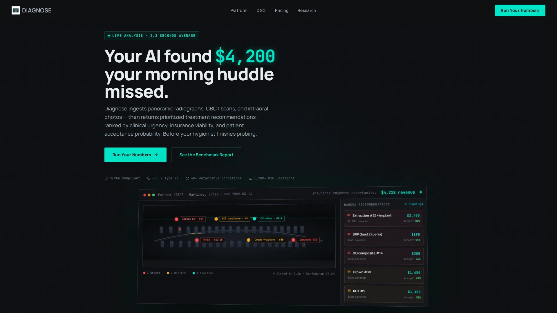
- A full-viewport product screenshot header with a headline, AI-detected finding pins, treatment rankings, and a teal revenue highlight bar
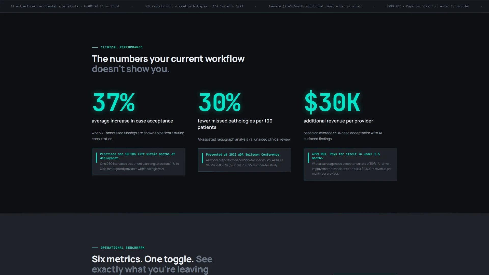
- A stats-first scroll rhythm where every section opens with an animated metric, then reveals supporting context, then proves the claim with a micro-screenshot
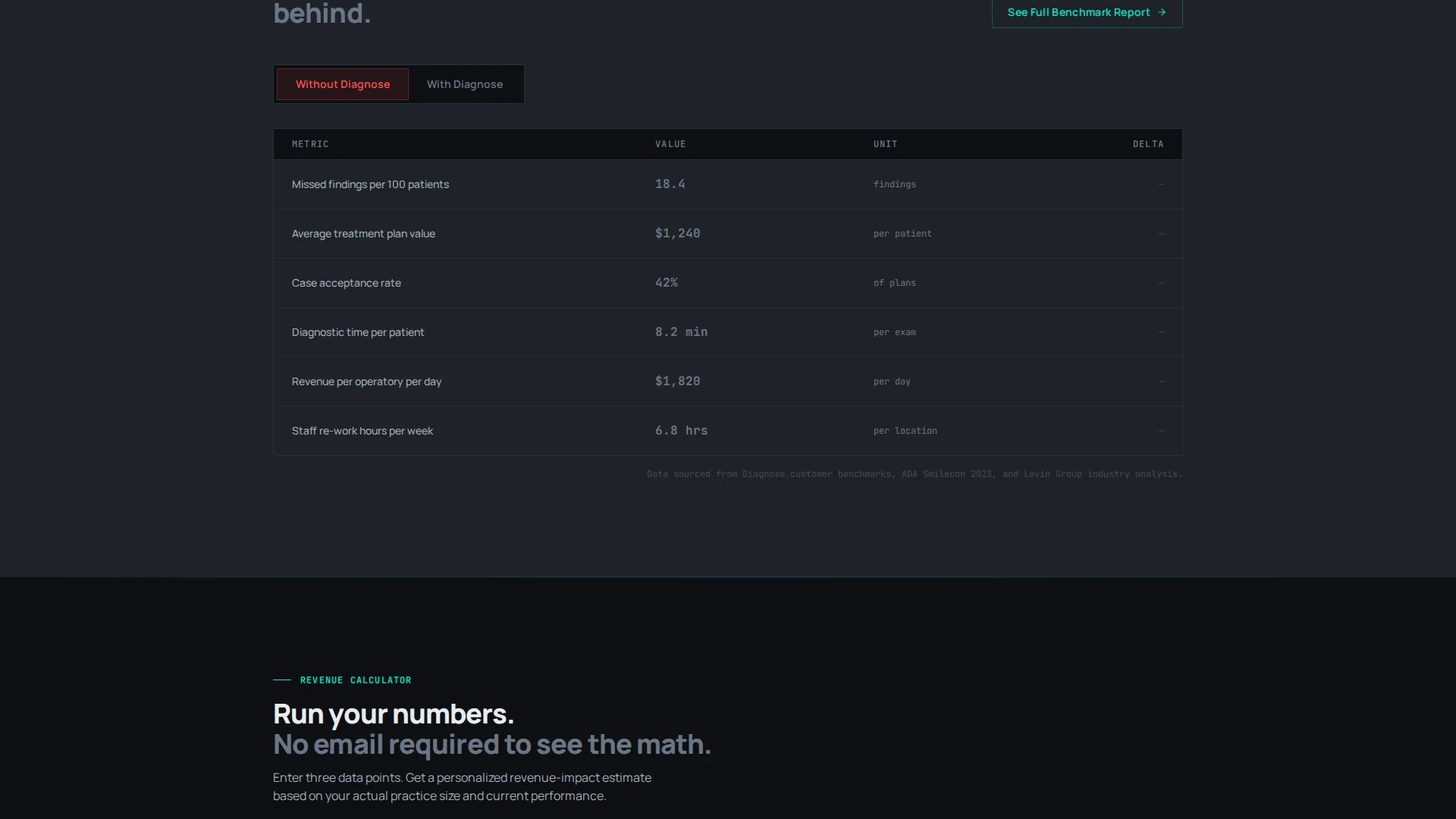
- An interactive comparison table toggling six operational metrics between "Without Diagnose" and "With Diagnose," with teal-animated deltas
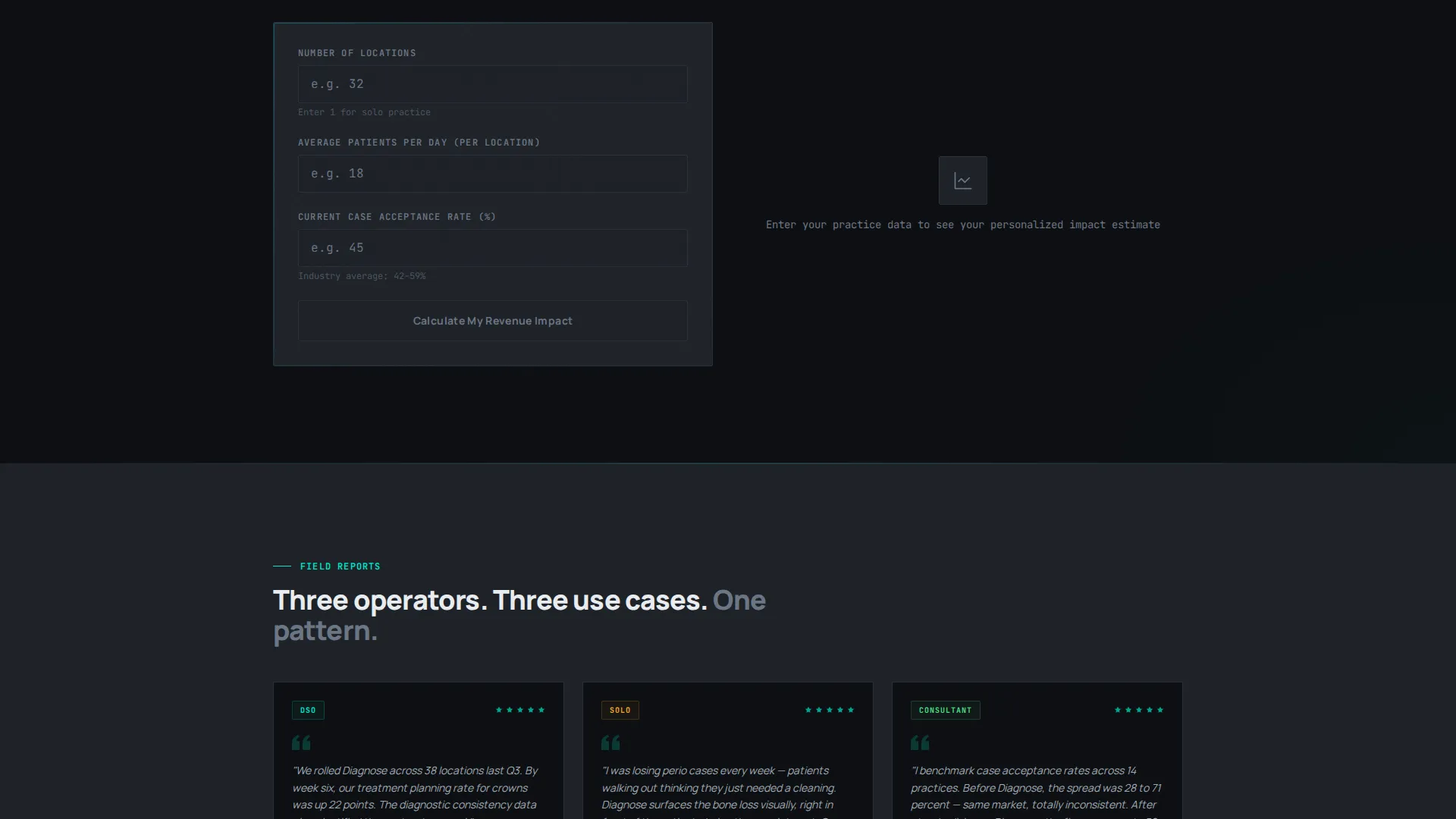
- A personalized revenue calculator ("Run Your Numbers") that returns a revenue-impact estimate before asking for an email
- A gated secondary call to action ("See the Full Benchmark Report") requiring only a business email address
Feature list
This section covers the core functional and design capabilities built into the Diagnose landing page template.
Scroll-Reveal Progressive Layout
Each section animates into view on viewport entry using a three-beat rhythm: a bold stat animates from zero, supporting context fades in beneath it, then a micro-screenshot confirms the claim inside the product interface. This structure keeps visitors engaged as the page escalates from clinical metrics to financial outcomes to operational scale.
Full-Viewport AI Dashboard Header
The header occupies the full viewport and displays a pixel-sharp product screenshot of the Diagnose interface. The screenshot shows a panoramic radiograph with AI-detected findings pinned across twelve teeth, color-coded by urgency tier. A right-side panel lists ranked treatment recommendations with acceptance-probability percentages, and a top bar shows the patient's insurance-adjusted revenue opportunity in bold teal. The layout is slightly rotated on a Z-axis with a faint carbon-textured shadow beneath it.
Interactive Comparison Table
A sticky mid-page table lets visitors toggle between two states across six operational metrics: missed findings per 100 patients, average treatment plan value, case acceptance rate, diagnostic time per patient, revenue per operatory, and staff rework hours. Each toggle animates the performance delta in high-alert teal, making the before-and-after contrast immediately readable.
Personalized Revenue Calculator
The primary call to action is a short inline calculator form. Visitors enter their number of locations, average patients per day, and current case acceptance percentage. The form returns a personalized revenue-impact estimate on screen before asking for an email address, reducing friction by proving value first.
Carbon Fiber Visual Identity System
The entire layout uses a four-color Carbon Fiber palette: deep cockpit black (#0D0F12), woven carbon mid-tone (#1E2228), clinical titanium (#A0ADB8), and high-alert teal (#00E5C7). Teal appears only on data highlights, active states, and call-to-action surfaces, keeping its visual weight earned and meaningful throughout the page.
Gated Benchmark Report call to action
A secondary call to action beneath the comparison table offers access to a full benchmark report. It is gated behind a business email entry only, keeping the ask minimal while qualifying leads by intent. The gate is positioned after the comparison table has already demonstrated value, so the visitor arrives at the form already convinced.
Page sections overview
| Section | Purpose |
|---|---|
| Full-Viewport Header | Introduce the product with an AI dashboard screenshot and revenue headline |
| Animated Stat Block | Open each scroll segment with a zero-to-number metric animation |
| Context Reveal Panel | Deliver supporting explanation after the stat lands |
| Micro-Screenshot Proof | Confirm each claim with a product interface capture |
| Comparison Toggle Table | Let visitors benchmark six operational metrics side by side |
| Revenue Calculator Form | Return a personalized revenue estimate before requesting email |
| Benchmark Report Gate | Capture qualified leads with a minimal business-email call to action |
Design & branding system
The visual identity follows a Data Command theme that feels like the interior of a surgical-grade instrument case: matte, dense, and entirely functional. No surface carries decoration that does not carry meaning.
- Four-color Carbon Fiber palette: deep cockpit black (#0D0F12) and woven carbon mid-tone (#1E2228) for all backgrounds, clinical titanium (#A0ADB8) for body text, and high-alert teal (#00E5C7) reserved strictly for data highlights, active interface states, and call-to-action elements
- Teal is used sparingly so that every appearance signals importance: a spiking metric, a converting button, or a revenue number that demands attention
- The header screenshot floats above the dark background with a Z-axis rotation and a carbon-textured drop shadow, giving the interface a physical, instrument-like presence
Mobile & speed optimization
The template is structured for clean rendering across screen sizes, ensuring the dense data-rich layout does not collapse into an unreadable wall of numbers on smaller viewports.
- Scroll-reveal animations are designed to trigger correctly on both desktop and mobile viewports, keeping the three-beat stat rhythm intact at every screen width
- The comparison table and calculator form are laid out to reflow gracefully on narrower screens without losing the toggle interaction or the delta animation behavior
How this template helps you convert
Every structural decision in this template exists to reduce the distance between a skeptical dental professional and a completed form submission.
- The stats-first scroll rhythm earns attention before making any request, so visitors arrive at the call-to-action surface already convinced by data they have seen animate in real time
- The comparison table positions the product against the status quo across six specific operational metrics, giving DSO directors and dental consultants the benchmarking language they already use internally
- The revenue calculator personalizes the value proposition before asking for an email, which removes the main objection to form completion on a high-ticket B2B product page
Other information about this template
This template is designed specifically for dental AI products targeting operations-level buyers in multi-location dental groups and private practice settings. It is equally suited for product launch campaigns, investor-facing demand pages, and conference lead capture.
- The template style is Scroll Reveal (Progressive), meaning content density increases as the visitor scrolls deeper, rewarding careful readers with harder operational data
- The page is classified as a single landing page, not a multi-page website, so all persuasion happens within one continuous scroll experience
- The creative direction is Stats-First Impact: every scroll trigger surfaces a quantified claim before explaining or proving it, which suits buyers who evaluate tools by outcomes, not features
- The header concept is a Product Screenshot showing the live Diagnose interface, which establishes credibility immediately without relying on illustrated mockups or abstract graphics
- The landing page direction is Comparison/Versus, making it especially effective for replacing an existing diagnostic workflow or competing against a manual review process
Theme
Data Command
Creative direction
Stats-First Impact
Color system
Carbon Fiber
Style
Scroll Reveal (Progressive)
Direction
Comparison/Versus
Page Sections
Scroll-reveal Progressive Layout
Full-viewport AI Dashboard Header
Interactive Six-metric Comparison Table
Personalized Revenue Calculator
Carbon Fiber Visual Identity
Gated Benchmark Report Call to Action
Related questions
Who is this landing page template designed for?
Can I customize the stats and metrics shown in the template?
What makes the comparison table different from a standard feature list?
Is the revenue calculator functional out of the box?
How does the gated benchmark report call to action work?



