Dental AI Landing Page Template for Imaging Tools
Diagnose is a Bold Brutalist landing page template built for a dental artificial intelligence imaging platform. It uses a hub and spoke anchor navigation layout with five conversion-focused spokes, a frozen dashboard header showing a live panoramic analysis, and a comparison architecture that makes the case for AI-assisted diagnostics before asking for a single detail from the visitor.
by Rocket studio
Quick summary
Diagnose is a single-page, anchor-navigated landing page template for a dental AI image analysis product. It opens with a frozen mid-analysis dashboard showing a full-arch panoramic radiograph, then guides visitors through five spoke sections covering accuracy, speed, integrations, compliance, and pricing. Every section is built to escalate urgency and move the visitor toward a free first scan.
Who this template is for
This template is built for dental technology companies and clinical software teams who need a high-conviction landing page that speaks directly to practicing clinicians. It is not a general healthcare template. The copy architecture assumes a technically literate audience who will challenge every claim.
- Associate dentists managing high patient volume who need a tool that speeds up diagnostic reads
- Oral surgeons triaging referral scans and needing confidence in impaction and pathology detection
- Dental service organization clinical directors who need every provider reading at a consistent diagnostic standard
What problem this template solves
Most dental software landing pages bury the product value in paragraphs of feature lists. Visitors leave before they understand why the tool matters. This template solves that by leading with the output, not the feature. The dashboard header shows the AI mid-analysis, so the value is visible before a single word is read.
- Missed pathology is a real clinical and legal exposure, and the template frames the product around that tension directly
- Generic conversion forms ask for identity too early, causing drop-off before the lead is qualified
- Clinicians distrust software that does not show proof, and this template leads with annotated evidence at every spoke
What you get with this template
You get a fully structured, single-page landing page layout with five anchor-navigated spokes, each designed to build on the last. The layout moves from proof to speed to workflow fit to regulatory standing to cost, in that order, so no visitor reaches the pricing section without already believing the product works.
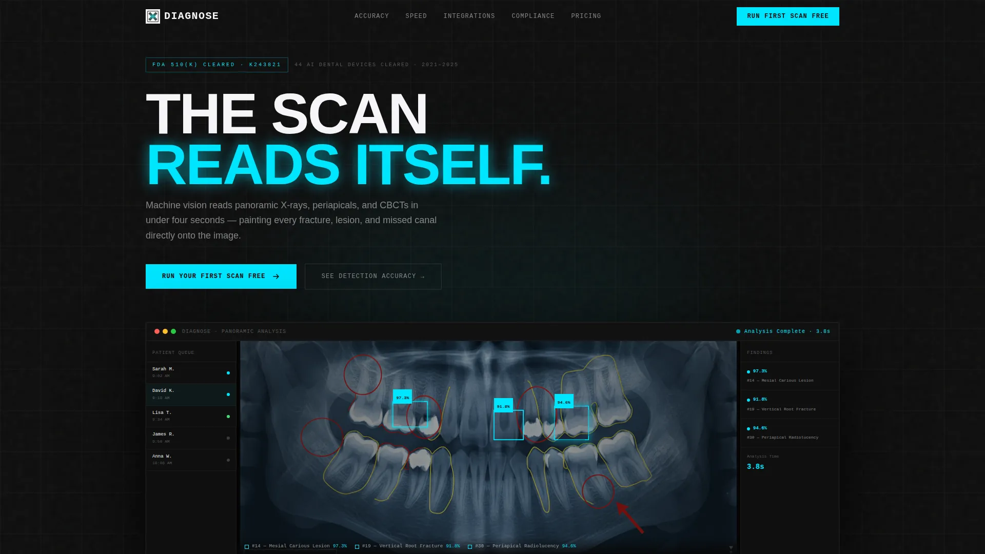
- A frozen dashboard header with a panoramic radiograph, cyan bounding boxes, confidence percentages, and a patient queue sidebar
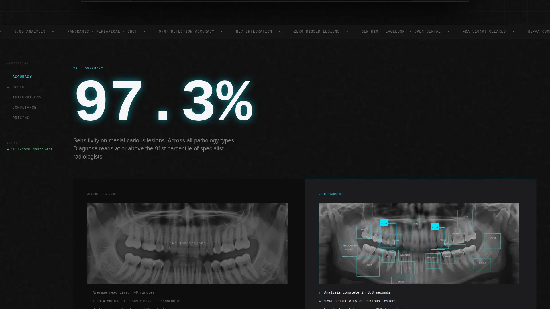
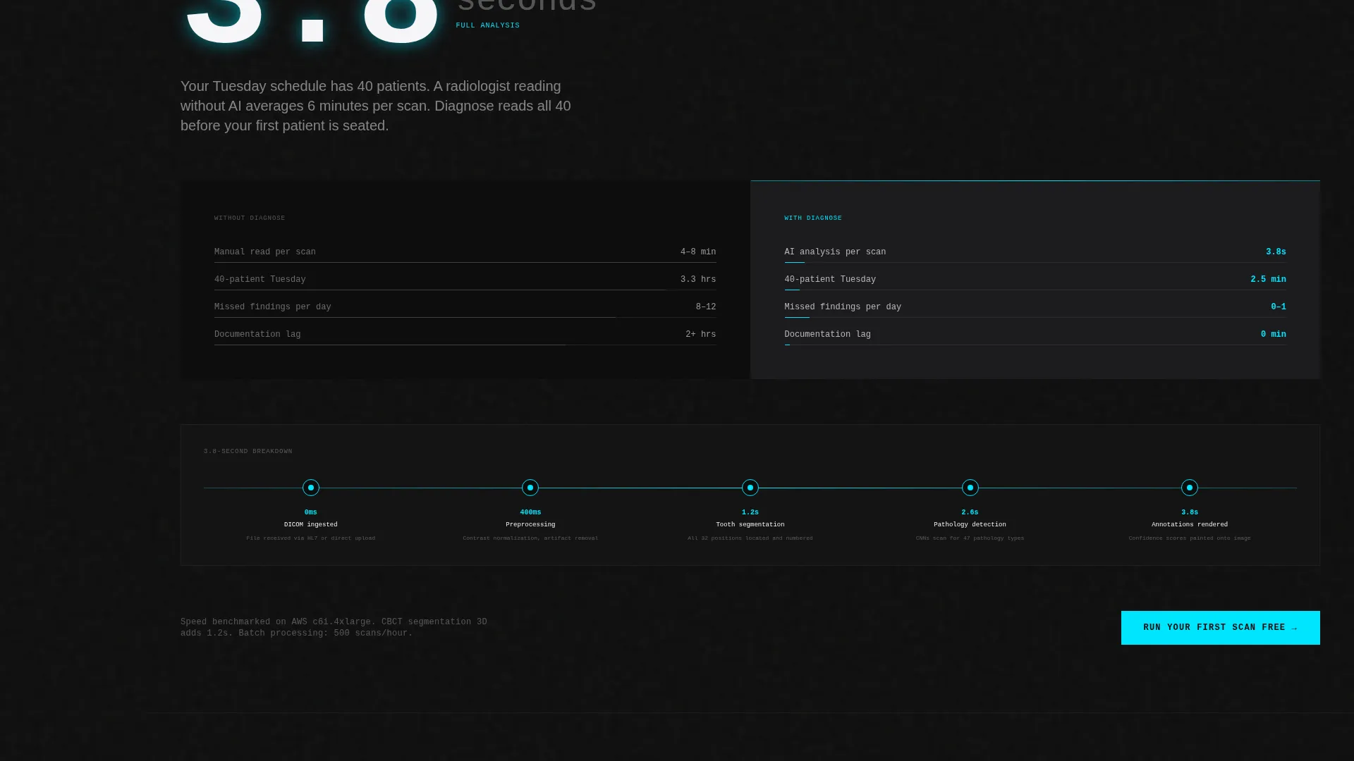
- Five spoke sections (Accuracy, Speed, Integrations, Compliance, Pricing) each opening with an oversized statistic and a without-versus-with comparison layout
- A progressive disclosure conversion form that captures practice management software and provider count before asking for a work email
Feature list
This template ships with a set of purposefully designed layout components. Each one is drawn directly from the brief and built to serve a specific conversion or trust function.
Frozen Dashboard Header
The header fills eighty percent of the viewport with a full-arch panoramic radiograph frozen mid-analysis. Cyan bounding boxes pulse around a mesial carious lesion, a periapical radiolucency, and a hairline vertical root fracture, each labeled with a confidence percentage in monospaced type. A dark sidebar shows a patient queue and the top bar reads "Analysis Complete · 3.8s". The whole composition sits at a slight isometric tilt for depth without breaking the brutalist flatness.
Hub and Spoke Anchor Navigation
A pinned left-rail navigation links to five named spokes: Accuracy, Speed, Integrations, Compliance, and Pricing. The anchor nav stays visible as the visitor scrolls, making it easy to jump between sections or return to a specific comparison. This structure keeps long-form content from feeling overwhelming.
Versus Comparison Architecture
Every spoke contains a split comparison panel. The left side shows the without-product state: raw film, missed pathology, and slow average read time. The right side shows the with-product state: annotated film, flagged findings, and a sub-four-second timestamp. This pattern repeats across all five spokes so the contrast compounds spoke by spoke.
Progressive Disclosure Lead Form
The conversion form is structured to qualify the lead before requesting identity. It asks for practice management software first using a dropdown, then number of providers using a stepper, and finally work email. This order reduces abandonment by deferring the identity field until the visitor is already engaged.
Repeating Primary Call to Action
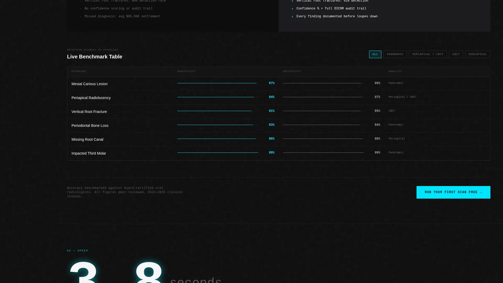
The primary call to action, "Run Your First Scan Free", appears at the header and repeats after every spoke section. A secondary path labeled "See Detection Accuracy by Pathology" links to a live benchmark table where visitors can filter results by lesion type. Both calls to action are present at every logical exit point.
Escalating Spoke Tension Layout
Each spoke is designed to land harder than the one before it. Accuracy establishes proof. Speed adds urgency. Integrations show workflow fit. Compliance removes regulatory doubt. Pricing reframes cost as risk exposure per scan. The energy of the page builds deliberately from top to bottom.
Page sections overview
| Section | Purpose |
|---|---|
| Dashboard Header | Opens with a frozen panoramic AI analysis to establish product proof immediately |
| Anchor Nav Rail | Pins five spoke links to the left rail for persistent in-page navigation |
| Accuracy Spoke | Leads with an oversized statistic and a before-versus-after pathology comparison |
| Speed Spoke | Shows sub-four-second read time against the average unassisted read benchmark |
| Integrations Spoke | Demonstrates workflow compatibility via HL7 connections to practice management systems |
| Compliance Spoke | Addresses regulatory standing including FDA clearance and patient data compliance |
| Pricing Spoke | Reframes cost as dollars-per-scan versus the exposure of a missed diagnosis |
| Repeating call to action Blocks | Places "Run Your First Scan Free" after every spoke to capture intent at each stage |
| Lead Capture Form | Qualifies the lead with software and provider count before requesting work email |
| Benchmark Filter Table | Lets visitors explore detection accuracy filtered by specific lesion or pathology type |
Design & branding system
The visual identity follows a Bold Brutalist theme using the Carbon Fiber color system. The palette is intentionally austere: structural black and titanium mid-gray carry the layout, clinical white handles legibility, and electric cyan appears only where the AI is speaking. No decorative color exists. Every chromatic decision is functional.
- Structural black (#0D0D0D) and titanium mid-gray (#3A3A3C) form the base of all panels, sidebars, and navigation rails
- Clinical white (#F5F5F7) is used for readable body text and primary label type against dark backgrounds
- Electric cyan (#00E5FF) is reserved exclusively for AI annotation overlays, bounding boxes, confidence labels, and interactive hover states
Mobile & speed optimization
The template layout is designed with scroll momentum and section hierarchy in mind. On smaller screens, the anchor nav rail collapses or adapts so the spoke structure remains navigable. The oversized statistics that open each spoke are set to scale proportionally so the impact reads at any viewport size.
- The isometric dashboard header is structured to reflow gracefully without losing the radiograph as the focal element
- The versus comparison panels are built to stack vertically on narrow screens so neither side loses context
- The progressive disclosure form maintains its field order on mobile so the qualification logic does not break at smaller breakpoints
How this template helps you convert
This template is built around a single conversion philosophy: show the product working before you ask for anything. The design removes every moment of doubt before the visitor reaches the form.
- The frozen dashboard header puts annotated diagnostic evidence at the very top of the page, so the product proves itself in the first three seconds of the visit before any copy is read
- The versus architecture in each spoke makes the cost of not using the product visible at every stage, so by the time the visitor reaches the pricing spoke, the conversation has already shifted from "should I try this" to "how do I start"
- The progressive disclosure form qualifies intent before collecting identity, which reduces the friction that causes high-value clinical leads to abandon at the email field
Other information about this template
This template was designed at the intersection of dental clinical workflow and high-stakes software adoption. The content architecture assumes that clinicians are skeptical buyers who respond to evidence, not enthusiasm. Every layout decision reflects that.
- The template style is Hub and Spoke with Anchor Navigation, making it straightforward to extend with additional spoke sections if the product roadmap grows
- The Bold Brutalist theme and Carbon Fiber palette are directly inspired by the visual language of radiology workstations and milled ceramic furnaces, grounding the aesthetic in the clinical world it serves
- The HL7 integration references in the Integrations spoke cover compatibility framing for common practice management platforms used across dental service organizations
- The FDA 510(k) clearance and Health Insurance Portability and Accountability Act compliance details are positioned in the Compliance spoke as trust anchors, not fine print
- The benchmark filter table tied to the secondary call to action gives analytically minded buyers, such as clinical directors and oral surgeons, a data-first path to conversion that bypasses the emotional framing of the primary funnel
Theme
Bold Brutalist
Creative direction
Launch Energy
Color system
Carbon Fiber
Style
Hub & Spoke (Anchor Nav)
Direction
Comparison/Versus
Page Sections
Frozen Dashboard Header with AI Annotations
Hub and Spoke Anchor Navigation
Versus Comparison Architecture
Escalating Spoke Tension Layout
Progressive Disclosure Lead Form
Repeating Call to Action with Benchmark Filter Table
Related questions
Who is this landing page template designed for?
What are the five spoke sections included in this template?
How does the progressive disclosure form reduce lead abandonment?
Can this template support a different dental or clinical software product?
What does the versus comparison layout show in each spoke?



