Specialist AI & Machine Learning Professional Website Template
Diagnose is a split-screen landing page template built for AI medical imaging platforms. It pairs a raw CT scan panel with a live AI overlay panel, presents clinical performance data in a scrollable feature matrix, and drives two conversion paths: a full demo request form and a whitepaper download gate. The result is a page that earns trust before it asks for anything.
by Rocket studio
Quick summary
Diagnose is a single-page, split-screen landing page template designed for AI medical imaging platforms. The left panel shows a raw scan; the right shows the AI's findings already circled. Every section builds clinical credibility through hard numbers, a scrollable performance matrix, and two carefully placed lead capture forms.
Who this template is for
This template is built for teams that sell AI-powered diagnostic tools to clinical buyers. The layout and content structure speak directly to the people who sign off on radiology technology decisions.
- Radiology department heads managing overnight read backlogs
- Hospital Chief Information Officers under pressure to cut diagnostic turnaround times
- Teleradiology companies scaling read volumes across time zones without adding headcount
What problem this template solves
Selling AI medical imaging software is hard. Buyers are skeptical, the clinical stakes are high, and vague product pages do not move them. This template solves the trust deficit by leading with clinical proof before asking for a commitment.
- Generic SaaS layouts cannot communicate the precision and urgency that clinical buyers need to feel
- Feature lists without cited performance data fail to differentiate an AI imaging platform from competitors
- Single-path conversion flows lose researchers and evaluators who are not yet ready to request a demo
What you get with this template
This template gives you a fully structured, conversion-ready landing page layout tailored to the AI medical imaging market. Every section is pre-designed to carry clinical weight.
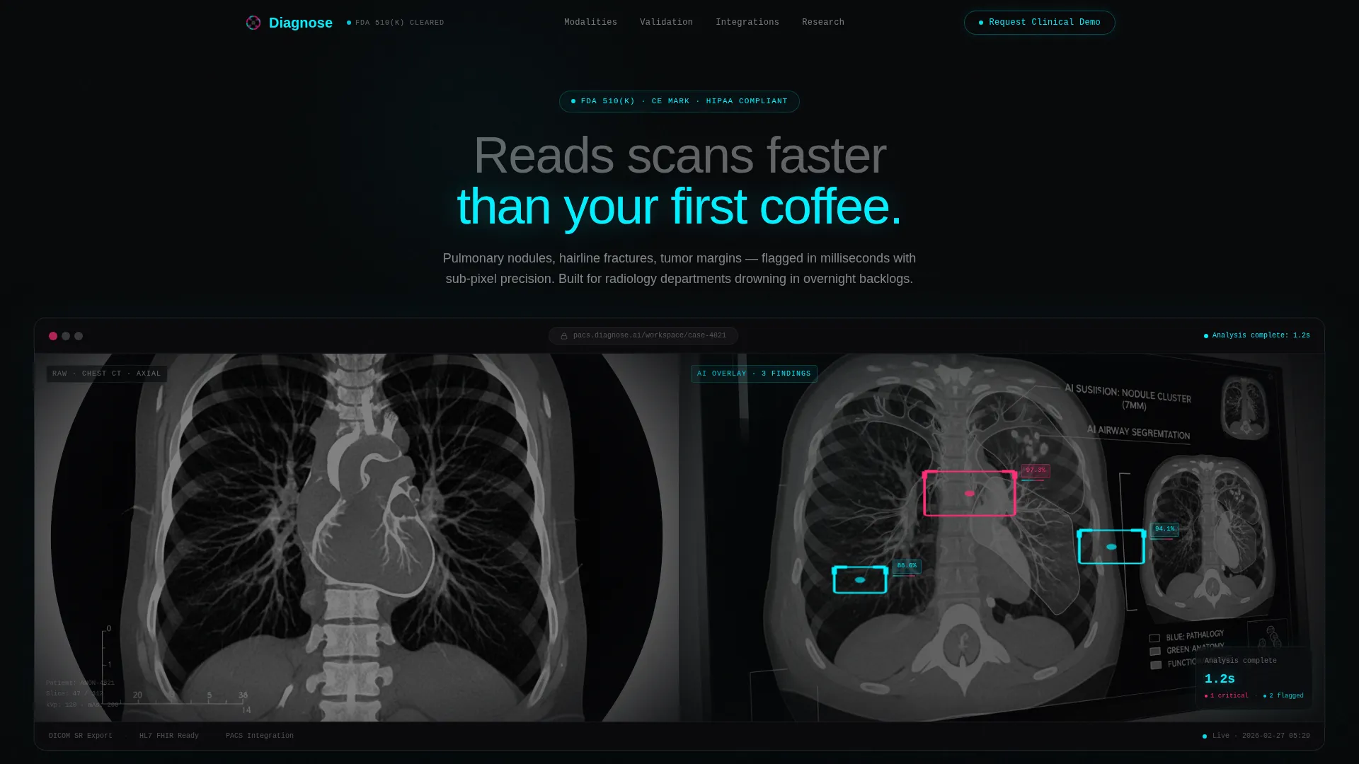
- A split-screen header with a raw CT scan panel alongside an AI overlay panel showing confidence scores and a 1.2-second analysis timestamp
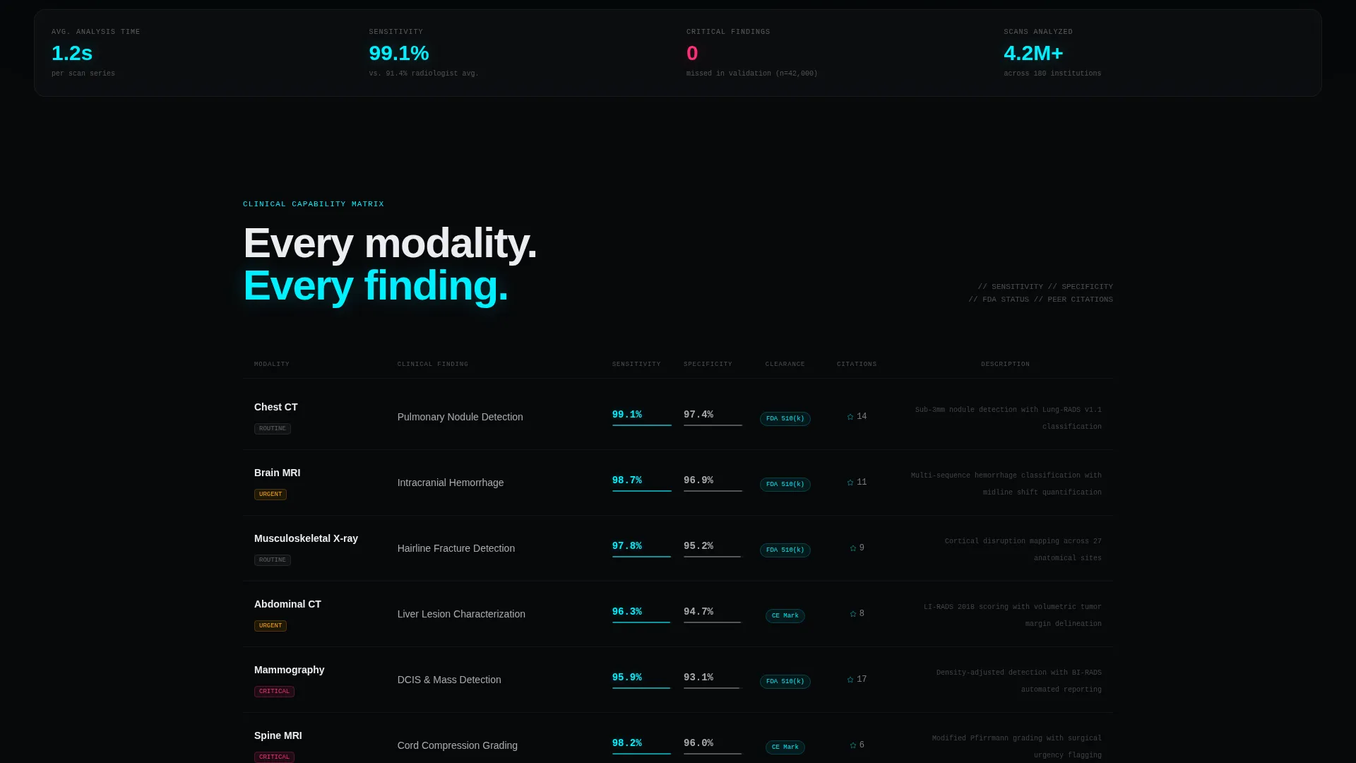
- A scrollable feature matrix pairing clinical modalities with sensitivity and specificity data, clearance status badges, and citation counts
- Two conversion paths: a full demo request form and a lower-commitment whitepaper download gate
Feature list
This landing page template is built around six core capabilities that work together to move a clinical buyer from first impression to form submission.
Split-Screen Diagnostic Header
The header divides the viewport evenly. The left half renders a grayscale CT chest slice. The right half shows the identical slice with the AI overlay active: cyan bounding boxes around three flagged nodules, confidence percentages at 97.3%, 94.1%, and 88.6%, a severity color band shifting from cyan to magenta, and a timestamp reading "Analysis complete: 1.2s." The layout is presented inside frosted-glass browser chrome with a soft depth-of-field blur at the edges.
Clinical Performance Matrix
The feature matrix is organized as a scrollable grid. Each row pairs a clinical modality on the left (chest CT, brain MRI, musculoskeletal X-ray) with a performance column on the right. The right column shows sensitivity and specificity percentages, clearance status badges, and peer-reviewed citation counts. The matrix escalates from routine screening rows to rare pathology detection as the visitor scrolls.
High-Impact Stat Interstitials
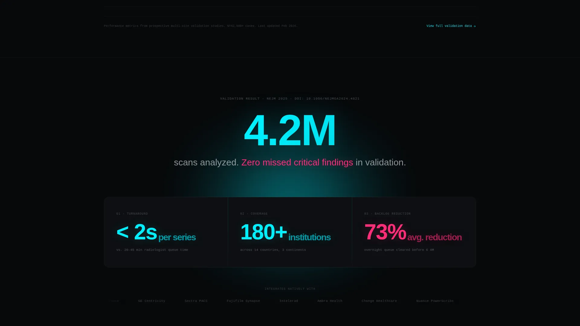
Between matrix sections, single-stat call-out blocks interrupt the scroll with hard numbers. The brief specifies one example: "4.2 million scans analyzed. Zero missed critical findings in validation." These interstitials break visual rhythm and anchor credibility at the moments when a skeptical buyer might otherwise stop reading.
Primary Lead Capture Form
The demo request form collects institution name, department (radiology, pathology, or orthopedics via dropdown), annual scan volume range, and a work email address. Personal email domains are not accepted, reinforcing the enterprise positioning. The form appears at the header fold and again anchored after the matrix.
Secondary Whitepaper Gate
A lower-commitment conversion path offers the validation whitepaper to researchers and evaluators who are not yet ready to request a demo. This gate requires only an email address and role, giving the page a second chance to capture visitors who leave the primary form blank.
Tech Glass Visual System
The entire page uses a frosted-glass aesthetic built on a dark, high-contrast color palette. Void black forms the background. Surgical-grade white handles text and panel surfaces. Electric cyan pulses through scan overlays and interactive states. Hot diagnostic magenta is reserved exclusively for detection highlights and alert badges.
Page sections overview
| Section | Purpose |
|---|---|
| Split-screen header | Show raw scan beside AI overlay with confidence scores and timestamp |
| Primary call to action fold | Place "Request a Clinical Demo" form at first scroll stop |
| Clinical modality matrix | Present chest CT, brain MRI, and musculoskeletal X-ray performance rows |
| Stat interstitials | Interrupt scroll with single hard-number credibility blocks |
| Secondary matrix rows | Escalate from routine screening to rare pathology detection |
| Post-matrix call to action | Repeat the demo request form after full evidence has been presented |
| Whitepaper download gate | Capture researchers with a lower-commitment email and role form |
Design & branding system
The visual identity follows a Tech Glass theme built on an Acid Digital color system. The palette is designed to feel like a high-density imaging monitor in a dark reading room, where every color carries a specific clinical meaning.
- Void black (#07080A) as the primary background, surgical-grade white (#EAECF0) for text and panel surfaces, electric cyan (#00F0FF) for scan overlays and interactive states, and hot diagnostic magenta (#FF2D78) reserved for detection highlights and alert badges
- Frosted-glass browser chrome frames the header screenshot, giving the diagnostic data a sense of depth and forward presence
- Color usage is strictly functional: cyan means a flagged finding, magenta means a severity alert, and the restrained palette keeps the clinical data readable at a glance
Mobile & speed optimization
The split-screen layout is designed to remain readable and functional as screen sizes change. The frosted-glass components and overlay elements are structured to avoid layout breaks on smaller viewports.
- The 50/50 split-screen header is built to reflow gracefully so the CT scan panel and AI overlay panel remain distinct and legible on mobile screens
- The feature matrix rows are structured for vertical stacking, keeping modality labels and performance data paired correctly without horizontal overflow
- Lightweight visual treatment using CSS-based glass effects keeps page weight low without sacrificing the high-contrast aesthetic
How this template helps you convert
Every layout decision in this template is made to reduce buyer hesitation and accelerate the path to form submission. The page earns the click by leading with clinical proof, not marketing language.
- The split-screen header creates an immediate before-and-after moment. A visitor understands the product's value in under three seconds, before reading a single word of copy.
- The feature matrix builds evidence row by row, moving from familiar modalities to high-stakes pathology detection. By the time the second call to action form appears, the visitor has already absorbed the clinical case for the platform.
- The dual-path conversion structure means the page captures both ready buyers (demo request) and early-stage evaluators (whitepaper download), doubling the number of touchpoints without adding page length.
Other information about this template
This template is part of a specialized category of AI and machine learning landing page designs built for regulated, high-stakes technology markets. It is well-suited for teams positioning a platform in the competitive AI medical imaging space.
- The template style is split-screen (50/50), a format that works especially well when a visual before-and-after comparison is central to the product's value proposition
- The Tech Glass theme and Acid Digital color system are designed for dark-mode presentation contexts, such as clinical reading rooms and enterprise sales environments
- The lead generation flow is structured for enterprise sales cycles, where institutional credibility and cited clinical data carry more weight than consumer-style social proof
- The page is built around a single-page, section-led flow, making it straightforward to publish as a standalone campaign page or embed within a larger product marketing site
Theme
Tech Glass
Creative direction
Feature Matrix
Color system
Acid Digital
Style
Split Screen (50/50)
Direction
Lead Generation
Page Sections
Split-screen Diagnostic Header
Scrollable Clinical Performance Matrix
Hard-number Stat Interstitials
Enterprise Demo Request Form
Whitepaper Download Gate
Tech Glass Visual Identity
Related questions
Who is this landing page template built for?
Can I adapt the feature matrix for different clinical modalities?
What makes the dual-form approach useful for this type of product?
Does the template include the CT scan image and AI overlay graphics?
Is this template suitable for a standalone campaign page?



