Audio Documentation App Landing Page Template
Dictate is a hub-and-spoke anchor-nav landing page template built for an audio documentation app. It opens with three dark glass metric panels, guides visitors through quantified proof sections, and drives app downloads with a signal-blue call to action. The Carbon Fiber color system and Tech Glass visual identity make every number feel live, precise, and instantly credible.
by Rocket studio
Quick summary
Dictate is a single-page, anchor-nav landing page template designed for an app that converts spoken words into structured documents in real time. The layout leads with oversized metrics, steps through five spoke sections, and ends at a clear download call to action. Everything is built to earn the visitor's trust before asking for the tap.
Who this template is for
This template suits teams and indie developers launching an audio documentation app to professional audiences. It works especially well when the product's credibility rests on speed and accuracy numbers rather than screenshots or testimonials.
- Developers and product teams releasing a voice-to-document app for professional users
- Marketers targeting high-trust verticals such as healthcare, legal, and field engineering
- Founders who need a polished, data-forward landing page without starting from scratch
What problem this template solves
Professionals who dictate notes have almost no patience for marketing fluff. They need evidence fast, or they leave. Most generic app landing pages bury the proof under headlines and hero images. Dictate flips that order entirely.
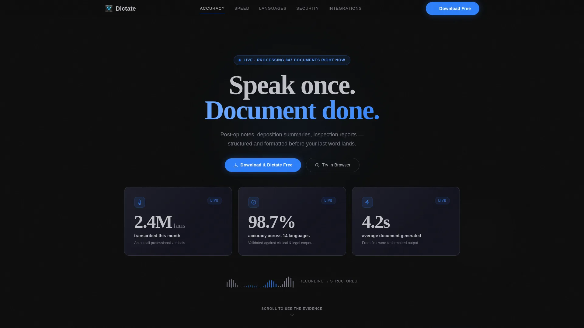
- Visitors see three live metric panels before reading a single line of product copy
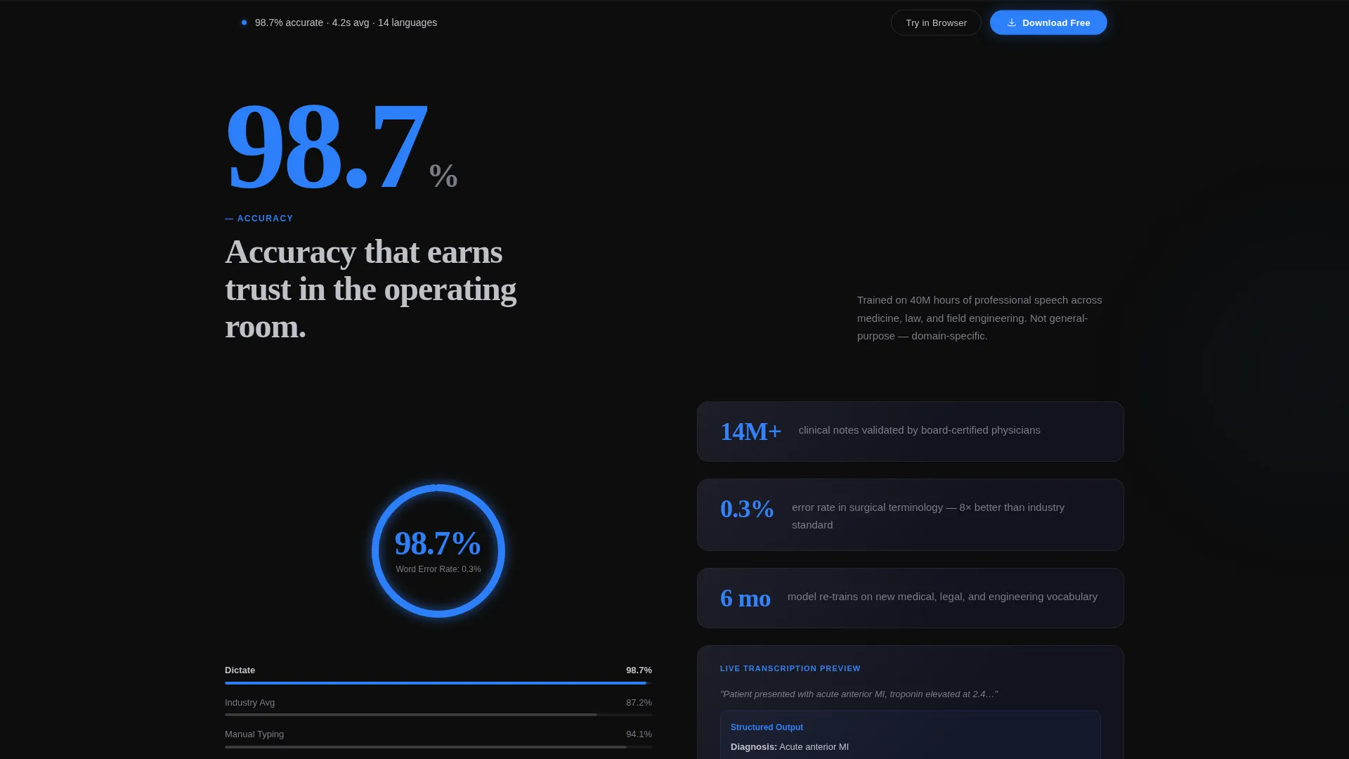
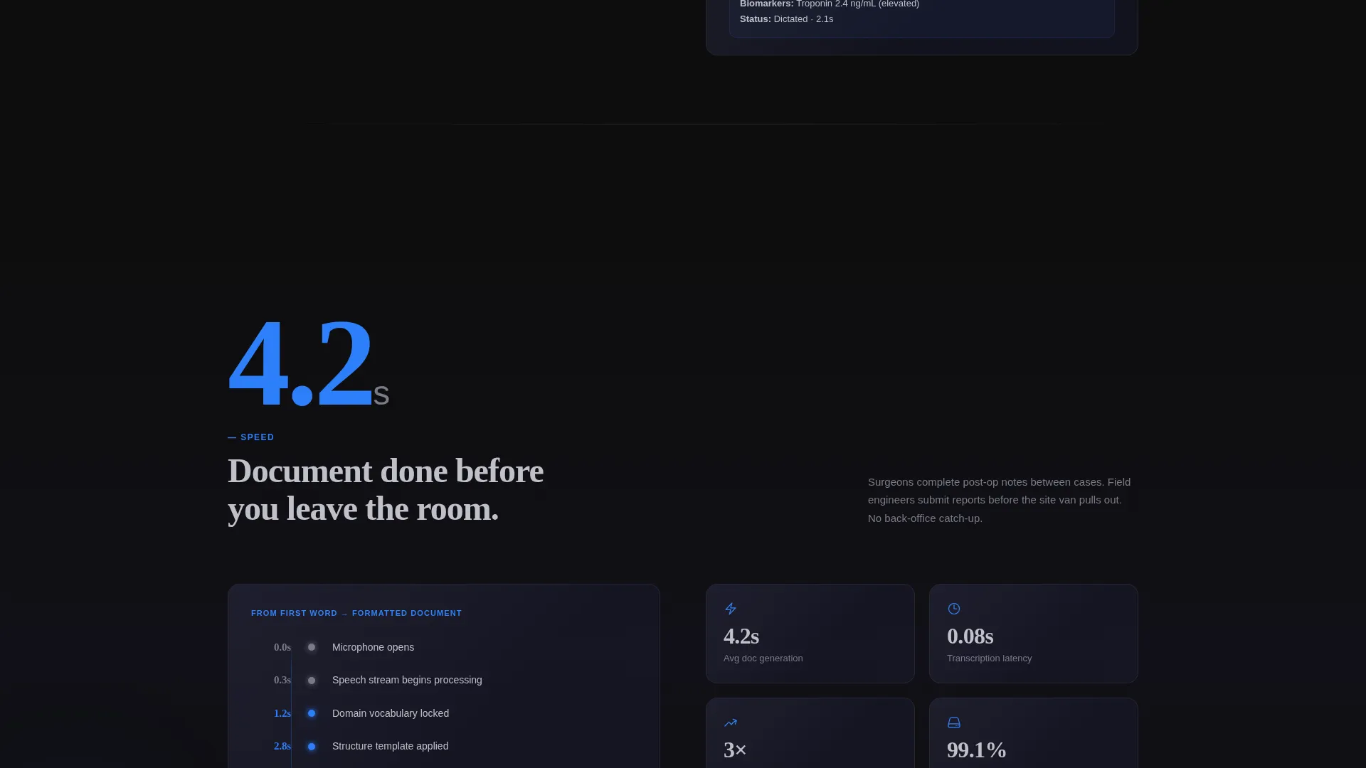
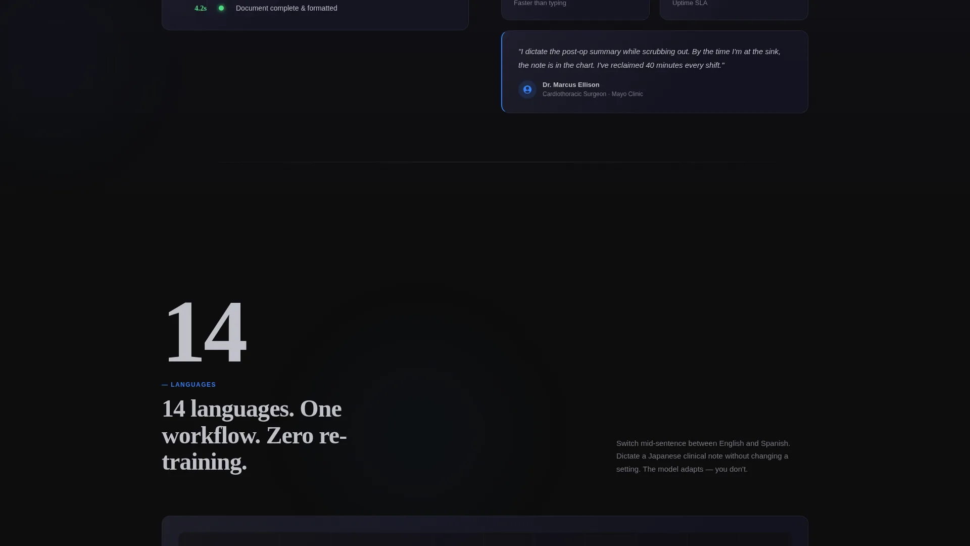
- Each anchor-nav spoke opens with one oversized number before explanation follows
- The download call to action appears early and repeats as a sticky bar so the action is never far away
What you get with this template
You get a fully structured, single-page layout with a pinned anchor navigation bar and five named spoke sections. The template ships with every visual component described below, ready to populate with your own data and branding.
- A three-panel Dark Glass header displaying live metrics with parallax depth and edge light refraction
- Five anchor-nav spokes covering Accuracy, Speed, Languages, Security, and Integrations
- An animated accuracy gauge, a waveform visualizer, and a language-node world map built into the scroll flow
- A primary "Download and Dictate Free" call to action in signal blue plus a secondary "Try in Browser" desktop path
- A sticky call to action bar that appears after the second spoke section
Feature list
This template is built around a specific visual and conversion philosophy. Every feature below is drawn directly from the design brief.
Dark Glass Panel Header
Three frosted-glass metric cards float on a pure black field. Each panel displays a live-style stat at a size readable from across a room. Subtle parallax depth and edge light refraction give the header a physical, instrument-grade presence without using any hero image or illustration.
Stats-First Anchor Navigation
A pinned navigation row links directly to five spoke sections: Accuracy, Speed, Languages, Security, and Integrations. Each section opens with a single oversized number before any explanatory copy appears. Scrolling feels like moving through a sequence of instrument panels rather than reading a brochure.
Animated Data Visualizations
Three purpose-built visual components bring the metrics to life. A real-time accuracy gauge animates from zero to 98.7 percent. A waveform visualizer shows speech collapsing into formatted text. A world map lights up language nodes one by one as the visitor scrolls.
OS-Detecting Download call to action
The primary call to action reads "Download and Dictate Free" and is rendered in signal blue. Tapping or clicking it detects the visitor's operating system and routes them to the correct app store automatically. No manual store selection is required.
Dual Conversion Path
Desktop visitors who want proof before installing see a secondary "Try in Browser" option alongside the primary download button. This two-path approach removes friction for cautious visitors and keeps the page useful across device types.
Sticky Repeat call to action Bar
After the visitor scrolls past the second spoke section, a sticky bar carrying the download call to action pins to the screen. The offer stays visible throughout the rest of the page so the visitor never has to scroll back up to act.
Page sections overview
| Section | Purpose |
|---|---|
| Dark Glass Header | Display three live metric panels above the fold |
| Anchor Nav Bar | Pin spoke links and primary call to action to the top |
| Accuracy Spoke | Open with animated gauge, then explain precision |
| Speed Spoke | Show waveform visualizer and document generation time |
| Languages Spoke | Light up world map and list language coverage |
| Security Spoke | Present security credentials and trust signals |
| Integrations Spoke | Summarize compatible tools and workflow connections |
| Sticky call to action Bar | Keep download offer visible after second spoke |
| Secondary call to action Path | Offer browser-based trial for desktop visitors |
Design & branding system
The visual identity follows a Tech Glass theme built on the Carbon Fiber color system. The palette is designed to feel like the back of a matte-black device catching a single strip of light: technical without being cold, dark without feeling heavy.
- Background layers use deep carbon black (#0D0D0D) and smoked glass gray (#1A1A2E); body text renders in waveform silver (#C0C0C8)
- Signal blue (#2D7FF9) appears only on active states, progress indicators, and call to action elements to preserve its visual weight
- Frosted glass panels, parallax depth, and edge light refraction create the layered, instrument-grade aesthetic throughout
Mobile & speed optimization
The template is structured for fast scanning on any screen size. The anchor nav and sticky call to action bar are designed to function cleanly on both mobile and desktop without layout conflicts.
- The OS-detecting call to action routes mobile visitors to the correct app store automatically, removing a friction point unique to small screens
- The sticky call to action bar is built to stay readable and tappable at mobile viewport widths
- Animated components such as the accuracy gauge and waveform visualizer are scoped to scroll-triggered presentation, keeping the visual load purposeful
How this template helps you convert
The conversion strategy in this template is built on a simple principle: let the evidence do the convincing before the pitch ever starts. Every layout decision serves that goal.
- The header delivers three specific, large-format metrics before the visitor reads any product description, so trust is established above the fold
- Each anchor-nav spoke front-loads a single quantified claim, building a cumulative case so that by the time the visitor reaches the call to action, the decision already feels made
- The dual call to action path (download for mobile, try in browser for desktop) meets each visitor at the right moment without asking them to commit before they are ready
Other information about this template
This template is categorized under Documentation and Support, with a sub-category focus on Accessibility Documentation and a niche alignment to Audio Documentation (Spoken). It is part of the Hub and Spoke (Anchor Nav) template style family and pairs the Tech Glass theme with the Carbon Fiber color system.
- The template is designed for use cases including surgical post-operative notes, field inspection reports, and legal deposition summaries
- The creative direction is Stats-First Impact, meaning quantified proof is the primary persuasion mechanism rather than narrative copy or imagery
- The landing page direction targets app downloads as the single primary conversion goal, with a browser trial as a supported secondary path
Theme
Tech Glass
Creative direction
Stats-First Impact
Color system
Carbon Fiber
Style
Hub & Spoke (Anchor Nav)
Direction
App Download
Page Sections
Dark Glass Panel Header
Stats-first Anchor Navigation
Animated Data Visualizations
Os-detecting Download Call to Action
Dual Conversion Path
Sticky Repeat Call to Action Bar
Related questions
Who is the Dictate template designed for?
Can I change the metrics shown in the header panels?
Does the template include the animated visualizations?
How does the OS-detecting call to action work?
Is this template suitable for a desktop-only product?



