Restaurant Newsletter Landing Page Template
Digest is a weekly restaurant newsletter landing page template built for independent owners, hospitality group managers, and food-PR consultants. It arrives pre-loaded with drag-and-drop blocks for seasonal menus, chef spotlights, event callouts, and reservation nudges. A Feature Tab Switcher header and comparison matrix make the value case instantly clear, so first-time email senders can launch with confidence.
by Rocket studio
Quick summary
Digest is a single-page restaurant newsletter template designed to get first-time email senders up and running fast. It comes with pre-built blocks for seasonal menus, chef spotlights, event callouts, and reservation nudges. The split-screen layout and interactive comparison grid make the product's value obvious from the very first scroll.
Who this template is for
This template is built for people in the restaurant and hospitality world who want a polished weekly email without spending hours writing one from scratch.
- Independent restaurant owners who post to social media regularly but have never sent a marketing email before.
- Marketing managers at small hospitality groups handling multiple restaurant concepts at once.
- Freelance food-PR consultants who need a reliable, good-looking send ready every Thursday.
What problem this template solves
Most restaurant owners know email works, but they never start because building a newsletter from zero takes too long. The blank-screen problem is real, and it stacks week after week until sending just stops happening.
- Time lost building layouts, writing subject lines, and formatting menus from scratch every week.
- Inconsistent sends that damage trust with a growing email audience.
- No clear way to show guests what makes each week worth opening.
What you get with this template
You get a fully structured, drag-and-drop ready landing page that sells a restaurant newsletter template kit. Every section has a specific job, and every design choice reinforces the argument that sending a weekly email should be easy.
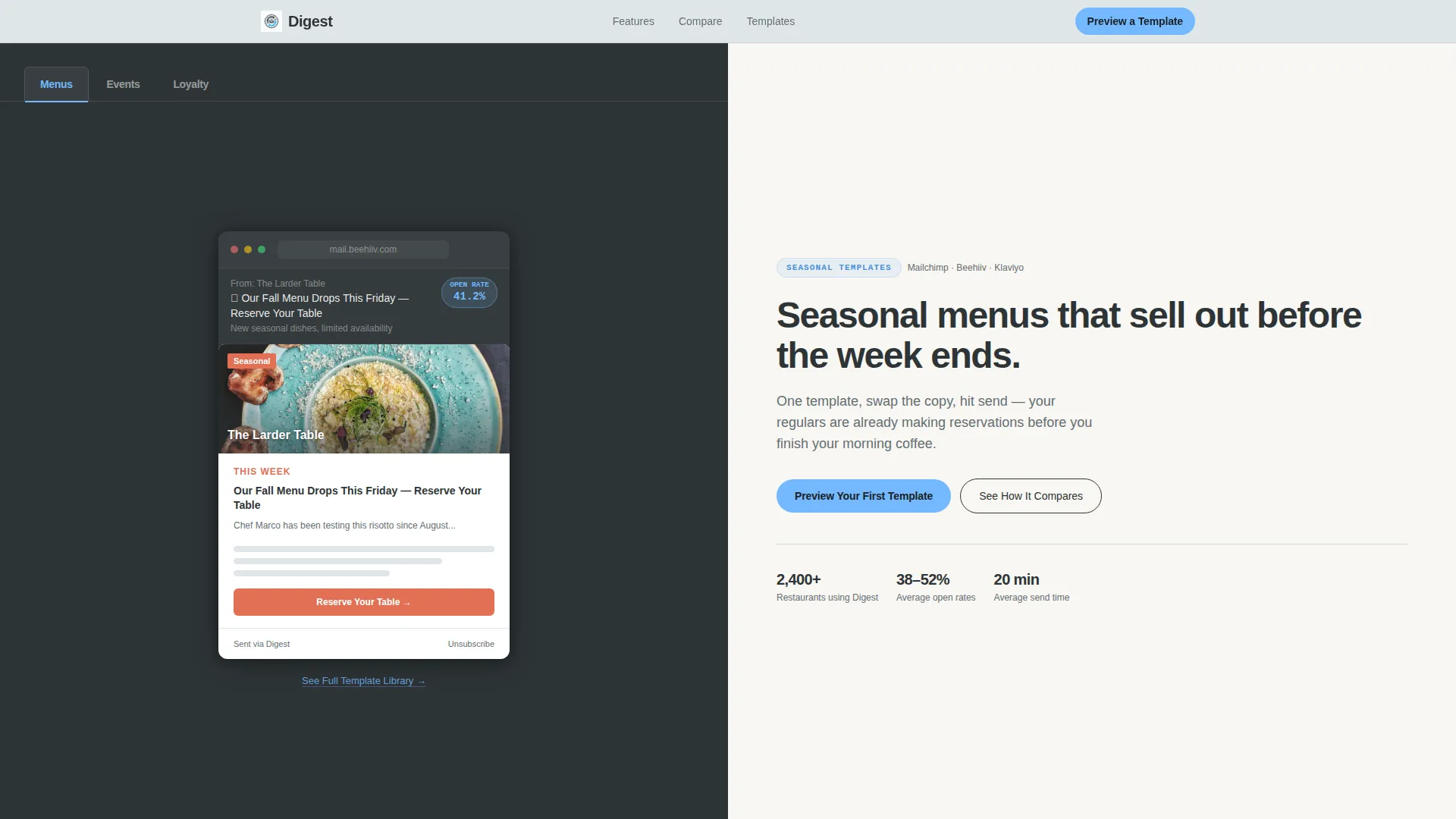
- A Feature Tab Switcher header with three live-rendered newsletter previews for Menus, Events, and Loyalty use cases.
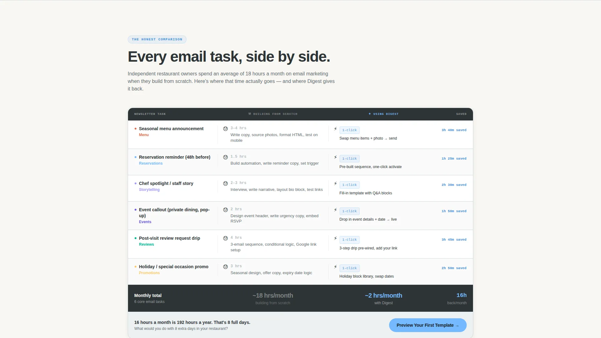
- A scrollable Feature Matrix comparing "Building from Scratch" against "Using Digest" row by row, with time-saved counters and one-click badges.
- A lightbox conversion flow that lets visitors enter their restaurant name and cuisine type to generate a personalized template mockup instantly.
Feature list
This landing page is assembled around four high-impact components, each designed to move a skeptical restaurant owner toward their first send.
Interactive Tab Switcher Header
The header splits 50/50 left and right. The left side holds three tabs labeled Menus, Events, and Loyalty. Each tab swaps in a live-rendered newsletter preview complete with placeholder photography, a realistic subject line, and a visible open-rate badge. The right side updates its headline and benefit sentence in sync. The active tab glows sky blue; inactive tabs hold in slate. The whole header functions as a product demo before the visitor scrolls a single pixel.
Scrollable Feature Matrix
Below the header, a structured comparison grid loads row by row. Each row is a real newsletter task: seasonal menu announcement, reservation reminder, review request drip. The left column shows time estimates and pain indicators for building from scratch. The right column shows one-click badges and hours-saved counters for using Digest. The matrix resolves at the bottom into a single summary row totalling hours saved per month.
Personalized Template Lightbox
The primary call to action opens a two-field lightbox. Visitors type their restaurant name and cuisine type. The result is an instant personalized template mockup. This moment of personalization replaces generic preview images with something the visitor can picture sending to their own guests.
Pre-Built Newsletter Block Kit
The underlying template kit contains drag-and-drop blocks for every recurring restaurant email need. Seasonal menu announcements, chef spotlight features, event callouts, and reservation nudge sequences are all included. Each block is ready to drop into a weekly send without layout work.
Floating and Pinned Call-to-Action System
The primary call to action, "Preview Your First Template," is pinned at the matrix's final row. It also appears as a floating button once a visitor has scrolled past 60 percent of the page. A secondary text link, "See Full Template Library," sits beneath each header tab for visitors who prefer to browse before committing.
Page sections overview
| Section | Purpose |
|---|---|
| Tab Switcher Header | Live newsletter preview demo with synced headlines |
| Feature Matrix Grid | Side-by-side comparison of scratch versus. Digest workflow |
| Matrix Summary Row | Totals hours saved per month to close the argument |
| Primary call to action Row | Pinned "Preview Your First Template" conversion trigger |
| Template Lightbox | Two-field personalized mockup generator |
| Floating call to action Button | Re-surfaces the primary action after 60% scroll depth |
| Secondary Browse Link | "See Full Template Library" path under each tab |
Design & branding system
The visual identity follows a Directory and Discovery theme. The palette is inspired by a well-worn neighborhood dining guide left open on a café table. It feels authoritative but approachable, with one accent color that earns attention without shouting.
- Deep editorial slate (#2D3436) is used for primary text and section dividers, giving the page a printed-publication feel.
- Soft cloud gray (#DFE6E9) is the dominant background, keeping the layout airy and easy to read.
- Open-sky blue (#74B9FF) appears on every interactive element and hover state, drawing the eye naturally toward clickable areas.
Mobile & speed optimization
The layout is built as a single-page flow, which naturally keeps the structure lightweight. The 50/50 split-screen format adapts cleanly to narrower viewports without losing the tab-switcher logic or the matrix readability.
- The Feature Tab Switcher collapses gracefully so the preview, headline, and benefit remain legible on smaller screens.
- The Feature Matrix stacks its columns vertically on mobile so both the scratch and Digest sides remain easy to compare without horizontal scrolling.
How this template helps you convert
Every design decision on this landing page is engineered to reduce hesitation and make the first send feel inevitable.
- The live-preview header removes abstraction immediately. Visitors see exactly what a finished restaurant newsletter looks like before they read a single word of copy, which builds trust faster than a static screenshot.
- The Feature Matrix makes the cost of inaction measurable. Seeing hours-per-month totals stacked in a grid turns a vague sense of "email takes too long" into a specific number, which makes the decision to use Digest feel logical rather than impulsive.
- The personalized lightbox bridges the gap between browsing and buying. Entering a real restaurant name and cuisine type creates a sense of ownership over the mockup, which shortens the mental distance between "this looks interesting" and "I want to use this."
Other information about this template
This template is designed for the restaurant email marketing space, where weekly newsletters build lasting guest relationships. A few additional details worth knowing before you use it.
- The drag-and-drop block kit is described as compatible with popular email platforms, making it practical for senders who already have an account and want to get started quickly.
- The template style is Split Screen (50/50), meaning both halves of every primary section carry equal visual weight and neither side feels like an afterthought.
- The creative direction is Feature Matrix, a format that works especially well for restaurant newsletter templates because the "time saved" argument is both concrete and emotionally resonant for busy hospitality teams.
- The Directory and Discovery theme positions Digest as more than a tool. It frames the restaurant owner as a local tastemaker whose weekly email is genuinely worth opening, which supports stronger subject line writing and higher engagement over time.
- The Slate and Sky color system was chosen specifically because it reads like editorial print media, giving even a first-time email sender the visual credibility of an established dining publication.

Theme
Directory & Discovery
Creative direction
Feature Matrix
Color system
Slate & Sky
Style
Split Screen (50/50)
Direction
Comparison/Versus
Page Sections
Feature Tab Switcher Header
Scrollable Feature Matrix
Drag-and-drop Newsletter Block Kit
Personalized Template Lightbox
Pinned and Floating Call to Action System
Related questions
Do I need email-design experience to use this template?
Can I use this template for more than one restaurant concept?
What does the personalized template mockup actually show?
How often is this template designed to be used?
Who is the Digest landing page template best suited for?



