Digest - Powerful Food & Beverage Landing Page Template
Digest is a bento grid landing page template built for food and beverage AI document processing platforms. It combines a scrolling logo bar, staggered card animations, and a sticky call-to-action bar to guide procurement teams and operations managers from first impression to first click, fast, confident, and visually sharp.
by Rocket studio
Quick summary
Digest is a single-page bento grid landing page template designed for AI-powered document processing tools in the food and beverage industry. It opens with a drifting logo bar for instant credibility, escalates through animated grid cards that demonstrate real document types, and closes every section with a high-contrast call-to-action that routes visitors directly to a product sandbox.
Who this template is for
This template was built for teams selling technical software to operations-heavy buyers in food and beverage supply chains. It speaks the language of people who deal with supplier PDFs, certificates of analysis, and purchase orders every single day.
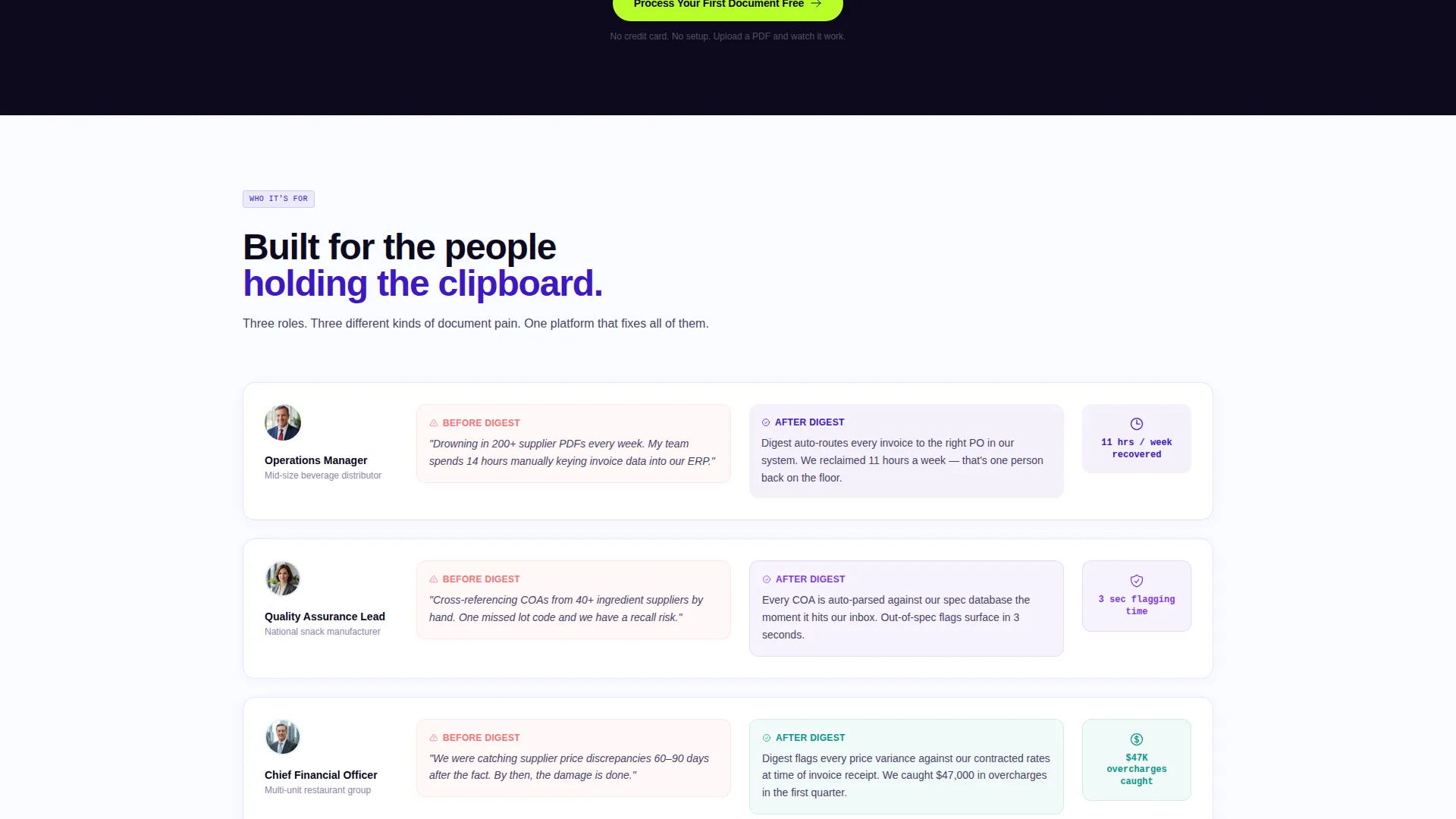
- Operations managers at mid-size beverage distributors buried in supplier document backlogs
- Quality assurance leads at snack manufacturers cross-referencing certificates of analysis by hand
- CFOs at restaurant groups who discover pricing discrepancies weeks or months too late
What problem this template solves
Procurement teams in food and beverage companies spend enormous amounts of time manually reading, sorting, and entering data from invoices, spec sheets, bills of lading, and purchase orders. This template gives platforms that solve that problem a landing page that feels as immediate as the relief the product delivers.
- Visitors land on a page that mirrors their daily frustration and instantly reframes it as solved
- The bento grid shows multiple document types being processed, removing doubt about scope before it forms
- A sticky call-to-action bar keeps the conversion point visible without interrupting the demonstration flow
What you get with this template
You get a fully structured, single-page layout built around a bento grid presentation style. Every section works as a visual proof point, not just a content block.
- A horizontally scrolling logo bar that functions as social proof from the first viewport
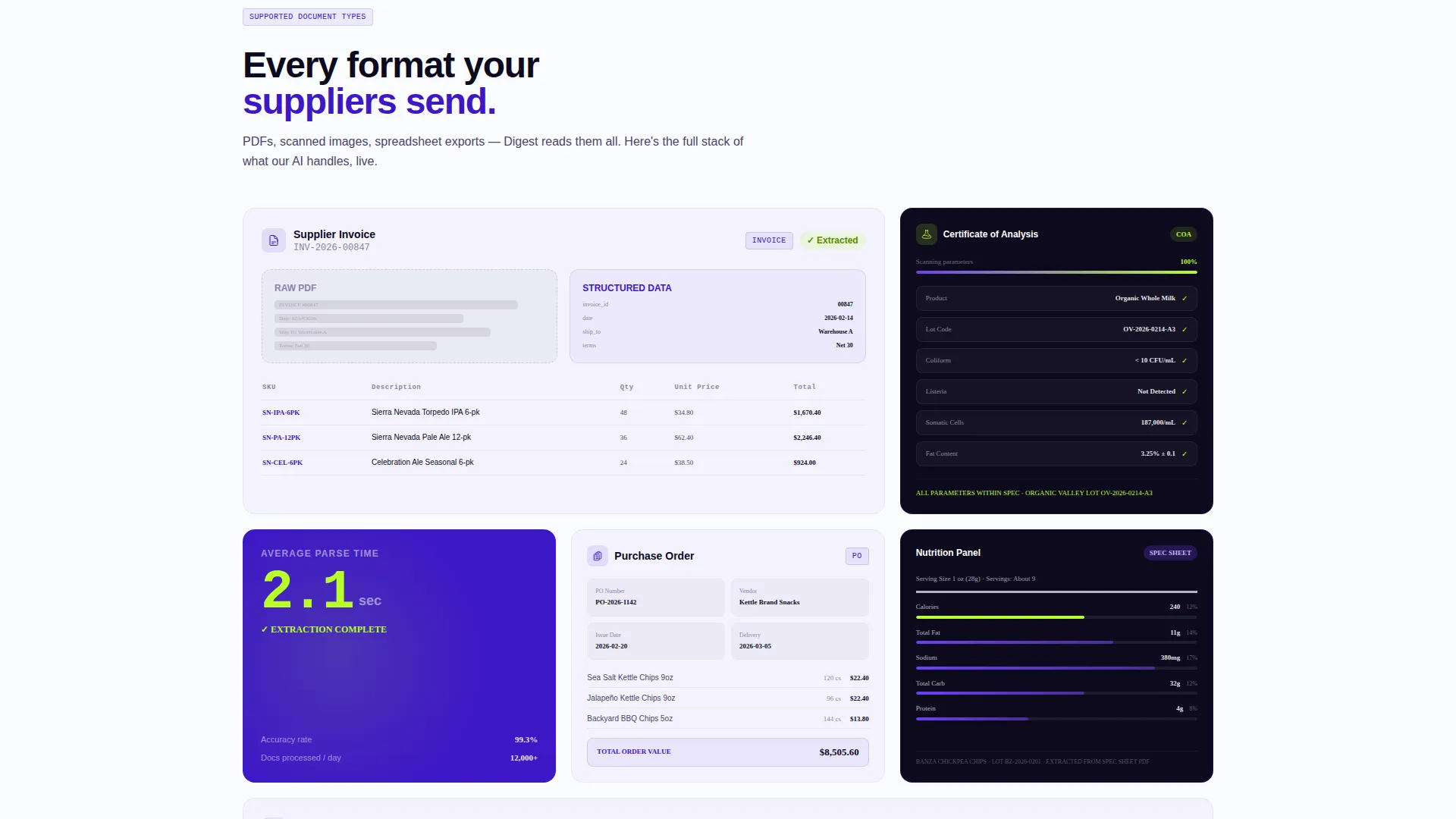
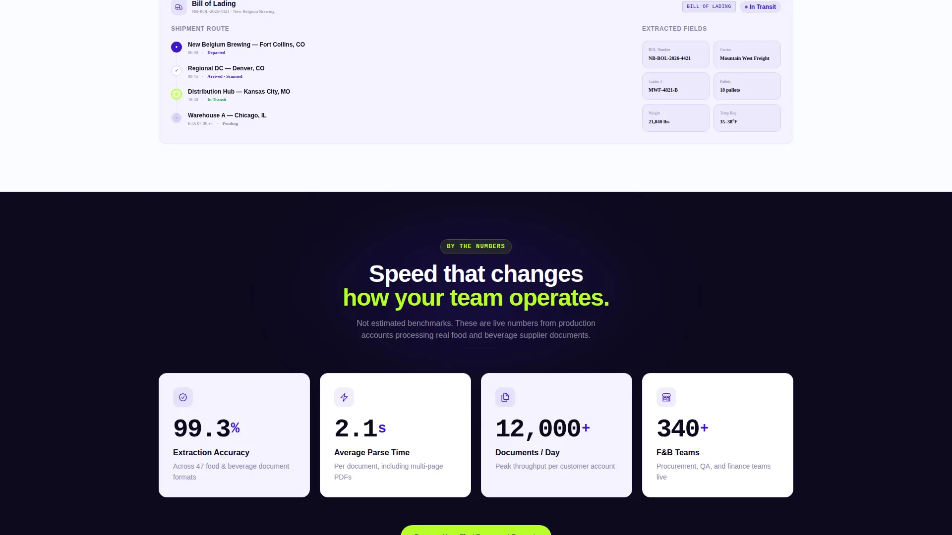
- A staggered bento grid with micro-animations revealing document types including invoices, bills of lading, lot codes, nutrition panels, and supplier agreements
- A sticky call-to-action bar, a primary header call to action, and a secondary anchor text link pointing mid-page for visitors who need more evidence first
Feature list
This template is built for one purpose: turning skeptical procurement and operations buyers into active product trialists. Every feature serves that goal directly.
Scrolling Logo Bar Header
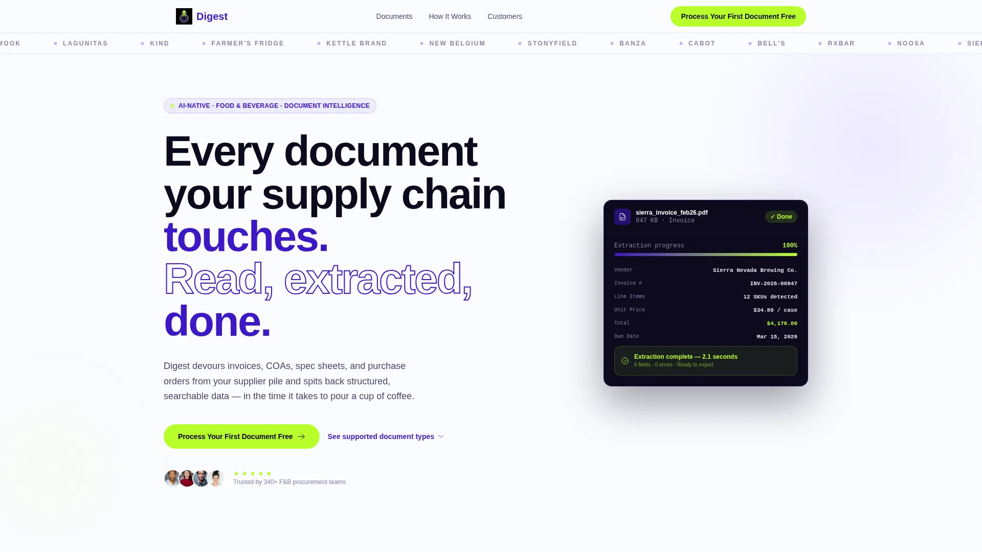
A horizontal scroll of food and beverage brand logos drifts slowly across the top of the viewport at a slow, confident pace. The logos act as ambient social proof, making visitors feel they have arrived at an industry directory rather than a generic software pitch.
Staggered Bento Grid Layout
The bento grid below the header does not load all at once. Cards stagger in with micro-animations, each one revealing a different document type the AI handles. The rhythm is fast and additive, building a rapid proof-stack that escalates with every row.
Animated Before-and-After Cards
Grid cards progress from static document thumbnails to animated before-and-after extraction views. This sequence shows the product in action without requiring the visitor to leave the page or watch a separate video.
Live-Feeling Processing Meter
A processing meter visualization appears inside the grid to communicate speed. It gives the impression of a live system at work, reinforcing the platform's core promise of structured data returned in seconds.
Sticky Call-to-Action Bar
After one scroll-depth, a slim sticky bar pins the primary call-to-action to the viewport. It stays visible as visitors move through the grid, keeping the conversion point present without crowding any individual section.
Dual Call-to-Action Architecture
The primary call-to-action button reads "Process Your First Document Free" in electric lime on indigo and appears first in the header. A secondary text link, "See supported document types," anchors directly to the bento grid mid-page for visitors who need more evidence before committing.
Page sections overview
| Section | Purpose |
|---|---|
| Logo Bar Header | Establishes social proof immediately via drifting brand logos |
| Hero Headline Block | Delivers the core value proposition in one oversized statement |
| Bento Grid Gallery | Demonstrates document types through staggered, animated cards |
| Before-and-After Cards | Shows AI extraction in action with visual before-and-after states |
| Processing Meter Row | Visualizes processing speed to reinforce the platform's core promise |
| Sticky call to action Bar | Keeps the primary conversion point visible throughout the scroll |
Design & branding system
The visual identity follows a Directory and Discovery theme built on an Electric Indigo color system. The palette is modern, urgent, and unmistakably technical while remaining grounded in something physical and human.
- Deep digital indigo (#3D17C6) as the primary brand anchor, charged violet (#6E3FF5) for hover states and active elements, crisp white (#FAFBFF) with a barely-there blue cast on card backgrounds
- Electric lime (#B8FF29) fires on calls-to-action and progress indicators, creating high contrast that draws the eye exactly where clicks need to happen
- Typography uses a tight grotesque typeface for the oversized headline, keeping the visual weight dense and confident against the dark indigo background
Mobile & speed optimization
The bento grid layout and staggered animations are structured to work across viewport sizes. The sticky call-to-action bar is especially useful on mobile, where scroll depth is longer and the conversion point can easily disappear.
- Card-based grid structure adapts naturally to narrower screens without losing the staggered reveal rhythm
- The slim sticky bar adds minimal visual weight on smaller viewports while maintaining consistent call-to-action presence throughout the scroll
How this template helps you convert
This template earns the click by showing the product at work before asking for anything. Every design decision points toward a single outcome: getting the visitor to upload their first document.
- The scrolling logo bar and oversized headline establish credibility and clarity within the first three seconds of the visit, removing the need for a long introductory pitch.
- The staggered bento grid acts as a self-running product demonstration, so by the time the sticky call-to-action bar comes into view again, the visitor has already seen the AI handle six or more document types.
- The dual call-to-action structure serves two buyer types simultaneously: the visitor who is ready to act immediately and the visitor who needs to explore the grid before committing.
Other information about this template
This template is part of the Digest series and sits within the Technology category, specifically the AI for Food and Beverage subcategory. It is designed for the food and beverage AI document processing niche and carries an intersection match score of 13 across theme, creative direction, color system, template style, and landing page direction fields.
- The template style is Bento Grid, the theme is Directory and Discovery, and the creative direction is Launch Energy
- The header concept is Logo Bar and the landing page direction is Click-Through, meaning every design choice prioritizes routing visitors to a product sandbox rather than capturing a form submission
- This template can support use cases wherever a procurement or supply chain software platform needs to communicate speed, accuracy, and industry fit to operations-focused buyers in food and beverage
Theme
Directory & Discovery
Creative direction
Launch Energy
Color system
Electric Indigo
Style
Bento Grid
Direction
Click-Through
Page Sections
Scrolling Logo Bar for Social Proof
Staggered Bento Grid with Micro-animations
Animated Before-and-after Extraction Cards
Live-feeling Processing Speed Meter
Sticky Call-to-action Bar
Dual Call-to-action Structure
Related questions
Who is this landing page template designed for?
Does this template include a contact form or lead capture form?
What document types does the bento grid showcase?
Can I adapt the color system for a different brand?
What makes the bento grid layout effective for this type of platform?



