Dine — Bistro Booking Landing Page Template
Menu is a split-screen landing page template built for digital menu platforms targeting restaurant owners, food hall operators, and ghost kitchen founders. It combines a live Calculator/Estimator header, Industry Report scroll sections, and a low-friction three-field signup form. The design uses a Slate and Sky color system to keep the focus on the product, not the page.
by Rocket studio
Quick summary
Menu is a single-page landing page template for startup digital menu platforms. It uses a 50/50 split-screen layout, a real-time estimator header, and an Industry Report scroll cadence. Each section pairs a bold data finding with a live menu mockup. The primary conversion path is a free signup requiring only three fields.
Who this template is for
This template is designed for founders and operators building digital menu products for the food and beverage industry. It speaks directly to the people serving those operators as much as to the operators themselves.
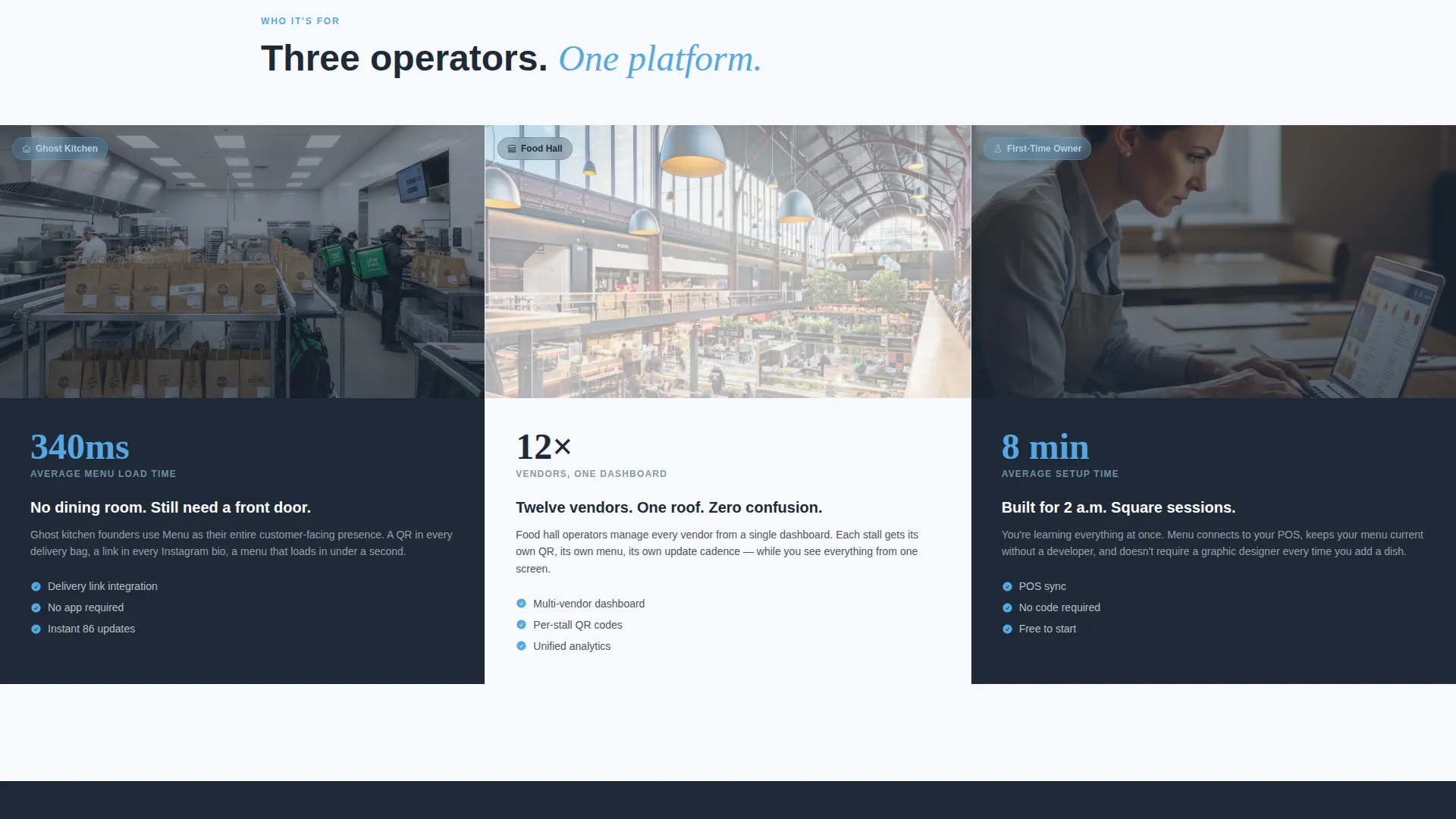
- First-time restaurant owners managing menus without a dedicated tech team
- Food hall operators coordinating multiple vendors under one digital roof
- Ghost kitchen founders who need a compelling front door with no physical dining room
What problem this template solves
Paper menus, PDF links, and outdated printed boards cost money every time something changes. This template helps a digital menu platform communicate that cost clearly and turn it into a reason to sign up for free.
- Visitors land without understanding the real cost of static menus
- Skeptical operators need proof before they hand over an email address
- The signup flow often asks for too much, too soon, and loses the lead
What you get with this template
You get a complete, conversion-focused landing page ready to represent a digital menu startup. Every section is purposeful and sequenced to move a skeptical operator toward a free account.
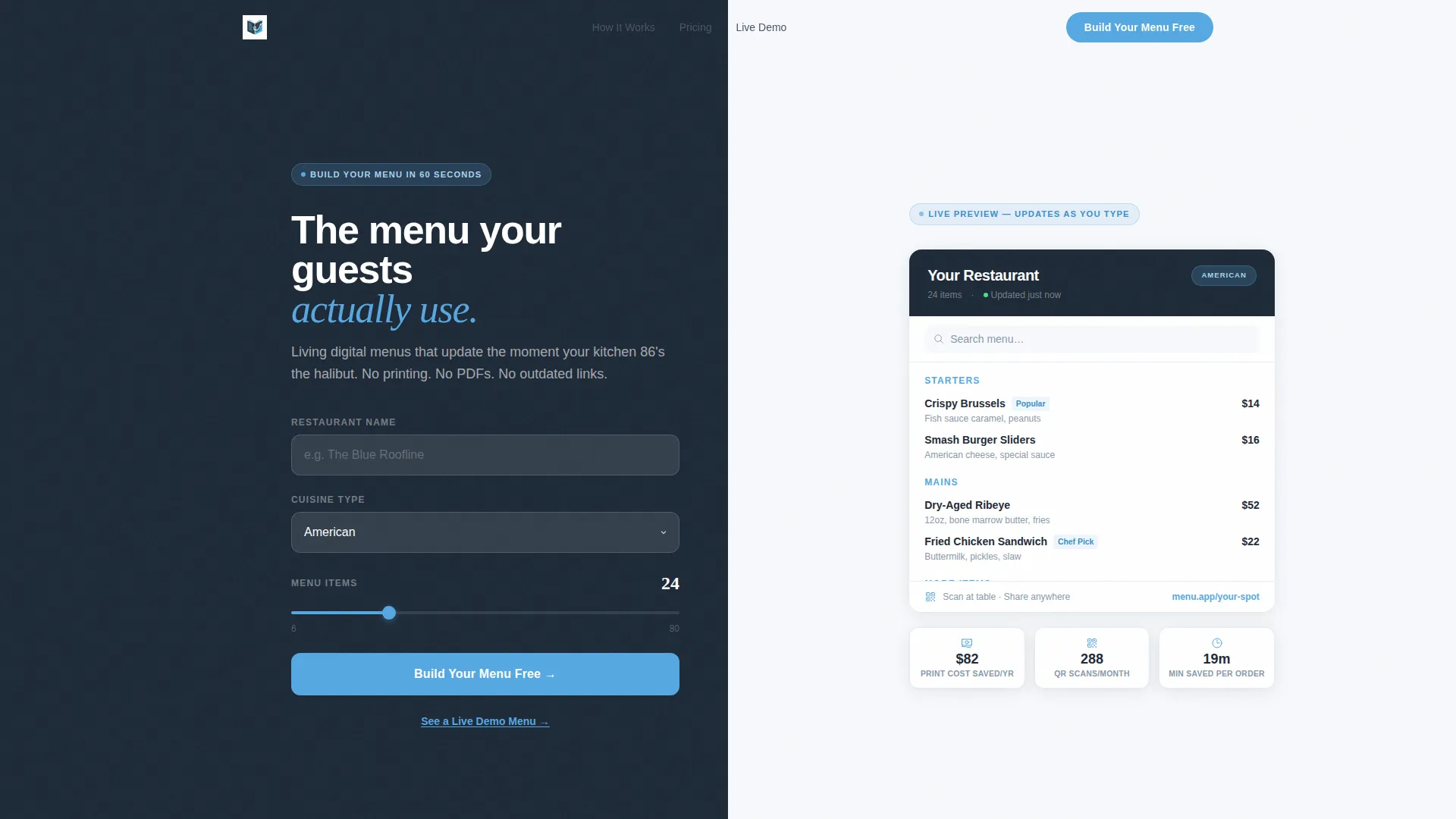
- A split-screen Calculator/Estimator header that renders a live menu preview as the visitor interacts
- A cost-savings ticker showing printing costs eliminated, projected QR scans, and time-to-order reduction
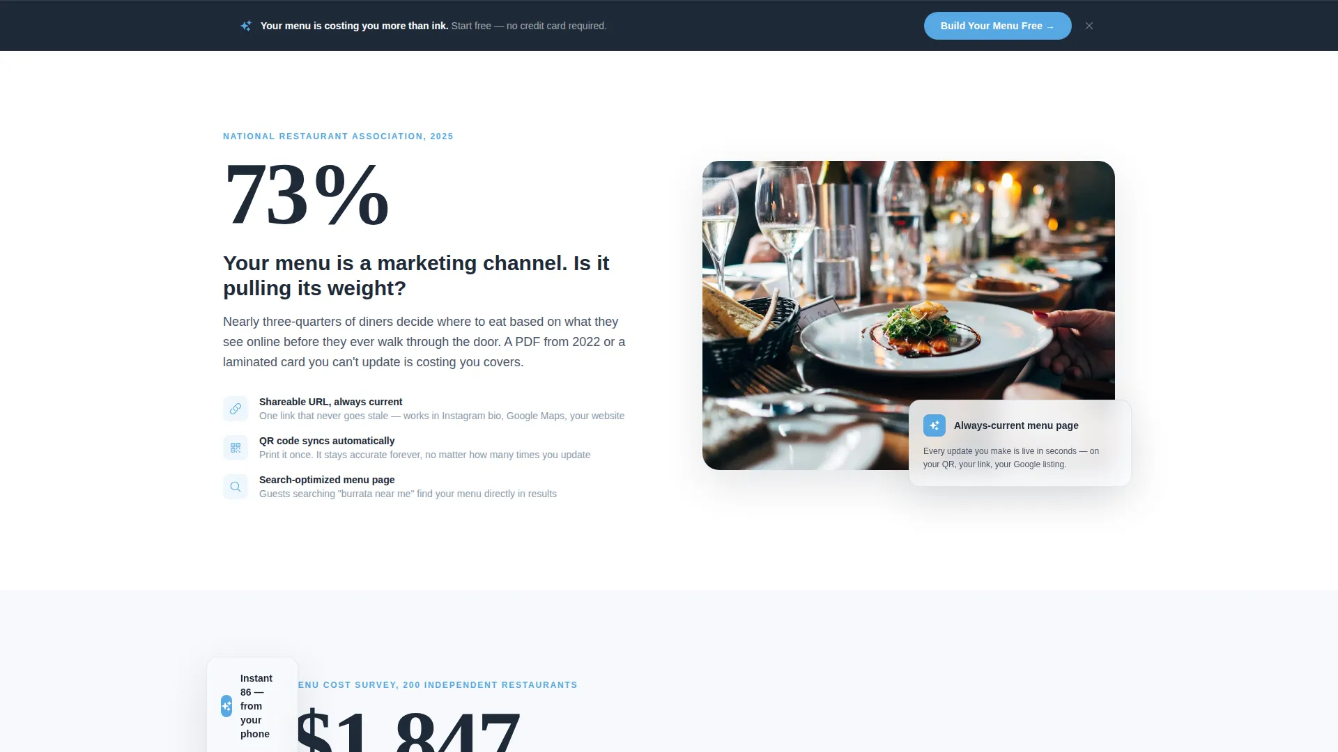
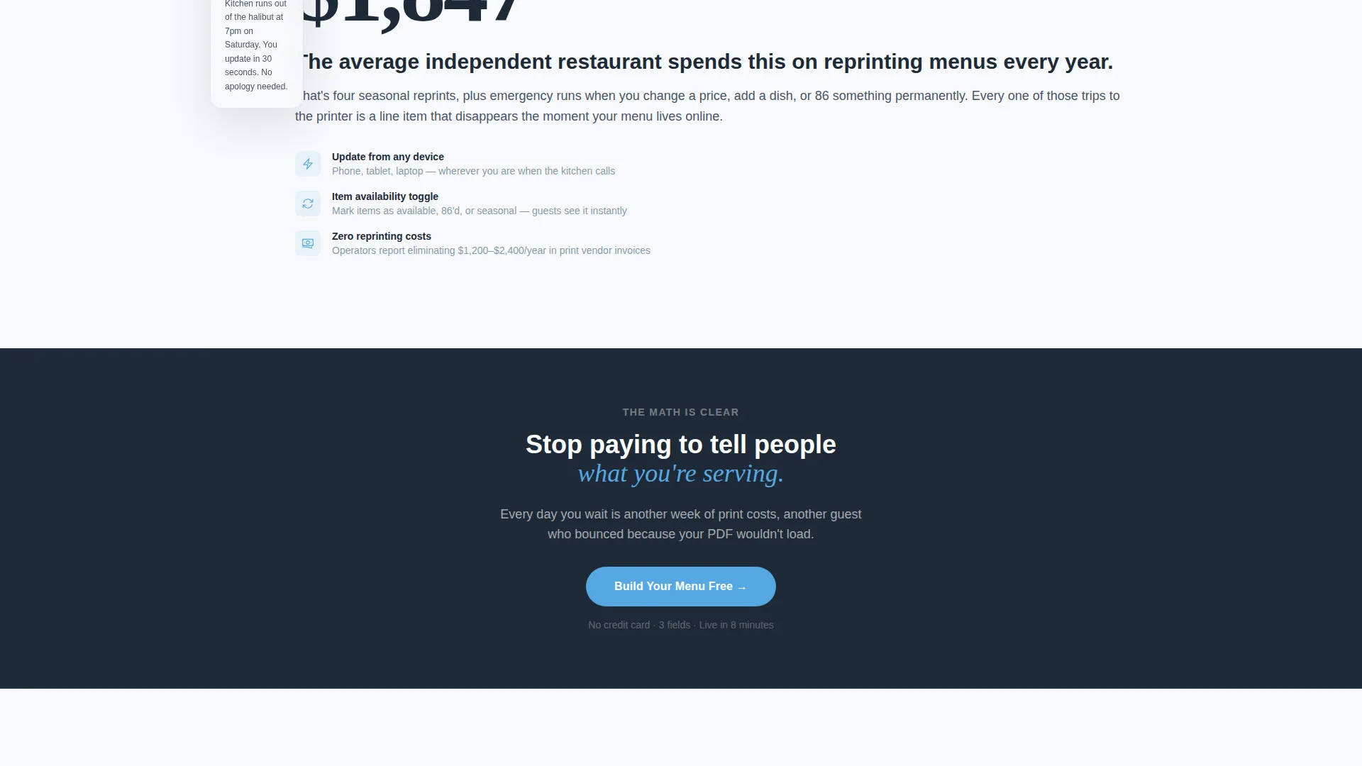
- An Industry Report scroll flow pairing hard stats with functioning menu mockups
- Operator testimonials styled as pull-quotes from a trade publication
- A sticky bottom bar with a persistent "Build Your Menu Free" call to action
- A secondary path linking to a live demo menu for low-commitment exploration
Feature list
This template is built around a clear sequence of purpose-built components. Each one has a specific job in the conversion flow.
Live Calculator and Estimator Header
The header splits 50/50. The left side shows a simulated restaurant profile with a name field, cuisine type selector, and item count slider. The right side renders a real-time digital menu preview that updates as the visitor adjusts each input. The headline fades in after the first interaction: "Your menu is costing you more than ink."
Cost-Savings Ticker
Directly below the estimator, a live ticker calculates three metrics: printing costs eliminated per year, projected monthly QR scans, and average customer time-to-order reduction. These numbers respond to the visitor's inputs and make the value of switching feel immediate and personal.
Industry Report Scroll Sections
Each scroll section presents one data finding as a bold stat on the left side of the screen. The right side pairs it with a functioning menu mockup that shows the product feature answering that problem. The page escalates from problem data to solution proof to social evidence, following the rhythm of a well-designed white paper.
Trade Publication Testimonials
Operator testimonials appear as pull-quotes formatted like excerpts from a trade publication. This layout signals credibility without relying on carousel cards or star ratings. Each quote feels like third-party editorial rather than a marketing slide.
Three-Field Signup Form
The primary conversion form asks for restaurant name, cuisine type from a dropdown, and email address only. There is no credit card field and no phone number required. The form appears at the header, at mid-scroll after the third stat section, and inside the sticky bottom bar.
Live Demo Menu Path
A secondary call to action labeled "See a Live Demo Menu" links visitors to a functioning sample menu they can tap through before committing. This path reduces skepticism by letting operators experience the product before they sign up.
Page sections overview
| Section | Purpose |
|---|---|
| Estimator Header | Simulate menu build and show live preview |
| Cost-Savings Ticker | Quantify printing and time savings instantly |
| Stat Section One | Pair first data finding with product feature |
| Stat Section Two | Pair second data finding with menu mockup |
| Stat Section Three | Pair third data finding with solution proof |
| Mid-Scroll Form | Capture leads after third stat section |
| Testimonials Block | Display operator pull-quotes for social proof |
| Demo Menu call to action | Offer low-commitment product exploration |
| Sticky Bottom Bar | Persist primary call to action across full page scroll |
Design & branding system
The visual identity follows a Directory and Discovery theme using the Slate and Sky color system. The palette is designed to feel calm and authoritative, like a well-run restaurant at the end of a dinner service.
- Deep charcoal slate (#1E2A38) for primary backgrounds, mid-tone graphite (#4A5568) for secondary surfaces
- Open-sky blue (#56A8E2) on every clickable element and progress indicator
- Cloud white (#F7F9FC) for content panels and menu cards, keeping menu items visually prominent
Mobile & speed optimization
The split-screen layout is designed to restack cleanly on smaller screens so the estimator and menu preview remain usable without horizontal scrolling. The page is built with a lean, section-led structure that avoids heavy asset bloat.
- The 50/50 split collapses to a stacked single-column view on mobile devices
- The sticky bottom bar with the primary call to action remains visible on all screen sizes
- The three-field form is touch-friendly and requires minimal input to complete
How this template helps you convert
This template earns the signup by proving the cost of inaction before asking for anything. Every structural decision reinforces that logic.
- The estimator header creates personal, data-driven engagement in the first few seconds, giving the visitor a reason to keep scrolling before they have read a single marketing claim.
- The Industry Report scroll cadence builds cumulative certainty, so by the time the mid-scroll form appears after the third stat section, the visitor already feels behind for not switching sooner.
- The three-field form with no credit card requirement and the live demo path working together remove the two most common reasons a qualified visitor leaves without converting.
Other information about this template
This template is part of the Technology category under the Startup Digital Presence subcategory. It is purpose-built for the Startup Digital Menu niche and reflects the full intersection of its matched context fields.
- Template style is Split Screen (50/50), and all layout decisions follow that structure throughout
- The creative direction is Industry Report, meaning every scroll section is designed to feel like a data-led editorial page, not a typical SaaS marketing deck
- The header concept is Calculator/Estimator, making the first interaction functional rather than decorative
- The conversion direction is Freemium and Trial, with a free tier positioned as the natural and obvious next step
- The theme is Directory and Discovery, meaning the layout prioritizes findability and clarity of information over visual showmanship
Theme
Directory & Discovery
Creative direction
Industry Report
Color system
Slate & Sky
Style
Split Screen (50/50)
Direction
Freemium/Trial
Page Sections
Live Calculator and Estimator Header
Cost-savings Ticker
Industry Report Scroll Flow
Trade Publication Testimonials
Three-field Signup Form
Live Demo Menu Secondary Path
Related questions
Who is this landing page template built for?
Does the estimator actually calculate numbers, or is it just visual?
What fields does the signup form require?
What is the live demo menu path for?
How many times does the primary call to action appear on the page?



