Dine — Culinary Experience Landing Page Template
Menu is a hub-and-spoke restaurant landing page template built for speed and impact. It puts a live product demo front and center, walks visitors through five core platform features via anchor navigation, and drives every click toward a free trial signup. The Dynamic Motion design and Carbon Fiber color system make the platform feel as sharp as the kitchens it serves.
by Rocket studio
Quick summary
Menu is a single-page, anchor-navigated landing page template for a restaurant website builder platform. It opens with a full-bleed animated header, guides visitors through five feature spokes, and closes with a conversion section tied to a free trial signup. Every design choice reflects the energy of a restaurant hitting its stride at service time.
Who this template is for
This template is built for teams marketing a restaurant software platform to operators who don't have time to read spec sheets. The target audience spans three distinct operator profiles.
- Independent restaurant owners who need a fast, branded online presence without hiring a developer
- New franchise operators launching multiple locations and needing a repeatable setup workflow
- Food hall vendors currently relying on social media to take orders and manage reservations
What problem this template solves
Most restaurant operators face the same frustrating gap: their website looks abandoned while their Instagram is full of life. This template gives the platform's marketing page the energy and credibility to close that gap.
- Restaurants lose customers to competitors with sharper, faster online ordering experiences
- Operators with no dedicated web team need a builder that proves itself visually before they commit to signing up
- Franchise and multi-location operators need to see that the platform can scale, not just serve a single dining room
What you get with this template
You get a fully structured, single-page landing page that demonstrates the platform's capabilities through motion and sequenced storytelling. The layout is organized around a sticky anchor navigation system with five labeled spokes.
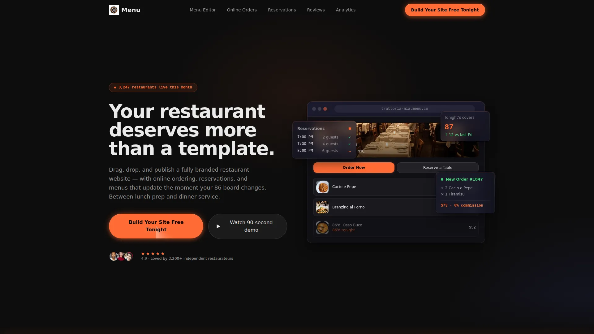
- A dark full-bleed animated header with a live product demo materializing from black, micro-animations, and a typewriter headline
- Five anchor-linked feature sections covering Menu Editor, Online Orders, Reservations, Reviews, and Analytics
- A persistent bottom call-to-action bar, a closing conversion section with a live restaurant launch counter, and zero form fields on-page
Feature list
This template is built around one core idea: show the platform working, then open the door. Every feature below serves that goal directly.
Animated Full-Bleed Header
The header opens on a pitch-black viewport. A fully rendered restaurant website builds itself from darkness, with user interface elements edged in soft ember-orange light. Micro-animations fire in sequence: a reservation widget pulses, a menu item image loads with a shimmer, and an "Order Now" button glows. A single headline types out letter by letter at 60 frames per second.
Sticky Anchor Navigation
After the visitor scrolls past the header, the anchor navigation pins to the top of the page. Each spoke is labeled in plain restaurant shorthand: Menu Editor, Online Orders, Reservations, Reviews, and Analytics. Clicking any spoke smooth-scrolls directly to that feature's dedicated section.
Embedded Motion Feature Sections
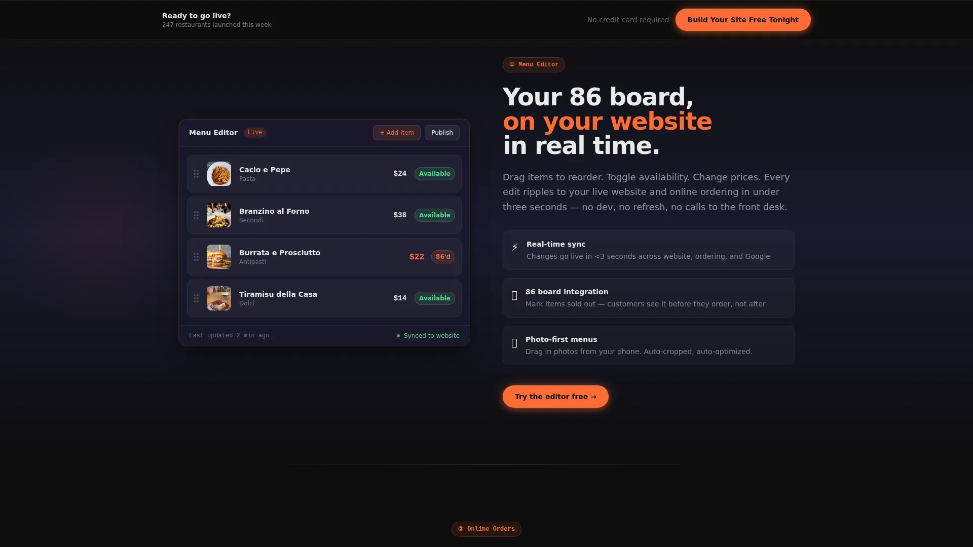
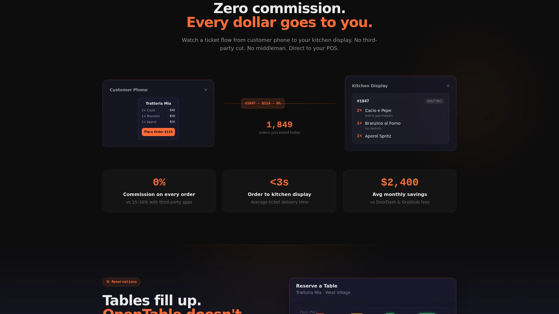
Each spoke section demonstrates its feature through an embedded animation rather than a static screenshot. The Menu Editor section shows drag-and-drop reordering with price changes rippling in real time. The Online Orders section animates a ticket flowing from a customer's phone to a kitchen display screen.
Persistent Bottom Call-to-Action Bar
After the visitor passes the second spoke section, a bottom bar floats into view and stays visible throughout the rest of the page. It carries the primary call to action, "Build Your Site Free Tonight," and routes every click to the signup flow with no form fields interrupting the journey.
Closing Conversion Section
The page ends with a dedicated section anchored around a live counter showing how many restaurants launched on the platform this week. The primary call to action appears here one final time, reinforcing momentum at the moment when buying intent is highest.
Real-Time Menu Update Display
The template demonstrates the platform's live menu update capability, showing how changes made when an item is removed from service reflect immediately on the published site. This builds trust with operators who know that static menus cost them real orders during service.
Page sections overview
| Section | Purpose |
|---|---|
| Animated Header Block | Opens with live product demo and typewriter headline |
| Sticky Anchor Nav | Pins after scroll, links all five feature spokes |
| Menu Editor Spoke | Demonstrates drag-and-drop menu reordering and real-time pricing |
| Online Orders Spoke | Animates ticket flow from customer phone to kitchen display |
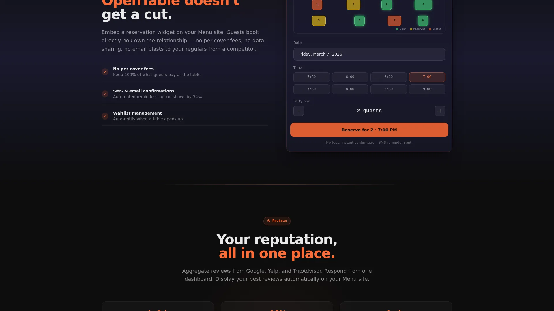
| Reservations Spoke | Showcases the reservation widget in an embedded motion demo |
| Reviews Spoke | Highlights how the platform surfaces and organizes guest reviews |
| Analytics Spoke | Shows platform data tools relevant to restaurant performance |
| Persistent call to action Bar | Floats after spoke two, drives clicks to free trial signup |
| Closing Conversion Section | Live launch counter plus final primary call to action |
Design & branding system
The Carbon Fiber color system is built to feel like professional kitchen equipment: matte where it should be matte, sharp where it needs an edge. Every color choice has a specific role and is never used interchangeably.
- Deep carbon black (#0D0D0D) and brushed graphite (#1A1A2E) hold all backgrounds, keeping the focus on motion and content
- Warm ember orange (#FF6B35) activates only on interactive elements, hover states, and call-to-action buttons, acting as a visual heat signal
- Soft plate white (#EAEAEA) carries all body and headline typography, floating clean against the dark backgrounds the way ticket paper reads under heat lamps
Mobile & speed optimization
The Dynamic Motion theme is designed to maintain visual impact across device sizes without losing the energy of the animated sequences. Layout and interaction patterns are built to translate from desktop to smaller screens.
- The sticky anchor navigation collapses gracefully on smaller viewports, keeping spoke links accessible without crowding the screen
- Motion sequences are structured to run smoothly and stay legible whether the visitor is on a desktop monitor or a mobile device during a lunch break
How this template helps you convert
The page is structured as a Click-Through landing page with one job: earn the click to the signup flow. It does this by showing the product in action before asking for anything.
- The animated header creates an immediate emotional connection, replacing a static hero image with a live product demo that proves the platform's quality before a single word is read
- The five sequenced feature spokes build cumulative confidence, so that by the time the visitor reaches the persistent call-to-action bar, they have already watched the platform handle menu updates, order routing, and reservations in motion
- The closing section adds social proof through a live restaurant launch counter and delivers the final call to action at the exact moment the visitor's intent is at its peak
Other information about this template
This template is built specifically for the restaurant website builder category within the broader restaurant software and SaaS space. A few additional details worth knowing before you use it.
- The template is designed as a single-page hub-and-spoke layout, not a multi-page website structure
- All call-to-action buttons route to an external signup or free trial flow; there are no embedded forms on this page
- The Dynamic Motion theme and Carbon Fiber palette are matched specifically to the restaurant and food service industry aesthetic, giving the platform immediate visual credibility with operators
- The template's creative direction positions the platform as a restaurant operating system that outputs a website, rather than a generic website builder with food-related add-ons
Theme
Dynamic Motion
Creative direction
Feature Matrix
Color system
Carbon Fiber
Style
Hub & Spoke (Anchor Nav)
Direction
Click-Through
Page Sections
Animated Full-bleed Header Demo
Sticky Five-spoke Anchor Nav
Embedded Motion Feature Sections
Persistent Bottom Call to Action Bar
Live Restaurant Launch Counter
Real-time Menu Update Demo
Related questions
Who is this landing page template designed for?
Does this template include any form fields for lead capture?
Can the template speak to multi-location restaurant operators?
What makes the header different from a standard hero section?
How does the sticky anchor navigation work?



